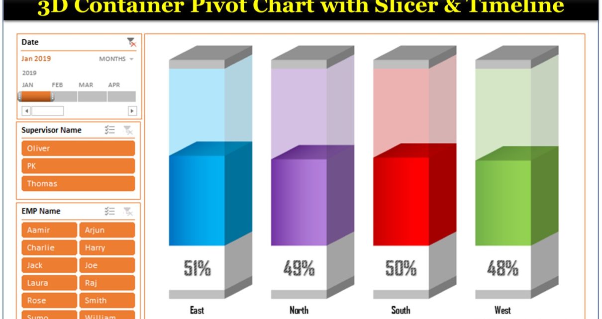
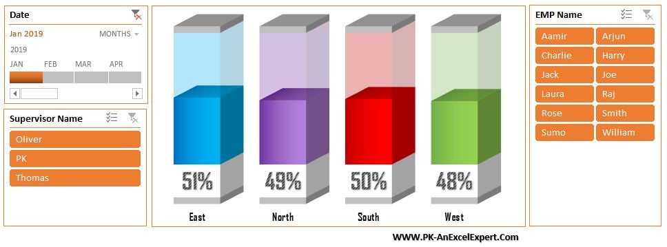
This time I am back with a beautiful 3D container Pivot Chart with the slicers and Timeline. We have displayed the sales conversion by Zone on the chart. We have used multiple calculated field in the Pivot table to create this chart.
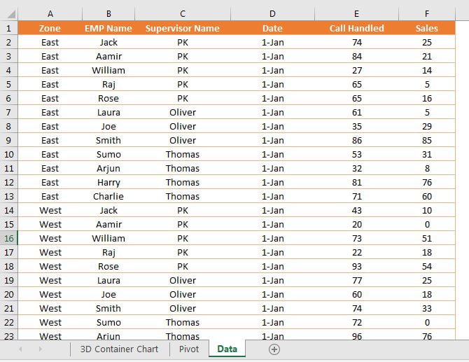
Below are the data points which we have used to create this chart-
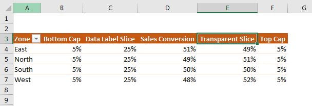
Below is pivot table which we have created to make this chart-
Below is the 3D Container Pivot Chart with Slicers and Date Timeline
Click to buy 3D Container Pivot Chart with Slicer and Timeline
Visit our YouTube channel to learn step-by-step video tutorials
Watch the step by step video tutorial:
Click to buy 3D Container Pivot Chart with Slicer and Timeline