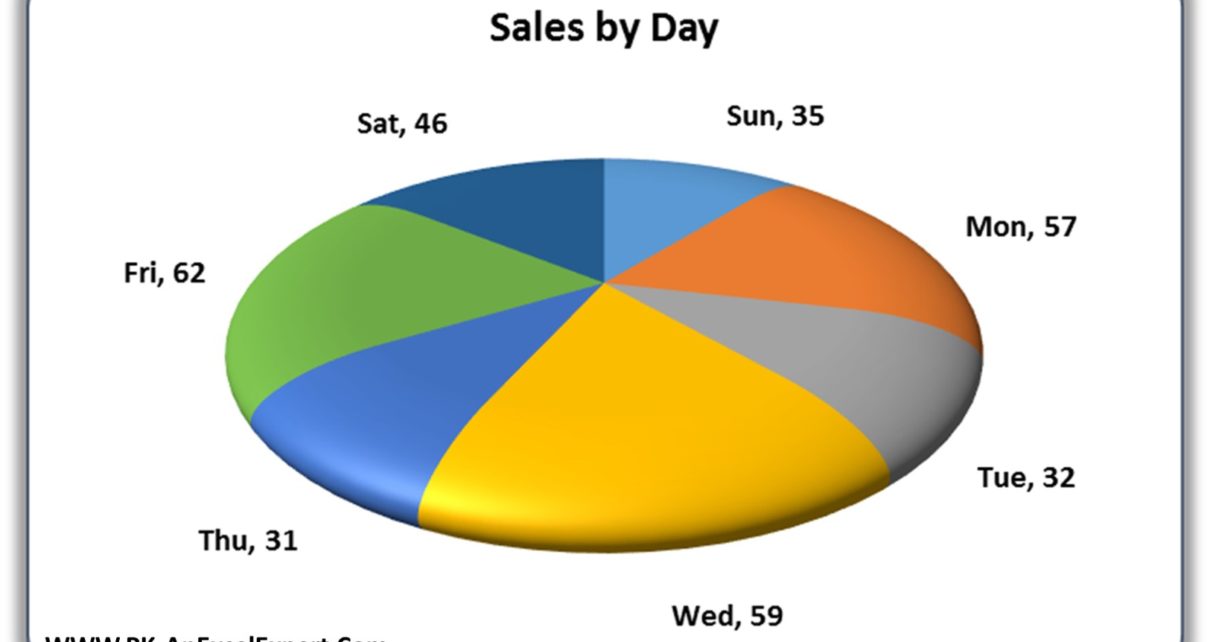
In today’s world, data visualization has become an essential part of business presentations and reporting. It helps to communicate complex information in a simple and visually appealing way. One of the popular visualization techniques is the pie chart. It displays data in slices that make up a whole. A 3D disk Pie Chart takes it one step further by adding a 3D effect which makes it even more visually appealing.
What is a 3D Disk Pie Chart in Excel?
A 3D disk pie chart is a type of Pie chart which displays data as slices of a disk. The chart is similar to a traditional pie chart. It has a 3D effect which makes it more visually appealing. You can use this chart to represent your categorized data.
Steps to create a 3D Disk Pie Chart in Excel
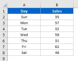
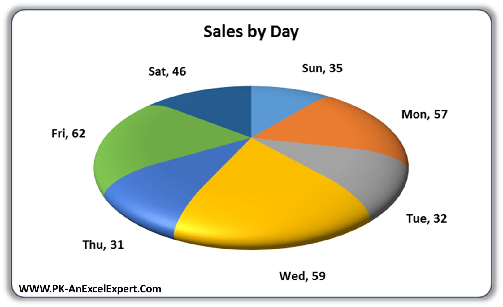
Input your data into Excel. For example, let’s consider day-wise sales. Follow the below steps-
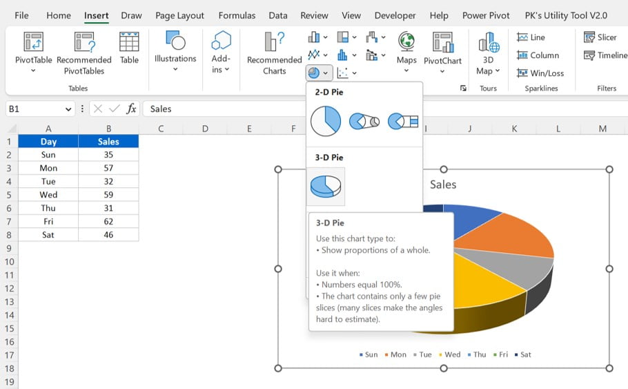
- Select the Data and insert a 3D Pie Chart
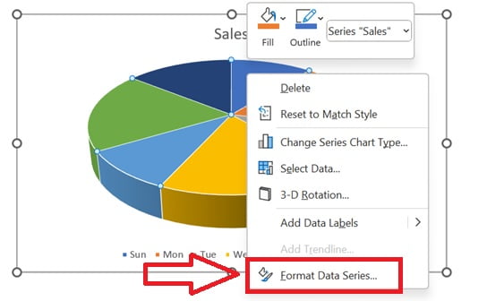
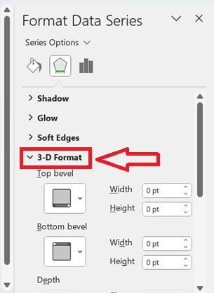
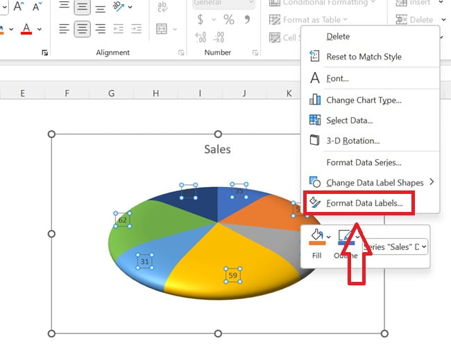
- Right click on the chart and click on “Format Data Series”.
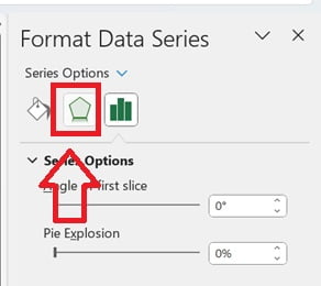
- Go to the Effects in Format Data Series.
- In the Effects, open the 3-D format feature.
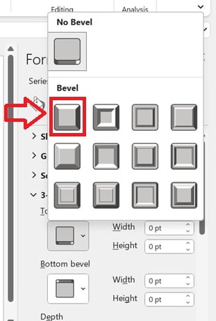
- Select the Top and Bottom Bevel as “Round” or “Circle”
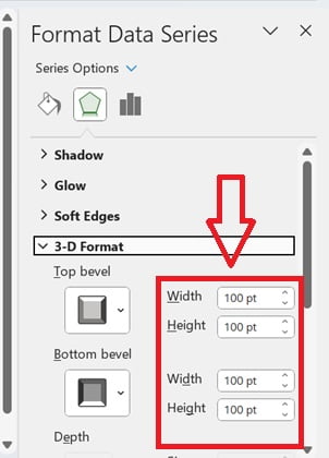
- Put the Width and Height as 100 pt for Top and Bottom bevel.
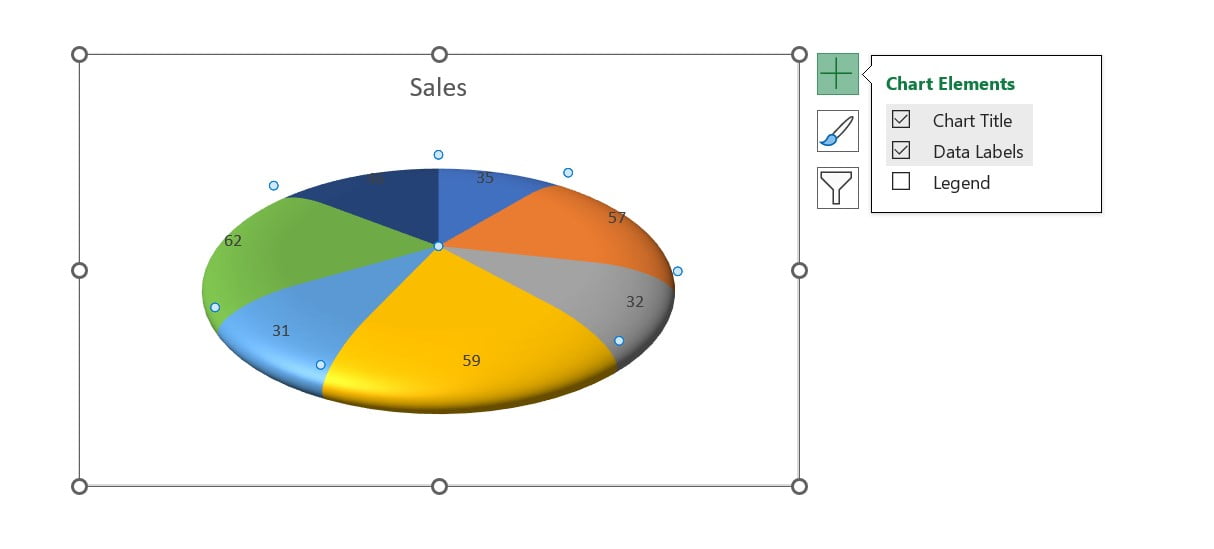
- Now the chart will look like 3D disk chart. Remove the Legends and Add Data Labels form the Chart Elements.
- Right click on the Data Labels and click on the Format Data Labels.
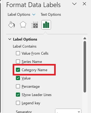
- In the Format Data Labels, Select the Category Name in the Label Contains
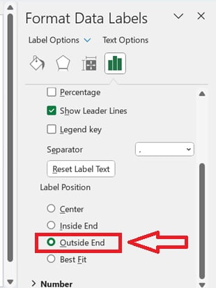
- Select the Label Position as Outside End.
Now our chart is ready. You do more adjustments if you need.
Click here to download this Excel File:
Watch the step-by-step video tutorial:
Visit our YouTube channel to learn step-by-step video tutorials