Data visualization is a very important part of data analysis. Microsoft Excel offers a wide range of charts and graphs which can be useful to convey complex information in a clear and concise manner. One such chart type is the Tornado or Butterfly charts in Excel. This chart is extremely useful to compare two teams or processes on different metrics or products. In this article, we will provide a step-by-step guide to create a Tornado or Butterfly chart in Excel. We will also explain use of this chart in data analysis process.
Tornado or Butterfly charts in Excel

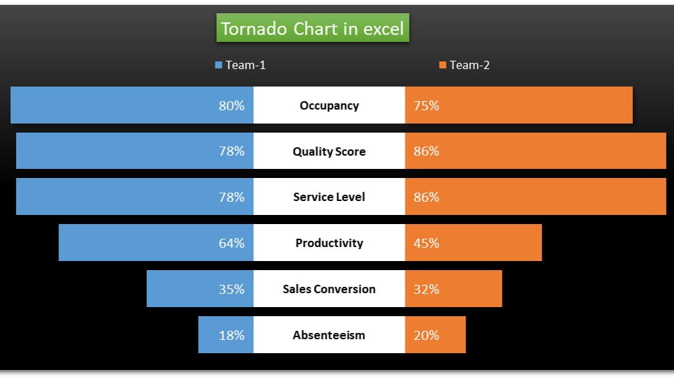
A Tornado or Butterfly chart is a type of bar chart that displays data in a horizontal orientation, with bars extending to the left and right of a vertical axis. The chart is useful to compare the performance of two teams or processes on different metrics or products. The bars are in descending order, with the longest bars at the top and the shortest bars at the bottom. The chart gets its name from its resemblance to a butterfly or a tornado, with the longest bars forming the wings of the butterfly or the funnel of the tornado.
Creating a Tornado or Butterfly chart in Excel
Visit our YouTube channel to learn step-by-step video tutorials
Watch the step-by-step video tutorial:
Click to buy Master the Art of Team Comparison with Tornado or Butterfly Charts in Excel
How a Tornado or Butterfly chart can be helpful in data analysis
A Tornado or Butterfly chart can be helpful in data analysis by allowing you to compare the performance of two teams or processes on different metrics or products. The chart highlights the differences between the two teams or processes. It helps you to identify the areas wherein one team or process outperforms the other.
For example, let’s say you compare the sales performance of two teams over the course of a year. By using a Tornado or Butterfly chart, you can quickly identify the products or metrics where one team outperforms the other. You can use this information to improve the overall sales performance of both teams.
How to interpret the chart
The Tornado or Butterfly chart provides a clear visual representation of the strengths and weaknesses of the two teams or processes. The chart helps to identify areas where one team or process may be excelling. As well as areas where they may be falling short in comparison to the other team or process. By comparing the two charts side by side, we can easily see the similarities and differences between the two teams or processes.
Although this chart is a useful tool for comparison, but it should not be the sole method of analysis. The chart should be used to performance of the teams or processes comparison.
Conclusion
The Tornado or Butterfly chart is a powerful tool for comparing the performance of two teams. By following the step-by-step guide in above given our YouTube Video tutorial, you can easily create this chart in Excel. You can use it to gain insights into the strengths and weaknesses of the teams or processes being compared. With a little bit of practice and experimentation, you can create effective Tornado or Butterfly charts that help you make informed decisions and drive better outcomes.
Click to buy Master the Art of Team Comparison with Tornado or Butterfly Charts in Excel


