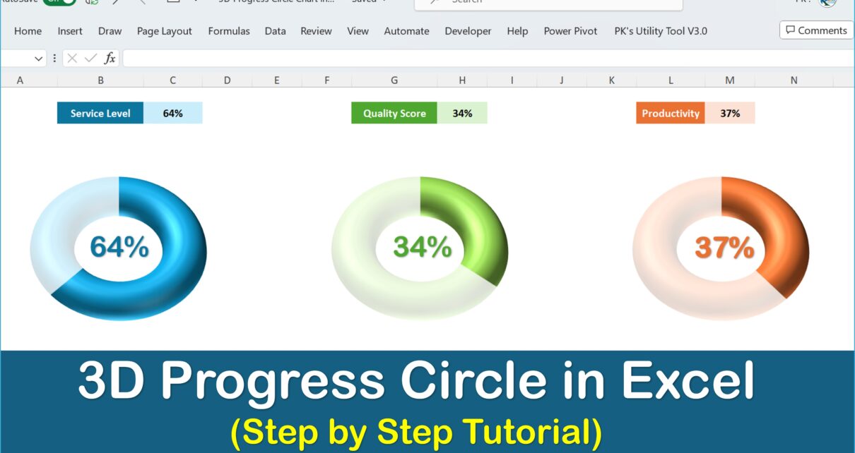
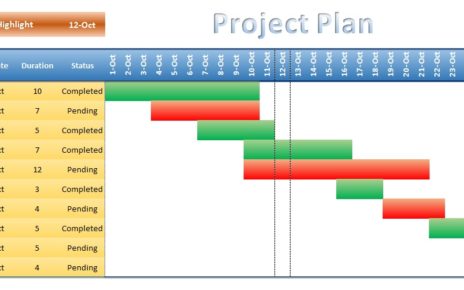
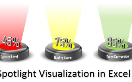
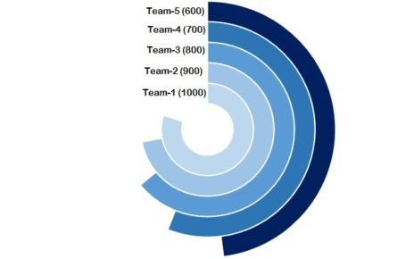
In today’s fast-paced digital world, it’s not just about delivering information, but more importantly, how you present it. Consequently, stepping away from conventional presentation methods is essential. For this reason, we introduce the dynamic 3D Progress Circle in Excel. Moreover, this chart type can be the magic touch your reports have been missing. So, let’s dive right in!
Understanding of the 3D Progress Circle in Excel
Firstly, before getting into the mechanics, it’s essential to grasp its value.

Click to buy How to WOW Your Boss 3D Progress Circle in Excel
- Visual Appeal: Instead of the usual bar or line charts, the 3D Progress Circle offers a refreshing change.
- Clarity in Display: Especially when it comes to showcasing progress to a goal, this chart gives an instant snapshot.
- Versatility: Whether managing personal tasks or corporate projects, this chart is adaptable.
Benefits of Using the 3D Progress Circle Chart
To begin with, let’s highlight its unique advantages:
- Immediate Impact: Due to its standout design, it’s instantly recognizable, making interpretation easier.
- Adaptable Data Presentation: It can handle various datasets, ranging from time to percentages.
- Enhancement in Presentation: By swapping out your usual progress chart in Excel for this 3D variant, the aesthetic appeal of your reports skyrocket.
Potential Areas of Refinement for the 3D Progress Circle Chart
However, like all tools, there are always areas to refine:
- Initial Familiarity: Given its unique nature, users might need time to familiarize themselves with its intricacies.
- Design Tweaks: Depending on your report theme, some adjustments in the 3D effects might be necessary for a seamless fit.
Recommended Practices for the 3D Progress Circle Chart
First and foremost, keeping some guidelines in mind can ensure optimal use:
- Harmonious Coloring: Always ensure your chosen colors are in line with the report’s theme and are consistent throughout.
- Unambiguous Data: Before you finalize, double-check that the represented data is clear and accurate.
- Embrace Minimalism: The chart is a visual tool, so naturally, the cleaner it is, the more effective.
Crafting the 3D Progress Circle in Excel
Having discussed its relevance and best usage, next, we move to its creation.
We’ve designed a comprehensive video tutorial for this purpose. To master the art of designing the 3D Progress Circle in Excel, do watch this insightful tutorial.
Visit our YouTube channel to learn step-by-step video tutorials
Watch the step-by-step video tutorial:
Click to buy How to WOW Your Boss 3D Progress Circle in Excel
Frequently Asked Questions
Q. Is the 3D Progress Circle universal for all report types?
While it boasts versatility, it shines brightest in reports where tracking progress is paramount, such as project dashboards.
Q. Can I modify the chart’s colors and design?
Undoubtedly! Excel offers a plethora of customization options to suit your taste.
Q. Are there alternatives to the 3D Progress Circle in Excel?
Indeed, Excel provides a range of charts like bar graphs and line charts. However, for unique progress visualization, the 3D Progress Circle is unparalleled.
Conclusion
In conclusion, introducing the 3D Progress Circle in your reports will not only impress your superiors but will also present data in a novel and compelling manner. With the perfect blend of style and clarity, it’s an essential tool for every Excel enthusiast. Therefore, don’t wait any longer – dive in and upgrade your Excel toolkit today!
Click to buy How to WOW Your Boss 3D Progress Circle in Excel


