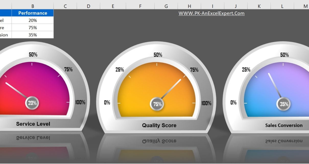
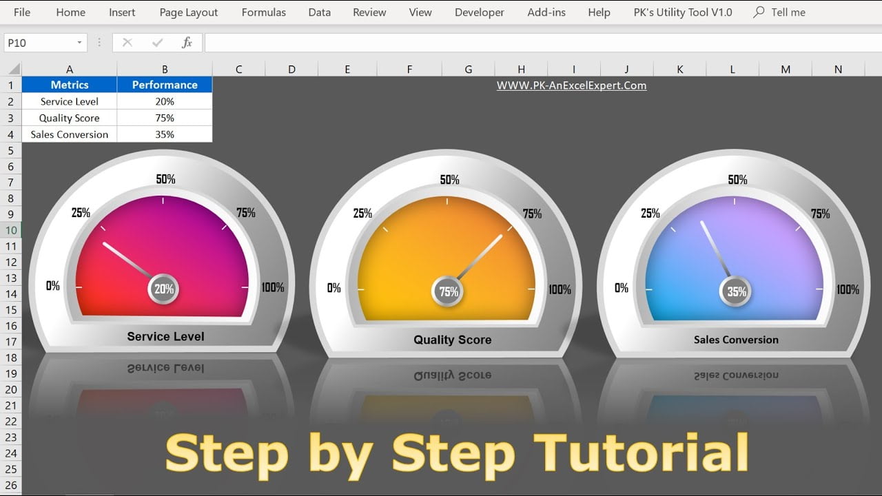
Elevate your business dashboards and presentations with our ready-to-use “3D Gauge Chart in Excel” template. This eye-catching and intuitive chart is designed to be easily understood, even by non-technical users, making it perfect for highlighting key metrics and performance indicators. Ideal for reports and presentations, the 3D Gauge Chart enhances data visualization, ensuring your audience stays engaged and informed. Save time and improve the impact of your data with our user-friendly Excel template.
3D Gauge Chart in Excel
19
Jun 2024
24Comments Off on 3D Gauge Chart in Excel
PK
Meet PK, the founder of PK-AnExcelExpert.com! With over 15 years of experience in Data Visualization, Excel Automation, and dashboard creation. PK is a Microsoft Certified Professional who has a passion for all things in Excel. PK loves to explore new and innovative ways to use Excel and is always eager to share his knowledge with others. With an eye for detail and a commitment to excellence, PK has become a go-to expert in the world of Excel. Whether you're looking to create stunning visualizations or streamline your workflow with automation, PK has the skills and expertise to help you succeed. Join the many satisfied clients who have benefited from PK's services and see how he can take your Excel skills to the next level!
https://www.pk-anexcelexpert.com
Related Articles
Fully Functional Dynamic Calendar Control in VBA
Ah, The complexities of automation! The versatile and multifaceted world of Excel VBA offers an array of tools and functionalities
Paste Special in Microsoft Excel
Introduction to Paste Special in Microsoft Excel Microsoft Excel offers a powerful feature called Paste Special, which enables users to
5 Layered Advanced Doughnut Chart
5 Layered Advanced Doughnut Chart In this article, we have created the 5 Layered Doughnut Chart to display the KPI