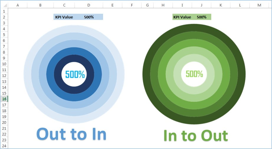
Introducing our ready-to-use “5 Layered Advanced Doughnut Chart” Excel template, designed to display KPI values up to 500%. This sophisticated chart offers two distinct versions: “In to Out” and “Out to In,” providing flexibility for your data presentation needs. Ideal for business dashboards and performance reports, this advanced doughnut chart enhances data visualization, making it easier to communicate complex metrics with clarity and style. Save time and improve your data presentations with our user-friendly Excel template.
![5 Layered Doughnut Chart](https://www.pk-anexcelexpert.com/wp-content/uploads/2019/11/5-Layered-Doughnut-Chart.jpg)
5 Layered Advanced Doughnut Chart
19
Jun 2024
14Comments Off on 5 Layered Advanced Doughnut Chart
PK
Meet PK, the founder of PK-AnExcelExpert.com! With over 15 years of experience in Data Visualization, Excel Automation, and dashboard creation. PK is a Microsoft Certified Professional who has a passion for all things in Excel. PK loves to explore new and innovative ways to use Excel and is always eager to share his knowledge with others. With an eye for detail and a commitment to excellence, PK has become a go-to expert in the world of Excel. Whether you're looking to create stunning visualizations or streamline your workflow with automation, PK has the skills and expertise to help you succeed. Join the many satisfied clients who have benefited from PK's services and see how he can take your Excel skills to the next level!
https://www.pk-anexcelexpert.com
Related Articles
Filling Stacked Column Chart in Excel
Today I have come with a beautiful Filling Stacked Column Chart. In this chart I have showcased day wise Sales
Info-graphics with Column chart (Part-1)
Using the info-graphics in the charts is very nice idea. It will increase the visual appeal and audience attention of
Dynamic Circle Chart in Excel
In this article, we have created Dynamic Circle Chart in Excel. We have used Bubble Charts to create this dynamic