3 Useful Tips for the Pivot Chart. These tips will help you build interactive Excel Dashboards that are both informative and visually appealing.
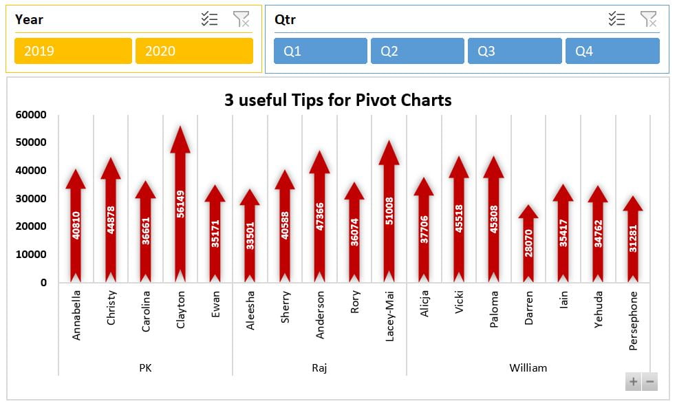
Key Features
- enhanced Interactivity: Learn to add expand and collapse buttons to your Chart for improved data exploration.
- Efficient Data Visualization: Discover how to effectively use fields in Axis and Values for clearer data representation.
- Easy Integration: Follow step-by-step instructions to insert Chart seamlessly into your existing or new worksheets.