Home>Download>RAG waffle Chart visualization with Slicer
RAG Waffle Chart with Slicer

RAG waffle Chart visualization with Slicer

A RAG waffle chart visualization with a slicer to display the Red, Amber, and Green percentages. Using Conditional Formatting and the linked picture feature, this beautiful and interactive visualization allows for a clear and dynamic representation of data.
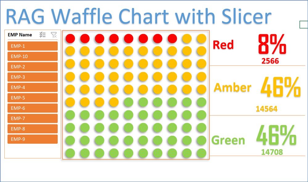
 

RAG waffle Chart visualization with Slicer

Key Features:

  • Interactive Slicers: Easily filter and view specific segments of data using interactive slicers for dynamic analysis.
  • Conditional Formatting: Utilize Conditional Formatting to visually distinguish between Red, Amber, and Green categories.
  • Linked Picture Feature: Create engaging and visually appealing charts with the linked picture feature for enhanced data presentation.
PK
Meet PK, the founder of PK-AnExcelExpert.com! With over 15 years of experience in Data Visualization, Excel Automation, and dashboard creation. PK is a Microsoft Certified Professional who has a passion for all things in Excel. PK loves to explore new and innovative ways to use Excel and is always eager to share his knowledge with others. With an eye for detail and a commitment to excellence, PK has become a go-to expert in the world of Excel. Whether you're looking to create stunning visualizations or streamline your workflow with automation, PK has the skills and expertise to help you succeed. Join the many satisfied clients who have benefited from PK's services and see how he can take your Excel skills to the next level!
https://www.pk-anexcelexpert.com