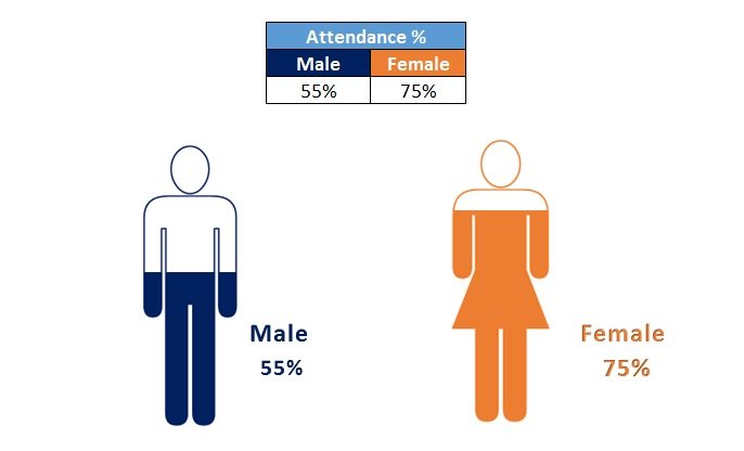
Elevate your business presentations and dashboards with our “Male and Female Info-graphics in Excel.” This powerful tool allows you to visually represent key performance indicators (KPIs) gender-wise, using aesthetically pleasing and data-driven charts. Ideal for displaying metrics like attendance percentages, productivity, and success rates across genders, these infographics make data analysis both straightforward and visually engaging.

Key Features:
- Gender-Specific KPI Visualization: Effortlessly compare and contrast metrics such as attendance, productivity, and success rates for male and female employees.
- Data-Driven Charts: Utilize robust Excel functionalities combined with creative PowerPoint shapes to render dynamic, data-linked visualizations.
- Versatile Usage: Perfect for incorporating into business presentations, dashboards, or any reports requiring a clear gender-based analytical perspective.
- Easy Integration: Designed for ease of use within Microsoft Excel, accompanied by a step-by-step tutorial to guide you through the setup and customization process.
Read the detailed blog post


