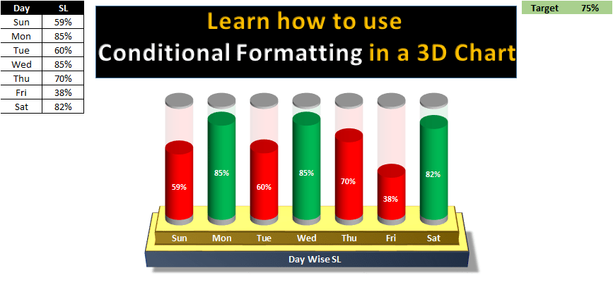
Unlock the potential of dynamic data visualization with our new Excel tutorial, “Conditional Formatting in Multiple Batteries Chart.” This paid Excel file guides you through the process of creating a multi-battery chart that effectively displays KPI metrics with vibrant conditional formatting to instantly reflect performance against targets.

Key Features:
- Dynamic Visualization: Learn to construct a battery chart that changes color based on performance—green when KPI targets are met, and red when they are not, providing a clear, instant visual cue of performance.
- Data-Driven Updates: The chart is fully dynamic, updating automatically as soon as any input values or targets change, ensuring that your data presentation is always current and accurate.
- Enhanced Decision Making: By visualizing KPI metrics in such an intuitive format, this chart aids in quicker decision-making and enhances the ability to track progress over time.


