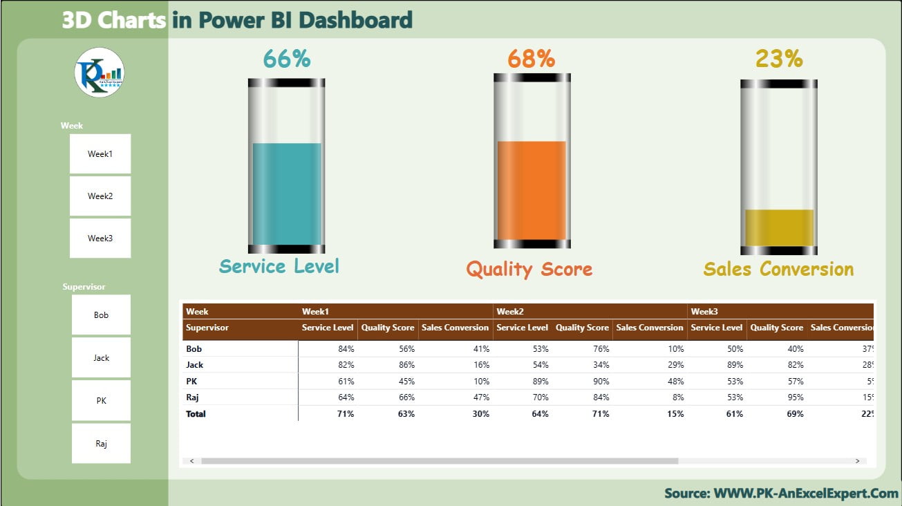
Harness the visual power of 3D graphics in your data analytics with our Power BI Dashboard featuring 3D Glass Charts. This unique visualization tool enhances your dashboard’s aesthetic and functional appeal, making complex data not only accessible but also engaging. Our guide will walk you through creating a stunning and effective 3D Glass Chart in Power BI, utilizing design techniques that elevate your business intelligence reporting.

Key Features of the Power BI Dashboard with 3D Glass Chart:
- Stunning 3D Visuals: Incorporate eye-catching 3D Glass Charts into your Power BI dashboard, designed to present key performance indicators (KPIs) in a visually engaging manner that captures attention and facilitates easier data interpretation.
- Interactive Slicers: Utilize dynamic slicers to filter and analyze data across different dimensions, such as time periods or supervisory levels, enhancing the dashboard’s interactivity and user customization options.
- Comprehensive Data Integration: Seamlessly combine 3D visualizations with detailed tables that underpin the charts, providing a robust view of the data and metrics that drive business decisions.
Read the detailed blog post


