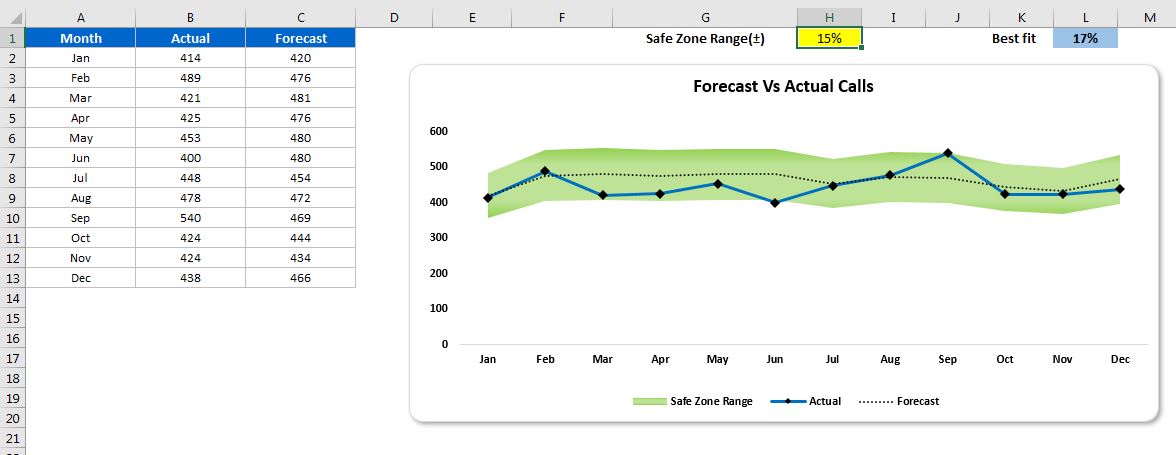
Elevate your financial or operational reporting with our “Forecast Vs Actual Chart with Safe Zone Range” in Excel. This innovative tool is designed to visually compare your forecasted data against actual results, incorporating a dynamic ‘Safe Zone’ range that automatically adjusts based on specified parameters. It’s an essential tool for analysts, managers, and anyone involved in planning and performance evaluation.

Key Features of the Forecast Vs Actual Chart with Safe Zone Range in Excel:
- Dynamic Safe Zone Range: Automatically adjusts the Safe Zone range to be ± a specified percentage of the forecast, providing a clear visual indicator of whether actual results fall within acceptable parameters.
- Visual Comparison: Seamlessly integrates actual and forecasted data into one chart, making it easy to compare performance at a glance and identify discrepancies.
- Customizable Parameters: Allows users to set their own percentage for the Safe Zone range, making the tool adaptable to different industries and forecasting scenarios.


