If you’re working with data in Excel and want to visualize it quickly and efficiently, SPARKLINE Chart in Excel are a game-changer. These tiny charts, embedded within cells, allow you to showcase trends and patterns without the need for elaborate graphs. In this post, we’ll dive deep into how you can use the SPARKLINE function in Excel with examples to bring your data to life!
Why Use SPARKLINE Charts?
Before we jump into the steps, let’s take a moment to talk about why SPARKLINE charts are so handy. Unlike regular charts, SPARKLINE Chart in Excel sit directly inside your spreadsheet cells. This makes them perfect for summarizing data trends immediately—whether it’s sales performance over the years or employee productivity.
Step-by-Step Guide: Creating a SPARKLINE Chart
Now, let’s get to the exciting part! Here’s how you can insert SPARKLINE charts in Excel for this dataset.
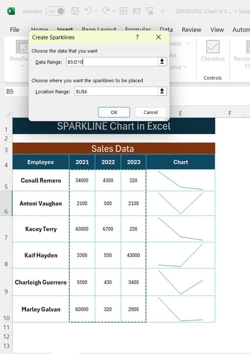
- Select Your Data Range
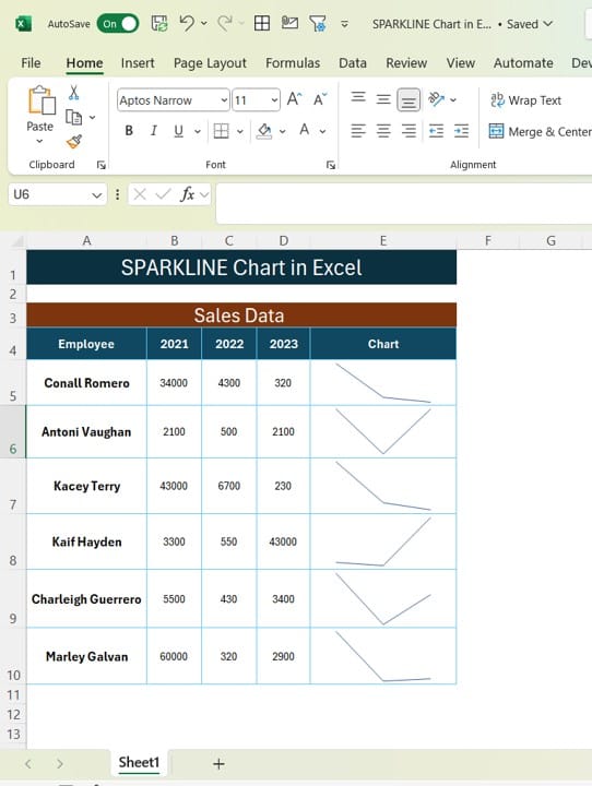
Start by selecting the cells where you want your SPARKLINE to appear. In our example, we’ll insert them in column E, right next to the data.
- Choose the SPARKLINE Type
Excel gives you several SPARKLINE Chart in Excel types, but for this tutorial, we’ll use the Line chart. Here’s how:
- Click on the Insert tab in Excel.
- In the Sparklines section, choose Line.
- Input Your Data Range
Once you’ve selected your SPARKLINE type, Excel will prompt you to choose a data range. In our example, we’ll be using the data in columns B to D (representing 2021, 2022, and 2023).
For the first employee (Conall Romero), your formula would look something like this:
=SPARKLINE (B4:D4)
This formula tells Excel to create a line chart that tracks the data for Conall Romero across 2021, 2022, and 2023.
- Copy the Formula
You can easily copy the SPARKLINE formula down the column to visualize the data for all employees. Simply drag the corner of the cell with the SPARKLINE formula downward.
Visualize Your Data Instantly!
Once you apply the SPARKLINE function to your dataset, you’ll immediately see the trends for each employee. For instance, you can quickly spot if an employee’s performance has improved or declined over the years.
Why SPARKLINE Charts Are Essential
SPARKLINE charts offer a lot of advantages:
- Compact: They take up minimal space and are embedded in the cells.
- Easy to Use: You don’t need any complex settings or configurations.
- Instant Insights: Perfect for quickly spotting trends without the clutter of larger charts.
Conclusion
With just a few simple steps, SPARKLINE charts in Excel can turn your boring data into an insightful visual representation. It’s a fantastic way to communicate information quickly, especially when working with large datasets. So next time you need to showcase trends, don’t hesitate to try out SPARKLINE Chart in Excel!
Visit our YouTube channel to learn step-by-step video tutorials
View this post on Instagram