Customer service plays a vital role in the success of any business. Whether you’re a startup or a well-established organization, keeping track of how well your customer service team is performing is essential. This is where a Customer Service KPI Dashboard in Excel comes in handy. By using a dashboard, you can easily track key performance indicators (KPIs), identify areas of improvement, and ensure that your team is consistently delivering high-quality service.
In this guide, we will take you through everything you need to know about creating and using a Customer Service KPI Dashboard in Excel. We’ll cover all the key features, explain how it works, and even provide best practices and opportunities for improvement. Plus, we’ll answer some frequently asked questions to clear up any lingering doubts you might have. So, let’s dive in!
Click to buy Customer Service KPI Dashboard in Excel
What is a Customer Service KPI Dashboard?
A Customer Service KPI Dashboard is essentially a visual tool that helps businesses track and measure the performance of their customer service team. The dashboard displays key metrics, or KPIs, that reflect how well your team is doing in various areas, such as response time, customer satisfaction, and resolution rates. By using Excel to create this dashboard, you can easily update data, analyze performance trends, and make informed decisions.
Key Features of the Customer Service KPI Dashboard
Click to buy Customer Service KPI Dashboard in Excel
The Customer Service KPI Dashboard in Excel that we’ve created comes with several important features. These features are designed to make it easy for you to input data, track performance, and visualize trends. The dashboard includes seven different worksheets, each serving a specific function. Let’s go through each of them:
Home Sheet
Click to buy Customer Service KPI Dashboard in Excel
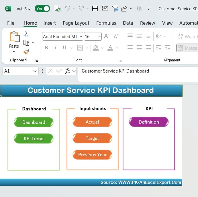
The Home Sheet acts as the main hub of the dashboard. It contains six buttons, which you can click to jump directly to the different sections of the dashboard. This sheet makes navigation simple and intuitive, ensuring that users can access the information they need with ease.
Dashboard Sheet Tab
Click to buy Customer Service KPI Dashboard in Excel
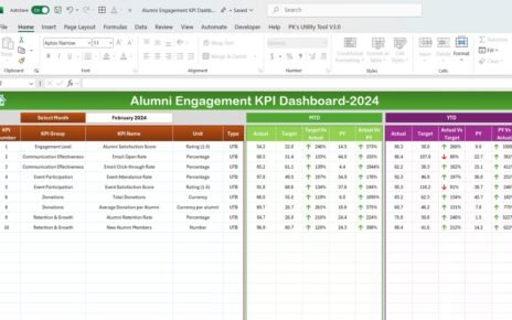
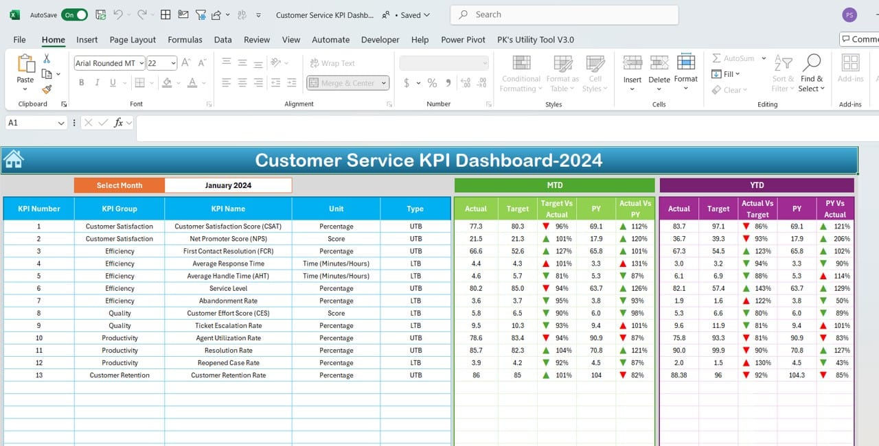
The Dashboard Sheet is where all the action happens. This is the main tab where you can view all the KPIs. The key feature here is the ability to select the month you want to analyze using a dropdown menu located in cell D3. Once you select a month, the dashboard automatically updates to display the data for that month.
Additionally, the Dashboard Sheet displays month-to-date (MTD) actuals, targets, and previous year (PY) data. It uses conditional formatting with arrows to show whether performance is improving or declining, making it easier for you to see where your team stands at a glance. Moreover, it includes year-to-date (YTD) figures for actuals, targets, and PY data, along with visual indicators to help you quickly identify performance trends.
KPI Trend Sheet Tab
Click to buy Customer Service KPI Dashboard in Excel
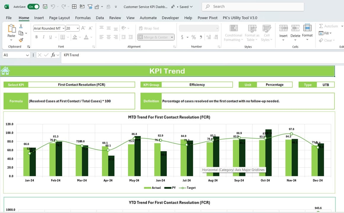
The KPI Trend Sheet allows you to dig deeper into the performance trends of specific KPIs. In this sheet, you can select the KPI you want to analyze from the dropdown menu in cell C3. Once selected, you’ll see detailed information about that KPI, including its group, unit, and whether it’s a metric where “Lower is Better” or “Upper is Better.”
Additionally, the sheet provides the formula used to calculate the KPI and its definition. This is particularly useful for understanding how each KPI is derived. You’ll also find trend charts for MTD and YTD figures, allowing you to visualize how the KPI is performing over time.
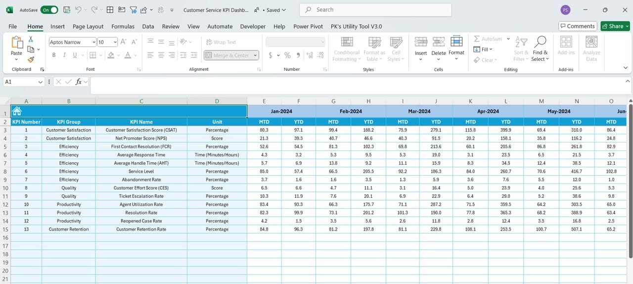
Actual Numbers Input Sheet

Actual Numbers Input Sheet
Click to buy Customer Service KPI Dashboard in Excel
The Actual Numbers Input Sheet is where you manually enter the performance data. This sheet is straightforward—you simply enter the actual MTD and YTD numbers for the selected month. You can change the month by updating cell E1. This flexibility ensures that the data is always up to date and reflects the most current information.
Target Sheet Tab
In the Target Sheet
Click to buy Customer Service KPI Dashboard in Excel
Tab, you can enter the target numbers for each KPI. It includes both MTD and YTD targets, making it easy to track how well your team is performing against the goals that have been set.
Previous Year Numbers Sheet Tab
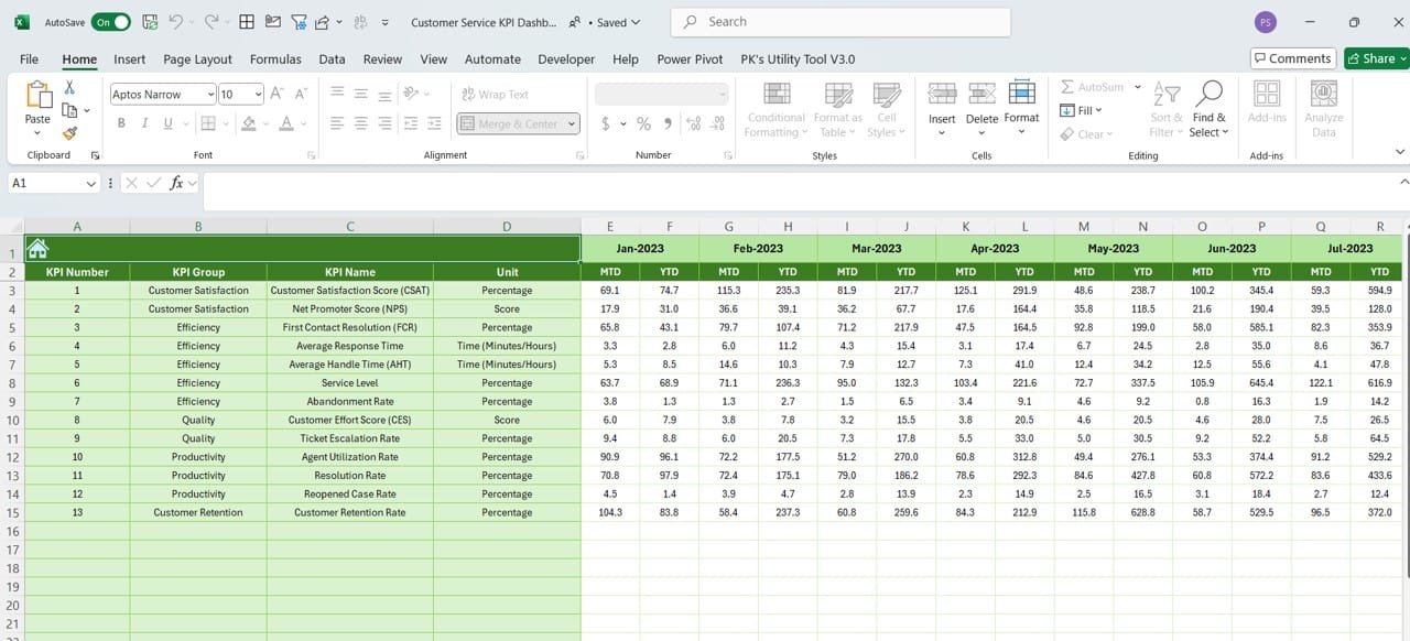
Previous Year Numbers Sheet
Click to buy Customer Service KPI Dashboard in Excel
The Previous Year Numbers Sheet allows you to input performance data from the previous year. This data provides a valuable comparison point, helping you see how current performance measures up to past results.
KPI Definition Sheet Tab
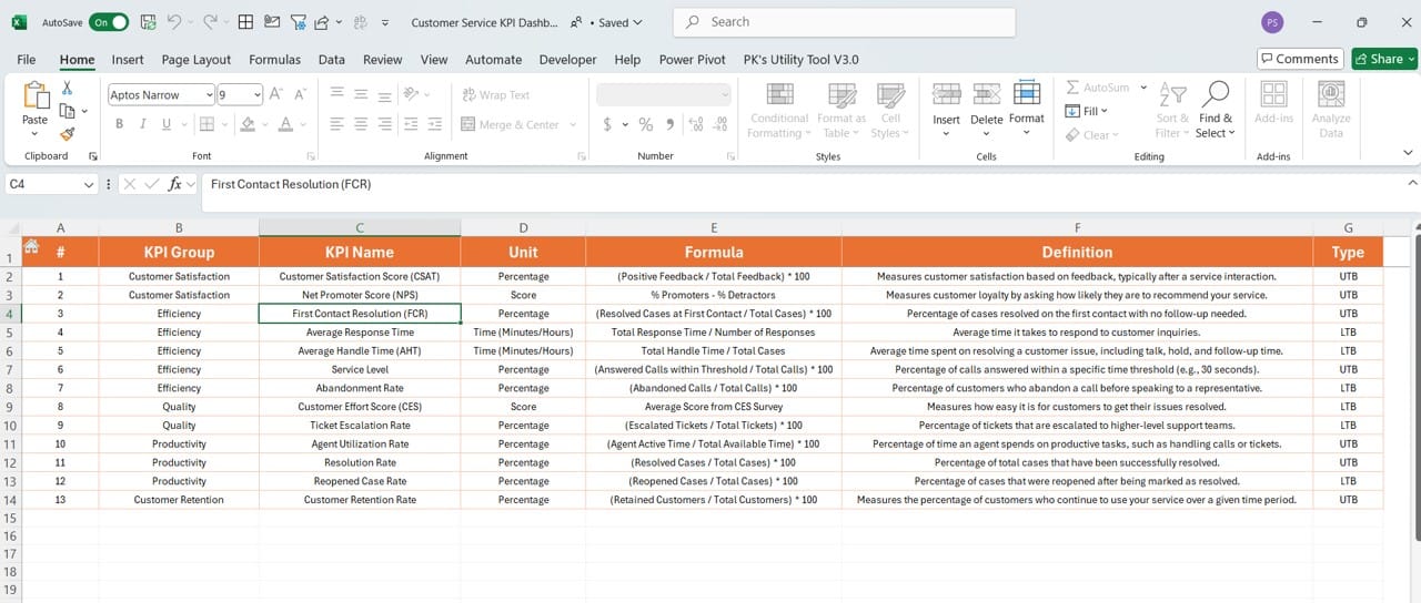
Finally, the KPI Definition Sheet is where you can define each KPI in detail. For each KPI, you’ll provide the name, group, unit, formula, and a clear definition. This ensures that everyone on the team understands exactly what each KPI measures and how it contributes to the overall performance goals.
Click to buy Customer Service KPI Dashboard in Excel
Advantages of Using a Customer Service KPI Dashboard
There are several advantages to using a Customer Service KPI Dashboard in Excel. Let’s take a closer look at some of the most important ones:
- Easy Data Management: First and foremost, Excel makes it incredibly easy to manage your data. All the information is stored in one place, and you can update it regularly without needing to switch between different programs or software.
- Real-Time Insights: Another key advantage is that the dashboard provides real-time insights. You can quickly see how your team is performing and whether they’re on track to meet their goals. This helps you make timely decisions and take corrective action when needed.
- Visual Representation of Data: The dashboard uses visual elements like charts and conditional formatting to display data. This makes it easier for you to understand the numbers and trends immediately, without needing to sift through rows of data.
- Flexibility and Customization: Because the dashboard is built in Excel, you can customize it to fit your specific needs. You can add new KPIs, modify existing ones, or even create new charts and reports. The flexibility of Excel allows you to tailor the dashboard to suit your business.
Click to buy Customer Service KPI Dashboard in Excel
Best Practices for Using a Customer Service KPI Dashboard
To get the most out of your Customer Service KPI Dashboard, here are a few best practices to keep in mind:
- Focus on Relevant KPIs: It’s important to focus on the KPIs that truly matter to your business. Avoid tracking too many metrics, as this can lead to information overload. Instead, stick to the KPIs that directly impact your customer service quality and overall business performance.
- Regularly Update Your Data: For the dashboard to be effective, you need to ensure that the data is updated regularly. This will provide you with real-time insights and allow you to make informed decisions based on current performance.
- Use Visual Indicators: Make good use of Excel’s visual tools, such as conditional formatting and charts. These elements make it much easier to interpret the data and spot trends quickly.
- Involve Your Team: Finally, make sure that your entire team is involved in using the dashboard. Hold regular meetings to review the data, discuss performance trends, and brainstorm ways to improve customer service.
Click to buy Customer Service KPI Dashboard in Excel
Opportunities for Improvement in Customer Service KPI Dashboard
Even though an Excel-based Customer Service KPI Dashboard is highly effective, there’s always room for improvement. Here are a few opportunities to consider:
- Automating Data Entry: One area where you could improve the dashboard is by automating data entry. Currently, data must be manually entered into the sheets. By linking the dashboard to your customer service software or CRM, you could automate this process and reduce the chances of human error.
- Adding More Interactivity: Another opportunity for improvement is adding more interactivity to the dashboard. For example, incorporating additional dropdowns or slicers would allow users to filter the data more easily and gain deeper insights into specific areas of performance.
- Cloud-Based Access: Finally, consider moving the dashboard to the cloud. By integrating it with services like Google Sheets or Microsoft OneDrive, you can allow team members to access and update the dashboard from anywhere, making it easier for remote teams to collaborate.
Click to buy Customer Service KPI Dashboard in Excel
Frequently Asked Questions (FAQs)
Q. What is Customer Service KPIs?
Customer Service KPIs are performance metrics that help you measure how well your customer service team is performing. Common KPIs include resolution time, first response time, and customer satisfaction score (CSAT).
Q. How do I create a Customer Service KPI Dashboard in Excel?
To create a dashboard, you’ll need to set up various worksheets for data input, define your KPIs, and use Excel’s charting tools to display performance data. The template we’ve provided simplifies the process by allowing you to focus on inputting the data.
Q. Which KPIs are most important for customer service?
Some of the most important KPIs include first response time, average resolution time, customer satisfaction score (CSAT), and Net Promoter Score (NPS). These metrics give you insight into how quickly and effectively your team is handling customer inquiries.
Q. Can this dashboard be used for other departments?
Yes, while this dashboard is designed specifically for customer service, you can easily modify it to track KPIs for other departments, such as sales, marketing, or finance.
Q. Is Excel a good tool for tracking KPIs?
Yes, Excel is a great tool for tracking KPIs, especially because it’s flexible, widely used, and offers a variety of customization options.
Click to buy Customer Service KPI Dashboard in Excel
Conclusion
A Customer Service KPI Dashboard in Excel provides an excellent way to monitor performance, track trends, and make informed decisions. It’s easy to use, highly customizable, and offers real-time insights that can significantly improve your customer service operations. By following the best practices outlined in this guide and exploring opportunities for improvement, you can ensure that your dashboard becomes a valuable tool for your business
Visit our YouTube channel to learn step-by-step video tutorials
Click to buy Customer Service KPI Dashboard in Excel