Key Performance Indicators (KPIs) are vital for any organization, and public sector entities are no exception. In fact, KPIs play a crucial role in helping public sector organizations deliver value to citizens, uphold transparency, and ensure accountability. But how can you keep track of all this performance data? That’s where an efficient KPI dashboard comes in. In this guide, we’ll take you through everything you need to know about creating and using a Public Sector KPI Dashboard. It’s designed to monitor performance, track progress, and identify areas that need improvement—all in one place.
What is a Public Sector KPI Dashboard?
Think of a Public Sector KPI Dashboard as your one-stop shop for tracking how well your organization is doing. This dashboard gives you a clear picture of your progress toward specific goals and objectives. Plus, it lets you monitor performance in real-time and make necessary adjustments to stay on track.
In this article, we’ll be diving into a ready-to-use Public Sector KPI Dashboard template, which includes 7 key worksheets. Each of these worksheets plays a unique role in making sure your organization stays on top of its performance metrics.
Key Features of the Public Sector KPI Dashboard
The dashboard is made up of 7 different worksheets, each designed to give you an in-depth look at various KPIs. Let’s break them down one by one.
Click to buy Public Sector KPI Dashboard In Excel
-
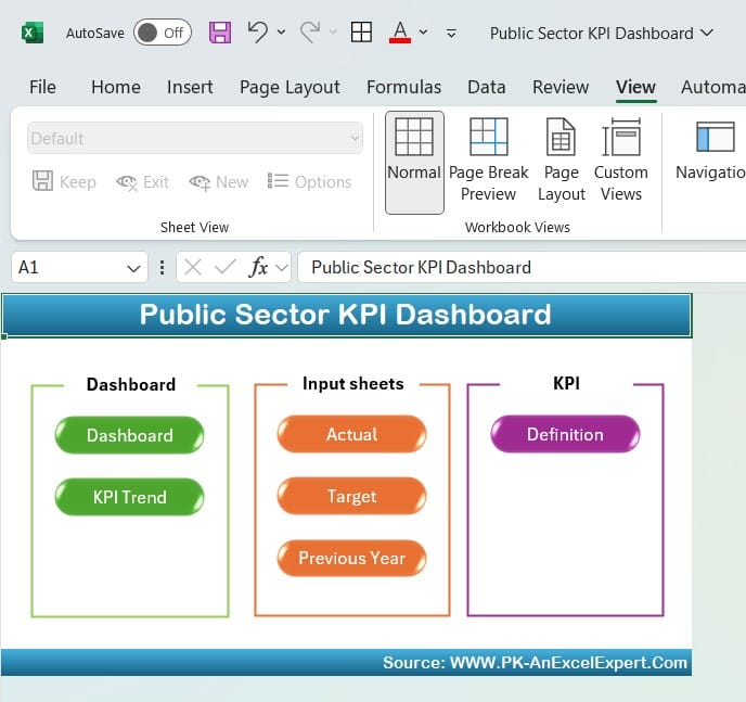
Home Sheet
The Home sheet is like the main menu of your dashboard. It contains six buttons, making it super easy to jump from one section to another. With these buttons, you can quickly move between the different worksheets without having to scroll endlessly. This sheet keeps everything simple and efficient.
Click to buy Public Sector KPI Dashboard In Excel
-
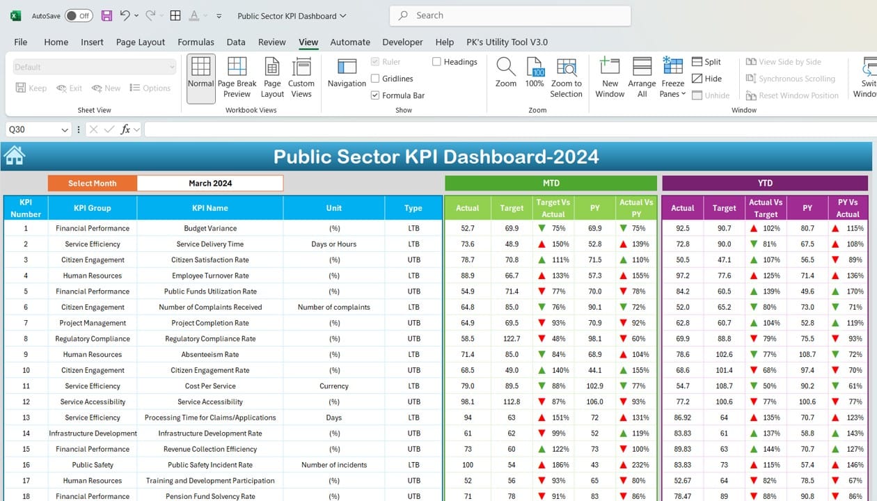
Dashboard Sheet Tab
The Dashboard sheet is where the magic happens. This is the main tab that shows you a high-level view of all your KPIs. You can select a month from the drop-down menu at cell D3, and the dashboard will instantly update to display the data for that period.
What’s really helpful here is the use of conditional formatting—those handy up and down arrows. These arrows show whether your performance is better or worse compared to the target or the previous year. This makes it easy to see how well your organization is performing at a glance.
Click to buy Public Sector KPI Dashboard In Excel
-
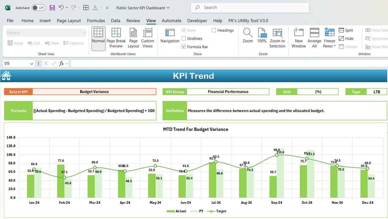
KPI Trend Sheet Tab
Want to dig a little deeper into specific KPIs? The KPI Trend Sheet lets you do just that. You can select any KPI from the drop-down list at cell C3, and this sheet will show you all the details. You’ll see the KPI group, the unit of measurement, and whether higher or lower values are better. Plus, it includes the formula for each KPI and a clear definition, so there’s no room for confusion.
Click to buy Public Sector KPI Dashboard In Excel
-
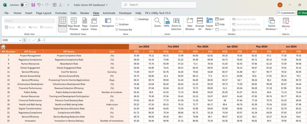
Actual Number Sheet Tab
This is where you enter the actual data for each KPI. The Actual Number Sheet lets you input monthly (MTD) and year-to-date (YTD) performance data. You can also change the starting month by adjusting the value in cell E1, making it perfect for organizations with different fiscal years.
Click to buy Public Sector KPI Dashboard In Excel
-
Target Sheet Tab
On the Target Sheet, you can set targets for each KPI, both for monthly and year-to-date performance. Having these targets side-by-side with your actual performance data allows decision-makers to quickly assess whether the organization is meeting its goals.

Click to buy Public Sector KPI Dashboard In Excel
-
Previous Year Number Sheet Tab
Need to compare this year’s performance with last year’s? The Previous Year Number Sheet lets you input last year’s data for each KPI. This comparison helps you identify trends and see where improvements have been made—or where things might be slipping.

Click to buy Public Sector KPI Dashboard In Excel
-
KPI Definition Sheet Tab
The KPI Definition Sheet is all about clarity. Here, you’ll define each KPI, including the group it belongs to, the unit of measurement, and the formula used to calculate it. Clear definitions ensure that everyone in the organization is on the same page when it comes to understanding what each KPI measures.

Click to buy Public Sector KPI Dashboard In Excel
Why You Should Use a Public Sector KPI Dashboard
Now that we’ve covered the features, let’s talk about why this dashboard is so useful for public sector organizations.
-
Centralized Performance Monitoring
With everything in one place, the dashboard makes it easy to monitor all of your organization’s KPIs. This helps decision-makers act faster and with more accuracy, as they can see all the relevant data at a glance.
-
Easy Navigation
Thanks to the buttons on the Home sheet, moving between different tabs is a breeze. This feature enhances the user experience and ensures you spend less time navigating and more time analyzing data.
-
Dynamic Data Representation
When you select a different month, the dashboard automatically updates. This ensures that you’re always working with the most up-to-date data, allowing for more accurate assessments.
-
Quick Insights with Visual Cues
Conditional formatting, like the up and down arrows, gives you a visual representation of how well your organization is doing. This makes it easier to spot trends and potential issues without having to sift through numbers.
-
Flexibility
Whether you’re inputting current or past year data, the system is designed to handle both. This flexibility allows for meaningful year-over-year comparisons.
Best Practices for Using a Public Sector KPI Dashboard
To get the most out of your dashboard, here are some best practices you should follow:
- Update Data Regularly: Ensure that the actual performance numbers and targets are updated frequently. This will give you real-time insights and help keep the dashboard current.
- Maintain Consistency: Everyone in the organization should agree on the definitions of the KPIs. The KPI Definition sheet is crucial for ensuring this consistency.
- Leverage Visual Indicators: Use the conditional formatting tools like arrows and color coding to quickly identify areas of success and concern.
- Align KPIs with Strategic Goals: Make sure that your KPIs align with the organization’s overall strategic objectives. Regularly review and adjust them to keep them relevant.
Opportunities for Improvement in the Public Sector KPI Dashboard
Even though this dashboard is highly effective, there’s always room for improvement:
- Automation: Automating data entry could save time and reduce errors. This is especially important for large organizations with multiple KPIs to track.
- Enhanced Visualization: Adding interactive graphs or charts could make the dashboard even more user-friendly and insightful.
- Custom KPI Groups: Allowing users to create their own KPI groups would provide greater flexibility, especially for larger organizations with diverse metrics.
- Mobile Compatibility: Making the dashboard mobile-friendly would allow decision-makers to access performance data on the go, improving accessibility.
Best Practices for Setting KPIs in the Public Sector
Setting the right KPIs is just as important as tracking them. Here are some tips:
- Set SMART KPIs: KPIs should be Specific, Measurable, Achievable, Relevant, and Time-bound. This ensures that the metrics you’re tracking are meaningful and achievable.
- Involve Stakeholders: When setting KPIs, make sure to involve people from different areas of the organization. This helps ensure that the KPIs represent the organization’s performance as a whole.
- Review Regularly: As your organization’s goals and circumstances change, your KPIs should too. Regularly reviewing and revising your KPIs keeps them aligned with your current objectives.
- Public Accountability: Since public sector organizations are accountable to the public, KPIs should reflect this. Make sure you’re tracking metrics that measure service quality, efficiency, and public satisfaction.
Visit our YouTube channel to learn step-by-step video tutorials
Click to buy Public Sector KPI Dashboard In Excel