In the fast-paced world of insurance, tracking key performance indicators (KPIs) is critical for ensuring operational success. An Insurance KPI Dashboard in Excel is a powerful tool that allows businesses to monitor performance metrics and make data-driven decisions. This article will walk you through everything you need to know about creating and utilizing an Insurance KPI Dashboard, along with the best practices, advantages, and opportunities for improvement.
Click to buy Insurance KPI Dashboard in Excel
What is an Insurance KPI Dashboard?
An Insurance KPI Dashboard is a visual tool used to track, analyze, and present the most important insurance performance metrics in a single view. These KPIs provide insight into the business’s efficiency, profitability, and overall performance. By consolidating all essential data in one dashboard, it becomes easier to make real-time decisions based on current trends and performance metrics.
Key Features of the Insurance KPI Dashboard in Excel
In this section, we’ll explore the structure and features of the Insurance KPI Dashboard in Excel, which consists of 7 essential worksheets designed for simplicity and effectiveness.
Home Sheet
Click to buy Insurance KPI Dashboard in Excel
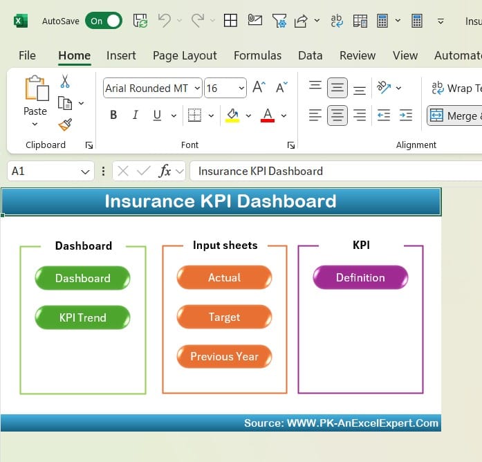
The Home Sheet serves as an index page. It includes six clickable buttons that allow users to quickly navigate to other sheets in the dashboard. This streamlined navigation helps users access different sections of the dashboard with ease, saving valuable time.
Dashboard Sheet Tab
Click to buy Insurance KPI Dashboard in Excel
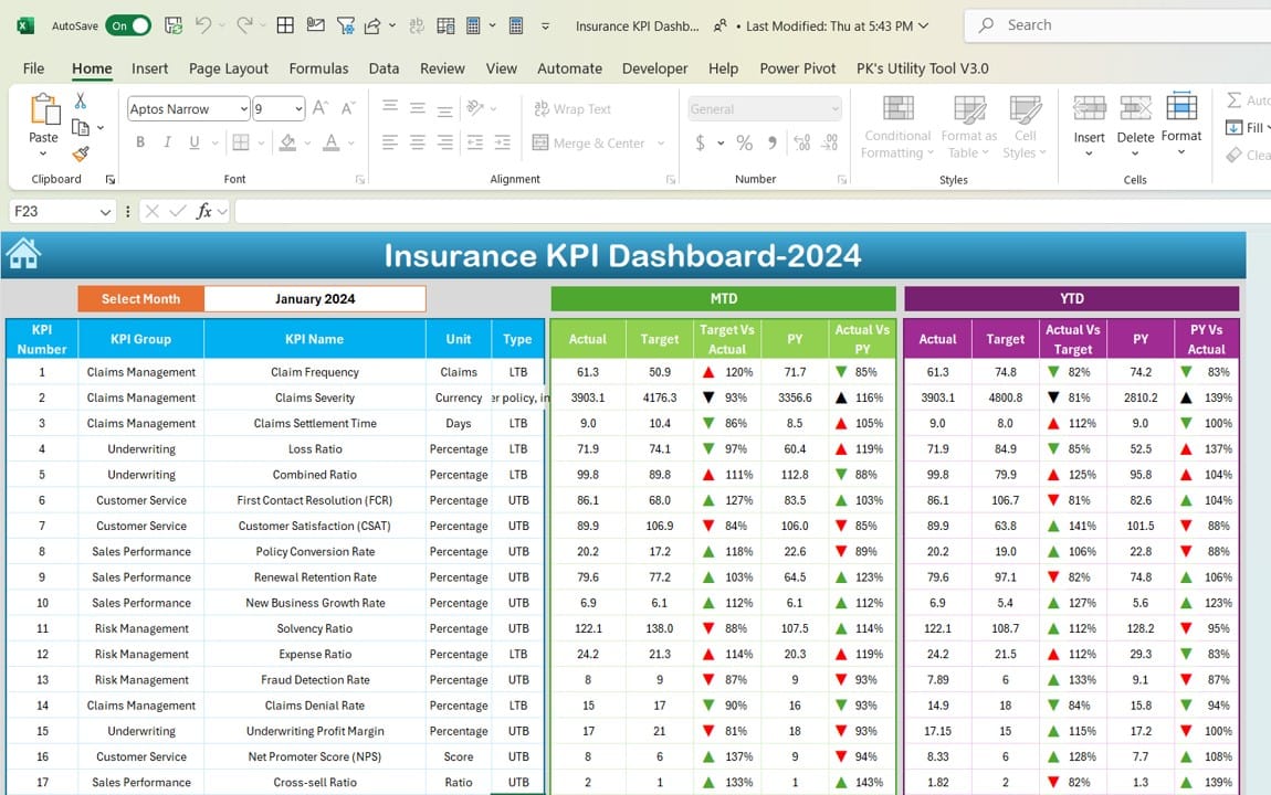
The Dashboard Sheet is the heart of this template, where the most critical information about all the KPIs is displayed. The following features make it indispensable:
- Dynamic Month Selection: Users can select the month from a dropdown in cell D3, and the dashboard will automatically update all KPI data accordingly.
- MTD and YTD Data: The dashboard displays Month-to-Date (MTD) and Year-to-Date (YTD) actual numbers alongside targets and previous year (PY) data.
- Conditional Formatting: Conditional formatting with arrows helps to visualize whether the current data is trending positively or negatively. For example, target vs. actual and PY vs. actual are represented with up and down arrows, making performance easy to interpret.
KPI Trend Sheet Tab
Click to buy Insurance KPI Dashboard in Excel
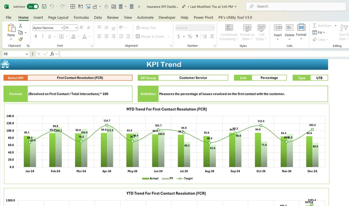
The KPI Trend Sheet is where users can track specific KPI trends over time. The key features include:
- KPI Selection: You can select a specific KPI from a dropdown in cell C3, and the sheet will update to show relevant information such as the KPI group, unit of measure, and whether lower or higher values are better.
- MTD and YTD Trend Charts: The sheet presents trend charts for MTD and YTD data, comparing actual numbers with targets and previous years.
- Formula and Definitions: Detailed information about the KPI’s formula, definition, and performance criteria (e.g., “Lower is better” or “Upper is better”) is available, ensuring transparency and clarity.
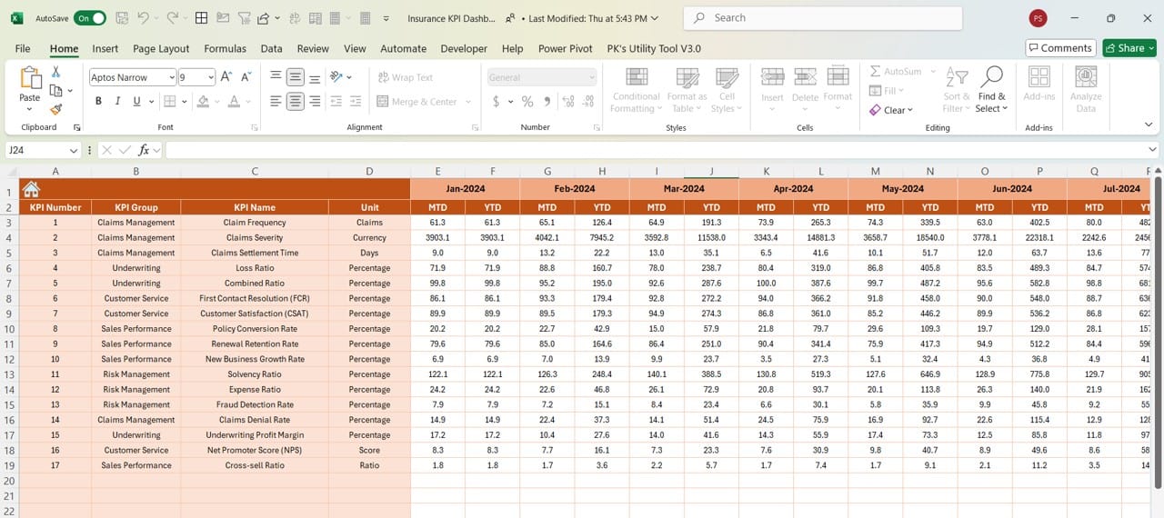
Actual Numbers Input Sheet
Click to buy Insurance KPI Dashboard in Excel
This sheet allows users to input actual performance data. Key aspects include:
- Month Selector: You can change the month using the dropdown in cell E1.
- YTD and MTD Input: Input the actual performance numbers for MTD and YTD in this sheet, which will automatically reflect across the dashboard.
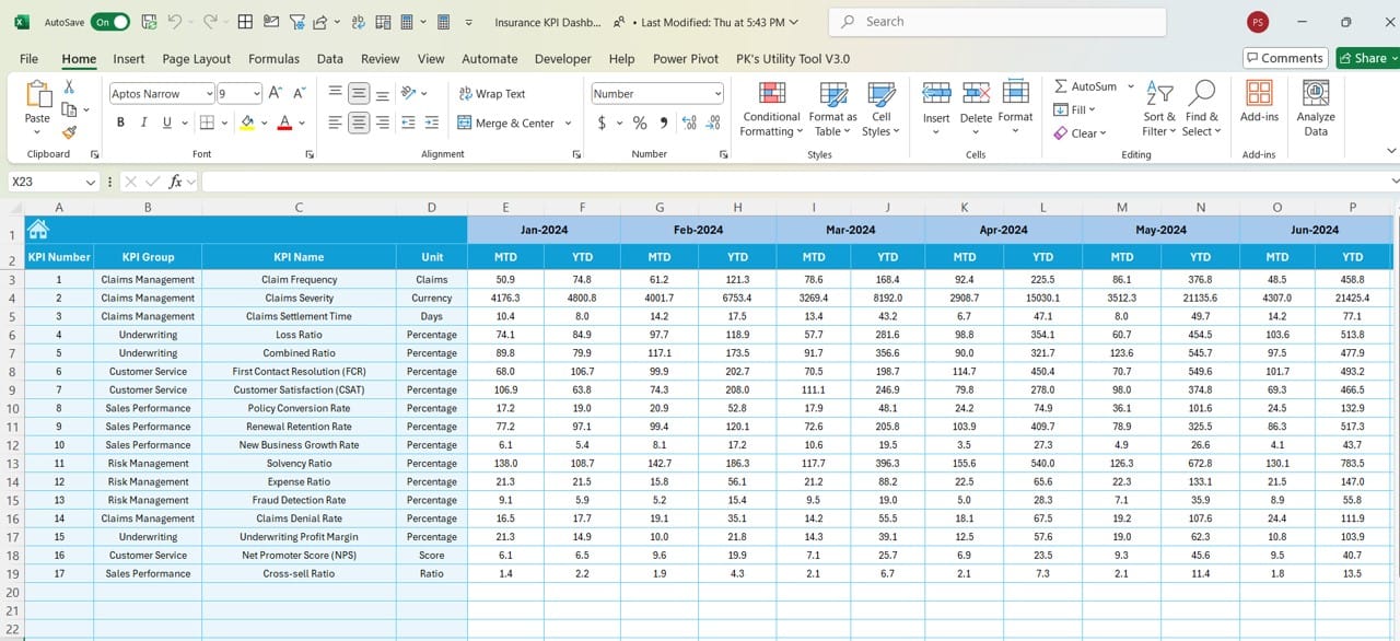
Target Sheet Tab
Click to buy Insurance KPI Dashboard in Excel
In the Target Sheet, users input the target numbers for each KPI on a monthly basis. You can:
- Set MTD and YTD Targets: Enter target numbers for MTD and YTD for better comparison and performance evaluation against actual data.
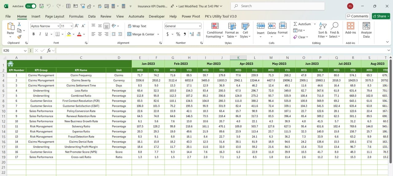
Previous Year Numbers Sheet Tab
Click to buy Insurance KPI Dashboard in Excel
The Previous Year Numbers Sheet is where users enter the previous year’s performance data for comparison purposes. It allows for a clear comparison between the current and previous years.
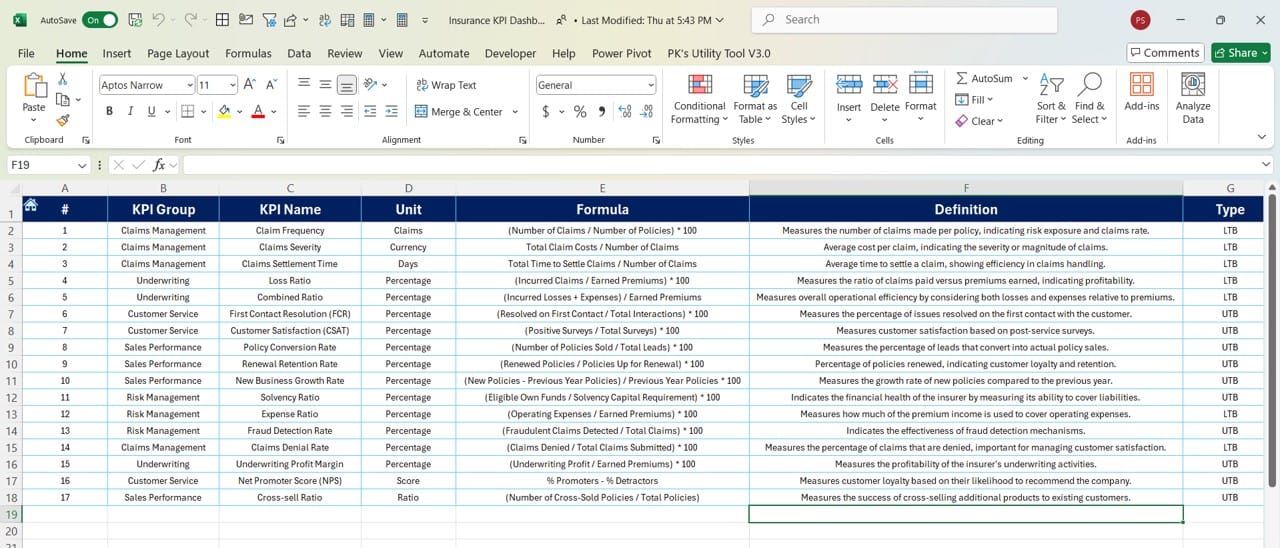
KPI Definition Sheet Tab
Click to buy Insurance KPI Dashboard in Excel
This sheet contains comprehensive information on each KPI, such as:
- KPI Name, Group, and Unit: Essential details that categorize each KPI.
- Formula and Definition: This section ensures a full understanding of how each KPI is calculated and why it is important.
Advantages of Using an Insurance KPI Dashboard in Excel
The Insurance KPI Dashboard offers several distinct advantages that benefit insurance companies:
- Easy Data Consolidation: By having all key metrics in one place, the dashboard allows users to view the most important business data at a glance, eliminating the need to sift through multiple reports.
- Real-Time Performance Tracking: With dynamic inputs and dropdowns, users can switch between different months and see how the business is performing in real time. This ability to quickly assess both MTD and YTD performance is invaluable for decision-makers.
- Improved Decision-Making: Having a visual representation of KPIs, along with performance indicators such as up and down arrows, makes it easier for business leaders to make informed decisions. They can quickly spot trends, areas for improvement, and successful strategies.
- Customization and Flexibility: Excel’s flexible nature means that users can modify the template as needed to suit their specific organizational requirements. Additional KPIs, custom charts, or data fields can easily be added to this template.
Click to buy Insurance KPI Dashboard in Excel
Best Practices for Using the Insurance KPI Dashboard in Excel
To get the most out of your Insurance KPI Dashboard, here are some best practices to follow:
- Regularly Update Data: Ensure that you update the actual numbers, targets, and previous year data on a monthly basis to keep the dashboard relevant and accurate.
- Define Clear KPI Criteria: When setting up KPIs, ensure they align with your company’s goals and objectives. Properly define whether higher values are better or worse for each KPI, and make sure to set realistic targets.
- Use Conditional Formatting for Visual Cues: Take advantage of Excel’s conditional formatting features to highlight trends and issues. This makes the dashboard more user-friendly and helps managers identify important areas to focus on quickly.
- Ensure Data Accuracy: Double-check your formulas and data inputs to avoid discrepancies. Any inaccuracies can lead to misleading insights, which can negatively impact decision-making.
Opportunities for Improvement in the Insurance KPI Dashboard
While the Insurance KPI Dashboard in Excel is highly effective, there are always opportunities for improvement:
- Enhanced Automation: Currently, data input is manual. Automating data imports from other systems, such as a CRM or accounting software, could save time and reduce human error.
- Additional KPI Metrics: Expanding the range of KPIs to include customer satisfaction scores, underwriting performance, or claim settlement efficiency could provide a more comprehensive view of business performance.
- Advanced Visualizations: Excel offers more advanced visualization tools that can enhance the dashboard’s usability. Incorporating more complex graphs, such as waterfall charts or gauge charts, could make it even more powerful.
- Collaboration Features: Currently, Excel is more suited for single-user analysis. Using Excel with cloud-based platforms such as SharePoint or OneDrive can enable multiple users to collaborate in real-time, which can improve decision-making across teams.
Click to buy Insurance KPI Dashboard in Excel
Conclusion
The Insurance KPI Dashboard in Excel is a powerful tool for tracking and optimizing key performance indicators within the insurance industry. By providing real-time data, allowing for easy comparison, and offering clear visual cues, this dashboard enables businesses to make data-driven decisions effectively. Whether you’re monitoring sales, underwriting, claims processing, or customer satisfaction, this dashboard serves as a comprehensive solution to all your KPI tracking needs.
Frequently Asked Questions (FAQs)
- What is an Insurance KPI Dashboard?
An Insurance KPI Dashboard is a tool used to track and visualize key performance indicators specific to the insurance industry. It helps businesses monitor metrics like sales, claim settlement, and underwriting performance in real-time.
- How do I use the Insurance KPI Dashboard in Excel?
To use the dashboard, input your actual performance data in the “Actual Numbers Input” sheet and set your targets in the “Target Sheet.” The dashboard will update automatically to reflect the MTD and YTD performance for selected months.
- Can I add more KPIs to the dashboard?
Yes, the Insurance KPI Dashboard in Excel is highly customizable. You can add new KPI rows, adjust formulas, and create additional charts as needed.
- What if my KPIs change over time?
You can easily modify the KPIs by updating the “KPI Definition Sheet” and adjusting the formulas on other sheets. This allows you to adapt the dashboard to evolving business needs.
- Is this dashboard suitable for small insurance companies?
Absolutely! The dashboard is designed to be flexible and scalable, making it useful for both small and large insurance companies. Small businesses can use it to monitor a few critical KPIs, while larger organizations can track a wide range of metrics.
- What is the importance of MTD and YTD in the dashboard?
MTD (Month-to-Date) and YTD (Year-to-Date) provide a snapshot of performance over different time frames, allowing companies to track short-term and long-term trends and make informed decisions based on real-time data.
Click to buy Insurance KPI Dashboard in Excel
This article has covered everything you need to know about building and using an Insurance KPI Dashboard in Excel. By following the best practices outlined here and making use of the flexibility that Excel provides, you’ll be well on your way to improving your company’s performance tracking and decision-making processes.
Visit our YouTube channel to learn step-by-step video tutorials
View this post on Instagram
Click to buy Insurance KPI Dashboard in Excel

