Do you want to learn how to visually display Profit and Loss Chart in Excel, highlighting positive and negative values clearly? With Excel’s IF function and conditional formatting, it’s easier than ever to create a Profit and Loss chart that’s both informative and visually engaging. This guide will take you step-by-step through the process, using real data and simple formulas. Let’s dive in! Profit and Loss Chart in Excel
Click to buy Profit and Loss Chart in Excel with Examples
Understanding the Data
Click to buy Profit and Loss Chart in Excel with Examples
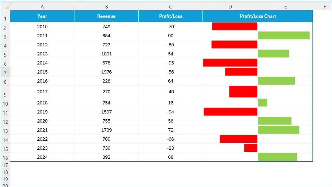
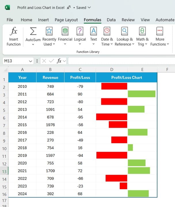
For this tutorial, we’ll be working with data on annual revenue and profit/loss over several years. Our dataset includes:
- Year: The specific year of the data.
- Revenue: Total revenue for each year.
- Profit/Loss: Indicates profit or loss for each year.
- Profit/Loss Chart: A visual representation of profit/loss values.
In our data, positive values in Profit/Loss indicate profit, while negative values indicate a loss.
Click to buy Profit and Loss Chart in Excel with Examples
Using the IF Function to Separate Profits and Losses
To create our Profit and Loss chart, we need to isolate positive and negative values in Profit/Loss. We’ll use the IF function in Excel to achieve this.
Setting Up Formulas
- For Losses: We want to display the absolute value of losses as positive numbers. Use this formula in the Profit/Loss Chart column for negative values:
=IF (C2 < 0, ABS(C2), “”)
This formula checks if the value in the Profit/Loss column is less than zero. If it is, it returns the absolute value; if not, it returns an empty cell.
- For Profits: We want to display positive values as they are. Use this formula for positive values:
=IF (C2 > 0, C2, “”)
This formula checks if the value is greater than zero and, if so, returns the same value; otherwise, it leaves the cell blank.
Applying these formulas will ensure that each year’s profit or loss appears in the Profit/Loss Chart column in a format suitable for visualization.
Adding Conditional Formatting to Create the Chart
Now that we’ve separated positive and negative values, let’s apply Conditional Formatting to create a simple yet effective chart.
- Select the Profit/Loss Chart Column: Highlight the range where your data resides.
- Apply Conditional Formatting: Go to Home > Conditional Formatting > Data Bars.
- Choose Data Bar Colors: Set a color for positive values (e.g., green for profit) and another for negative values (e.g., red for loss). This visual difference will make it easy to distinguish between profit and loss.
Click to buy Profit and Loss Chart in Excel with Examples
Final Output
Once the formulas and conditional formatting are applied, you’ll see a visual representation of your profit and loss data for each year, making it easy to compare annual performance immediately. This setup helps highlight trends, such as years with higher losses or significant profits, providing valuable insights without needing complex charts.
Why Use Conditional Formatting for Profit and Loss?
Using conditional formatting with the IF function in Excel provides several advantages:
- Easy Setup: No need for complicated charts; a few formulas and conditional formatting do the job.
- Instant Insights: Quickly identify profitable vs. loss-making years.
- Visual Clarity: Color-coded bars make data easy to interpret immediately.
Click to buy Profit and Loss Chart in Excel with Examples
Wrapping Up
Creating a Profit and Loss chart in Excel doesn’t require advanced skills—just a few formulas and some creativity with formatting! Whether you’re tracking business finances or personal projects, this chart setup can help you visualize and understand performance over time.
Visit our YouTube channel to learn step-by-step video tutorials
Watch the step-by-step video tutorial:
Click to buy Profit and Loss Chart in Excel with Examples
