If you’re managing infrastructure KPIs and need an efficient way to track them, this Infrastructure KPI Dashboard in Excel is the tool for you! This ready-to-use template has everything you need to monitor, compare, and analyze key metrics quickly. Let’s walk through the main features and each sheet included in this dashboard.
Click to buy Infrastructure KPI Dashboard in Excel
Key Features of the Infrastructure KPI Dashboard
Our Infrastructure KPI Dashboard is organized into seven essential worksheets, each with its own unique purpose. Here’s how each sheet works:
Home Sheet
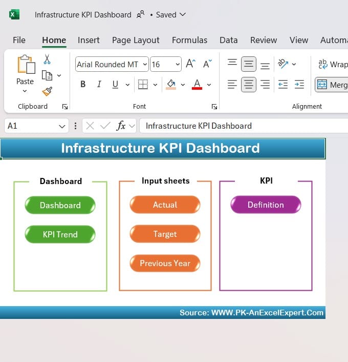
The Home sheet is your starting point. It serves as an index, with six buttons that take you straight to specific sections of the dashboard, making navigation a breeze.
Click to buy Infrastructure KPI Dashboard in Excel
Dashboard Sheet
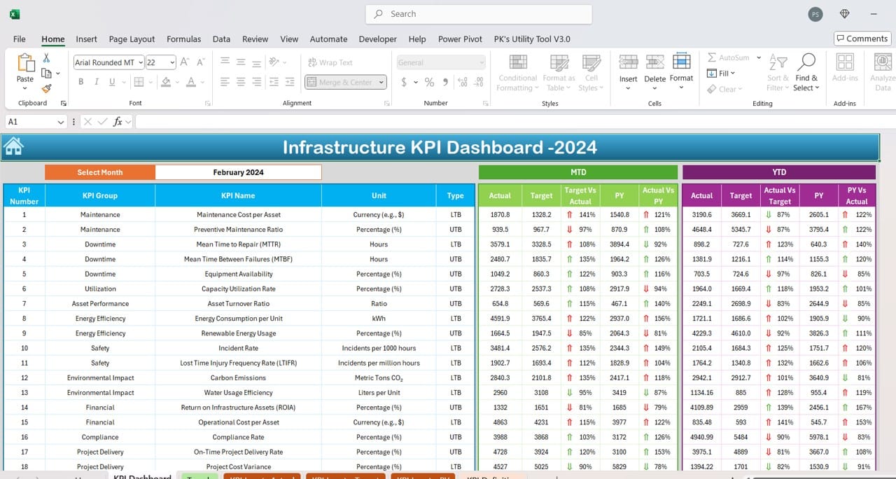
This is the main view where all KPI data comes together. Here’s what you can do on this tab:
- Select the Month: Choose a month from the dropdown in cell D3, and watch the dashboard instantly update to reflect the data for that month.
- MTD and YTD Performance: See Month-to-Date (MTD) and Year-to-Date (YTD) figures, along with the target, last year’s data, and actuals. This tab also includes conditional formatting to highlight performance:
Target vs. Actual and Previous Year (PY) vs. Actual are both visualized with up/down arrows, so you can see trends at a glance.
This view gives a full picture of how each KPI is performing, both monthly and yearly.
Click to buy Infrastructure KPI Dashboard in Excel
KPI Trend Sheet
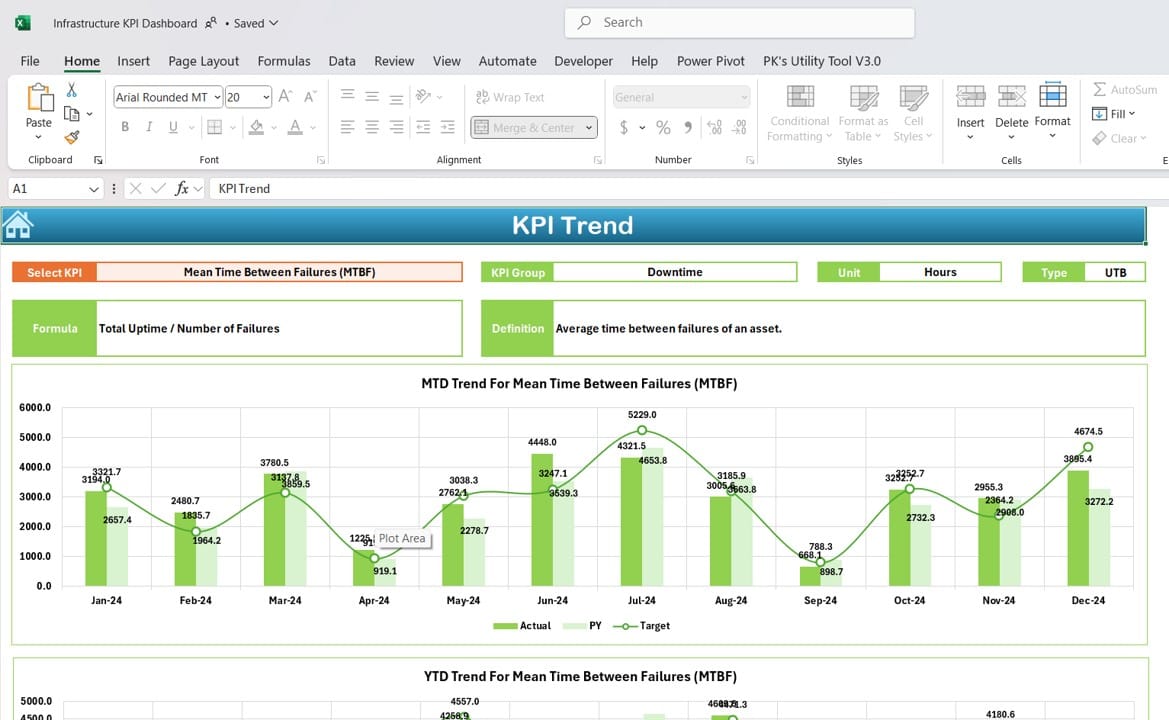
The KPI Trend sheet lets you dive into individual KPI trends. Here’s what you’ll find:
- KPI Selector: Choose a KPI from the dropdown in cell C3, and the chart will update accordingly.
- KPI Details: See information like KPI group, unit of measurement, whether higher or lower values are better, the KPI formula, and a clear KPI definition.
- Trend Charts: Visualize MTD and YTD trends for actual, target, and previous year (PY) numbers to get a sense of how each KPI has evolved over time.
Click to buy Infrastructure KPI Dashboard in Excel
Actual Numbers Input Sheet
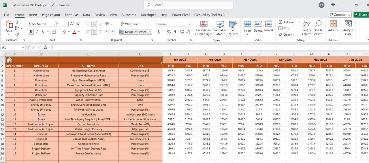
To make the dashboard accurate, you’ll need to enter actual numbers for each KPI:
- Choose the Month: Select the current month in cell E1. This will adjust the sheet to let you enter Month-to-Date (MTD) and Year-to-Date (YTD) numbers for that month.
This sheet keeps your dashboard updated with real data.
Target Sheet
Click to buy Infrastructure KPI Dashboard in Excel
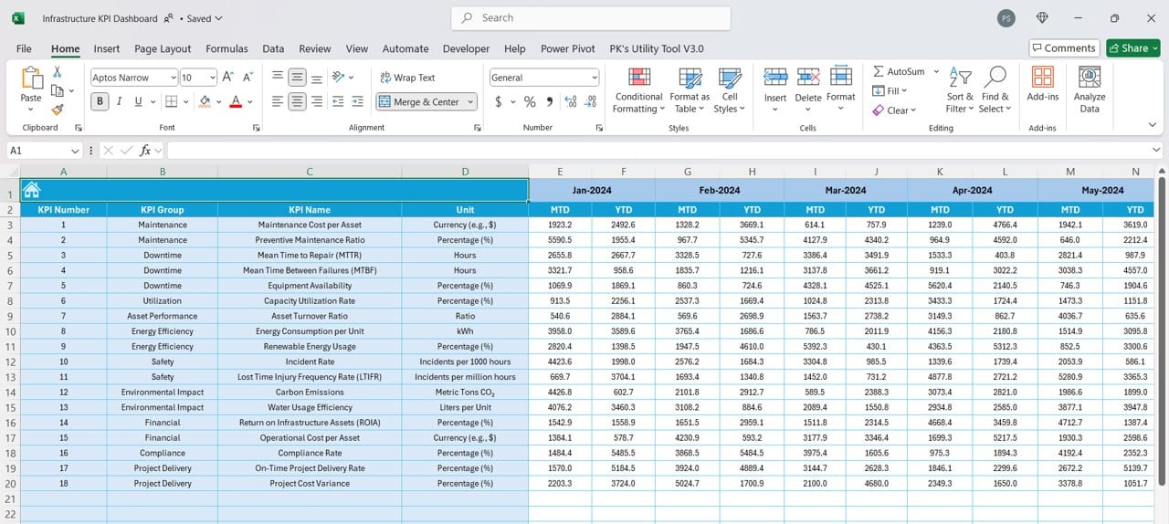
Here’s where you set your monthly and yearly targets for each KPI:
- Enter Monthly Targets: Specify the MTD target for each KPI.
- Yearly Targets: Add the YTD target for each KPI.
With these targets in place, you’ll have clear benchmarks to compare against actual performance.
Previous Year Numbers Sheet
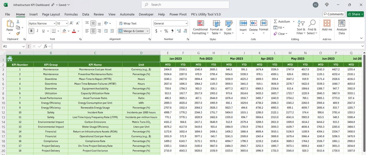
To track progress and growth, you’ll need last year’s numbers. In this sheet:
- Input Previous Year Data: Enter the monthly and yearly figures from last year, just as you did for the current year’s data.
This comparison adds context, helping you see trends over time.
Click to buy Infrastructure KPI Dashboard in Excel
KPI Definition Sheet
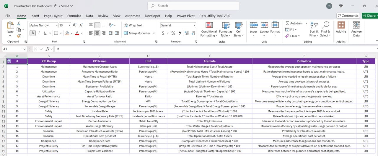
To keep all KPIs well-defined and organized, this sheet is a reference point for:
- KPI Name, Group, and Unit: Label each KPI with its name, group, and unit of measurement.
- Formula and Definition: Include the formula and a brief description of each KPI to clarify what it measures and how it’s calculated.
This sheet ensures consistency and clarity in how each KPI is defined and tracked.
Wrap-Up: Why Use the Infrastructure KPI Dashboard?
With this Excel dashboard, tracking infrastructure KPIs is both manageable and insightful. Each sheet is designed to streamline your process, from entering data and setting targets to analyzing trends and viewing your progress. Just input your numbers, set your targets, and let the dashboard do the rest!
This tool not only keeps all your KPI data in one place but also gives you a visual, interactive way to monitor your infrastructure goals month by month and year over year.
Visit our YouTube channel to learn step-by-step video tutorials
View this post on Instagram
Click to buy Infrastructure KPI Dashboard in Excel


