In the fast-paced and competitive textile industry, monitoring performance is essential for sustaining growth and achieving goals. A well-structured Textile Industry KPI Dashboard in Excel provides a clear view of key performance indicators (KPIs) that reflect your company’s performance across various dimensions. This article will take you through the essential features, best practices, and advantages of a Textile Industry KPI Dashboard in Excel while also outlining ways to optimize and improve its use.
Click to buy Textile Industry KPI Dashboard in Excel
Let’s explore this dashboard in detail and see how it can revolutionize data tracking and decision-making for textile businesses.
Key Features of the Textile Industry KPI Dashboard
This Textile Industry KPI Dashboard is a ready-to-use Excel template containing seven sheets. Each sheet is designed to streamline data entry, visualization, and performance analysis for quick decision-making. Below is an overview of each worksheet and its unique role:
Click to buy Textile Industry KPI Dashboard in Excel
Home Sheet:
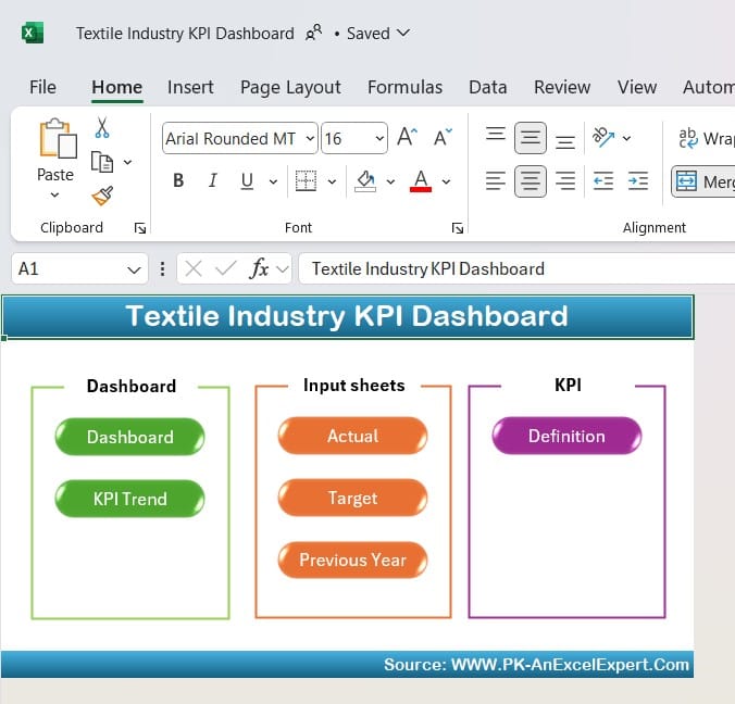
The Home Sheet serves as an index, simplifying navigation across the dashboard. Here, you’ll find six buttons that allow you to jump quickly to specific sheets, making the interface intuitive and user-friendly.
Click to buy Textile Industry KPI Dashboard in Excel
Dashboard Sheet Tab:
Click to buy Textile Industry KPI Dashboard in Excel
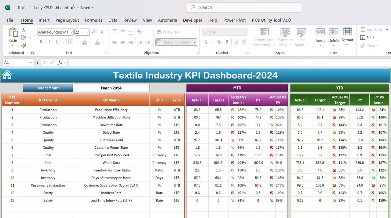
The Dashboard Sheet is the core of the KPI dashboard, offering an extensive view of all KPIs. On this sheet, you can select a specific month from a dropdown list in cell D3. Once you select a month, the dashboard updates instantly, providing insights into:
- MTD Actual, Target, and Previous Year Data: These metrics allow you to compare the current month’s numbers with targets and the previous year’s values.
- Target vs. Actual and PY vs. Actual Comparisons: Conditional formatting with up and down arrows provides visual cues for quickly assessing performance against targets and previous results.
- YTD Actual, Target, and Previous Year Data: Year-to-date comparisons for each KPI allow you to monitor long-term progress alongside monthly targets.
KPI Trend Sheet Tab:
Click to buy Textile Industry KPI Dashboard in Excel
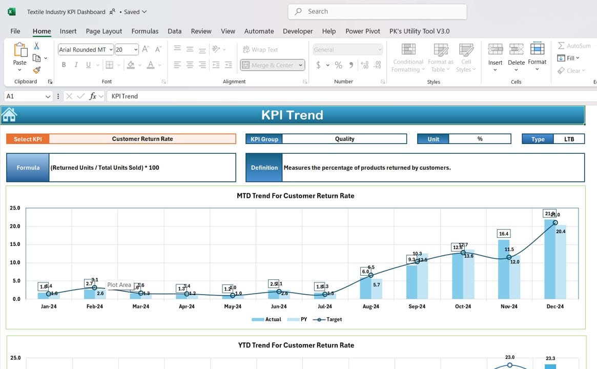
The KPI Trend Sheet brings the data to life with trend charts. On this sheet, you can select any KPI from a dropdown list (cell C3) to view key details such as:
- KPI Group, Unit, and Type: Information on whether a lower or higher number indicates better performance, along with the KPI formula and definition.
- MTD and YTD Trend Charts: Visualize month-to-date (MTD) and year-to-date (YTD) trends for Actual, Target, and Previous Year numbers to quickly understand how KPIs are trending over time.
Actual Numbers Input Sheet:
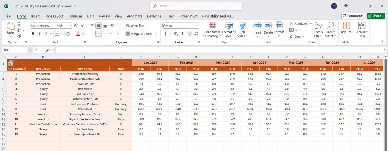
The Actual Numbers Input Sheet enables you to enter actual figures for each KPI, both for the year-to-date and month-to-date periods. Change the month in cell E1 to start from the first month of the year, then continue entering data throughout the year.
Target Sheet Tab:
Click to buy Textile Industry KPI Dashboard in Excel
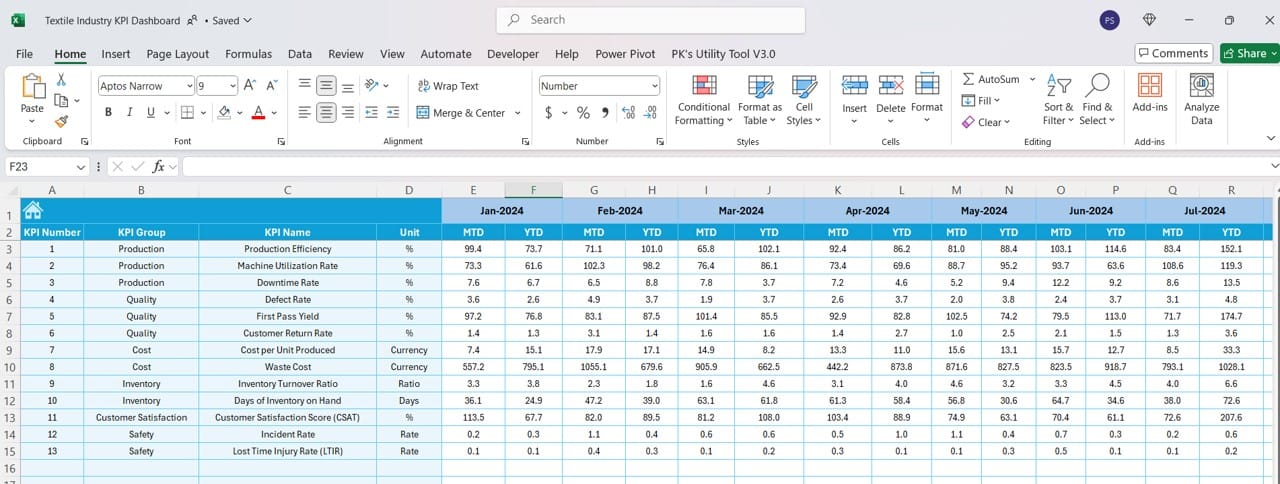
Click to buy Textile Industry KPI Dashboard in Excel
This sheet provides a space for inputting monthly and year-to-date targets for each KPI. Setting these goals enables comparison against real-time data to assess performance.
Previous Year Numbers Sheet Tab:
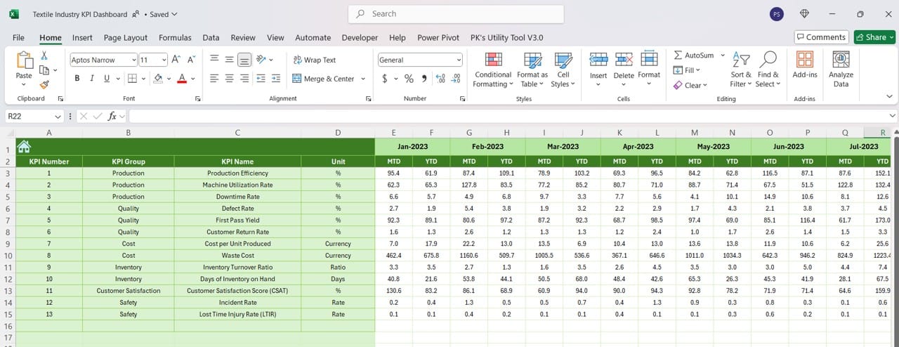
In this sheet, you can input figures for the previous year, enabling a quick and efficient year-over-year comparison. Benchmarking against past results helps identify trends and areas of growth or concern.
KPI Definition Sheet Tab:
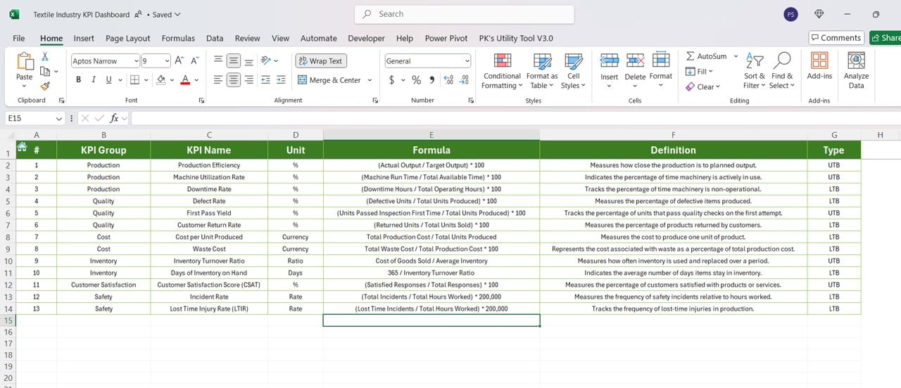
Click to buy Textile Industry KPI Dashboard in Excel
The KPI Definition Sheet lists essential information for each KPI, including the KPI Name, KPI Group, Unit, Formula, and Definition. Defining each KPI clearly helps ensure that all stakeholders understand what each metric measures and its significance to the business.
Advantages of Using a Textile Industry KPI Dashboard
Implementing a KPI dashboard tailored to the textile industry offers a host of benefits. Here are the most notable ones:
- Centralized Data Visualization: The dashboard consolidates all critical KPIs into one view, making it easier to monitor trends and make informed decisions.
- Improved Decision-Making: By providing real-time updates on KPI performance, managers can respond swiftly to any changes, keeping operations aligned with strategic goals.
- Benchmarking and Trend Analysis: Comparison with previous year’s data and target values helps identify seasonal trends and track progress against past performance.
- Enhanced Accountability: KPI dashboards foster a culture of accountability by allowing each team member to see their performance relative to organizational goals.
- Time Efficiency: Automated data updates reduce manual work and improve the speed at which performance reports are available.
Best Practices for the Textile Industry KPI Dashboard
To get the most out of your Textile Industry KPI Dashboard, consider these best practices:
- Regularly Update Data: Updating actual numbers and targets regularly is crucial. This ensures the dashboard reflects the latest information, allowing for real-time decision-making.
- Set Realistic and Measurable KPIs: Each KPI should be clear, achievable, and aligned with business objectives. Avoid setting overly ambitious targets, as they can lead to discouragement and burnout.
- Use Conditional Formatting for Quick Insights: Conditional formatting, like up and down arrows, offers visual cues that make it easier to interpret complex data at a glance. Take full advantage of this feature to highlight areas that require attention.
- Monitor Trends with MTD and YTD Analysis: MTD and YTD analysis allows for a balanced view of short-term and long-term performance. Use both metrics to gauge how you are progressing toward targets month by month and over the year.
- Define KPIs Clearly: Having a well-defined KPI is essential for clarity and accuracy. Include information like KPI name, group, unit, and formula to avoid misunderstandings and ensure uniformity in data entry.
Opportunities for Improvement in the Textile Industry KPI Dashboard
Even with a robust system, there are always opportunities for enhancing your KPI dashboard. Here are a few suggestions:
- Incorporate Advanced Visualizations: Using additional chart types or data visualizations can make the dashboard more intuitive. Consider adding heat maps, bar graphs, or line charts for better trend analysis.
- Automate Data Entry and Updates: Linking data from other systems (such as ERP systems) to Excel can streamline data entry. This automation would reduce errors and save time.
- Include Predictive Analytics: Leveraging predictive analytics can help forecast trends and prepare for potential challenges. It may require integrating with tools like Power BI or Tableau.
- Customize for Different Users: Different departments may prioritize different KPIs. Customizing views or filters based on the user’s role can enhance the dashboard’s usability and relevance.
Click to buy Textile Industry KPI Dashboard in Excel
Frequently Asked Questions (FAQs)
Q. What KPIs should I include in a Textile Industry KPI Dashboard?
Some essential KPIs for the textile industry might include Production Efficiency Rate, Waste Percentage, On-Time Delivery Rate, Cost per Unit, and Order Accuracy. Tailor your KPIs to match your business goals.
Q. How often should I update the Textile Industry KPI Dashboard?
For real-time monitoring, updating it monthly is ideal. However, weekly updates can provide even more timely insights, especially for fast-paced operations.
Q. Can I add more KPIs to this dashboard?
Yes, this Excel-based dashboard is customizable. You can add more KPIs as needed, but be mindful of not overcrowding the dashboard, as it can reduce clarity.
Q. How do I know if a KPI is effective?
An effective KPI is aligned with business goals, is measurable, and clearly shows performance trends over time. Regularly review KPIs to ensure they continue to provide valuable insights.
Q. What software can integrate with this Excel dashboard?
Excel can connect with various data sources, including ERP systems, databases, and APIs. For advanced analytics, consider integrating with tools like Power BI.
Conclusion
A well-structured Textile Industry KPI Dashboard in Excel offers invaluable insights into your company’s performance. By consolidating and visualizing critical KPIs in one dashboard, you can effectively monitor trends, make informed decisions, and stay competitive in a demanding industry. The dashboard’s flexibility, combined with best practices and continuous improvement, will empower you to reach your business objectives with clarity and efficiency.
Whether you’re in operations, production, or management, this dashboard can streamline performance tracking and provide the foundation for data-driven decision-making. Now, it’s time to implement and optimize this powerful tool for your textile business!
Visit our YouTube channel to learn step-by-step video tutorials
Click to buy Textile Industry KPI Dashboard in Excel


