Effective data management and analysis are critical for monitoring public health outcomes. In this article, we introduce the Public Health KPI Dashboard in Excel—a dynamic, ready-to-use template designed to track, analyze, and improve public health KPIs. This dashboard simplifies complex data, providing actionable insights at your fingertips Public Health KPI Dashboard.
Click to Public Health KPI
Key Features of the Public Health KPI Dashboard
- The Public Health KPI Dashboard is structured across 7 worksheets, each catering to a specific functionality. Here’s a breakdown of the dashboard’s key features:
Home Sheet
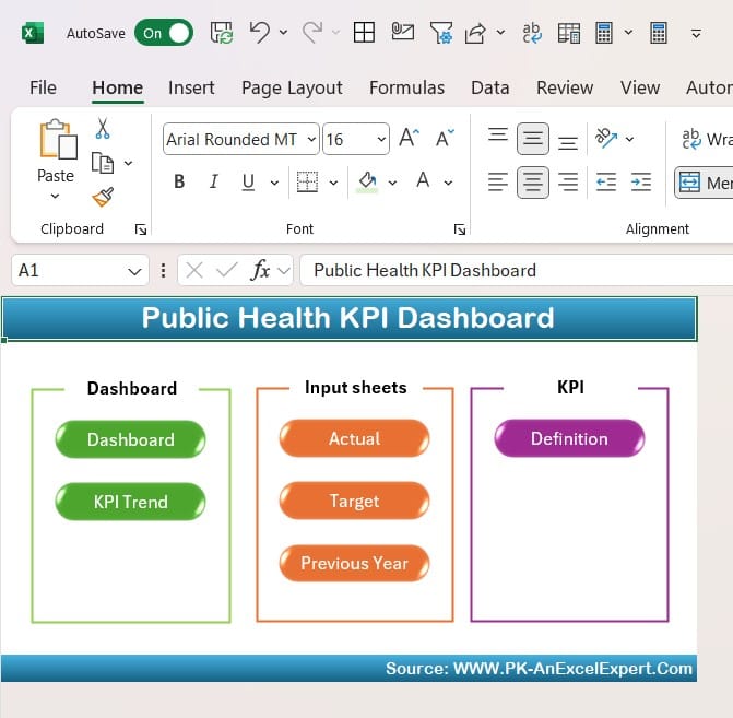
- The Home Sheet serves as the navigation hub of the dashboard.
- It features 6 clickable buttons that allow users to jump directly to the respective sheets.
- This intuitive design ensures a seamless user experience, even for those with limited Excel expertise.
Click to Public Health KPI
Dashboard Sheet Tab
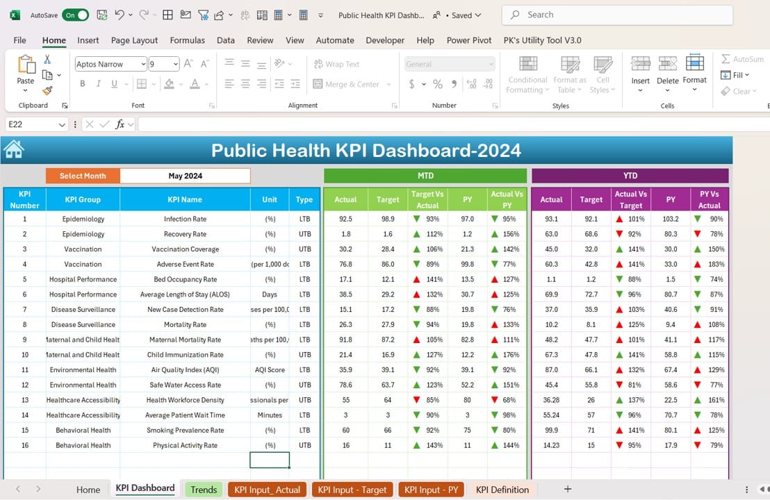
- The Dashboard Sheet is the central focus of the tool, showcasing critical KPIs in a visually appealing manner.
- Users can select the month from a drop-down menu (Cell D3), which dynamically updates the dashboard to display:
- Month-to-Date (MTD) Actual, Target, and Previous Year data.
- Comparison of Target vs. Actual and Previous Year (PY) vs. Actual using conditional formatting with up/down arrows.
- Year-to-Date (YTD) data for Actual, Target, and PY, along with similar comparative metrics.
KPI Trend Sheet Tab
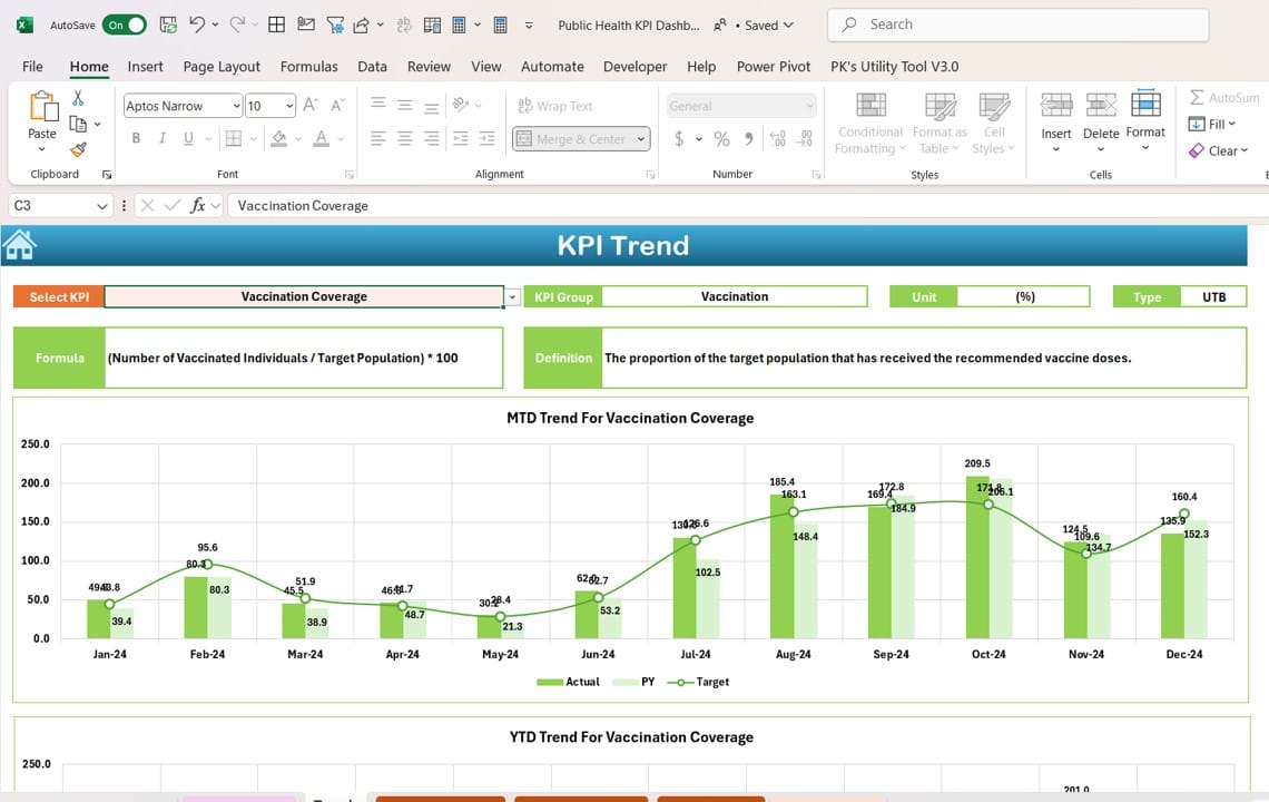
- The KPI Trend Sheet provides a detailed view of trends for individual KPIs:
- Select a KPI from a drop-down menu (Cell C3) to display its group, unit, type (e.g., “Lower is Better” or “Upper is Better”), formula, and definition.
- MTD and YTD trend charts visually represent Actual, Target, and PY data, enabling easy identification of patterns.
Click to Public Health KPI
Actual Numbers Input Sheet
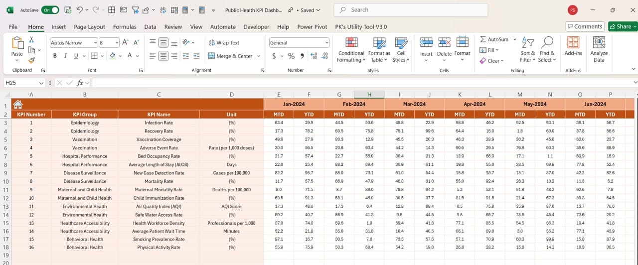
- Input the actual data for MTD and YTD figures on this sheet.
- To adjust for different months, change the starting month in Cell E1. The sheet auto-calculates based on the input.
Target Sheet Tab
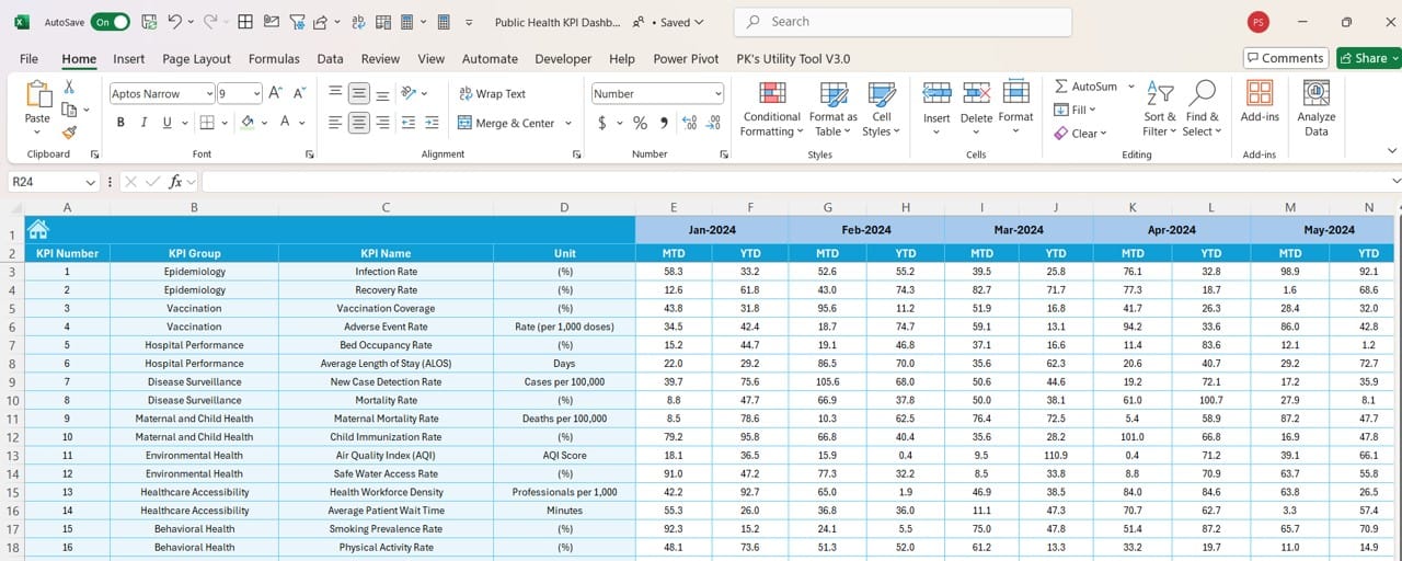
- Enter monthly targets for each KPI in this sheet.
- Both MTD and YTD targets are accommodated, ensuring consistency in goal-setting.
Previous Year Numbers Sheet Tab
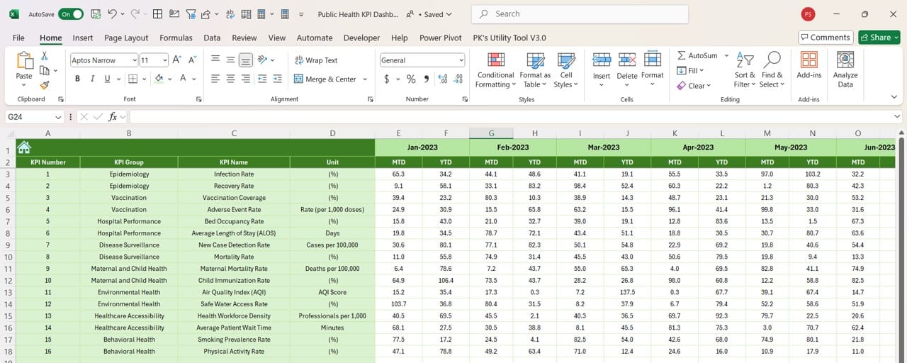
- Record Previous Year’s data in a format identical to the current year’s input.
- This allows for seamless year-over-year comparisons within the dashboard.
KPI Definition Sheet Tab
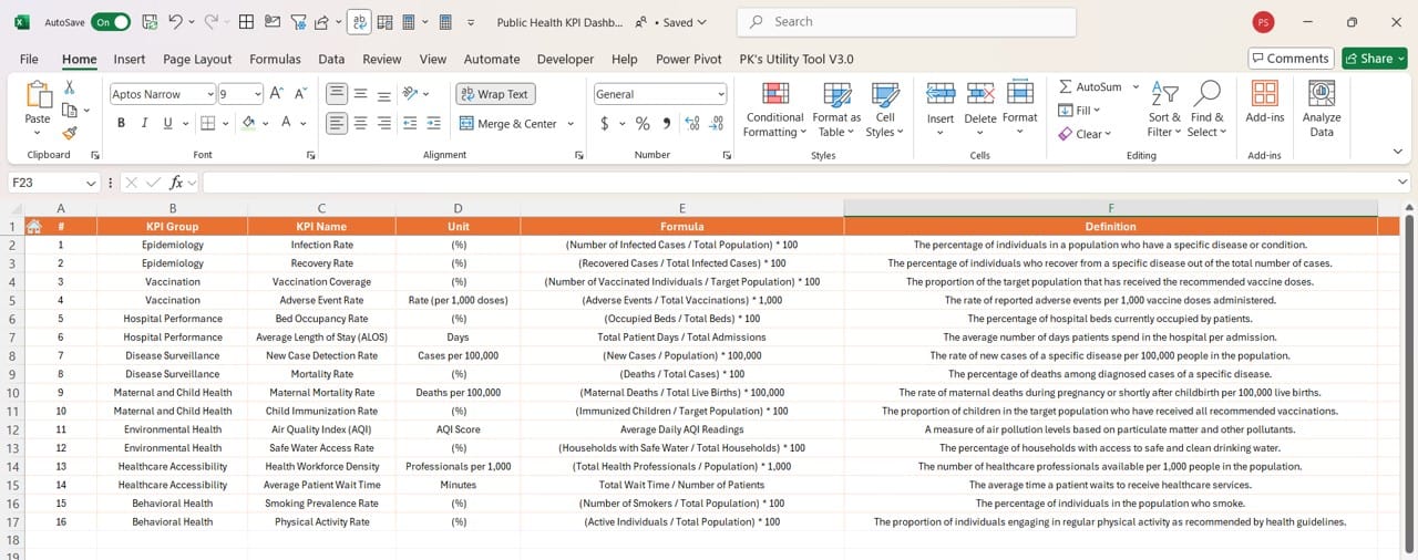
- Define KPIs comprehensively by entering:
- KPI Name, Group, Unit, Formula, and Definition.
- This sheet serves as a reference, ensuring clarity in data interpretation.
Advantages of the Public Health KPI Dashboard
The dashboard offers several benefits that enhance public health management:
- Data Centralization: All KPIs are tracked in one location, streamlining data access and reducing errors.
- Customizable Design: Adjust KPI names, targets, and definitions to meet the unique needs of any public health initiative.
- Dynamic Updates: Drop-down menus allow for real-time updates, ensuring that the displayed data is always accurate and relevant.
- Visual Representation: Trend charts and conditional formatting highlight key insights, making data easier to understand.
- Ease of Use: The intuitive design ensures users of all technical backgrounds can navigate and utilize the dashboard efficiently.
Click to Public Health KPI
Best Practices for Using the Public Health KPI Dashboard
To maximize the utility of this dashboard, follow these best practices:
- Define Clear KPIs: Begin by identifying the most relevant KPIs for your public health goals. For example:
- Ensure Accurate Data Entry: Input data meticulously in the Actual Numbers Input Sheet and Target Sheet to prevent discrepancies.
- Regularly Update the Dashboard: Update the Previous Year and Target data annually to maintain relevant comparisons.
- Leverage Trends for Actionable Insights: Use the KPI Trend Sheet to identify underperforming areas and allocate resources accordingly.
- Train Your Tea: Provide training on how to navigate and utilize the dashboard effectively, ensuring it becomes a key decision-making tool.
Conclusion
The Public Health KPI Dashboard in Excel is an essential tool for public health professionals seeking to track and improve performance metrics. By centralizing data, offering dynamic updates, and presenting actionable insights, this dashboard empowers users to make informed decisions that positively impact community health.
Click to Public Health KPI
Frequently Asked Questions (FAQs)
Q. What is the purpose of a Public Health KPI Dashboard?
The dashboard is designed to track, monitor, and analyze key performance indicators in public health. It helps professionals make data-driven decisions to improve outcomes.
Q. Can I customize the KPIs in this dashboard?
Yes, the dashboard is fully customizable. You can modify KPI names, formulas, and targets to align with your specific requirements.
Q. Is this dashboard suitable for large-scale public health programs?
Absolutely. The dynamic features and trend analysis capabilities make it ideal for both small and large-scale public health initiatives.
Q. Do I need advanced Excel skills to use this dashboard?
No, the dashboard is user-friendly and includes intuitive navigation. However, basic familiarity with Excel will be helpful.
Q. How often should I update the dashboard?
You should update the Actual Numbers and Targets monthly to ensure the data remains current and actionable.
Q. Can I share this dashboard with my team?
Yes, you can share the Excel file with your team. It is recommended to maintain a master copy for accurate updates.
Click to Public Health KPI
Visit our YouTube channel to learn step-by-step video tutorials
View this post on Instagram


