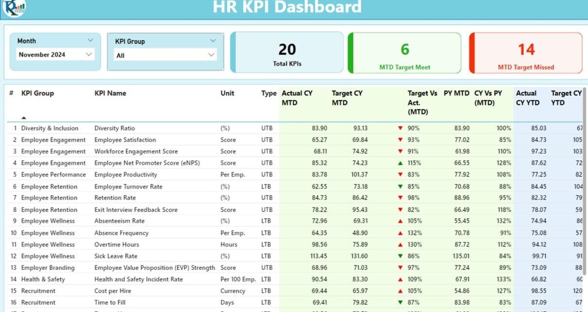
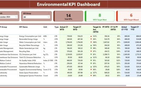
The HR KPI Dashboard in Power BI is a powerful tool designed to track, monitor, and analyze Key Performance Indicators (KPIs) effectively. With its user-friendly interface and seamless integration with Excel data sources, it offers actionable insights to optimize HR performance. This article explores the key features, advantages, and best practices for using this dashboard, along with answers to frequently asked questions.
Click to buy HR KPI Dashboard in Power BI
What is the HR KPI Dashboard in Power BI?
The HR KPI Dashboard in Power BI is a ready-to-use solution for HR professionals to measure performance metrics like employee productivity, turnover rates, and training effectiveness. The dashboard connects to an Excel file as its data source and provides dynamic visualizations and detailed reports through its three primary pages: Summary Page, KPI Trend Page, and KPI Definition Page.
Key Features of the HR KPI Dashboard in Power BI
Summary Page
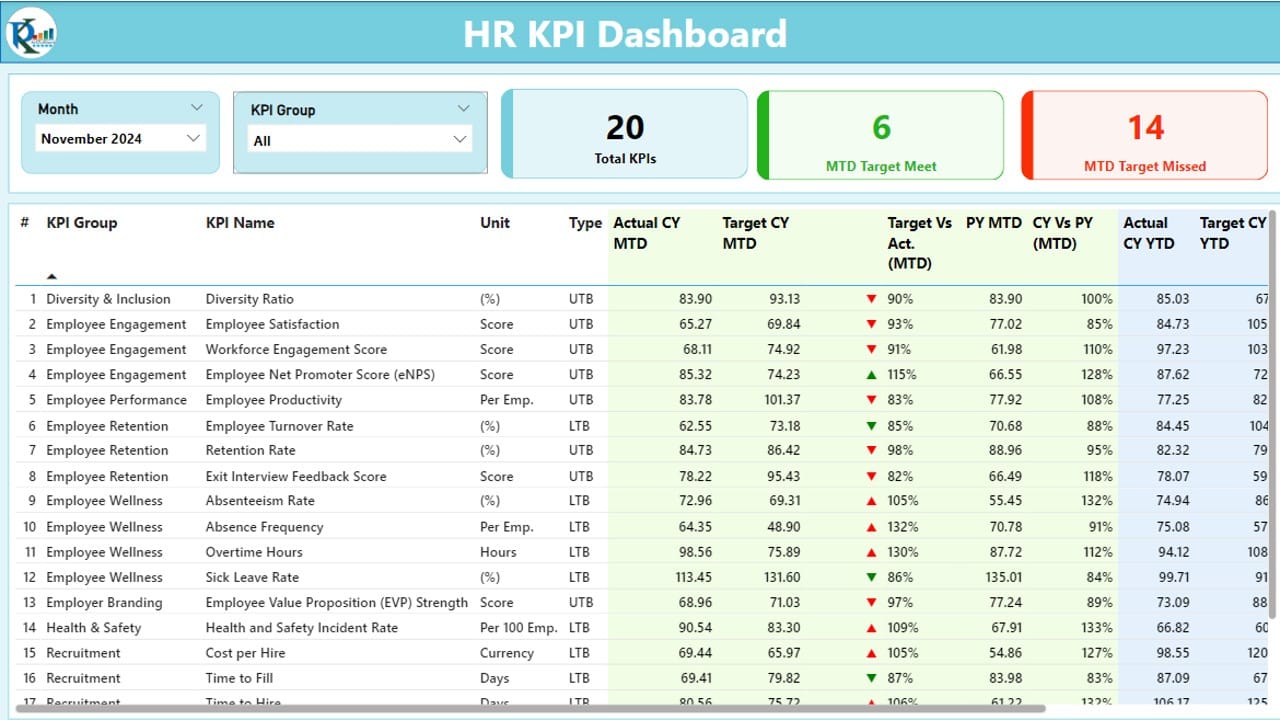
The Summary Page is the central hub of the dashboard, offering a detailed overview of KPIs with intuitive slicers and visuals. Here’s what it includes:
Click to buy HR KPI Dashboard in Power BI
- Month and KPI Group Slicers: Filter data by specific months or KPI groups for a focused view.
- KPI Cards: Display the total KPI count, month-to-date (MTD) targets met, and MTD targets missed.
Detailed KPI Table:
Click to buy HR KPI Dashboard in Power BI
Includes the following information:
- KPI Number: Sequential identifier for each KPI.
- KPI Group: Categorization of KPIs by department or function.
- KPI Name: The specific KPI being tracked.
- Unit: Measurement unit (e.g., percentage, days).
- Type: Indicates whether lower is better (LTB) or upper is better (UTB).
- MTD and YTD Data: Displays actual values, targets, and comparisons for both month-to-date and year-to-date.
- Icons for Performance Status: Red and green arrows indicate whether the actual values meet the targets.
- Target vs. Actual (MTD and YTD): Displays percentages for quick comparison.
- CY vs. PY Metrics: Year-over-year performance comparisons.
Click to buy HR KPI Dashboard in Power BI
KPI Trend Page
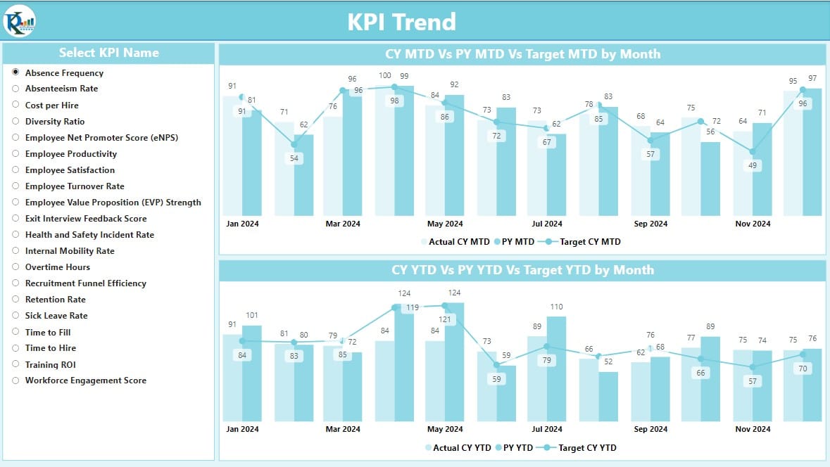
- This page visualizes trends using combo charts, allowing users to compare:
- Actual numbers for the current year and previous year.
- MTD and YTD targets.
- A slicer lets users select specific KPIs for an in-depth trend analysis, making it easier to spot patterns and areas needing improvement.
KPI Definition Page
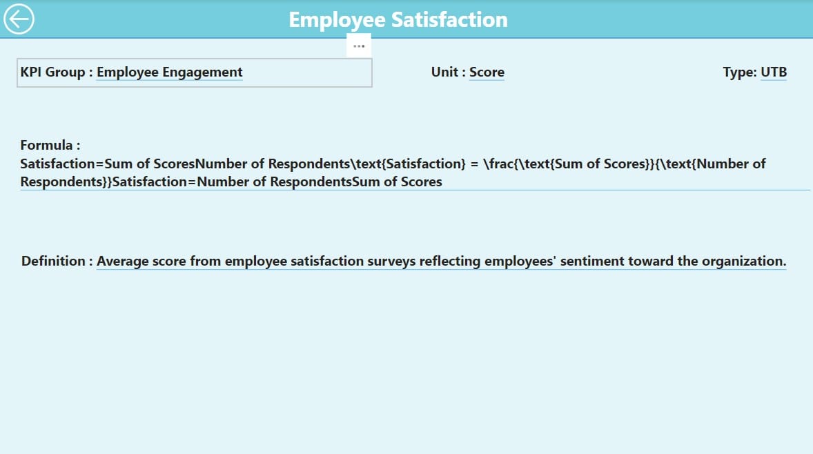
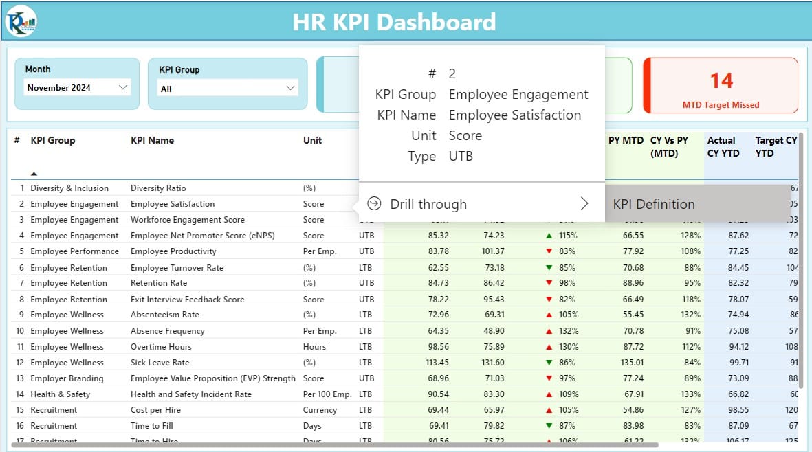
This hidden drill-through page provides granular details about each KPI, including:
- Formulas: The logic behind each metric.
- Definitions: Clear explanations of what each KPI measures.
Users can navigate back to the main dashboard by clicking the Back Button on the top-left corner.
Click to buy HR KPI Dashboard in Power BI
Advantages of the HR KPI Dashboard in Power BI
- Enhanced Decision-Making: Track KPIs with precision and make informed decisions based on real-time data insights.
- Customizable Visualizations: Adjust slicers and filters to focus on specific metrics, teams, or time frames.
- Seamless Excel Integration: Use Excel as the primary data source, making it easier to update and maintain data consistency.
- Dynamic and Interactive: Drill through pages, compare trends, and gain a deeper understanding of HR metrics.
- Time-Saving: Automates data analysis and visualization, reducing manual effort.
Best Practices for Using the HR KPI Dashboard
- Maintain Accurate Data in Excel: Ensure that the data in the Actual, Target, and KPI Definition sheets is accurate and up-to-date. Errors here will directly impact the dashboard’s insights.
- Define Clear KPIs: Define measurable, relevant, and actionable KPIs. For example:
- Regularly Monitor Trends: Leverage the KPI Trend Page to identify patterns in performance. Use this insight to address issues like employee turnover or low productivity promptly.
- Use Performance Icons Effectively: Pay attention to the red and green arrows. These visual cues can highlight areas where immediate action is needed.
- Secure the Data Source: Ensure the Excel file is stored in a secure location and regularly backed up to prevent data loss.
Click to buy HR KPI Dashboard in Power BI
How to Set Up the HR KPI Dashboard
Excel Data Preparation
Input Actual Sheet:
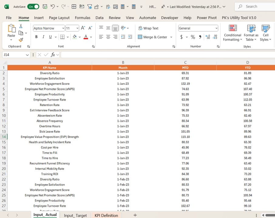
- Add actual numbers for each KPI by month, including MTD and YTD data.
Input Target Sheet:
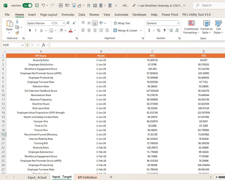
- Enter target numbers for each KPI by month, including MTD and YTD values.
Click to buy HR KPI Dashboard in Power BI
KPI Definition Sheet:
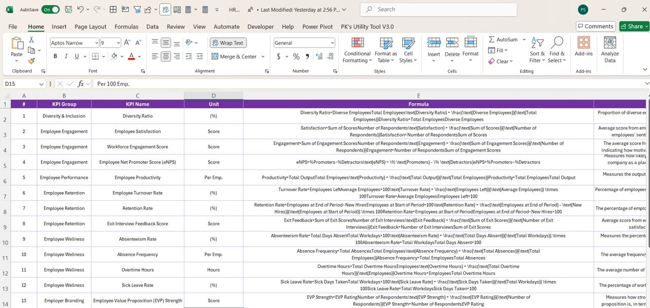
- Fill out details such as KPI Number, Group, Name, Unit, Formula, and Type (LTB or UTB).
- Uploading Data to Power BI
- Connect Power BI to the Excel file.
- Map the data fields to the corresponding visuals in the dashboard.
- Publish the dashboard for team-wide access.
Frequently Asked Questions (FAQs)
Q. What KPIs should I include in an HR dashboard?
Include metrics such as employee turnover rate, average hiring time, training effectiveness, and absenteeism rate. These KPIs provide a comprehensive view of HR performance.
Q. Can I customize the visuals in Power BI?
Yes, Power BI offers extensive customization options. You can modify charts, colors, and layouts to match your organizational preferences.
Q. How often should I update the data?
For accurate insights, update the data at least monthly. However, for high-activity organizations, consider weekly updates.
Q. What does LTB and UTB mean?
- LTB (Lower the Better): Metrics where lower values indicate better performance, e.g., absenteeism rate.
- UTB (Upper the Better): Metrics where higher values are desirable, e.g., training completion rate.
Q. Can I use other data sources apart from Excel?
Yes, Power BI supports multiple data sources, including SQL databases, SharePoint, and cloud services like Azure.
Click to buy HR KPI Dashboard in Power BI
Conclusion
The HR KPI Dashboard in Power BI is an indispensable tool for HR professionals looking to streamline performance tracking. With its dynamic visualizations, interactive features, and seamless Excel integration, it simplifies complex data into actionable insights. By following the best practices outlined in this guide, you can maximize the dashboard’s potential and drive better outcomes for your HR initiatives.
Click to buy HR KPI Dashboard in Power BI
Visit our YouTube channel to learn step-by-step video tutorials
Watch the step-by-step video tutorial:
Click to buy HR KPI Dashboard in Power BI
