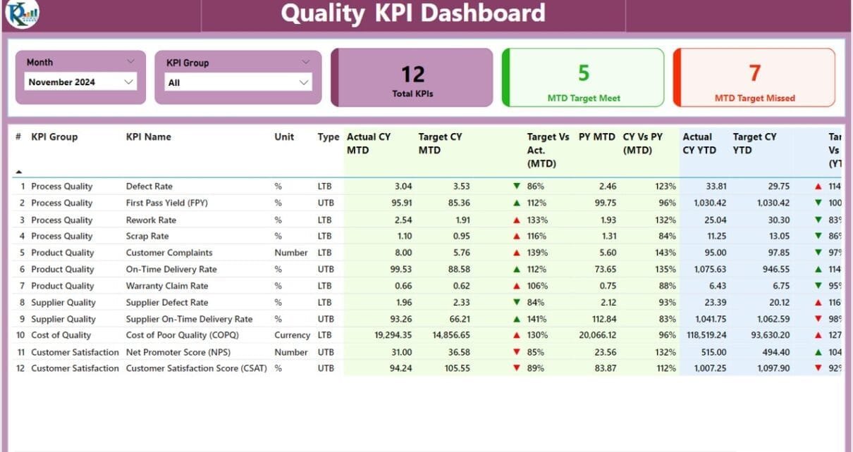
Tracking quality metrics is essential for businesses striving to maintain high standards. The Quality KPI Dashboard in Power BI is a practical and efficient tool for monitoring and analyzing key performance indicators (KPIs) related to quality. Whether you’re managing processes or evaluating outcomes, this dashboard helps you stay on track with your quality goals. Let’s explore its features, advantages, best practices, and more to help you get the most out of this tool.
Click to Quality KPI Dashboard
What is a Quality KPI Dashboard in Power BI?
A Quality KPI Dashboard in Power BI is a user-friendly tool that transforms raw data into meaningful insights. By connecting it to an Excel data source, the dashboard allows you to track KPIs through interactive visuals and organized pages. It’s designed to make data monitoring easier while helping teams achieve their quality objectives.
Click to Quality KPI Dashboard
Key Features of the Quality KPI Dashboard
- This dashboard is equipped with several features to ensure that your quality metrics are not just monitored but also actionable. Here’s what it includes:
Summary Page
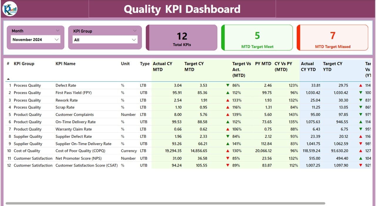
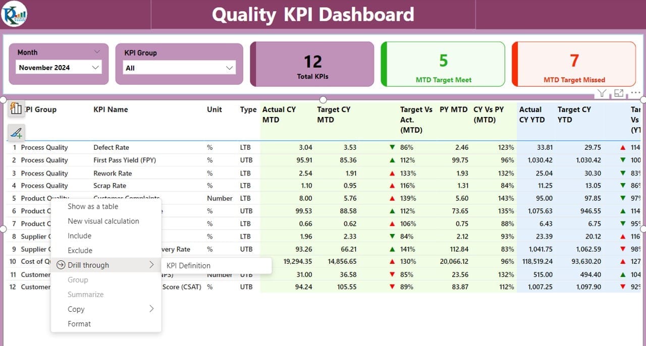
- The Summary Page acts as the main hub of the dashboard. It provides a comprehensive overview of all your KPIs, making it easier to assess performance at a glance. Here’s what it offers:
Click to Quality KPI Dashboard
Filters and Slicers:
- Month slicer: Focus on specific time periods.
- KPI Group slicer: Analyze data by category.
Summary Cards:
- Total KPIs Count: Displays the total number of KPIs being tracked.
- MTD Target Met Count: Shows how many KPIs have met their Month-to-Date (MTD) targets.
- MTD Target Missed Count: Highlights the KPIs that did not meet their MTD targets.
- Detailed KPI Table:
- KPI Details: Includes KPI Number, KPI Group, KPI Name, and Unit of Measurement.
- Icons for Status: Green ▲ for meeting targets, and red ▼ for falling short.
- Target vs. Actual (MTD and YTD): Compare performance against set goals.
- Year-over-Year Comparison: Assess Current Year (CY) vs. Previous Year (PY) numbers.
KPI Trend Page
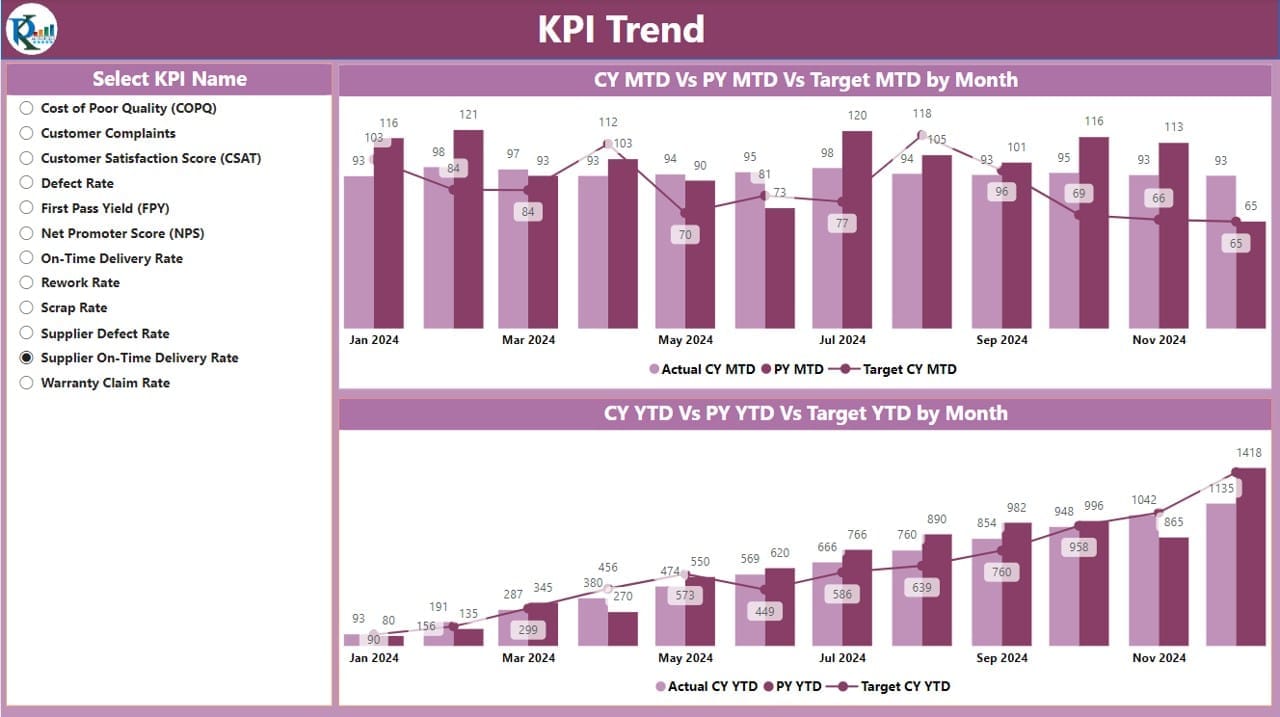
- The Trend Page is where you can dive deeper into the data. By visualizing trends, you can quickly identify patterns and areas that need attention. Key features include:
Click to Quality KPI Dashboard
Combo Charts:
- Show actual numbers for the Current Year, Previous Year, and set targets for both MTD and YTD.
- Slicer for KPI Names:
- Select specific KPIs to view their performance trends over time.
KPI Definition Page
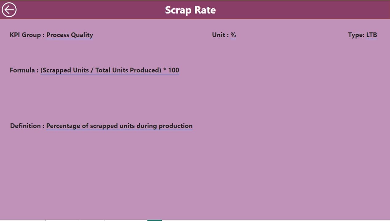
This hidden drill-through page provides a closer look at each KPI’s formula and definition. You can access it by clicking through from the Summary Page. It includes:
- KPI Formula: Shows the calculations behind the KPI.
- Definition: Explains the purpose and measurement criteria.
- Navigation: A back button at the top-left corner makes returning to the Summary Page simple.
How the Dashboard Works
The dashboard uses an Excel file as its data source, which simplifies data entry and updates. The Excel file consists of three key sheets:
Input Actual Sheet:
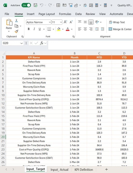
- Record the actual performance data for each KPI.
- Include fields like KPI Name, Month, MTD, and YTD values.
Click to Quality KPI Dashboard
Input Target Sheet:
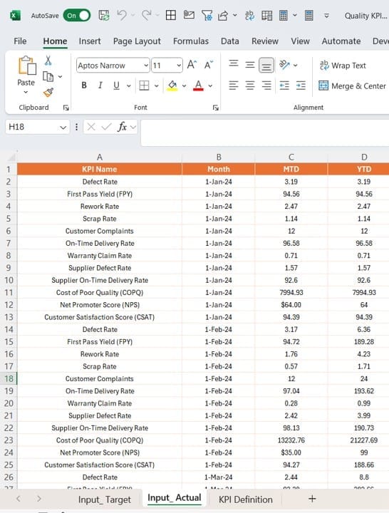
- Enter the target values for each KPI.
- Use the same format as the Input Actual sheet for consistency.
KPI Definition Sheet:
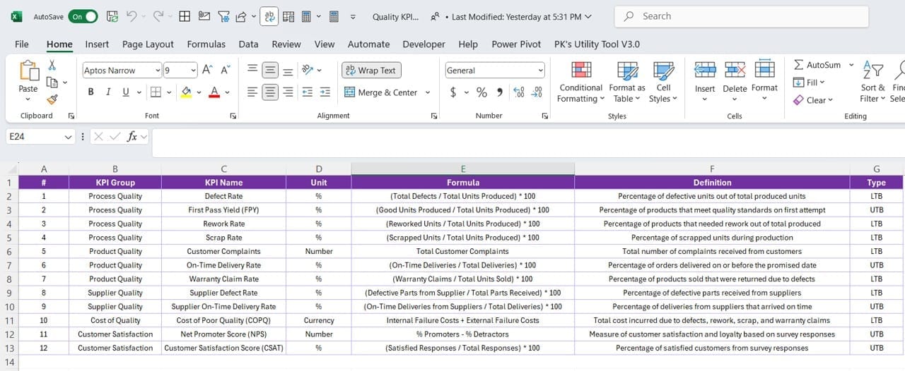
- Define each KPI with details like Number, Group, Name, Unit, Formula, and Type (Lower the Better or Upper the Better).
- Once the data is filled in these sheets, the Power BI dashboard automatically updates to reflect the latest information.
Click to Quality KPI Dashboard
Advantages of the Quality KPI Dashboard
This dashboard comes with several benefits that make it an indispensable tool for quality management. Here’s why it’s worth considering:
- Comprehensive View of Quality Metrics: See all your KPIs in one place, from individual performance to overall trends.
- Interactive Features: Use filters and slicers to customize the data displayed, allowing for a more focused analysis.
- Real-Time Insights: Get instant updates whenever you refresh the Excel data source, enabling quicker decision-making.
- Improved Efficiency: Spend less time crunching numbers and more time addressing quality concerns.
- Trend Analysis Made Easy: Understand how your KPIs are performing over time, which helps in spotting recurring issues or opportunities for growth.
Best Practices for Using the Quality KPI Dashboard
To ensure you’re getting the most out of this tool, follow these best practices:
- Keep Data Up-to-Date: Regularly update the Excel sheets with accurate MTD and YTD numbers. Outdated data can lead to poor decision-making.
- Use Slicers Effectively: Focus on specific time periods or KPI categories by using slicers. This makes it easier to identify problem areas or celebrate successes.
- Pay Attention to Icons: The green and red icons provide a quick visual cue for performance. Act promptly on ▼ icons to improve underperforming KPIs.
- Involve Your Team: Train your team members on how to navigate and interpret the dashboard. Collaborative reviews can lead to better strategies.
- Align KPIs with Goals: Ensure the KPIs reflect your organization’s overall quality objectives. This makes the dashboard more relevant and impactful.
Click to Quality KPI Dashboard
Why Use Power BI for Quality KPIs?
Power BI offers several advantages when it comes to managing KPIs:
- Ease of Use: The interface is intuitive, even for those new to data analytics.
- Versatile Visualizations: Create charts and visuals that best represent your data.
- Seamless Integration: Easily connect to Excel and other data sources.
- Collaborative Sharing: Share dashboards with your team via the Power BI service.
Frequently Asked Questions (FAQs)
Q. What does LTB and UTB mean in KPIs?
- LTB (Lower the Better): Indicates that lower values are desirable, like defect rates or downtime.
- UTB (Upper the Better): Indicates that higher values are better, such as customer satisfaction scores.
Q. How often should I update the Excel data source?
It’s recommended to update the data source at least monthly or whenever new data is available.
Q. Can I customize the dashboard for my organization?
Yes, you can modify the Excel file, visuals, and formulas in Power BI to suit your specific needs.
Q. Is this dashboard suitable for small businesses?
Absolutely. It’s scalable and works well for businesses of all sizes.
Q. Can I track other types of KPIs with this dashboard?
Yes, while it’s designed for quality KPIs, you can adapt it for other metrics, such as financial or operational KPIs.
Conclusion
The Quality KPI Dashboard in Power BI is a powerful tool for tracking and improving quality performance. With its interactive features, trend analysis, and easy-to-use interface, it simplifies quality management while providing actionable insights. By following the best practices mentioned here, you can ensure that your organization meets its quality goals efficiently.
Click to Quality KPI Dashboard
Visit our YouTube channel to learn step-by-step video tutorials
View this post on Instagram
