Managing and analyzing Key Performance Indicators (KPIs) for virtual events can become complex without the right tools. With the Virtual Events KPI Dashboard in Excel, you get a powerful and user-friendly solution for tracking and managing critical metrics. This article provides a detailed overview of the dashboard, its features, and how to maximize its potential.
Click to Virtual Events KPI
What Is a Virtual Events KPI Dashboard in Excel?
A Virtual Events KPI Dashboard is a customizable Excel-based template designed to monitor, analyze, and visualize KPIs for virtual events. It simplifies data management, ensures real-time insights, and improves decision-making through interactive charts, conditional formatting, and intuitive navigation.
Key Features of the Virtual Events KPI Dashboard
The Virtual Events KPI Dashboard in Excel includes seven meticulously crafted worksheets, each serving a unique purpose. Here’s a closer look:
Home Sheet
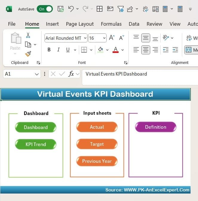
- Purpose: Acts as the control panel for the entire dashboard.
- Features:
- Contains six navigation buttons to quickly jump to other worksheets.
- Provides a clean and organized starting point for users.
Click to Virtual Events KPI
Dashboard Sheet Tab
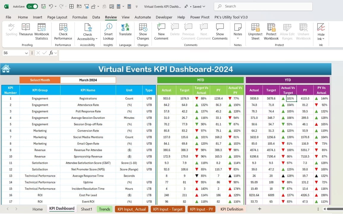
- Purpose: Serves as the core visualization space for KPIs.
- Features:
- A drop-down menu (D3) allows month selection, updating all metrics dynamically.
- Displays:
- Month-to-Date (MTD): Actual, Target, and Previous Year data.
- Year-to-Date (YTD): Actual, Target, and Previous Year data.
Utilizes conditional formatting with up/down arrows to highlight Target vs. Actual and PY vs. Actual comparisons.
Click to Virtual Events KPI
KPI Trend Sheet Tab
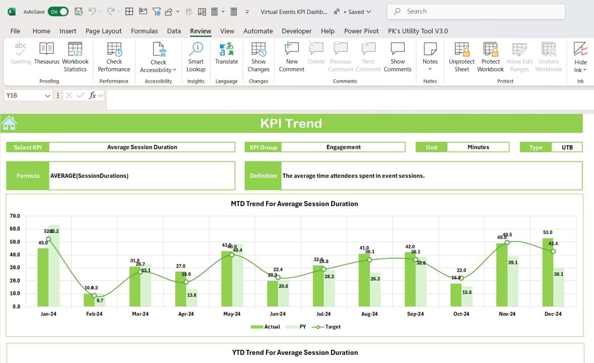
- Purpose: Offers a detailed view of KPI trends over time.
- Features:
- A drop-down (C3) to select specific KPIs.
- Displays:
- KPI Group
- Unit of KPI
- KPI Type (e.g., “Lower the Better” or “Upper the Better”)
- Formula and definition of the KPI.
Trend charts for MTD and YTD, comparing Actual, Target, and Previous Year values.
Actual Numbers Input Sheet
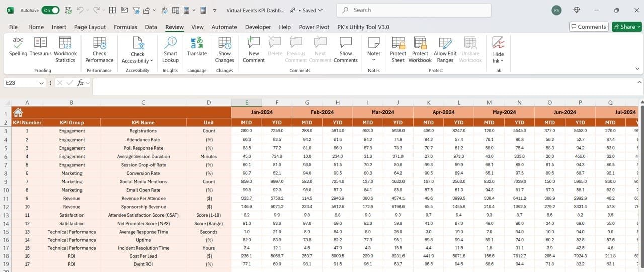
- Purpose: Centralizes data input for actual performance numbers.
- Features:
- Enter MTD and YTD actual numbers for any month.
- Change the year’s first month in E1, and all calculations update automatically.
Click to Virtual Events KPI
Target Sheet Tab
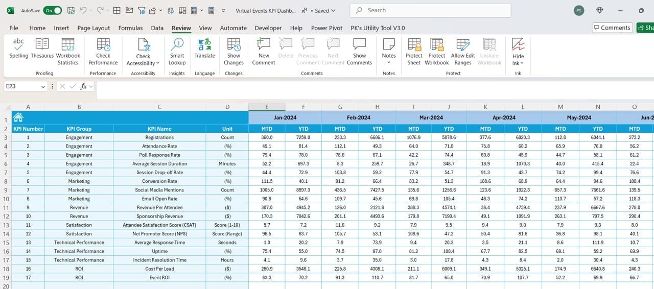
- Purpose: Captures the target values for KPIs.
- Features:
- Input MTD and YTD target numbers for each KPI.
- Seamless integration with other sheets for accurate comparisons.
Previous Year Numbers Sheet Tab
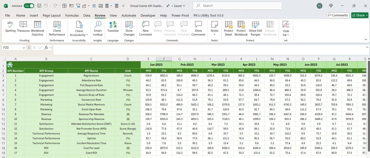
- Purpose: Records historical data for year-on-year comparisons.
- Features:
- Input previous year’s MTD and YTD numbers.
- Ensures consistency and accuracy in trend analysis.
KPI Definition Sheet Tab
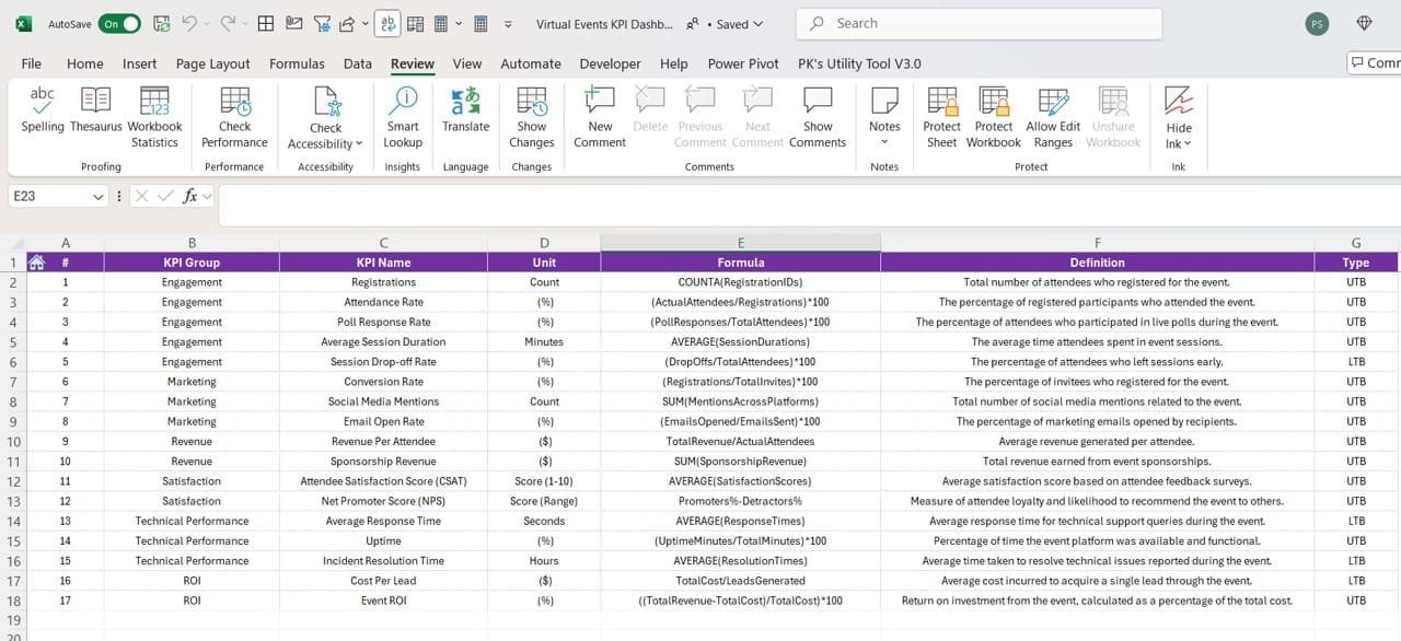
- Purpose: Serves as a reference for KPI details.
- Features:
- Enter KPI Name, Group, Unit, Formula, and Definition.
- Acts as a guide for understanding each metric in the dashboard.
Click to Virtual Events KPI
Advantages of Using the Virtual Events KPI Dashboard
- Simplified Data Analysis : Easy-to-read visualizations for MTD and YTD comparisons.
Focuses on key insights with conditional formatting.
- Customizable for Any Business Need : Modify KPI definitions, targets, and data inputs effortlessly.
Add or remove KPIs as needed.
- Real-Time Insights for Better Decisions : Dynamic drop-downs ensure updated metrics for selected months or KPIs.
Instant identification of performance gaps.
Best Practices for Using the Virtual Events KPI Dashboard
- Keep Data Updated: Regularly update the actual, target, and previous year’s numbers to maintain accuracy.
- Leverage Trends: Use the KPI Trend Sheet to identify long-term patterns and make data-driven decisions.
- Customize KPI Definitions: Tailor the KPI Definition sheet to reflect your specific goals and metrics.
- Use Conditional Formatting Effectively: Interpret the up/down arrows to quickly spot areas needing attention.
- Validate Data Regularly: Cross-check numbers to avoid errors that can mislead your analysis.
- How to Get Started with the Virtual Events KPI Dashboard
- Familiarize Yourself with the Home Sheet: Navigate through the six buttons on the Home Sheet to explore the structure of the dashboard.
Click to Virtual Events KPI
Input Your Data
- Use the Actual Numbers Input Sheet to fill in your performance data.
- Enter target values in the Target Sheet Tab.
- Record last year’s data in the Previous Year Numbers Sheet Tab.
Analyze the Dashboard: Switch to the Dashboard Sheet Tab to view updated metrics and compare performances.
Utilize KPI Trends: Dive into the KPI Trend Sheet Tab for detailed visualizations and insights.
Frequently Asked Questions (FAQs)
Q. What is the purpose of the Virtual Events KPI Dashboard in Excel?
The dashboard helps track, manage, and analyze virtual event performance metrics in a simple and visual format, ensuring data-driven decisions.
Q. Can I customize the KPIs in this dashboard?
Yes, the KPI Definition Sheet Tab allows you to modify existing KPIs or add new ones based on your requirements.
Q. Is this dashboard suitable for other event types?
While designed for virtual events, the dashboard is highly customizable and can be adapted for other event types.
Q. Does the dashboard support historical data analysis?
Yes, the Previous Year Numbers Sheet Tab and trend charts enable year-over-year comparisons.
Q. Do I need advanced Excel skills to use this dashboard?
Not at all! The dashboard is user-friendly and includes clear instructions, making it accessible even for beginners.
Conclusion
The Virtual Events KPI Dashboard in Excel is an indispensable tool for professionals looking to streamline KPI tracking and analysis for virtual events. With its intuitive design, dynamic charts, and customizable features, it empowers users to gain actionable insights and drive success.
Click to Virtual Events KPI
Visit our YouTube channel to learn step-by-step video tutorials
View this post on Instagram

