The healthcare industry thrives on efficiency, quality of care, and patient satisfaction. To achieve these goals, healthcare organizations need to monitor their performance closely. A Healthcare KPI Dashboard in Power BI is an essential tool that can provide real-time insights into key performance indicators (KPIs), track progress against targets, and help improve healthcare outcomes.
In this article, we will explore how the Healthcare KPI Dashboard in Power BI works, the essential features it offers, and how it can be used to monitor healthcare KPIs. We will also provide a detailed explanation of the dashboard’s components, its advantages, and best practices for using it to improve healthcare operations.
What is a Healthcare KPI Dashboard in Power BI?
A Healthcare KPI Dashboard in Power BI is a visual reporting tool that aggregates and displays key performance indicators related to healthcare operations in an easy-to-understand format. It enables healthcare professionals and administrators to track important metrics such as patient satisfaction, treatment times, hospital efficiency, staff performance, and financial health.
The dashboard can be customized to show real-time data, historical trends, and comparisons across different departments or facilities. By utilizing Power BI, it becomes an interactive and dynamic tool that can be easily customized and updated to fit the needs of any healthcare organization.
Key Features of the Healthcare KPI Dashboard in Power BI
The Healthcare KPI Dashboard in Power BI is designed with a user-friendly interface that allows healthcare professionals to gain deep insights into their operations. Here are the key features of this dashboard:
Summary Page
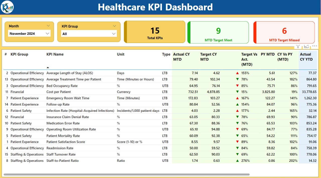
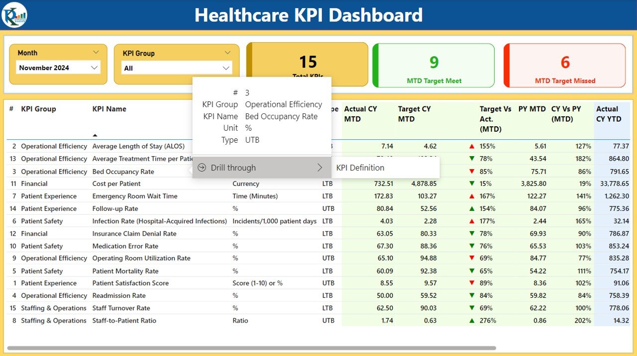
The Summary Page is the central hub of the dashboard. It displays a high-level overview of the healthcare KPIs and allows users to filter data by month and KPI group. This page includes:
- Month and KPI Group Slicers: These slicers allow users to filter the data for specific time periods and groups of KPIs.
- KPIs Cards: Displays the total number of KPIs, MTD (Month-to-Date) Target Meet count, and MTD Target Missed count.
- Detailed Table: Below the cards, a detailed table shows:
- KPI Number: The unique number assigned to each KPI.
- KPI Group: The group or category the KPI belongs to (e.g., Patient Satisfaction, Financial Health).
- KPI Name: The name of the KPI.
- Unit: The unit of measurement for each KPI (e.g., Percentage, Hours, Dollars).
- Type (LTB/UTB): Indicates whether the KPI is “Lower the Better” (LTB) or “Upper the Better” (UTB).
- Actual CY MTD: The actual value for the current year Month-to-Date (MTD).
- Target CY MTD: The target value for the current year MTD.
- MTD Icon: Displays green or red arrows to indicate if the actual value is meeting or missing the target.
- Target Vs Actual (MTD): The percentage comparison between the actual value and the target value for MTD.
- CY Vs PY (MTD): The percentage comparison between the current year’s MTD and the previous year’s MTD.
- Actual CY YTD: The actual value for the current year Year-to-Date (YTD).
- Target CY YTD: The target value for the current year YTD.
- YTD Icon: Green or red arrows indicating the status of the YTD value against the target.
- Target Vs Actual (YTD): The percentage comparison between the actual YTD and the target YTD.
Click to Healthcare KPI Dashboard
KPI Trend Page
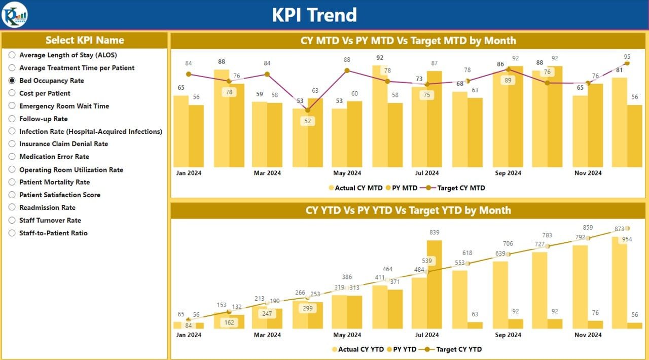
The KPI Trend Page provides a detailed view of the performance trends for specific KPIs over time. This page includes:
- Combo Charts: Two combo charts are displayed, showing the actual values for both the current year (CY) and previous year (PY), as well as the targets for MTD and YTD.
- KPI Slicer: A slicer on the left allows users to select a specific KPI to focus on, helping them to analyze trends for a single metric.
Click to Healthcare KPI Dashboard
KPI Definition Page
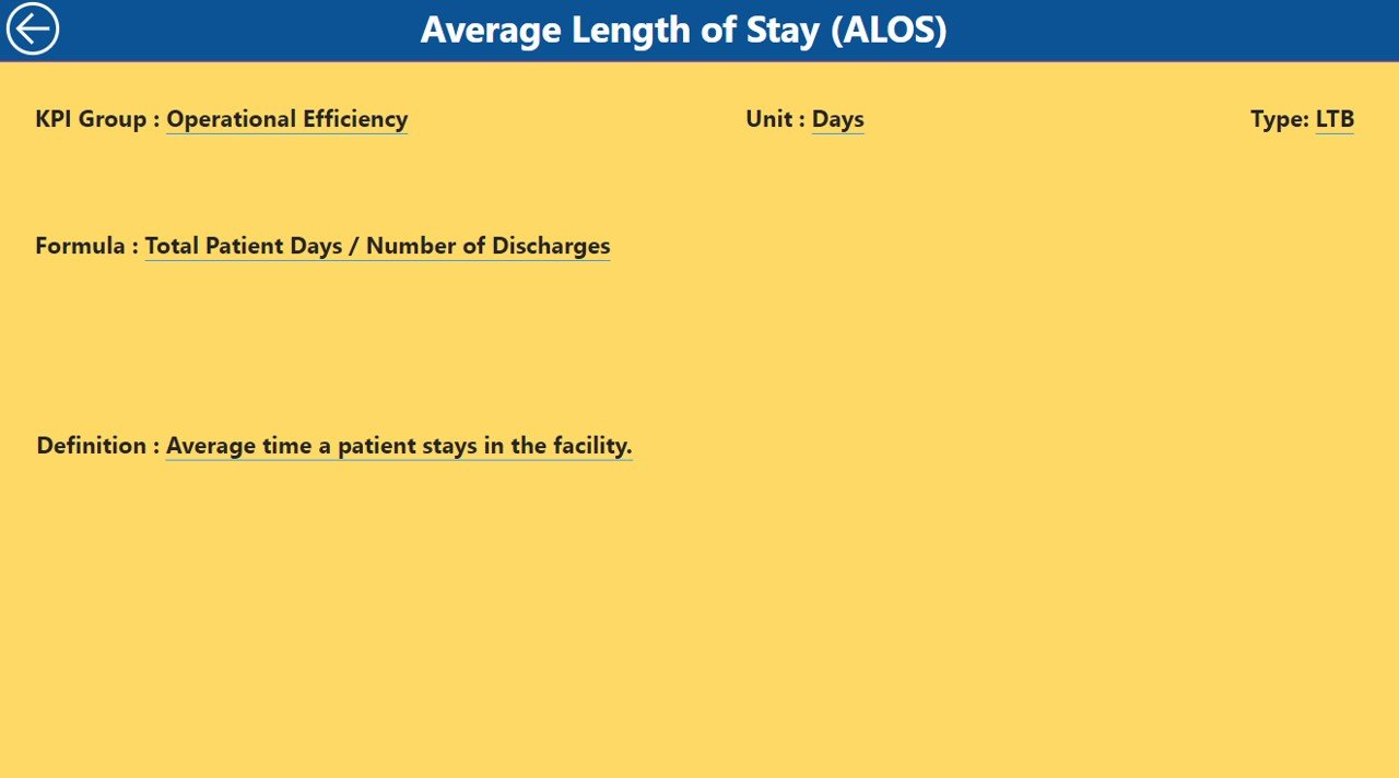
The KPI Definition Page is a drill-through page that provides in-depth information about each KPI. It includes:
Click to Healthcare KPI Dashboard
- Formula: The formula used to calculate the KPI.
- Definition: A detailed description of what the KPI measures and its relevance to healthcare operations.
By clicking on the back button at the top left corner, users can return to the summary page.
Click to Healthcare KPI Dashboard
Excel Data Integration
The data for this dashboard is sourced from an Excel file that users need to update regularly. This Excel file consists of three worksheets:
- Input_Actual Sheet: Here, users fill in the actual numbers for KPIs, including MTD and YTD figures for the current year.

Click to Healthcare KPI Dashboard
- Input_Target Sheet: This sheet is used to input the target numbers for each KPI for both MTD and YTD.

Click to Healthcare KPI Dashboard
- KPI Definition Sheet: Users enter the KPI number, group, name, unit, formula, definition, and type (LTB or UTB).

Click to Healthcare KPI Dashboard
Advantages of the Healthcare KPI Dashboard in Power BI
Implementing the Healthcare KPI Dashboard in Power BI offers numerous benefits that can help organizations improve their overall efficiency and effectiveness. Here are the key advantages:
- Real-Time Monitoring: With a KPI dashboard, healthcare organizations can track key performance metrics in real-time. This allows healthcare professionals to address issues as they arise, leading to faster and more effective decision-making.
- Increased Transparency: The dashboard presents all important data in one location, providing transparency for all stakeholders. Everyone, from healthcare providers to administrators, can easily access the data they need to make informed decisions.
- Improved Decision Making: By displaying data in an easy-to-read format, the dashboard helps healthcare leaders make data-driven decisions. This improves operational performance, patient care, and resource management.
- Time-Saving: The dashboard automates the process of tracking and analyzing KPIs. This saves valuable time compared to manual data entry and allows healthcare professionals to focus on other critical tasks.
- Enhanced Data Security: Since the dashboard integrates with Power BI, organizations can ensure data is secure while still being accessible. Power BI’s security features allow for role-based access to ensure only authorized personnel view sensitive information.
Opportunities to Improve the Healthcare KPI Dashboard in Power BI
While the Healthcare KPI Dashboard in Power BI is a powerful tool, there are always opportunities to improve it. Here are some potential areas for further enhancement:
- AI Integration for Predictive Analytics: Integrating artificial intelligence (AI) can help predict future trends, such as patient care demands or staffing needs. AI can also be used to proactively identify potential issues, such as medication shortages or patient discharge delays, allowing for better planning.
- Mobile Compatibility: Making the dashboard mobile-friendly would allow healthcare managers and staff to access critical data on-the-go. This is particularly useful for healthcare professionals working in the field or managing multiple facilities.
- Customizable Alerts: Adding customizable alerts for KPIs, such as patient satisfaction or critical care incidents, would allow healthcare professionals to respond quickly to any significant deviations from the target. Alerts would also help keep everyone informed in real-time.
- Cloud Integration: Integrating the dashboard with the cloud would allow for real-time data updates and easier access to the dashboard from multiple locations. It would also improve collaboration among different departments within the healthcare organization.
Best Practices for the Healthcare KPI Dashboard in Power BI
To get the most out of the Healthcare KPI Dashboard in Power BI, it’s important to follow these best practices:
- Regular Data Updates: Ensure that data is updated regularly to provide accurate, real-time insights. This helps stakeholders make timely decisions based on the most current information available.
- Align KPIs with Healthcare Goals: Make sure the KPIs being tracked align with the broader goals of the healthcare organization. Whether it’s improving patient satisfaction, reducing wait times, or cutting costs, tracking the right KPIs is essential.
- Use Clear Visuals: Leverage visuals, such as charts, graphs, and icons, to make the data easy to interpret. Clear visuals help healthcare professionals quickly understand performance trends and make data-driven decisions.
- Limit Access Based on Roles: To ensure data security and privacy, limit access to the dashboard based on roles. Only authorized personnel should be able to view or modify sensitive data.
- Track Historical Data: Incorporating historical data allows healthcare professionals to analyze trends over time, helping to identify long-term patterns and improve decision-making.
Frequently Asked Questions (FAQs)
What is a Healthcare KPI Dashboard in Power BI?
A Healthcare KPI Dashboard in Power BI is a tool that helps healthcare organizations track and analyze important performance metrics, such as patient satisfaction, treatment times, and staff performance.
How can I use the Healthcare KPI Dashboard in my organization?
The dashboard can be used to monitor and optimize various aspects of healthcare operations, such as improving patient care, reducing costs, and ensuring regulatory compliance.
What KPIs are essential for healthcare organizations?
Essential KPIs for healthcare organizations include Patient Satisfaction, Treatment Times, Bed Occupancy Rate, Staff Utilization Rate, and Financial Health Metrics.
Is the Healthcare KPI Dashboard customizable?
Yes, the dashboard is highly customizable. You can adjust the KPIs, targets, and visualizations to meet the specific needs of your organization.
Conclusion
A Healthcare KPI Dashboard in Power BI is a game-changer for healthcare organizations looking to improve efficiency, monitor performance, and ensure better patient care. By tracking the right KPIs and analyzing the data, healthcare leaders can make informed decisions that enhance operations, save costs, and improve overall performance. With its user-friendly interface, real-time monitoring capabilities, and integration with Power BI, this dashboard is an essential tool for modern healthcare management.
Visit our YouTube channel to learn step-by-step video tutorials
View this post on Instagram
Click to Healthcare KPI Dashboard


