Sports KPI Dashboards in Power BI provide a powerful way for sports analysts, coaches, and managers to monitor, analyze, and enhance athletic performance through data visualization. This article dives deep into the essentials of creating and using a sports KPI dashboard in Power BI, utilizing data captured in Excel. It will guide you through setting up your dashboard, key features, and best practices to make the most of your data analytics efforts Sports KPI Dashboard.
Click to buy Sports KPI Dashboard in Power BI
Key Features of the Sports KPI Dashboard
Dashboard Layout
- The Sports KPI Dashboard in Power BI is designed with three main pages, each serving a unique purpose:
Summary Page:
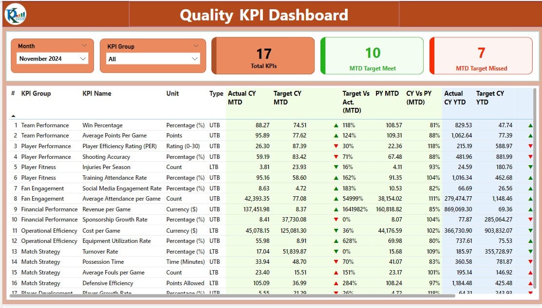
- Slicers for Month and KPI Group: Quickly filter data according to specific months or KPI groups.
- KPI Metrics Display: Three cards display the Total KPIs count, MTD (Month-to-Date) Target Meet count, and MTD Target Missed count.
- Detailed KPI Table: Showcases data such as KPI Number, Group, Name, Unit, Type (LTB or UTB), and performance against targets with dynamic icons and percentages.
Click to buy Sports KPI Dashboard in Power BI
KPI Trend Page:
Click to buy Sports KPI Dashboard in Power BI
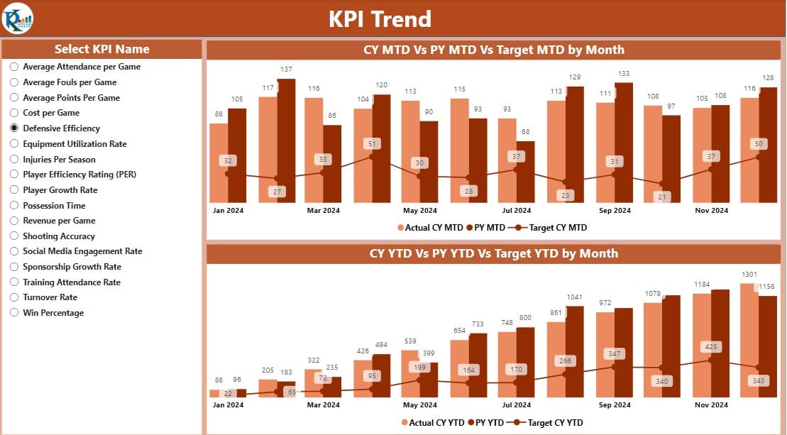
- Visual Trend Analysis: Two combo charts depict Actual Numbers for the Current and Previous Years alongside Targets for MTD and YTD (Year-to-Date).
- KPI Selector Slicer: Allows users to filter the display based on specific KPIs.
KPI Definition Page:

Click to buy Sports KPI Dashboard in Power BI
- Drill-Through Capability:
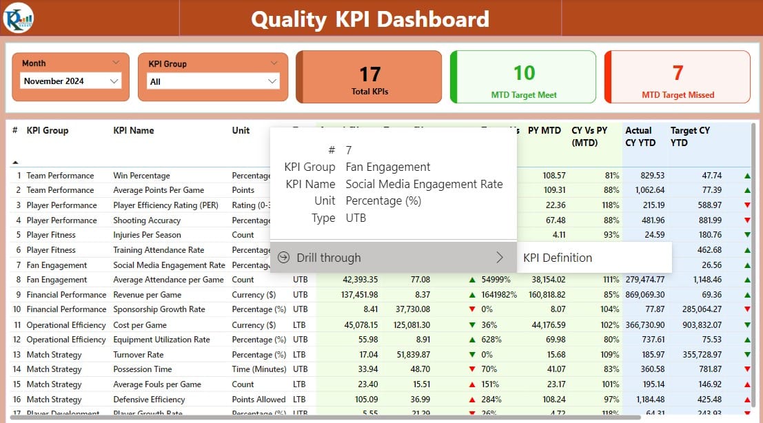
Access detailed formulas and definitions for each KPI. This page is hidden but accessible through a drill-through from the Summary page.
Click to buy Sports KPI Dashboard in Power BI
Data Integration and Management
Excel as Data Source:
- The dashboard leverages an Excel file with three worksheets to manage and input data:
Input Actual Sheet:
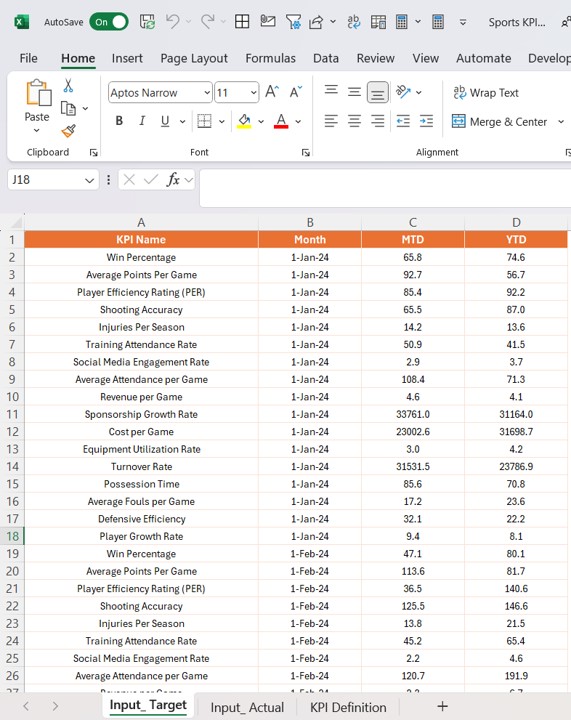
- For recording actual KPI numbers monthly.
Click to buy Sports KPI Dashboard in Power BI
Input Target Sheet:
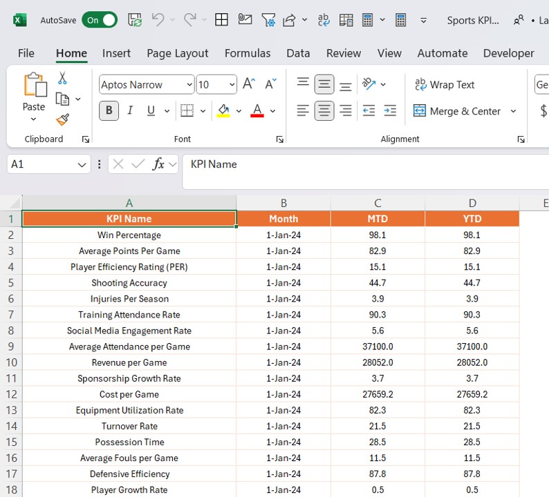
- For target KPI figures.
- Click to buy Sports KPI Dashboard in Power BI
KPI Definition Sheet:
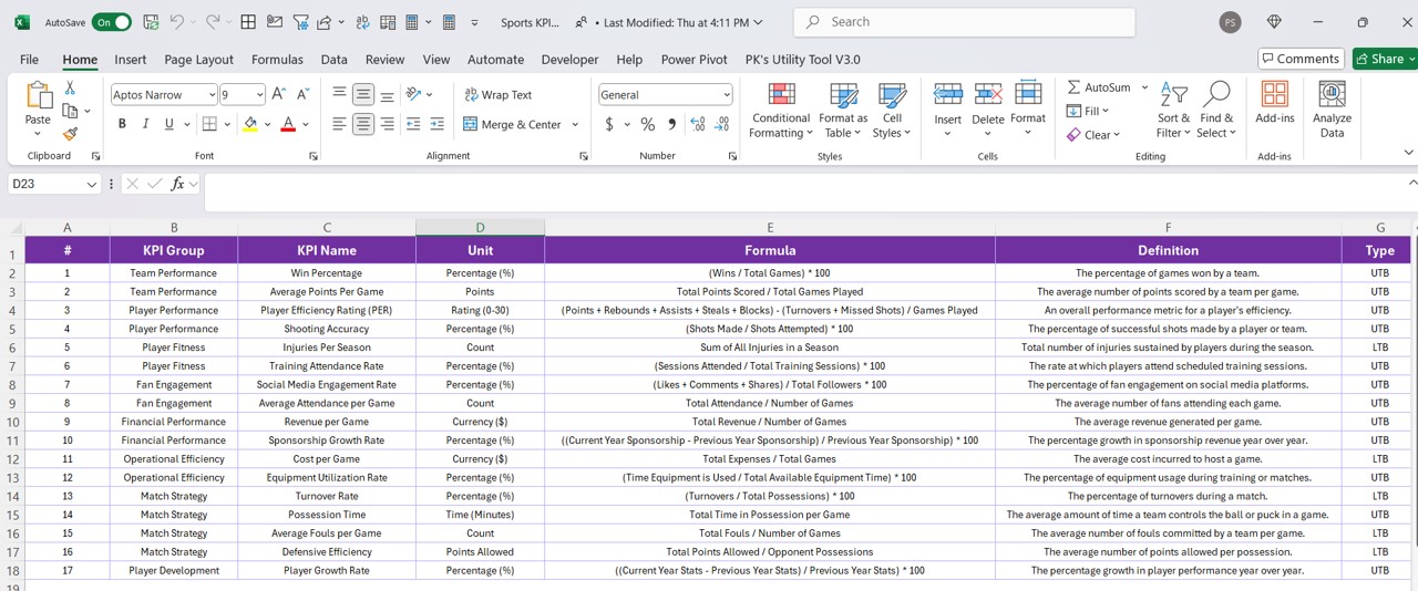
- Details like KPI Number, Group, Name, Unit, Formula, Definition, and Type.
Advantages of Implementing a Sports KPI Dashboard in Power BI
- Enhanced Decision-Making: Real-time data visualization aids in making informed decisions quickly.
- Performance Tracking: Easily track and compare current performance against past records and targets.
- Customizable Views: Tailor views and analyses to specific needs and objectives.
- Efficient Data Management: Centralized data handling through Excel integration simplifies the data entry and update process.
Best Practices for Sports KPI Dashboards
- Regular Data Updates: Ensure data in the Excel sheets is updated regularly to maintain accuracy in reporting.
- Use of Slicers: Maximize the use of slicers to make the dashboard interactive and user-specific.
- Consistent Review of KPI Definitions: Regularly review and update the KPI definitions to align with evolving sports performance metrics.
- Training for Users: Provide adequate training for all users to ensure they can navigate and utilize the dashboard effectively.
Frequently Asked Questions with Answers
Q1: How do I customize the dashboard for different sports?
A1: Customize by adjusting the KPIs and metrics in the Excel data sheets to reflect the specific performance indicators relevant to each sport.
Q2: Can the dashboard be accessed on mobile devices?
A2: Yes, Power BI dashboards are accessible on mobile devices through the Power BI app, allowing you to check updates on the go.
Q3: What should I do if the data is not displaying correctly?
A3: Ensure that the data types in Excel match those expected in the Power BI dashboard settings. Check for any discrepancies in data entry or formula calculations in the Excel sheets.
Q4: How often should the dashboard be updated?
A4: Update the dashboard as frequently as new data is available, typically monthly, to maintain up-to-date insights into performance metrics.
Click to buy Sports KPI Dashboard in Power BI
Visit our YouTube channel to learn step-by-step video tutorials
View this post on Instagram
Click to buy Sports KPI Dashboard in Power BI
