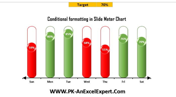
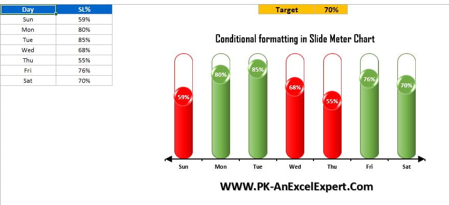
This is the version-3 of Slide Meter Chart. In the Slide Meter Chart (Version-1), we displayed the KPI metric performance with solid bar. In the Slide Meter Chart (Version-2), we displayed the KPI metric performance with semi filled bar. Now in this version of this chart we have put the conditional formatting. If the value of Service Level will be less than target then it will be in Red otherwise it will be in Green.
Slide Meter Chart (Version-3)
Below is the snapshot of the chart. Here we have add the Target of Service Level. Wherever Service level is below the target then Red Color will be appear there and if it is greater than Target then it will be in Green. You can customize the charts or colors as per your requirement. You can also change the data.
Click to buy Slide Meter Chart (Version-3)
Visit our YouTube channel to learn step-by-step video tutorials
Watch the step by step tutorial:
Click to buy Slide Meter Chart (Version-3)
