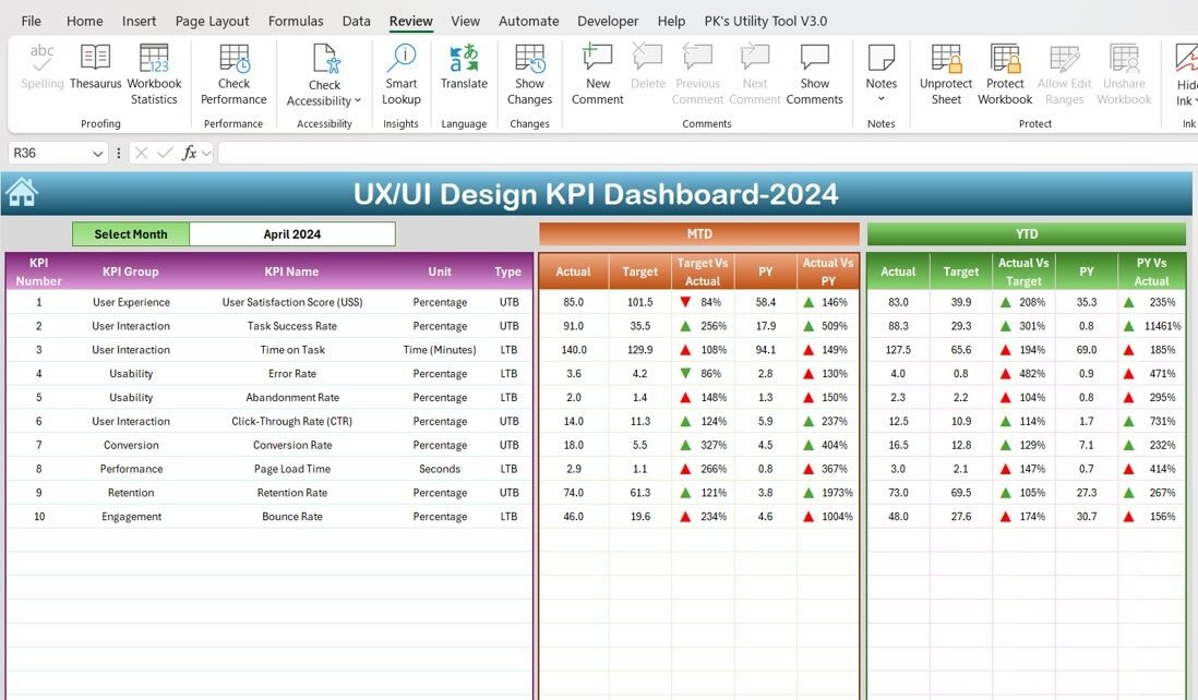
The UX/UI Design KPI Dashboard in Excel is a powerful tool designed to help product managers, UX/UI designers, and business leaders track and measure the effectiveness of their user experience and user interface designs. This ready-to-use template allows teams to monitor key design performance indicators (KPIs), identify areas for improvement, and make data-driven decisions to enhance the overall user experience. With this dashboard, you can optimize design efforts, measure progress, and achieve better results.
Key Features of the UX/UI Design KPI Dashboard in Excel
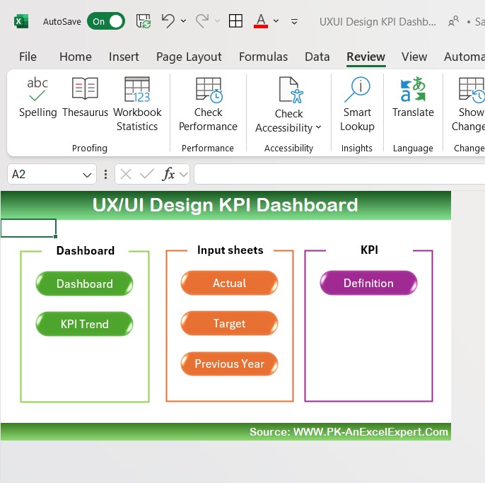
Home Sheet:
The index sheet provides easy navigation with six buttons linking to different sections of the dashboard.
Dashboard Sheet Tab:
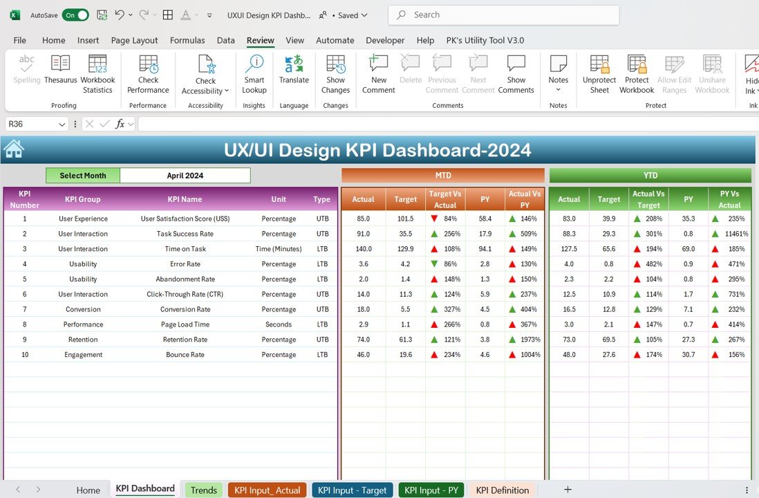
This is the central sheet displaying key KPIs, with dropdown options for selecting the month and tracking MTD, YTD, and Previous Year data.
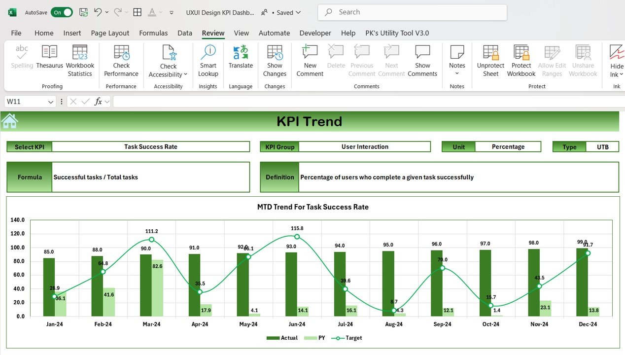
KPI Trend Sheet Tab:
Offers the ability to select a specific KPI, showcasing its group, unit, formula, and definition.
Actual Numbers Sheet Tab:
Input actual data for YTD and MTD, and update monthly performance with ease.
Target Sheet Tab:
Track and input target values for each KPI, ensuring that your goals are clearly defined and monitored.
Previous Year Data Sheet Tab:
Compare current performance with previous year’s numbers to track progress.
KPI Definition Sheet Tab:
Provides clear definitions for each KPI, helping your team understand what’s being measured and why it’s important.
