In the rapidly evolving insurance sector, leveraging data to drive decisions has never been more crucial. This is where the Insurance KPI Dashboard in Power BI steps in, transforming complex data into actionable insights with remarkable efficiency.
Click to Insurance KPI
Why opt for a Power BI Dashboard for Insurance KPIs?
- Immediate Data Processing: Instantly turns raw data into insightful information.
- Engaging Visuals: Engages users with dynamic charts and graphs that make data easy to understand.
- Tailored Insights: Customizes data displays to meet specific analytical needs, ensuring that everyone gets exactly what they need from the dashboard.
Exploring the Key Features of the Insurance KPI Dashboard
Designed for ease of use and comprehensive analysis, the dashboard includes three main pages, each serving a distinct purpose in data visualization and insights delivery.
Summary Page
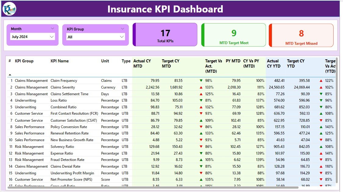
Effortless Adjustments with Slicers: Quickly alter views to display data by month or KPI group.
- At-a-Glance KPI Metrics: Shows total KPIs count, along with metrics for targets met and missed.
- In-depth KPI Details: Provides a table with extensive details such as KPI number, group, name, unit, type, and performance comparisons for the current and previous years.
Click to Insurance KPI
KPI Trend Page
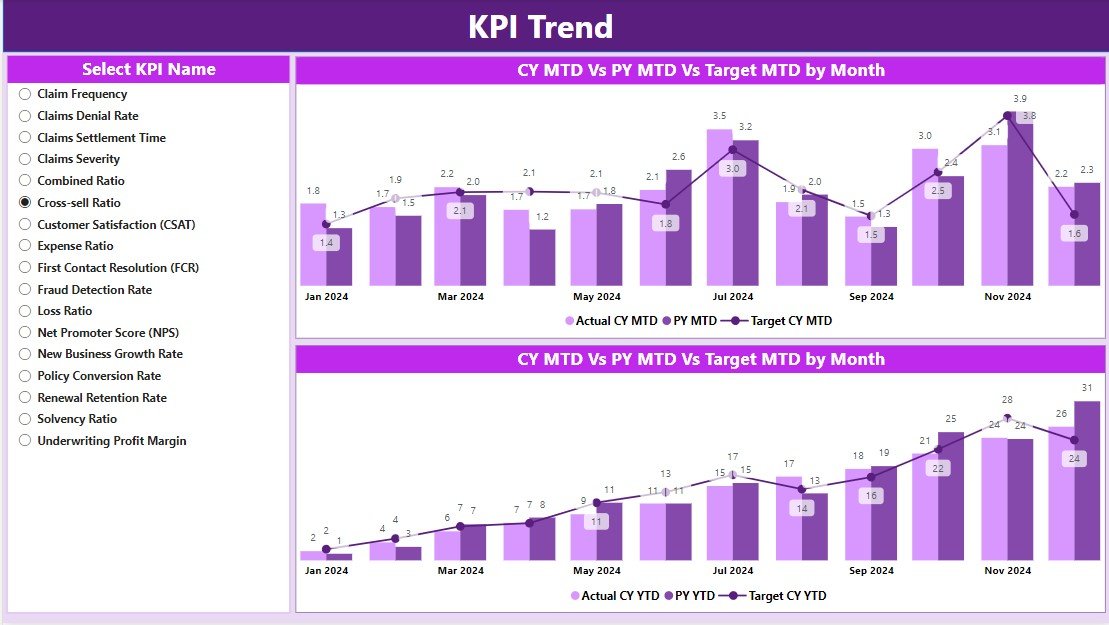
- Insightful Combo Charts: Depicts actual figures against targets for monthly and yearly data.
- Focused Analysis with KPI Slicers: Filters data by specific KPIs for targeted analysis.
KPI Definition Page
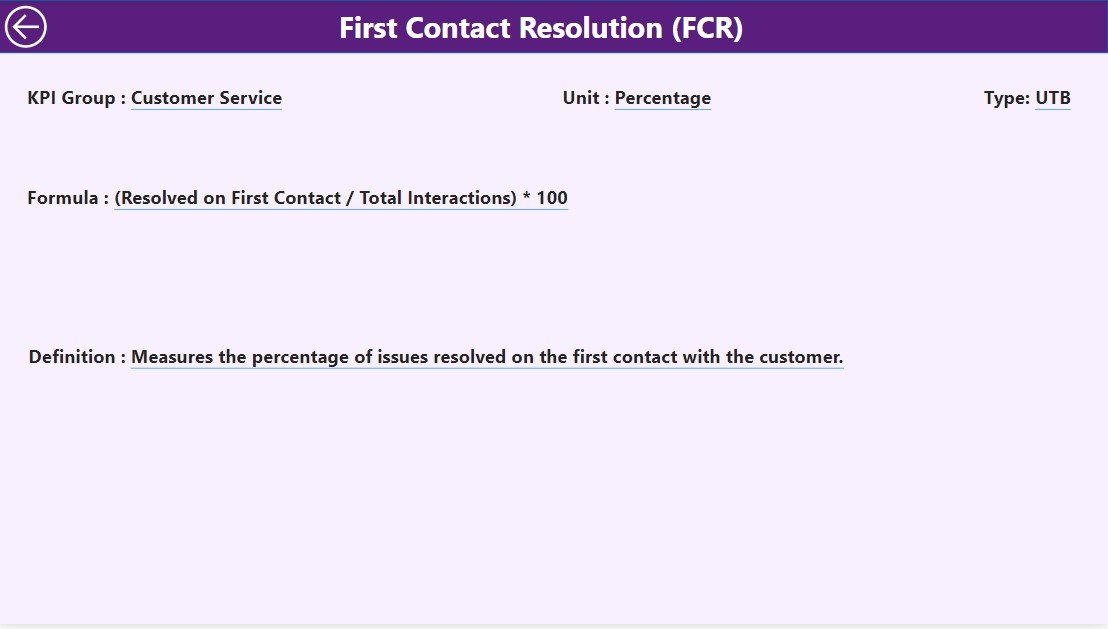
Deep Dive with Drill-Through:
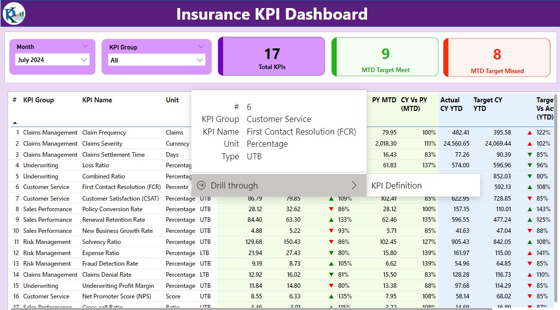
- Offers in-depth definitions and formulas for each KPI.
- Sleek, Hidden Design: Maintains a clean interface while providing detailed information upon request.
Click to Insurance KPI
Setting Up Your Dashboard
Preparing Your Data in Excel
- Organized Input Sheets: Fill in actuals and targets in designated Excel sheets to seamlessly feed data into the dashboard.
-
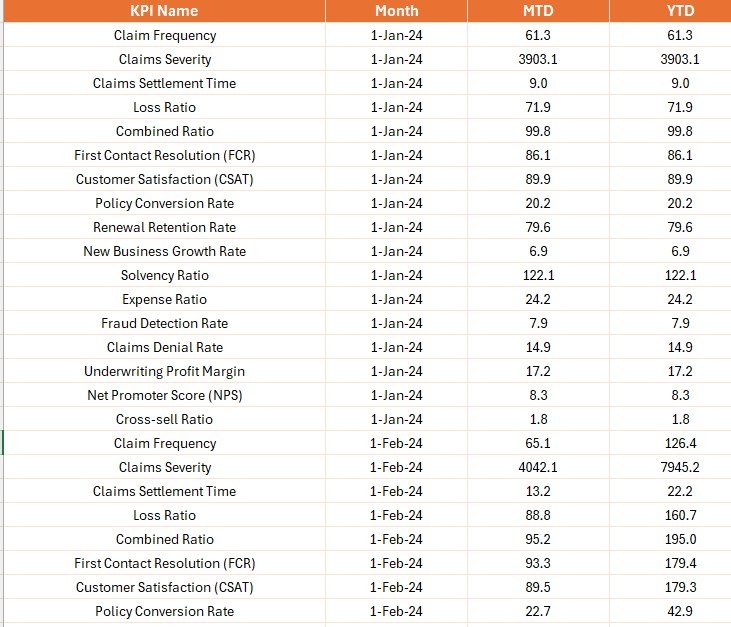
Input Sheets
Detailed KPI Definitions:
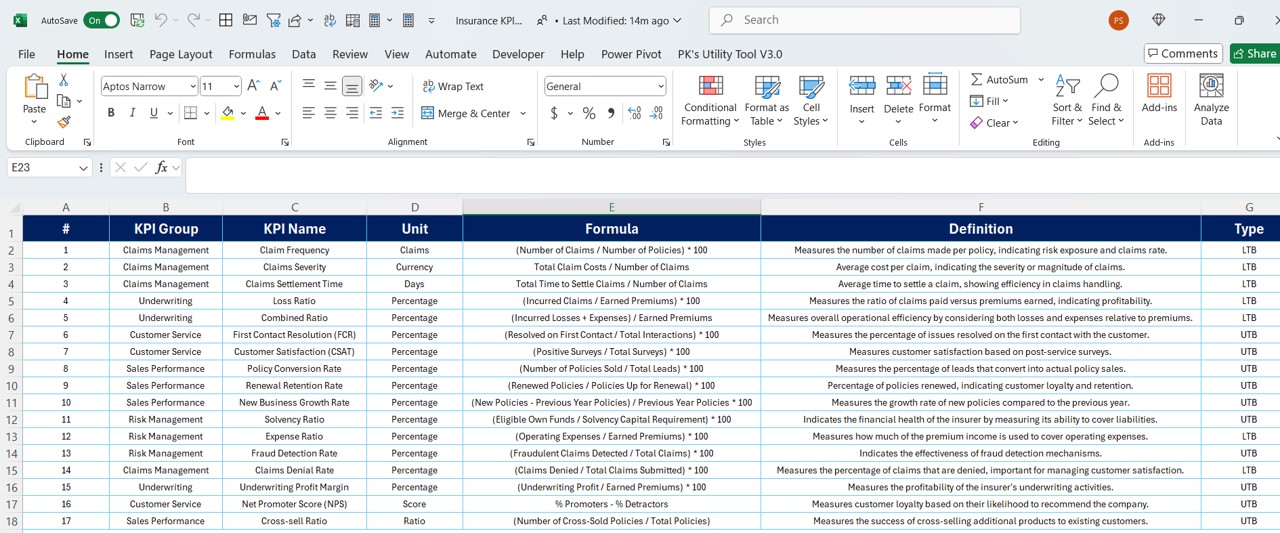
- Clearly define each KPI’s metrics, including its formula and classification.
Advantages of Implementing an Insurance KPI Dashboard in Power BI
- Enhanced Decision-Making: Provides swift access to key data, supporting quicker and more informed decisions.
- Streamlined Reporting: Automates reporting processes, minimizing manual efforts and reducing errors.
- Strategic Insights: Aligns daily metrics with overarching strategic goals, facilitating effective monitoring and tactical adjustments.
Click to Insurance KPI
Best Practices for Effective Dashboard Management
- Consistent Updates: Keep both your data sources and dashboard elements frequently updated.
- Comprehensive User Training: Ensure users are well-trained and fully understand how to navigate and utilize the dashboard.
- Constructive Feedback Implementation: Regularly incorporate user feedback to continuously refine and enhance the dashboard’s functionality.
Click to Insurance KPI
Conclusion
By integrating an Insurance KPI Dashboard in Power BI into your data strategy, you transform voluminous data into clear, actionable insights that can significantly influence your business outcomes.
Frequently Asked Questions
Q. How frequently should the dashboard data be updated?
Ideally, updating the dashboard data should occur as often as new data becomes available to maintain accuracy and relevance, typically on a daily basis.
Q. Can the dashboard be customized to fit different user roles?
Absolutely, Power BI supports extensive customization to cater to various user roles within an organization, ensuring access to relevant information as needed.
Q. What are the best practices for securing sensitive data within the dashboard?
It is crucial to implement role-based access controls and utilize Power BI’s robust security features to safeguard sensitive data effectively.
Click to Insurance KPI
Visit our YouTube channel to learn step-by-step video tutorials
View this post on Instagram


