The Public Sector KPI Dashboard in Power BI is an advanced and user-friendly tool that streamlines the tracking and analysis of Key Performance Indicators (KPIs) for public sector organizations. This dashboard is designed to track the performance of various public sector operations, with clear visibility into both current and past data. By leveraging the power of Power BI and Excel, this dashboard offers real-time insights that allow public sector managers to make data-driven decisions quickly and effectively.
In this article, we will break down the key features of this dashboard, the data structure, and how it can help improve the performance management within the public sector. We will also cover best practices, opportunities for improvement, and frequently asked questions about implementing a KPI dashboard in Power BI for the public sector.
Key Features of the Public Sector KPI Dashboard in Power BI
The Public Sector KPI Dashboard in Power BI is designed with three key pages that provide a comprehensive view of KPI data and trends:
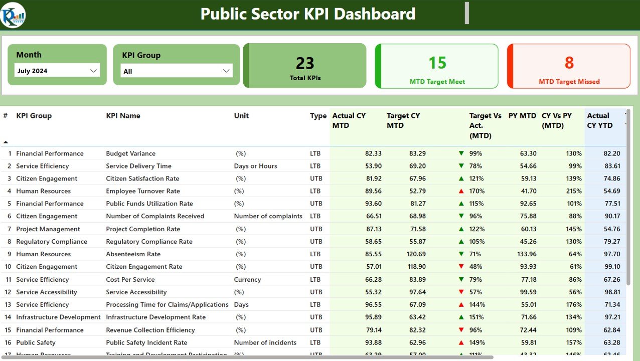
Summary Page
This is the central hub of the dashboard, providing an overview of the key metrics and KPIs for the selected period.
- Slicers: The page includes two slicers at the top for selecting the month and KPI group, which helps to filter the data and make it easier to analyze specific KPIs.
- KPI Overview: The main section displays three key performance indicators:
- Total KPIs Count
- MTD (Month-to-Date) Target Met Count
- MTD Target Missed Count
- Detailed KPI Table: This table provides granular details for each KPI, such as:
- KPI Number: The unique identifier for each KPI.
- KPI Group: The category or type of KPI (e.g., Operational, Financial).
- KPI Name: The specific KPI being tracked.
- Unit of Measurement: The unit used to measure the KPI (e.g., dollars, percentage, number of cases).
- Type: Whether the KPI is “Lower the Better” (LTB) or “Upper the Better” (UTB).
- Actual CY MTD: The current year’s MTD value for the selected KPI.
- Target CY MTD: The target MTD value for the current year.
- MTD Icon: A visual indicator (▲ or ▼) that shows whether the KPI is above or below the target, using color coding (green for met targets, red for missed targets).
- Target vs. Actual (MTD): A percentage that compares the actual performance against the target for MTD.
- PY MTD: The MTD value from the previous year for comparison.
- CY vs. PY (MTD): A percentage that compares the current MTD value to the same period in the previous year.
- Actual CY YTD: The current year’s actual Year-to-Date (YTD) value.
- Target CY YTD: The target YTD value for the current year.
- YTD Icon: A similar visual indicator for YTD performance.
- Target vs. Actual (YTD): A percentage comparing YTD actuals against targets.
- PY YTD: The YTD value for the previous year.
- CY vs. PY (YTD): A percentage comparing the current YTD value to the previous year’s YTD performance.
Click to Purchase Public Sector KPI Dashboard in Power BI
KPI Trend Page
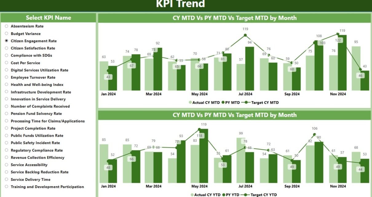
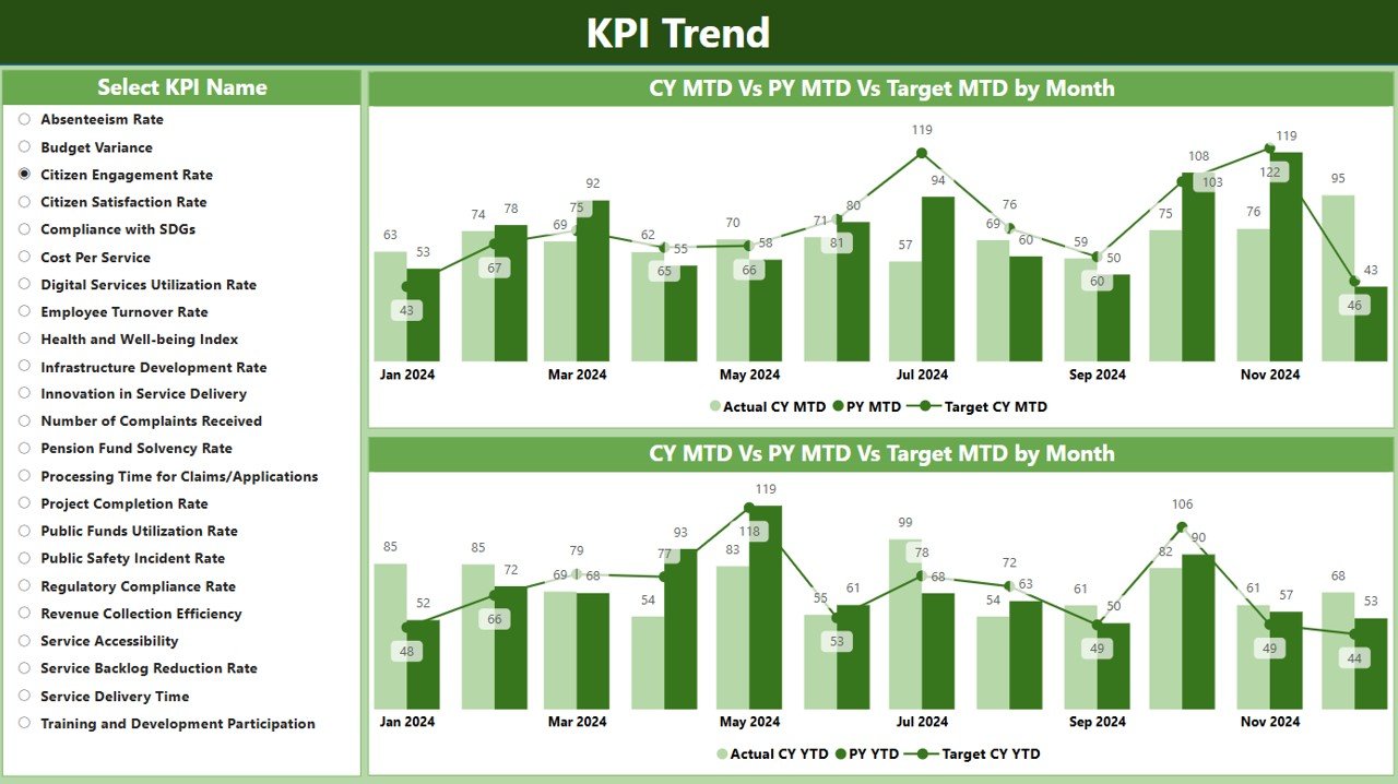
The KPI Trend Page provides a graphical representation of KPI data over time. This page includes:
- Combo Charts: Two combo charts display the actual values for both the current year and the previous year, alongside the target values for MTD and YTD.
- Slicer for KPI Selection: Users can select a specific KPI from a slicer on the left to focus the charts on a particular performance metric.
KPI Definition Page
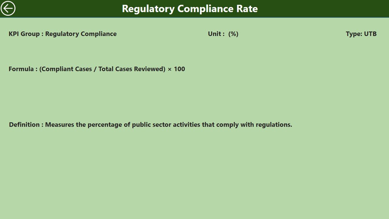
This page offers more in-depth information on each KPI. It is a drill-through page where users can click through from the summary page to see the detailed KPI definition, formulas, and other key information. The page is hidden by default but can be accessed with a back button for easy navigation.

Setting Up Your Dashboard
To set up the Advertising KPI Dashboard, follow these steps:
Excel Data Preparation:
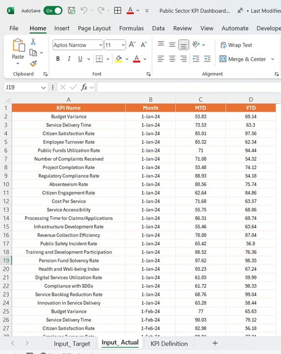
Input Actual Sheet Tab:
- Enter actual KPI values, including month, MTD, and YTD numbers.
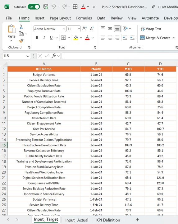
Input Target Sheet Tab:
- Fill in target KPI values similarly.
Click to Purchase Public Sector KPI Dashboard in Power BI
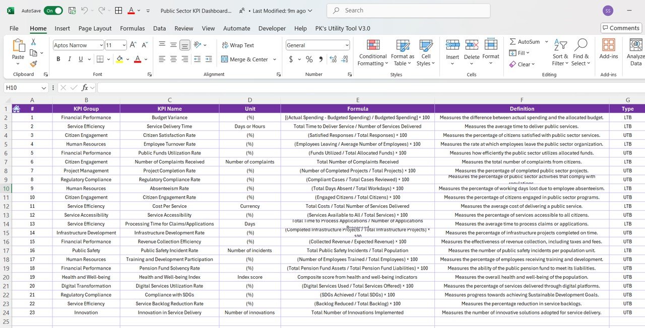
KPI Definition Tab:
- Input details like KPI Number, Group, Name, Unit, Formula, and Type.
Advantages of Using the Public Sector KPI Dashboard
Implementing a KPI dashboard in Power BI offers several key advantages for public sector organizations:
- Improved Decision Making: The dashboard allows public sector managers to quickly assess performance, compare actual values to targets, and make data-driven decisions. This leads to faster, more informed actions that improve efficiency and effectiveness in public service operations.
- Real-Time Data Access: With Power BI’s real-time data processing capabilities, users have access to up-to-date performance metrics, ensuring they are always working with the latest available information.
- Centralized Data: The integration of various data sources into a single dashboard simplifies the process of accessing and analyzing data, providing a holistic view of performance across multiple sectors.
- Enhanced Accountability: By tracking KPIs transparently, public sector organizations can hold individuals and teams accountable for performance. This can help in identifying areas where improvement is needed and ensuring that goals are being met.
Opportunity for Improvement in the Public Sector KPI Dashboard
While the Public Sector KPI Dashboard in Power BI offers many benefits, there are always opportunities to enhance its functionality and usability:
- Data Integration: Integrating data from additional systems such as HR, Finance, and Project Management could enhance the dashboard’s insights and provide a more comprehensive view of public sector performance.
- User Customization: Allowing users to personalize dashboards by adding custom KPIs or adjusting the layout to suit their needs could increase the dashboard’s value and improve user experience.
- Predictive Analytics: Adding predictive analytics capabilities could help forecast future performance trends, allowing public sector managers to proactively address potential issues before they arise.
- Mobile Compatibility: Ensuring the dashboard is optimized for mobile devices could make it more accessible for field staff and remote workers who need to access performance data on-the-go.
Best Practices for Implementing a Public Sector KPI Dashboard in Power BI
To ensure the dashboard delivers maximum value, public sector organizations should follow these best practices:
- Define Clear and Relevant KPIs: It’s crucial to select KPIs that are aligned with the organization’s goals and objectives. KPIs should be measurable, actionable, and relevant to the public sector’s mission.
- Regular Data Updates: Ensure that the data is regularly updated to reflect the most current performance metrics. This requires an efficient data input process and timely updates from all departments.
- Focus on Simplicity: Keep the dashboard layout clean and easy to navigate. Overloading the dashboard with too much information can overwhelm users and reduce its effectiveness.
- Train Users: Provide training to staff on how to use the dashboard effectively. Ensure they understand how to interpret the data and make informed decisions based on the information presented.
- Ensure Data Accuracy: The accuracy of the data displayed on the dashboard is critical. Set up processes to validate data and ensure consistency across different sources.
Conclusion
The Public Sector KPI Dashboard in Power BI is a powerful tool for improving performance management in public sector organizations. It provides real-time insights, fosters accountability, and enhances decision-making capabilities. By following best practices, addressing opportunities for improvement, and ensuring data accuracy, public sector entities can maximize the dashboard’s potential and drive better results.
Frequently Asked Questions (FAQs)
1. What is a Public Sector KPI Dashboard in Power BI?
A Public Sector KPI Dashboard in Power BI is a tool that helps track, monitor, and analyze the performance of key performance indicators (KPIs) within public sector organizations. It provides real-time data visualization and helps decision-makers make informed choices.
2. What data is required for the Public Sector KPI Dashboard?
The dashboard requires data in an Excel format, including actual and target numbers for each KPI, as well as KPI definitions and formulas. There are three main worksheets: Input_Actual, Input_Target, and KPI_Definition.
3. How does the KPI Trend page work?
The KPI Trend page uses combo charts to visualize the actual numbers for the current year and previous year, along with the targets for MTD and YTD. This helps users easily compare performance over time.
4. Can the dashboard be customized?
Yes, the dashboard can be customized to fit the specific needs of the public sector organization. Users can add new KPIs, adjust the layout, or integrate additional data sources for more comprehensive insights.
5. How do I navigate the KPI Definition page?
The KPI Definition page is a drill-through page that is hidden by default. Users can access it by clicking on a specific KPI in the Summary page, where they can view detailed information such as the KPI formula and definition.
Visit our YouTube channel to learn step-by-step video tutorials
