Transportation management plays a pivotal role in ensuring the seamless flow of goods and services. It allows businesses to track the performance of their logistics operations, measure efficiency, and optimize resources. With the advent of modern technologies, Power BI has become a vital tool for businesses looking to visualize key performance indicators (KPIs) in real-time.
In this article, we will delve into the Transportation KPI Dashboard in Power BI, focusing on its features, advantages, best practices, and opportunities for improvement. We will also answer frequently asked questions to help you better understand how to use this tool to enhance your transportation operations.
What is a Transportation KPI Dashboard in Power BI?
A Transportation KPI Dashboard in Power BI is a ready-to-use solution designed to track and analyze performance in the transportation industry. By collecting data from various sources, this dashboard provides a comprehensive view of key metrics related to transportation operations. From monitoring the on-time delivery rate to tracking fuel efficiency, the dashboard offers insights that allow businesses to make data-driven decisions.
This dashboard leverages the power of Power BI to visualize the key performance indicators (KPIs) that are essential to transportation management. Through intuitive charts, tables, and slicers, businesses can gain insights into both historical and real-time performance.
Key Features of the Transportation KPI Dashboard in Power BI
The Transportation KPI Dashboard is designed with three key pages in Power BI, each providing a different aspect of performance. Below are the key features of the dashboard:
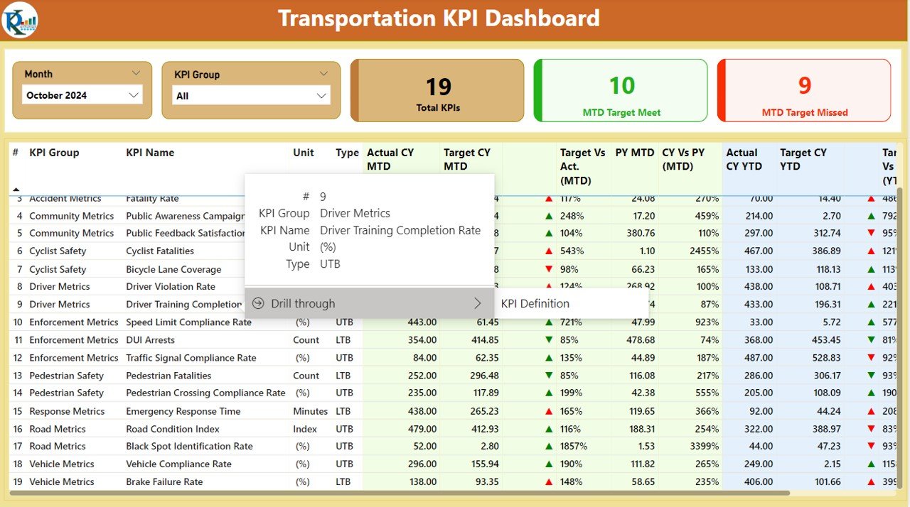
Summary Page
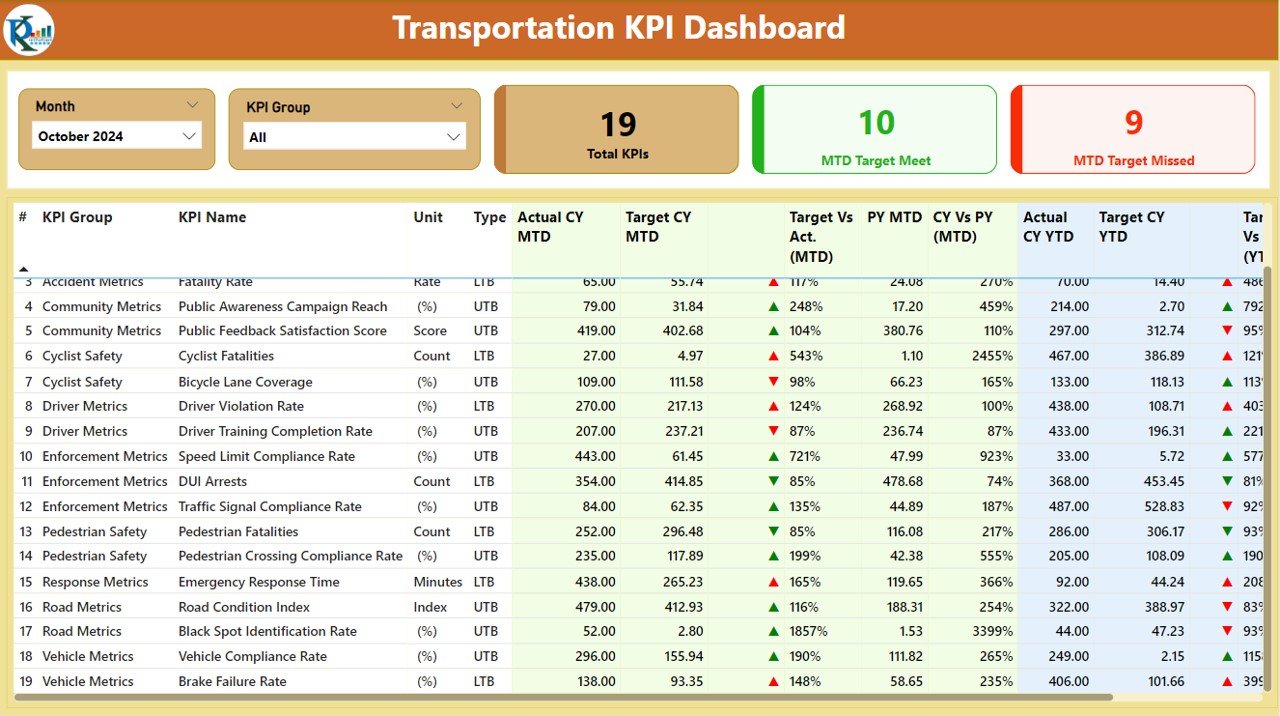
The Summary Page is the main hub of the dashboard. It provides an overview of the transportation KPIs and is equipped with a series of slicers to filter data according to different time periods and KPI groups.
KPIs Overview: The page displays three main cards showing:
- Total KPIs Count
- MTD Target Met Count
- MTD Target Missed Count
Detailed KPI Table: Below the cards, you’ll find a detailed table with the following columns:
- KPI Number: A sequential number assigned to each KPI.
- KPI Group: The category to which the KPI belongs.
- KPI Name: The specific name of the KPI.
- Unit: The unit of measurement for the KPI.
- Type: Whether the KPI is ‘Lower the Better’ (LTB) or ‘Upper the Better’ (UTB).
- Actual CY MTD: The actual value for the current year Month-to-Date (MTD).
- Target CY MTD: The target value for the current year MTD.
- MTD Icon: A green (▲) or red (▼) icon indicating the KPI’s status against the target for MTD.
- Target vs. Actual (MTD): The percentage comparison between the actual and target values for MTD.
- PY MTD: The Month-to-Date value for the same period last year.
- CY vs. PY (MTD): The percentage comparison between the current year’s MTD actual and last year’s MTD actual.
- Actual CY YTD: The actual Year-to-Date (YTD) value for the current year.
- Target CY YTD: The target YTD value for the current year.
- YTD Icon: A green (▲) or red (▼) icon indicating the KPI’s status against the target for YTD.
- Target vs. Actual (YTD): The percentage comparison between the actual and target values for YTD.
- PY YTD: The YTD value for the same period last year.
- CY vs. PY (YTD): The percentage comparison between the current year’s YTD actual and last year’s YTD actual.
Click to buy Transportation KPI Dashboard in Power BI
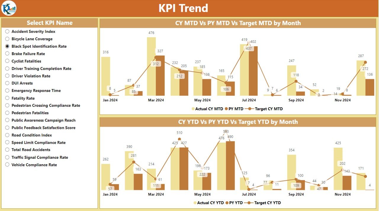
KPI Trend Page
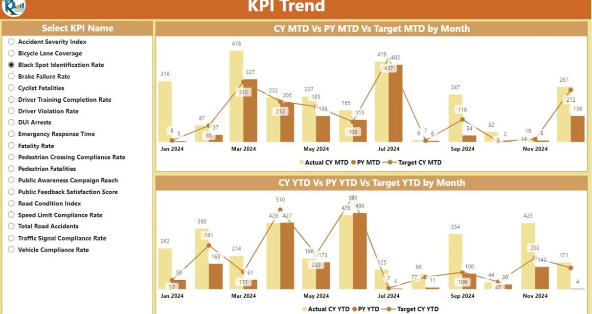
The KPI Trend Page provides a detailed view of performance over time. This page includes:
- Combo Charts: The page displays two combo charts showing the actual numbers for the current year, previous year, and targets for both MTD and YTD.
- Slicers: A slicer on the left allows users to select different KPIs, making it easier to focus on specific metrics.
Click to buy Transportation KPI Dashboard in Power BI
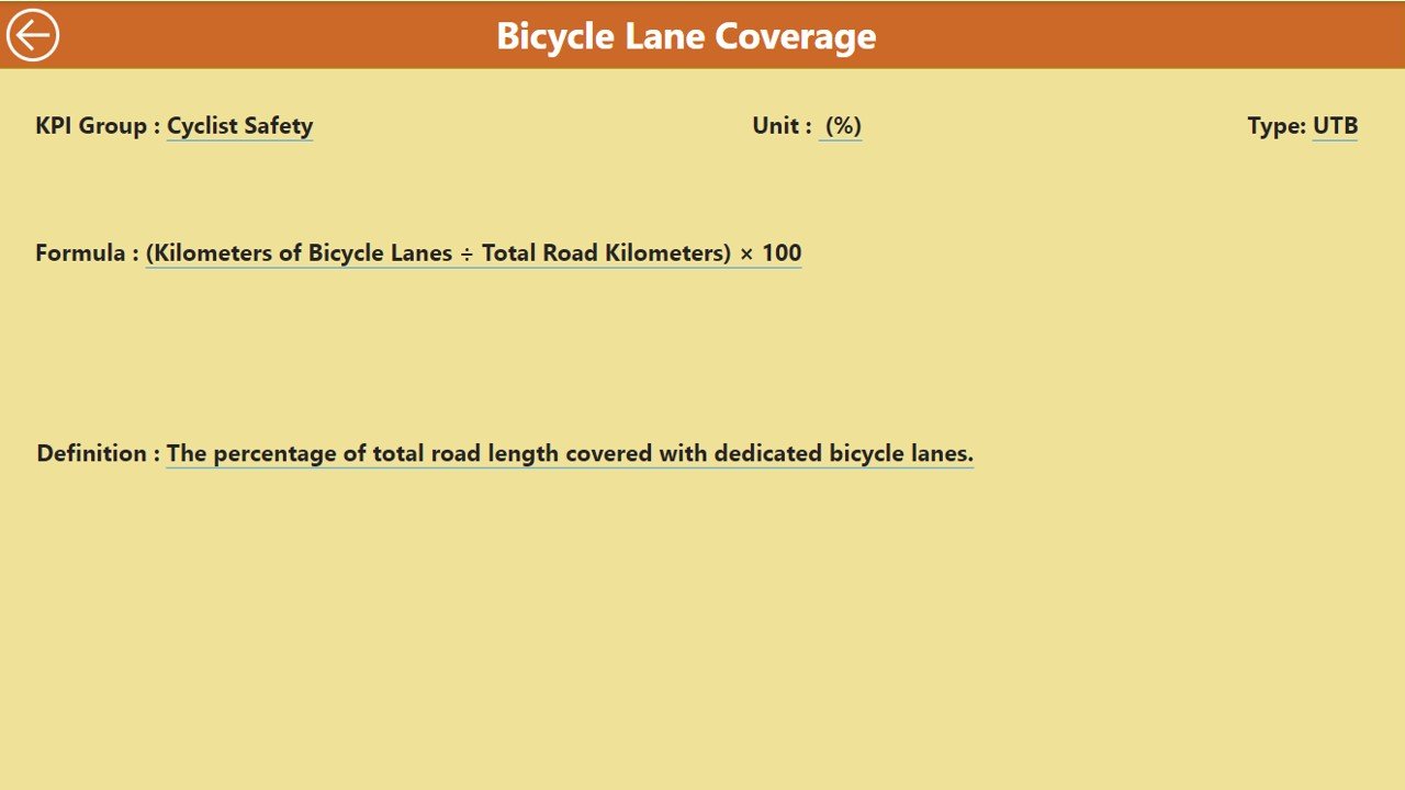
KPI Definition Page
The KPI Definition Page is a drill-through page that provides in-depth details about each KPI. This page is hidden by default but can be accessed by drilling through from the Summary Page. It includes:
Click to buy Transportation KPI Dashboard in Power BI
- KPI Formula
- KPI Definition
Users can easily navigate back to the Summary Page using the back button available in the top-left corner.
Click to buy Transportation KPI Dashboard in Power BI
Advantages of the Transportation KPI Dashboard in Power BI
Using a Transportation KPI Dashboard in Power BI offers numerous advantages for businesses in the transportation sector. Below are some key benefits:
- Real-Time Insights: Power BI enables users to visualize data in real-time, allowing businesses to monitor performance and make adjustments on the fly. By tracking KPIs such as on-time deliveries, fuel efficiency, and cost per mile, businesses can respond quickly to emerging issues.
- Data-Driven Decision Making: With the ability to aggregate data from various sources, the dashboard helps businesses make informed decisions. Managers can track trends and performance metrics, which aids in resource optimization and cost reduction.
- Increased Operational Efficiency: The dashboard’s visual elements allow for quick identification of areas that need improvement. Businesses can use this data to streamline operations, reduce delays, and optimize routes.
- Improved Reporting: By consolidating KPIs into a single dashboard, the reporting process becomes simpler and more efficient. Managers can create customized reports and share insights with stakeholders in a clear and concise manner.
- Customization and Flexibility: Power BI offers customization options, allowing users to tailor the dashboard to meet specific business needs. Whether it’s adjusting the KPIs, adding new metrics, or incorporating new data sources, the dashboard can be modified as required.
Opportunities for Improvement in Transportation KPI Dashboards
While the Transportation KPI Dashboard in Power BI provides powerful insights, there are always opportunities for improvement. Here are some areas where businesses can enhance their dashboard usage:
- Data Integration: One potential improvement is integrating additional data sources, such as GPS tracking or weather data. By doing so, businesses can track variables like route efficiency, traffic conditions, and weather impact on deliveries.
- Predictive Analytics: Incorporating predictive analytics into the dashboard could help businesses forecast performance trends, such as predicting delays or identifying potential issues before they occur.
- Mobile Compatibility: Making the dashboard mobile-friendly can provide greater accessibility for users on the go. This would allow drivers, fleet managers, and other personnel to access real-time data from anywhere, improving decision-making in the field.
- User Training: While Power BI is user-friendly, ensuring that all team members are fully trained in using the dashboard can unlock its full potential. Regular training sessions can help employees understand how to interpret the data and take necessary actions.
Best Practices for Using a Transportation KPI Dashboard in Power BI
To maximize the benefits of the Transportation KPI Dashboard, it is important to follow best practices. Here are some tips to get the most out of your dashboard:
- Define Clear KPIs: Ensure that the KPIs you choose align with your business goals. KPIs like on-time delivery, cost per mile, and fleet utilization are great starting points, but you should tailor them to fit your specific operations.
- Keep the Dashboard Simple: Avoid cluttering the dashboard with too much data. Focus on the most important KPIs and present them in an easily digestible format. Power BI offers a variety of visualizations that can make complex data more accessible.
- Regularly Update the Data: For accurate and up-to-date insights, ensure that the data is updated regularly. Whether you are pulling data from an Excel file or an API, setting up an automated process for data updates will improve the reliability of the dashboard.
- Use Drill-Down Features: Leverage Power BI’s drill-down capabilities to get deeper insights into specific KPIs. By drilling down into a KPI, you can uncover the root causes of performance issues and identify opportunities for improvement.
- Share Insights with Stakeholders: Share your findings with key stakeholders in your organization to drive collaboration and decision-making. Power BI makes it easy to share dashboards with decision-makers, ensuring that everyone has access to the same data.
Conclusion
The Transportation KPI Dashboard in Power BI is a powerful tool that allows businesses to track and analyze their transportation operations. By offering real-time insights, improved reporting, and operational efficiency, this dashboard helps organizations make data-driven decisions that lead to cost savings and better performance. However, continuous improvements, such as better data integration and mobile compatibility, can further enhance its value.
Frequently Asked Questions (FAQs)
What KPIs should be tracked in a Transportation KPI Dashboard?
Key KPIs for transportation include on-time delivery rate, fuel efficiency, cost per mile, fleet utilization, and accident rate. These metrics help businesses monitor efficiency and reduce costs.
How can I update data in the Transportation KPI Dashboard?
Data can be updated by modifying the Excel sheets linked to the dashboard. Ensure that the actual and target values for each KPI are regularly entered to maintain accurate reporting.
Can I customize the Transportation KPI Dashboard?
Yes, Power BI allows users to customize the dashboard by adding new KPIs, modifying the layout, and integrating additional data sources to meet specific business needs.
How can I share the Transportation KPI Dashboard with my team?
Power BI makes it easy to share dashboards with team members by publishing them to the Power BI service. You can also export reports to Excel or PDF for easy distribution.
Is the Transportation KPI Dashboard mobile-friendly?
While Power BI is not natively optimized for mobile devices, users can access their dashboards on mobile apps. However, for optimal experience, consider creating a mobile-compatible version of the dashboard.
Visit our YouTube channel to learn step-by-step video tutorials
View this post on Instagram
Click to buy Transportation KPI Dashboard in Power BI
