The aerospace industry is highly dynamic, with constant challenges in meeting performance targets, maintaining safety standards, and optimizing operational efficiency. To navigate these complexities, businesses need tools that provide real-time insights into their operations, allowing them to make data-driven decisions. One such tool is the Aerospace KPI Dashboard in Power BI.
In this comprehensive guide, we will explore the features of the Aerospace KPI Dashboard in Power BI, its benefits, opportunities for improvement, and best practices. We’ll also answer common questions to help you leverage this tool effectively for tracking your aerospace key performance indicators (KPIs).
What is an Aerospace KPI Dashboard in Power BI?
The Aerospace KPI Dashboard in Power BI is a ready-to-use solution designed to help businesses in the aerospace industry track, analyze, and visualize their KPIs. This dashboard integrates data from multiple sources, providing a unified view of important metrics, such as aircraft performance, maintenance efficiency, flight schedules, and safety compliance. With Power BI’s powerful data visualization capabilities, businesses can gain real-time insights into their operations, identify bottlenecks, and optimize performance.
The dashboard is customizable and designed to fit the unique needs of the aerospace industry. Whether you’re tracking flight delays, fuel consumption, or maintenance costs, this dashboard provides a clear, intuitive interface for analyzing and reporting your KPIs.
Key Features of the Aerospace KPI Dashboard in Power BI
The Aerospace KPI Dashboard in Power BI is structured with three main pages that provide different views of the data. Below are the key features of each page:
Summary Page
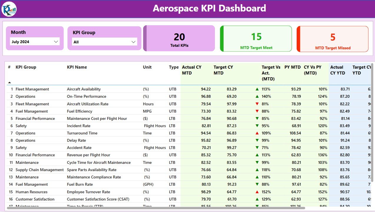
The Summary Page is the core of the dashboard, offering an overview of all key metrics. It is designed to provide a high-level snapshot of the performance of various KPIs.
Slicers: The page includes slicers for filtering data by month and KPI group, allowing users to customize their view.
KPIs Overview Cards: Three main cards are displayed at the top to show:
- Total KPIs Count
- MTD Target Met Count
- MTD Target Missed Count
Detailed KPI Table: Below the cards, a detailed table presents the following information:
- KPI Number: A sequential identifier for each KPI.
- KPI Group: The category or group of the KPI.
- KPI Name: The specific name of each KPI.
- Unit: The unit of measurement for the KPI.
- Type: Whether the KPI is ‘Lower the Better’ (LTB) or ‘Upper the Better’ (UTB).
- Actual CY MTD: The actual value for the current year’s Month-to-Date (MTD).
- Target CY MTD: The target value for the current year’s MTD.
- MTD Icon: A red or green icon (▼ or ▲) indicating whether the KPI has met the target for the MTD.
- Target vs. Actual (MTD): A percentage comparison of actual vs. target values for the MTD.
- PY MTD: The MTD number for the same period in the previous year.
- CY vs PY (MTD): A percentage comparison between the current year’s MTD and the previous year’s MTD.
- Actual CY YTD: The actual Year-to-Date (YTD) value for the current year.
- Target CY YTD: The target YTD value for the current year.
- YTD Icon: A green or red icon indicating whether the KPI has met the YTD target.
- Target vs. Actual (YTD): A percentage comparison of actual vs. target values for the YTD.
- PY YTD: The YTD number for the same period last year.
- CY vs PY (YTD): A percentage comparison of current YTD performance against the previous year’s YTD.
Click to buy Aerospace KPI Dashboard in Power BI
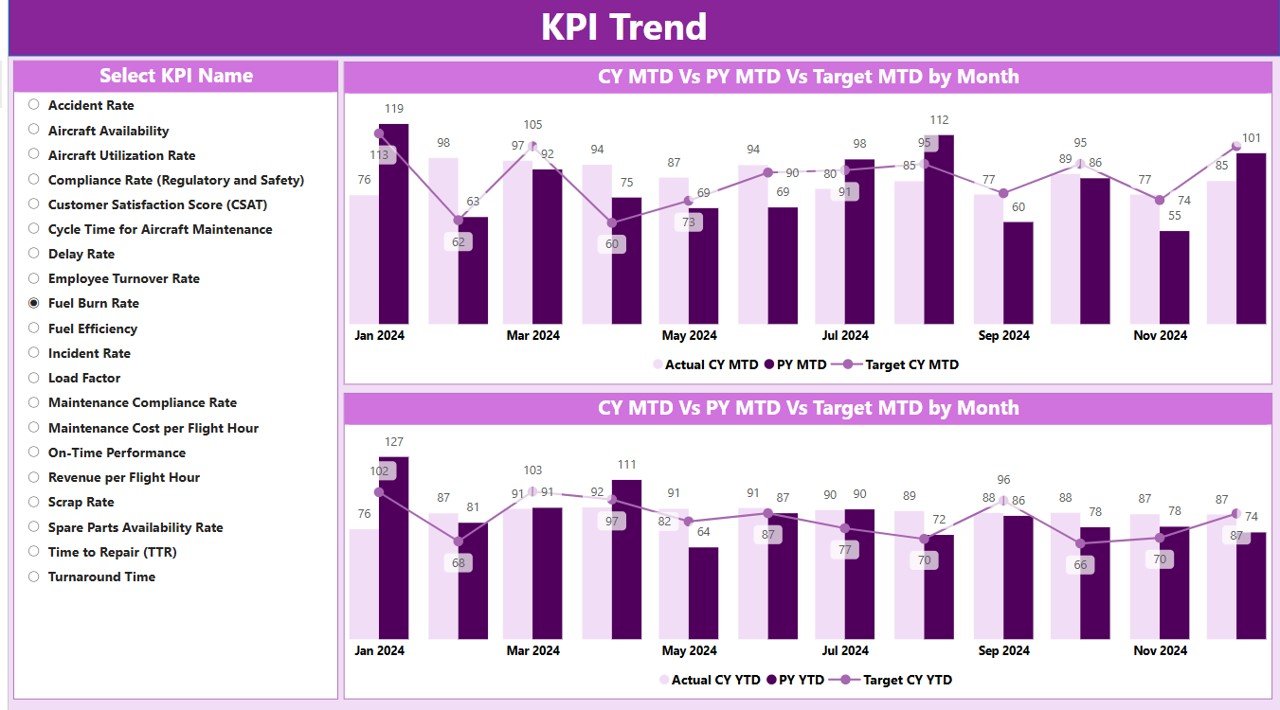
KPI Trend Page
The KPI Trend Page provides a detailed view of how each KPI is performing over time. The page features:
- Combo Charts: These charts display the actual numbers for the current year, previous year, and targets for both MTD and YTD, providing a visual comparison of performance trends.
- Slicer: A slicer is available on the left side of the page, allowing users to select and view individual KPIs.
Click to buy Aerospace KPI Dashboard in Power BI
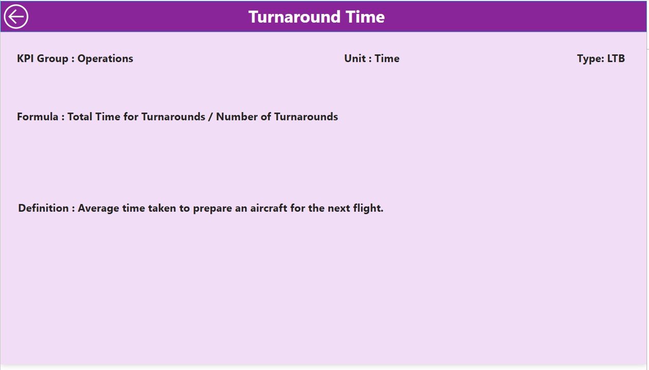
KPI Definition Page
The KPI Definition Page is a drill-through feature that provides deeper insights into each KPI, including:
- KPI Formula: The formula used to calculate each KPI.
- KPI Definition: A detailed explanation of each KPI’s significance and how it impacts the overall performance of the aerospace operation.
Click to buy Aerospace KPI Dashboard in Power BI
The KPI Definition Page is hidden by default, but users can access it by drilling through from the Summary Page. To return to the main page, simply click on the back button at the top left corner.

Click to buy Aerospace KPI Dashboard in Power BI
Advantages of the Aerospace KPI Dashboard in Power BI
Using the Aerospace KPI Dashboard in Power BI provides several advantages for businesses in the aerospace industry:
- Real-Time Data Analysis: The dashboard provides real-time insights into performance, allowing businesses to monitor KPIs as they occur. This enables quick decision-making and the ability to take immediate corrective actions when necessary.
- Improved Decision-Making: The dashboard consolidates key data in an easy-to-understand format, helping managers and executives make data-driven decisions. By tracking important metrics like aircraft availability, on-time performance, and maintenance costs, businesses can optimize their operations.
- Enhanced Operational Efficiency: With the dashboard’s visual elements, businesses can identify trends, bottlenecks, and inefficiencies. This leads to better resource allocation, improved fleet utilization, and reduced operational costs.
- Customizable and Flexible: Power BI allows for easy customization of the dashboard to meet the specific needs of the aerospace industry. Users can add or modify KPIs, adjust the layout, and integrate additional data sources to enhance the dashboard’s functionality.
- Easy Reporting and Sharing: The dashboard simplifies reporting by providing pre-configured views that can be customized for different stakeholders. Reports can be easily shared with team members, helping foster collaboration and keeping everyone on the same page.
Opportunities for Improvement in Aerospace KPI Dashboards
While the Aerospace KPI Dashboard in Power BI is an incredibly powerful tool, there are always opportunities to improve its usage and functionality. Below are a few potential areas for improvement:
- Data Integration: Integrating more data sources, such as weather data, flight path information, and real-time tracking systems, could provide a more comprehensive view of operations. This integration could help businesses predict delays, optimize flight routes, and monitor the impact of weather on operations.
- Predictive Analytics: Incorporating predictive analytics into the dashboard could help businesses forecast trends and performance issues before they arise. For example, businesses could predict maintenance needs based on historical data and usage patterns.
- Mobile Compatibility: While Power BI dashboards can be accessed on mobile devices, making the dashboard fully optimized for mobile usage can increase accessibility for field agents, pilots, and crew members. Mobile compatibility will allow team members to access real-time data while on the go, improving decision-making in the field.
- User Training and Support: To ensure the full potential of the dashboard is realized, businesses should invest in regular training for their staff. Providing hands-on training and support ensures that all team members can interpret data and make informed decisions.
Best Practices for Using the Aerospace KPI Dashboard in Power BI
To get the most out of your Aerospace KPI Dashboard in Power BI, follow these best practices:
- Define Clear KPI: Before implementing the dashboard, define the KPIs that are most important to your operations. Focus on metrics like on-time performance, aircraft utilization, fuel efficiency, and maintenance costs. These KPIs should align with your business goals.
- Keep the Dashboard Simple and Focused: Avoid cluttering the dashboard with too much data. Focus on the most critical KPIs and present them in an easy-to-read format. Power BI offers various visualization options that help make data more accessible and digestible.
- Regularly Update Data: Ensure that the data in the dashboard is updated regularly. Set up an automated process to import data from your various systems so that you always have access to the most accurate and up-to-date information.
- Use Drill-Down Features for Deeper Insights: Leverage Power BI’s drill-down capabilities to explore the root causes of performance issues. By drilling down into specific KPIs, you can gain deeper insights into how each factor influences the overall performance.
- Share Insights Across Teams: Ensure that key stakeholders, from executives to field personnel, have access to the dashboard. Power BI makes it easy to share insights and reports with others, helping to foster collaboration and ensure everyone is on the same page.
Conclusion
The Aerospace KPI Dashboard in Power BI is an essential tool for businesses in the aerospace industry. It provides real-time insights into key metrics, improves decision-making, and enhances operational efficiency. With its customizable features, businesses can track performance, monitor trends, and optimize resources, ultimately leading to cost savings and better outcomes.
By following the best practices, integrating more data sources, and continually optimizing the dashboard, businesses can unlock even greater value from their aerospace operations.
Frequently Asked Questions (FAQs)
What KPIs should be tracked in an Aerospace KPI Dashboard?
Key KPIs for aerospace operations include aircraft availability, on-time performance, fuel efficiency, maintenance costs, and flight delays. These metrics help businesses monitor and improve efficiency.
How can I update the data in the Aerospace KPI Dashboard?
The data can be updated by modifying the Excel sheets linked to the dashboard. Ensure that both actual and target values for each KPI are regularly entered to maintain accurate reporting.
Can I customize the Aerospace KPI Dashboard?
Yes, Power BI allows users to customize the dashboard by adding new KPIs, adjusting the layout, and integrating other data sources. This ensures that the dashboard meets your specific needs.
How can I share the Aerospace KPI Dashboard with my team?
You can share the dashboard through Power BI’s sharing features. Additionally, reports can be exported to Excel or PDF for easy distribution.
Is the Aerospace KPI Dashboard mobile-friendly?
While Power BI is not optimized for mobile devices by default, users can access their dashboards on mobile apps. Consider making the dashboard mobile-compatible for improved accessibility in the field.
Visit our YouTube channel to learn step-by-step video tutorials
View this post on Instagram
Click to buy Aerospace KPI Dashboard in Power BI
