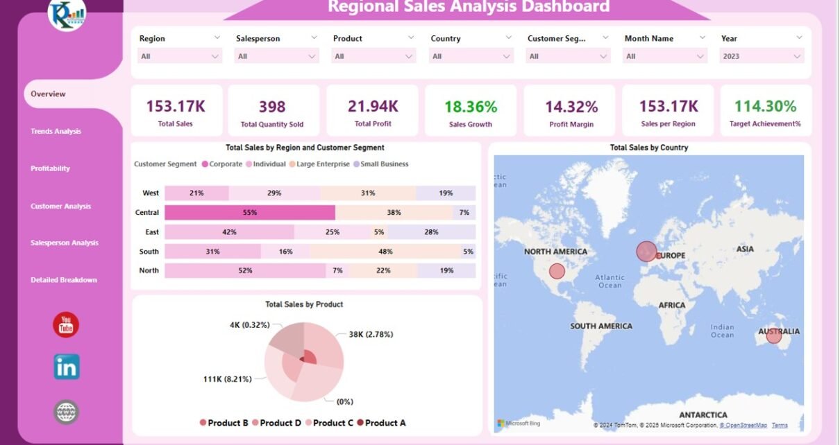
In today’s data-driven business environment, understanding and optimizing sales across various regions is crucial for sustaining growth and maintaining competitiveness. A Regional Sales Analysis Dashboard in Power BI provides a dynamic tool to visualize and analyze sales data efficiently. This dashboard captures data from an Excel file, integrating it into Power BI to create a comprehensive view of sales metrics and trends across different dimensions.
Key Features of the Regional Sales Analysis Dashboard
Page Navigator
Located on the left side of the dashboard, the Page Navigator feature facilitates effortless navigation through different analytical pages, ensuring that users can easily access the insights they need without hassle.
Overview Page
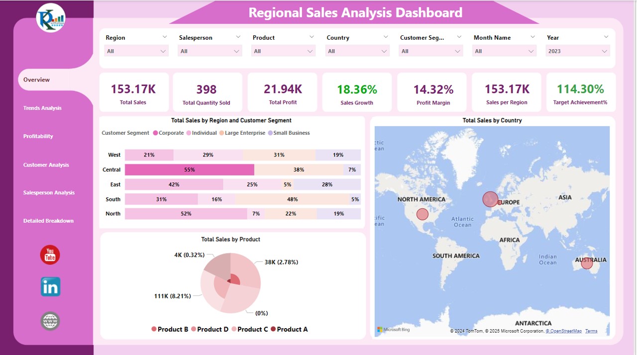
The Overview Page is the heart of the dashboard, featuring seven slicers for Region, Salesperson, Product, Country, Customer Segment, Month Name, and Year. Key metrics displayed on this page include:
- Total Sales: A card showing the sum of all sales.
- Total Quantity Sold: Highlights the total units sold.
- Total Profit: Represents the net profit earned.
- Sales Growth: Tracks the growth in sales over time.
- Profit Margin: Displays the profit percentage.
- Sales Per Region: Analyzes sales distributed across different regions.
- Target Achievement %: Shows the percentage of sales targets achieved.
Visualizations on this page include:
- Total Sales by Region and Customer Segment: Displayed as a 100% Stacked Bar Chart.
- Total Sales by Country: Visualized using a Map to pinpoint sales distribution geographically.
- Total Sales by Product: Presented through a Pie Chart for a clear product-wise sales distribution.
Trends Analysis Page
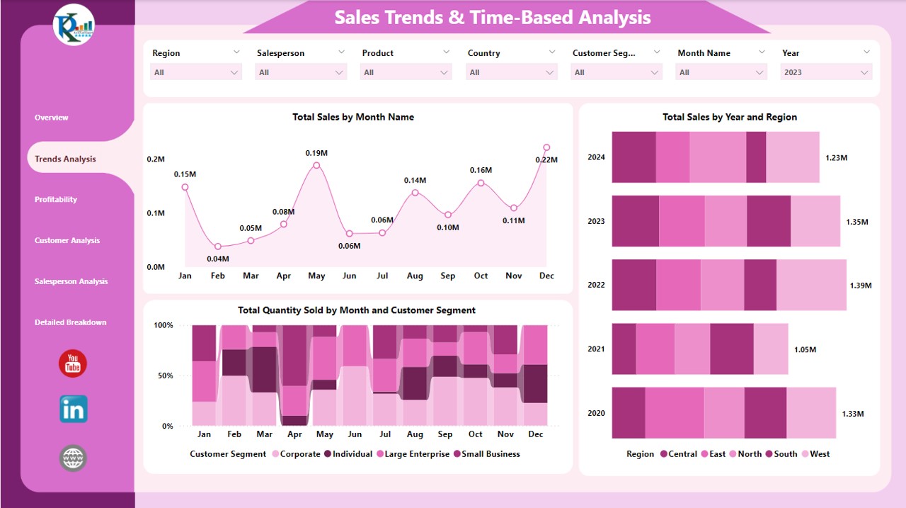
This page allows users to delve deeper into the sales data over time and across various categories using the same seven slicers. Charts on this page include:
- Total Sales by Month Name: Visualized through an Area Chart to show trends over time.
- Total Sales by Year and Region: Displayed as a Stacked Bar Chart to compare yearly sales across regions.
- Total Quantity Sold by Month and Customer Segment: Illustrated by a 100% Stacked Column Bar Chart to highlight sales volume trends.
Profitability Page
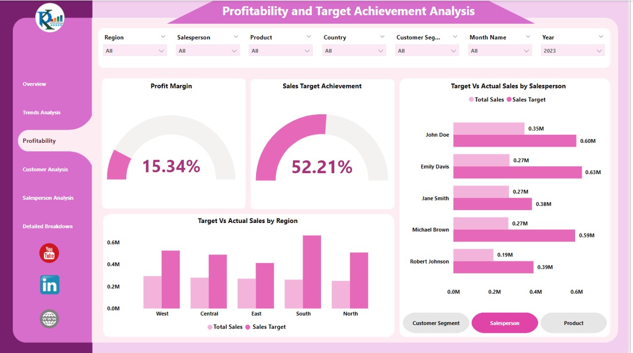
The Profitability Page focuses on financial metrics and includes:
- Profit Margin Gauge Chart: Provides a quick visual reference to the profit margins.
- Sales Target Achievement Gauge Chart: Shows how well sales targets are being met.
- Target Vs Actual Sales by Salesperson: Visualized using a Clustered Bar Chart.
- Target Vs Actual Sales by Region: Displayed as a Clustered Column Chart to compare targets against actual sales.
Customer Analysis Page
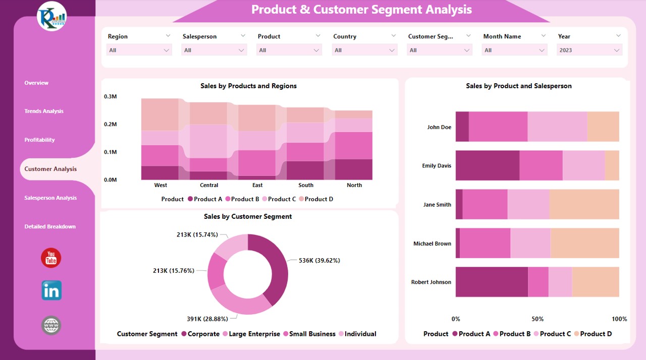
Analyzing customer segments and product performance, this page features:
- Sales by Products and Regions: A Stacked Column Chart providing insights into which products are selling where.
- Sales by Product and Salesperson: Shown as a 100% Stacked Bar Chart to evaluate individual salesperson performance.
- Sales by Customer Segment: Visualized using a Donut Chart for a quick look at which segments are most profitable.
Salesperson Analysis Page
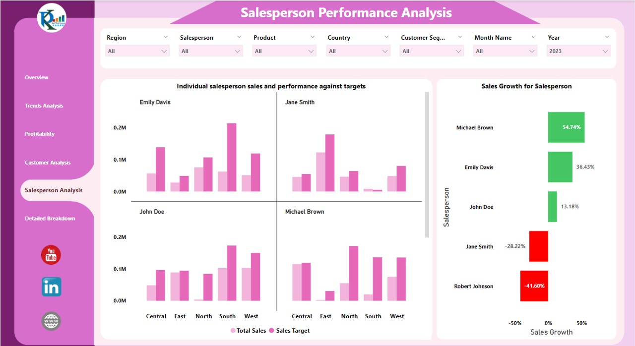
Dedicated to evaluating individual and overall salesperson performance, this page includes:
- Individual Salesperson Sales and Performance Against Targets: Illustrated through a Multiple Clustered Column Chart.
- Sales Growth for Salesperson: Displayed as a Clustered Bar Chart to track growth.
Detailed Breakdown Page
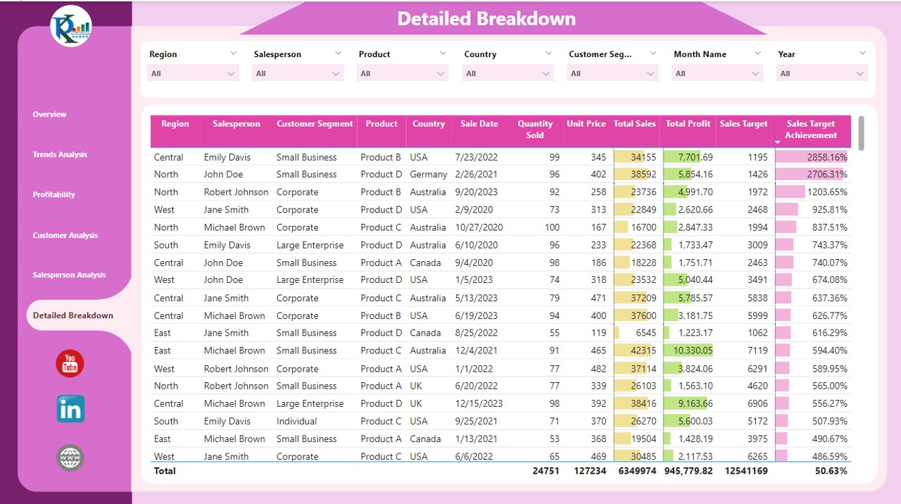
- The most granular view of the data, this page contains a detailed table listing sales by Region, Salesperson, Customer Segment, Product, and more. It includes columns for Quantity Sold, Unit Price, Total Sales, Total Profit, and Sales Target, among others.
Advantages of a Regional Sales Analysis Dashboard in Power BI
- Enhanced Decision Making: Provides real-time data visualization to support strategic decisions.
- Increased Productivity: Reduces time spent on data processing and analysis.
- Customizable Views: Offers various filters and controls to customize data views according to specific needs.
- Improved Sales Strategies: Helps identify trends and patterns that can optimize sales tactics and approaches.
Best Practices for Implementing a Regional Sales Analysis Dashboard
- Regular Data Updates: Ensure the data fed into the dashboard is updated regularly to maintain accuracy.
- Training for Users: Conduct training sessions for users to maximize the dashboard’s utility.
- Feedback Loop: Implement a feedback system to continuously improve the dashboard based on user experience.
- Security Measures: Keep the data secure, especially when integrating sensitive sales information.
Frequently Asked Questions with Answers
Q: How often should the dashboard be updated?
A: Update the dashboard as frequently as new data becomes available or at a minimum, at the end of every sales cycle.
Q: Can the dashboard be customized for different regions?
A: Yes, the dashboard can be customized with specific slicers for different regions to provide localized insights.
Q: What are the system requirements for using this dashboard?
A: The dashboard requires Power BI Desktop for creation and Power BI Service for sharing and collaboration. A stable internet connection is also essential for accessing real-time data.
Visit our YouTube channel to learn step-by-step video tutorials
