The Library Services KPI Dashboard is a highly effective tool designed to track and evaluate the key performance indicators (KPIs) of library services. This ready-to-use dashboard template offers a powerful way to streamline library operations, measure performance, and ensure that library services are being delivered efficiently.
In this article, we’ll explore the Library Services KPI Dashboard, its features, and the essential KPIs it includes. We’ll also discuss best practices, opportunities for improvement, and how to make the most of this tool to optimize your library’s performance.
What is a Library Services KPI Dashboard?
A Library Services KPI Dashboard is a visual representation of key metrics that help library management assess various aspects of their services. These KPIs can cover areas such as library usage, customer satisfaction, resource allocation, and operational efficiency. The dashboard provides real-time data, helping libraries monitor performance, compare it with past data, and make informed decisions for improvement.
Key Features of the Library Services KPI Dashboard
The Library Services KPI Dashboard comes with seven distinct worksheets, each serving a specific purpose to help manage KPIs efficiently:
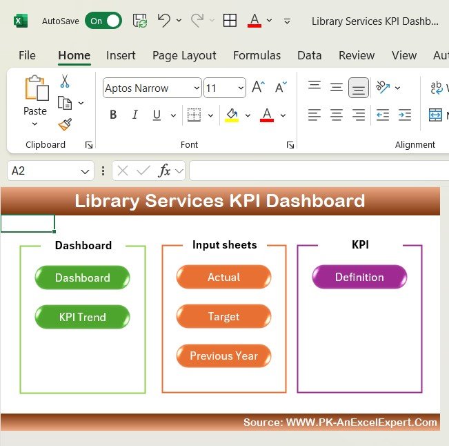
1. Home Sheet
The Home Sheet acts as an index for easy navigation. It contains six buttons that allow you to jump to the respective sheets. This centralizes the control and makes it easier to access different sections of the dashboard quickly.
Click to buy Library Services KPI Dashboard in Excel
2. Dashboard Sheet Tab
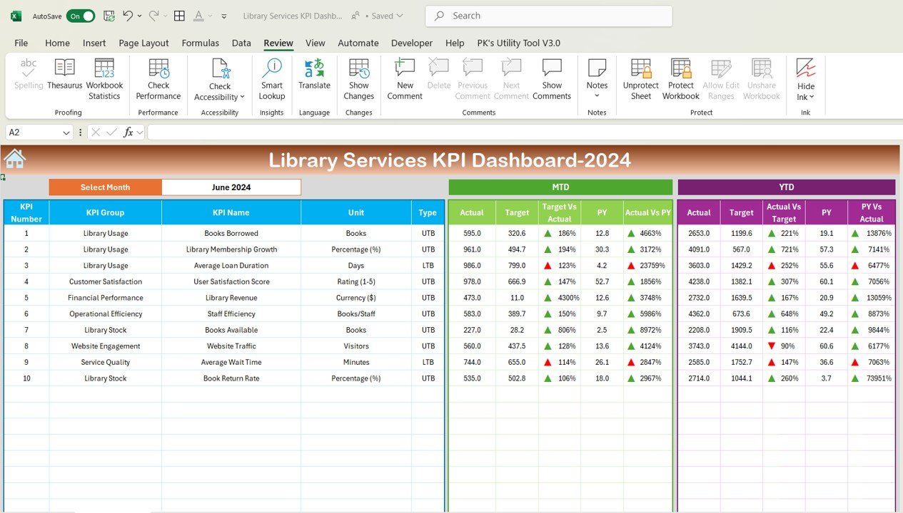
This is the main sheet where the KPIs are displayed. It provides an overview of MTD (Month-to-Date) and YTD (Year-to-Date) performance, as well as comparisons with the previous year’s data. You can select the month from a dropdown in cell D3, which dynamically updates the data on the dashboard.
Key features of this sheet:
- MTD Actual, Target, Previous Year Data are shown with Target vs Actual and Previous Year vs Actual comparisons, using conditional formatting for easy visualization (up and down arrows).
- YTD Actual, Target, Previous Year Data follow the same format as MTD, providing a comprehensive year-to-date comparison.
Click to buy Library Services KPI Dashboard in Excel
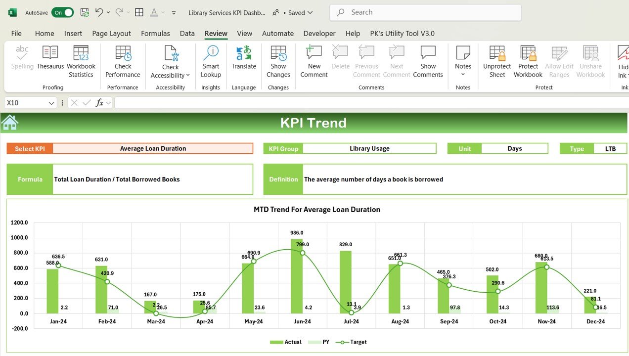
3. KPI Trend Sheet Tab
The KPI Trend Sheet allows you to track the trends of specific KPIs over time. You can select the KPI name from a dropdown (cell C3), and the dashboard will display the relevant KPI information:
- KPI Group
- Unit of KPI
- Type of KPI (whether it’s “Lower the Better” or “Upper the Better”)
- Formula of the KPI
- Definition of the KPI
Click to buy Library Services KPI Dashboard in Excel
4. Actual Number Sheet Tab
In this sheet, you enter the actual numbers for MTD and YTD based on the current month. The month is selectable via range E1, allowing you to update the data for any month as required.

Click to buy Library Services KPI Dashboard in Excel
5. Target Sheet Tab
This tab is used to enter the target values for each KPI for both MTD and YTD. It enables you to set the target goals and track progress effectively.

Click to buy Library Services KPI Dashboard in Excel
6. Previous Year Number Sheet Tab
Here, you enter the numbers for the previous year that correspond to the current year’s KPIs. This is useful for comparing performance with last year and identifying trends or areas for improvement.

Click to buy Library Services KPI Dashboard in Excel
7. KPI Definition Sheet Tab
The KPI Definition sheet provides a place to enter:
- KPI Name
- KPI Group
- Unit
- Formula
- KPI Definition

Click to buy Library Services KPI Dashboard in Excel
This ensures that all KPIs are properly defined and standardized across the dashboard.
Advantages of Using the Library Services KPI Dashboard
The Library Services KPI Dashboard offers several advantages, making it an invaluable tool for managing library performance:
- Data-Driven Decisions: By tracking key metrics, the dashboard helps in making informed decisions based on real-time data.
- Performance Tracking: You can easily monitor how well the library is performing in different areas, such as customer satisfaction, resource usage, and operational efficiency.
- Easy Comparisons: With the comparison of current performance against past data (MTD, YTD, and Previous Year), you can quickly identify trends and areas that need attention.
- User-Friendly Interface: The dashboard’s design is intuitive, making it easy for anyone to navigate and understand the data.
- Time-Saving: It reduces the manual effort of tracking and consolidating data, allowing library staff to focus on more important tasks.
Opportunities to Improve Library Services KPI Dashboard
While the Library Services KPI Dashboard is a powerful tool, there are always opportunities to enhance its effectiveness:
- Customization: Allow users to add custom KPIs that are relevant to their specific library needs. Libraries may have unique services or operations that could benefit from tailored KPIs.
- Automation: Consider integrating the dashboard with other library management systems to automate the data input process, reducing errors and manual labor.
- Real-Time Data Integration: Use integration with real-time data sources to update KPIs instantly, rather than relying on periodic manual updates.
- Advanced Analytics: Add advanced analytics features, such as predictive modeling or trend forecasting, to provide deeper insights into library performance.
Best Practices for Using the Library Services KPI Dashboard
Click to buy Library Services KPI Dashboard in Excel
To maximize the benefits of the Library Services KPI Dashboard, follow these best practices:
- Regular Updates: Ensure that the dashboard is updated regularly with the most current data. This helps in making timely decisions and adjustments.
- Set Realistic Targets: Set achievable and realistic targets for each KPI. This ensures that the goals are motivating and aligned with the library’s capabilities.
- Engage Stakeholders: Share the dashboard with library staff and other stakeholders. This promotes collaboration and ensures everyone is aligned with the library’s goals.
- Monitor Trends: Regularly monitor trends in the data and make adjustments to improve performance. For example, if visitor numbers drop, explore the reasons and take corrective actions.
- Leverage Visuals: Use the conditional formatting features of the dashboard to highlight trends and performance, making it easier for users to identify key areas that need attention.
Conclusion
The Library Services KPI Dashboard is an essential tool for libraries looking to enhance their operations and services. With its user-friendly interface, detailed tracking of key performance indicators, and the ability to compare current performance with past data, this dashboard offers valuable insights that help improve decision-making and operational efficiency.
By following best practices, monitoring trends, and continuously updating the data, libraries can use this dashboard to optimize their services and ensure they are providing the best experience for their patrons.
Frequently Asked Questions (FAQs)
What are KPIs in the context of library services?
KPIs (Key Performance Indicators) in library services are metrics used to measure the performance and effectiveness of the library’s services. They include factors like visitor numbers, customer satisfaction, and resource usage.
How can the Library Services KPI Dashboard improve library management?
The dashboard provides real-time data on library performance, helping management make informed decisions, track trends, and identify areas for improvement.
Can the Library Services KPI Dashboard be customized for different libraries?
Yes, the dashboard can be customized to track additional KPIs or accommodate specific needs of a library, making it a flexible tool for various types of libraries.
How often should the data on the dashboard be updated?
The data should be updated regularly, ideally on a monthly basis, to ensure that the dashboard reflects the most current performance metrics.
Is it difficult to use the Library Services KPI Dashboard?
No, the dashboard is designed to be user-friendly. With clear instructions and easy navigation, users can quickly learn how to input data and interpret the results.
Visit our YouTube channel to learn step-by-step video tutorials
View this post on Instagram
Click to buy Library Services KPI Dashboard in Excel


