Water supply systems are essential to the efficient management of urban environments and the protection of natural resources. Implementing a Water Supply KPI Dashboard in Power BI enables utility managers and policymakers to visualize, track, and analyze crucial performance indicators effectively. This dynamic tool is pivotal for enhancing the operational oversight of water supply services.
Click to buy Water Supply KPI Dashboard in Power BI
Key Features of the Water Supply KPI Dashboard
The Water Supply KPI Dashboard is intuitively designed to provide critical information at a glance, thereby facilitating informed decision-making. Let’s explore the main features that make this dashboard an indispensable tool:
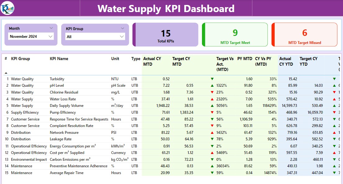
Summary Page

The heart of the dashboard features:
- KPI Cards: Displaying counts of Total KPIs, MTD Target Met, and MTD Target Missed.
Detailed Table Information:
- KPI Number: Assigns a unique sequence number to each KPI.
- KPI Group: Categorizes the KPI.
- KPI Name: Names the KPI clearly.
- Unit: Specifies the unit of measurement.
- Type: Indicates whether the KPI is ‘Lower the Better’ (LTB) or ‘Upper the Better’ (UTB).
- Actual vs. Target Metrics: Compares Current and Previous Year metrics for MTD and YTD, illustrated with color-coded icons and percentage calculations.
Click to buy Water Supply KPI Dashboard in Power BI
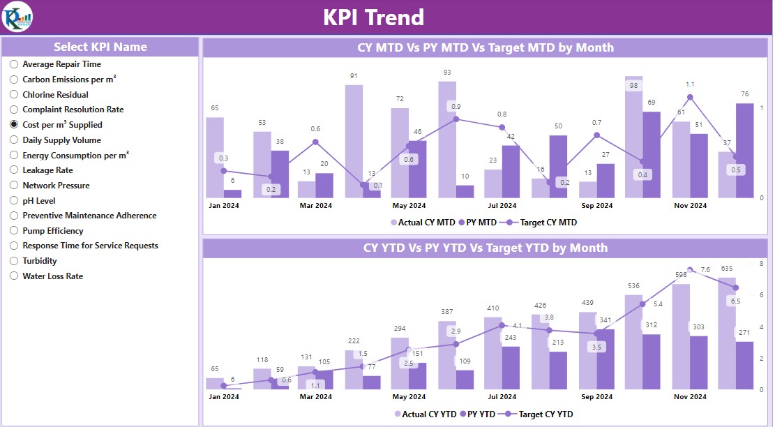
KPI Trend Page

This page enriches the dashboard by:
- Combo Charts: Showcasing Actual Numbers for Current and Previous Years against the set Targets for MTD and YTD.
- KPI Slicer: Enabling the selection of specific KPIs for a more detailed examination.
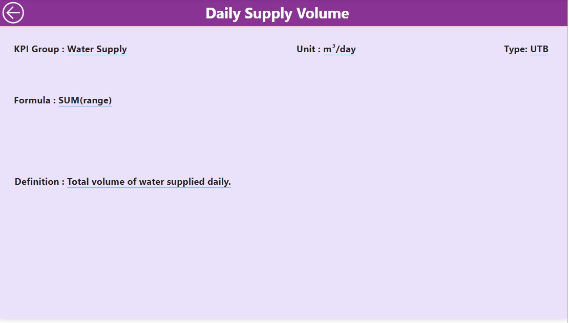
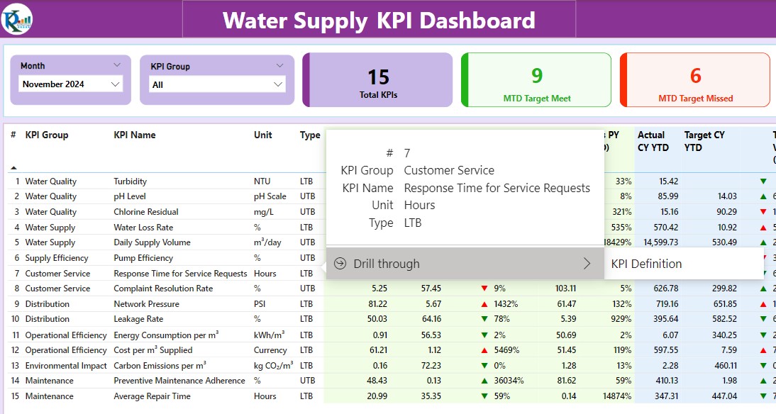
KPI Definition Page

A hidden drill-through page that provides:

- Detailed Definitions and Formulas: For each KPI.
- Navigation: A back button on the top left corner facilitates easy navigation to the main page.
Advantages of Using a Water Supply KPI Dashboard in Power BI
Employing a KPI dashboard for water supply metrics in Power BI offers several advantages:
- Enhanced Monitoring: Allows for real-time tracking of performance against targets, which is crucial for quick and effective decision-making.
- Increased Transparency: Makes performance metrics available to all stakeholders, promoting transparency and accountability.
- Improved Resource Management: Identifies opportunities for optimizing resource allocation.
- Historical Data Analysis: Supports trend analysis over various periods, which is beneficial for strategic planning.
Best Practices for Implementing a Water Supply KPI Dashboard
To ensure the dashboard operates effectively, consider the following best practices:
- Regular Data Updates: It’s essential to keep the data up-to-date to maintain its accuracy and relevance.
- User Training: Educate users on interpreting the dashboard metrics to facilitate informed decision-making.
- Dashboard Customization: Customize the dashboard to meet specific organizational needs and preferences.
- Security Measures: Apply robust security protocols to protect sensitive data.
Conclusion
The Water Supply KPI Dashboard in Power BI is a vital tool for managing water supply effectively, providing key insights into operational metrics and supporting strategic decision-making based on robust data analysis.
Click to buy Water Supply KPI Dashboard in Power BI
Frequently Asked Questions
Q. What is a KPI Dashboard?
A KPI Dashboard is a visual tool that displays key performance indicators, helping organizations understand and optimize their performance.
Q. How often should the data on the KPI Dashboard be updated?
Ideally, update the data as frequently as new information becomes available to ensure the dashboard remains accurate and relevant, typically monthly or quarterly.
Q. Can the Water Supply KPI Dashboard be customized to suit different regional requirements?
Absolutely, the dashboard can be tailored to reflect the specific needs and conditions of different regions.
Click to buy Water Supply KPI Dashboard in Power BI
Visit our YouTube channel to learn step-by-step video tutorials
View this post on Instagram
Click to buy Water Supply KPI Dashboard in Power BI


