In today’s data-driven world, understanding customer engagement is vital for making informed business decisions. With the help of powerful tools like Power BI, companies can build dashboards that allow them to track, analyze, and act on Key Performance Indicators (KPIs) effectively. This article dives deep into the Customer Engagement KPI Dashboard in Power BI, exploring its features, benefits, best practices, and more.
Table of Contents
ToggleWhat is a Customer Engagement KPI Dashboard in Power BI?
A Customer Engagement KPI Dashboard is an intuitive and easy-to-understand Power BI report that provides insights into various customer engagement metrics. It offers a way to track KPIs that measure how well a business is engaging with its customers. By consolidating data from multiple sources, this dashboard enables real-time monitoring and visualization of customer behavior, helping businesses make data-backed decisions.
The Customer Engagement KPI Dashboard in Power BI is designed to be both comprehensive and user-friendly, allowing users to track and analyze key metrics that impact customer engagement across different periods (MTD, YTD) and in comparison to previous years.
Key Features of the Customer Engagement KPI Dashboard
The Customer Engagement KPI Dashboard is built using Power BI Desktop and comes with a well-structured design. Here’s an overview of the key features:
1. Summary Page: The Main Overview
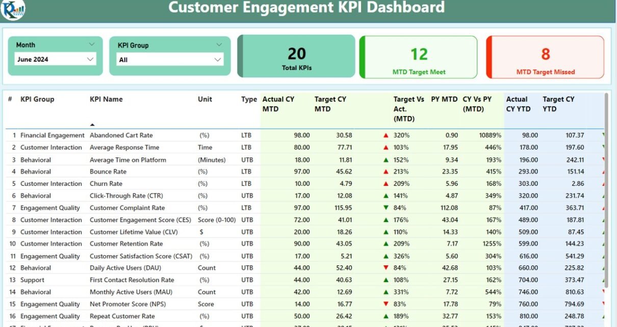
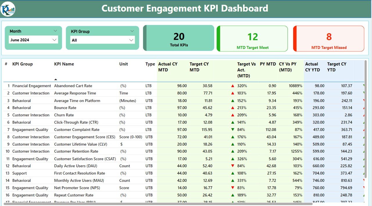
The Summary Page is the heart of the dashboard, providing a high-level view of customer engagement KPIs. This page includes several key components:
KPI Group and Month Slicers: Users can filter the data by selecting the month and KPI group, ensuring they view only the most relevant data.
Key Performance Cards: This includes three cards:
- Total KPIs Count: Displays the total number of KPIs.
- MTD Target Met: Shows how many KPIs have met the Month-to-Date (MTD) target.
- MTD Target Missed: Displays KPIs that missed the MTD target.
KPI Table: Below the cards, a detailed table shows various customer engagement metrics, including:
- KPI Number: Sequence number for each KPI.
- KPI Group: The category to which the KPI belongs.
- KPI Name: The name of the KPI being measured.
- Unit: The unit of measurement (e.g., percentage, number of customers).
- Type: Specifies whether the KPI is Lower the Better (LTB) or Upper the Better (UTB).
- Actual CY MTD: The actual value for the current year’s MTD.
- Target CY MTD: The target value for the current year’s MTD.
- MTD Icon: Green and red arrows indicating whether the target was met.
- Target vs. Actual (MTD): Percentage comparison between actual and target numbers.
- PY MTD: MTD value for the same period last year.
- CY vs. PY (MTD): Comparison between the current year and the previous year’s MTD values.
- Actual CY YTD: Actual value for the current year’s Year-to-Date (YTD).
- Target CY YTD: Target value for the current year’s YTD.
- YTD Icon: Green and red arrows indicating whether the YTD target was met.
- Target vs. Actual (YTD): Percentage comparison for YTD numbers.
- PY YTD: YTD number for the same period of the previous year.
- CY vs. PY (YTD): A percentage comparison between the current year’s YTD and last year’s YTD.
Click to buy Customer Engagement KPI Dashboard in Power BI
2. KPI Trend Page: Visualizing Performance Over Time
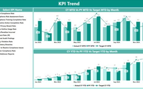
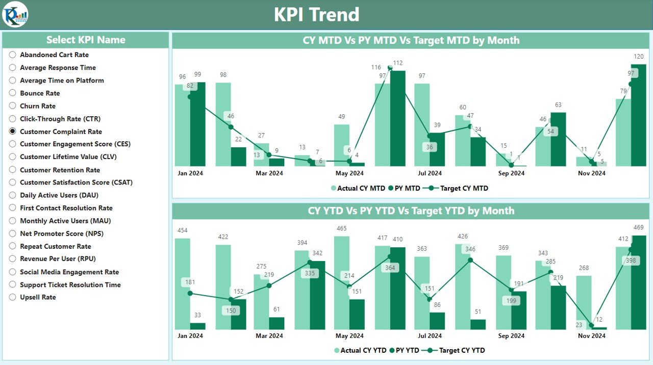
The KPI Trend Page provides a visual representation of the KPI performance over time. It includes:
- Combo Charts: These charts show both the actual numbers and the targets for MTD and YTD, comparing the current year’s performance against the previous year’s data.
- KPI Selector Slicer: This slicer allows users to select a specific KPI and view its trend across different time periods.
Click to buy Customer Engagement KPI Dashboard in Power BI
3. KPI Definition Page: Dive Into the Details

Click to buy Customer Engagement KPI Dashboard in Power BI
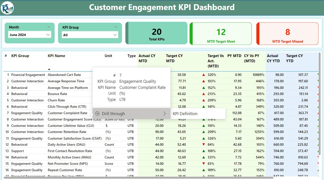
The KPI Definition Page provides an in-depth view of each KPI’s details. This is a hidden page designed for drill-through, enabling users to get further information about a KPI’s definition, formula, and type. Clicking on the back button in the top-left corner takes users back to the summary page for easy navigation.
Click to buy Customer Engagement KPI Dashboard in Power BI
Excel Data: How the Dashboard Works
The data source for this dashboard is an Excel file. Users need to input data into three worksheets for the dashboard to function properly:
- Input_Actual Sheet Tab: Users fill in the actual numbers for KPIs, specifying month, MTD, and YTD values.

Click to buy Customer Engagement KPI Dashboard in Power BI
- Input_Target Sheet Tab: Users fill in the target numbers for each KPI, month, MTD, and YTD.

Click to buy Customer Engagement KPI Dashboard in Power BI
- KPI Definition Sheet: This sheet includes detailed information about each KPI, including the KPI number, group, name, unit, formula, definition, and whether the KPI is LTB or UTB.

Click to buy Customer Engagement KPI Dashboard in Power BI
Advantages of the Customer Engagement KPI Dashboard
There are several key advantages of using the Customer Engagement KPI Dashboard in Power BI, including:
- Real-Time Data Analysis: The dashboard provides real-time updates on customer engagement, enabling businesses to track performance continuously and adjust strategies promptly.
- Visual Representation of KPIs: With Power BI’s powerful visualization tools, users can view complex data in a simplified and engaging way through graphs, charts, and color-coded icons.
- Comprehensive Data Comparison: The dashboard allows easy comparison of current data (MTD, YTD) with previous years, helping businesses identify trends and areas for improvement.
- Customizable and Flexible: The use of slicers and filters allows businesses to tailor the dashboard to their specific needs, enabling users to analyze data based on different time periods or KPI groups.
- Enhanced Decision-Making: By tracking customer engagement KPIs in real-time, companies can make better-informed decisions that drive business growth.
Opportunities to Improve Customer Engagement with Power BI
While the Customer Engagement KPI Dashboard in Power BI provides valuable insights, there are always opportunities for improvement. Here are some suggestions:
- Integrate More Data Sources: Businesses can improve the dashboard by integrating more data sources, such as customer feedback, social media sentiment analysis, or CRM data. This can provide a more holistic view of customer engagement.
- Add Predictive Analytics: Incorporating predictive analytics can help businesses forecast customer behavior and trends, giving them a competitive edge.
- Improve User Interaction: Enhancing the user interface with more interactive elements, such as drill-down options and tooltips, can improve the user experience and make the dashboard more intuitive.
- Focus on Data Accuracy: Ensuring that the data input into the Excel sheets is accurate and up-to-date is crucial for the dashboard’s effectiveness. Automating data entry through API integrations could minimize errors.
Best Practices for Creating a Customer Engagement KPI Dashboard in Power BI
To maximize the potential of your Customer Engagement KPI Dashboard, follow these best practices:
- Define Clear KPIs: Start by clearly defining what customer engagement means for your business. Choose KPIs that directly reflect customer satisfaction, retention, and interaction.
- Simplify Data; Avoid overwhelming the dashboard with too many KPIs. Focus on the most relevant metrics and keep the dashboard clean and easy to understand.
- Make It Actionable: Ensure that the dashboard helps users make decisions. Display data in a way that drives action, such as highlighting KPIs that are underperforming and need attention.
- Use Color-Coding Wisely; Use color to make the dashboard more intuitive. For example, use green for KPIs that meet the target and red for those that miss it. This provides immediate visual feedback to users.
- Keep It Updated: Regularly update the data and KPIs on the dashboard. Outdated data can lead to wrong decision-making.
- Engage Stakeholders: Involve key stakeholders in the creation and development of the dashboard. Their input can ensure that the dashboard reflects what’s important for the business.
Conclusion
The Customer Engagement KPI Dashboard in Power BI is a powerful tool for tracking and analyzing customer engagement data. By offering real-time insights and detailed comparisons, it empowers businesses to improve their engagement strategies. With its customizable features, users can adapt the dashboard to suit their unique needs and gain a deeper understanding of customer behavior.
Frequently Asked Questions (FAQs)
1. What is a KPI in customer engagement?
A KPI (Key Performance Indicator) is a measurable value that indicates how well a company is achieving its objectives. In customer engagement, KPIs track metrics like customer satisfaction, retention rates, and interaction frequency.
2. How can I improve my customer engagement KPIs?
To improve customer engagement KPIs, focus on providing personalized experiences, engaging customers through multiple channels, and responding promptly to feedback.
3. How often should I update the Customer Engagement KPI Dashboard?
It’s best to update the Customer Engagement KPI Dashboard regularly (daily or weekly) to ensure the data is current and relevant.
4. Can I use this dashboard for other business metrics?
While this dashboard is specifically designed for customer engagement, its structure can be adapted to track other business KPIs, such as sales or employee performance.
5. Do I need advanced skills to use this dashboard?
No, the dashboard is designed to be user-friendly. However, familiarity with Power BI and Excel is helpful for setting it up and customizing it.
Visit our YouTube channel to learn step-by-step video tutorials
