Aviation operations involve the seamless coordination of many variables to ensure safe, efficient, and timely travel. From flight schedules to baggage handling, each part of the operation contributes to the overall success of an airline or airport. Monitoring key performance indicators (KPIs) is crucial for optimizing these processes, reducing costs, and enhancing customer satisfaction. The Aviation Operations KPI Dashboard provides a powerful tool to track these metrics and guide decision-making.
In this article, we will dive into the Aviation Operations KPI Dashboard, exploring the key KPIs, their definitions, and how they help measure operational efficiency. We will also discuss how this dashboard functions, its key features, and how it can benefit airlines, airports, and other aviation stakeholders.
What is an Aviation Operations KPI Dashboard?
An Aviation Operations KPI Dashboard is a tool that tracks the performance of various aspects of aviation operations. It consolidates data on several key metrics such as on-time performance, baggage handling, flight cancellations, and operational costs, offering a comprehensive view of an airline or airport’s operational efficiency. By presenting these metrics in real-time, the dashboard enables stakeholders to make data-driven decisions, improve operational performance, and provide better customer service.
This dashboard uses key performance indicators (KPIs) to measure specific aspects of aviation operations, helping managers understand where improvements are needed and where they are excelling. These KPIs allow organizations to align their operations with their goals, improve efficiency, and ensure a high level of service quality.
Key Features of the Aviation Operations KPI Dashboard
The Aviation Operations KPI Dashboard is designed to be a ready-to-use, customizable template that simplifies tracking and managing aviation performance. It includes seven essential worksheets that each focus on different aspects of aviation operations.
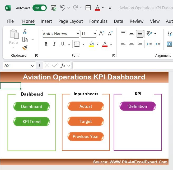
1. Home Sheet: The Index Sheet
The Home Sheet serves as the starting point for the dashboard, offering an organized index with six buttons that provide easy access to the other worksheets. It is designed for quick navigation, ensuring users can move seamlessly from one area of analysis to another.
Click to buy Aviation Operations KPI Dashboard in Excel
2. Dashboard Sheet Tab: The Core Sheet
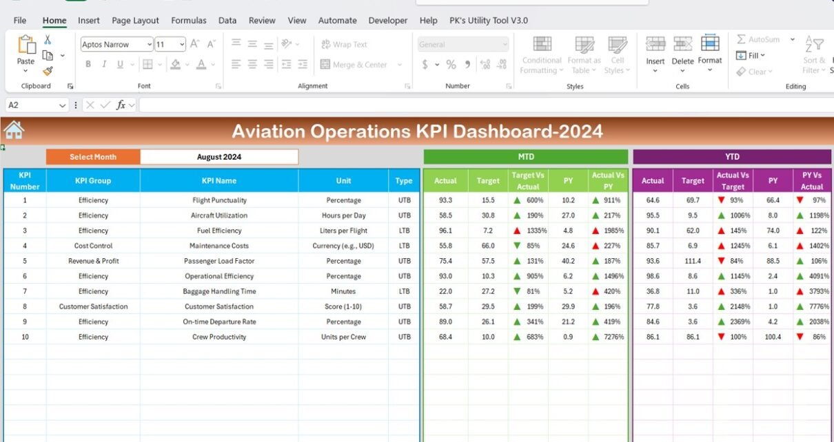
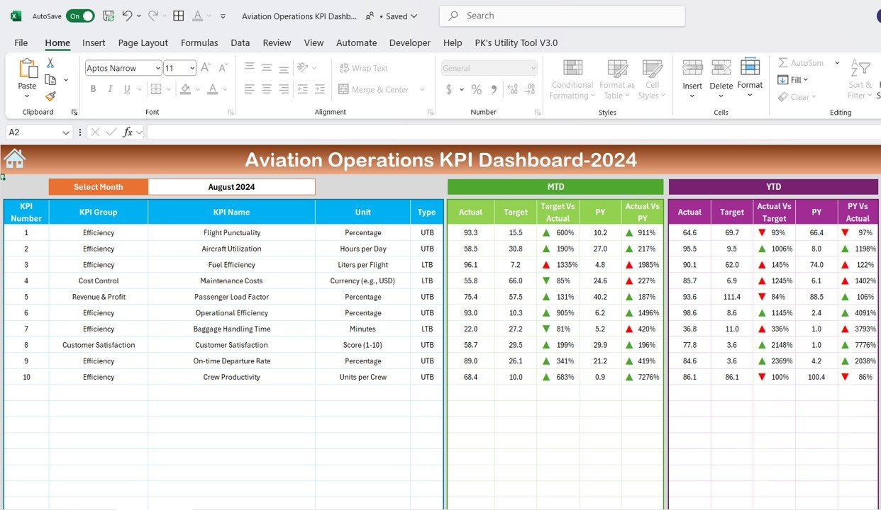
The Dashboard Sheet is the primary sheet where all key KPIs are displayed. Here, users can:
- Select the Month: From a dropdown menu in cell D3, users can select the month to track performance. The entire dashboard will update automatically with the selected month’s data.
- MTD Actual: Shows Month-to-Date actual performance metrics.
- MTD Target: Compares actual performance with set targets for the month.
- Previous Year Data (PY): Displays a comparison of this year’s data with last year’s performance.
- Target vs Actual: Visual indicators (up and down arrows) show the comparison between the target and actual performance.
- YTD Actual: Shows Year-to-Date actual metrics.
- YTD Target: Displays the year’s cumulative performance targets.
- PY vs Actual: Compares Year-to-Date actual performance with the previous year’s, using visual cues like arrows for easy analysis.
Click to buy Aviation Operations KPI Dashboard in Excel
3. KPI Trend Sheet Tab: Performance Tracking Over Time
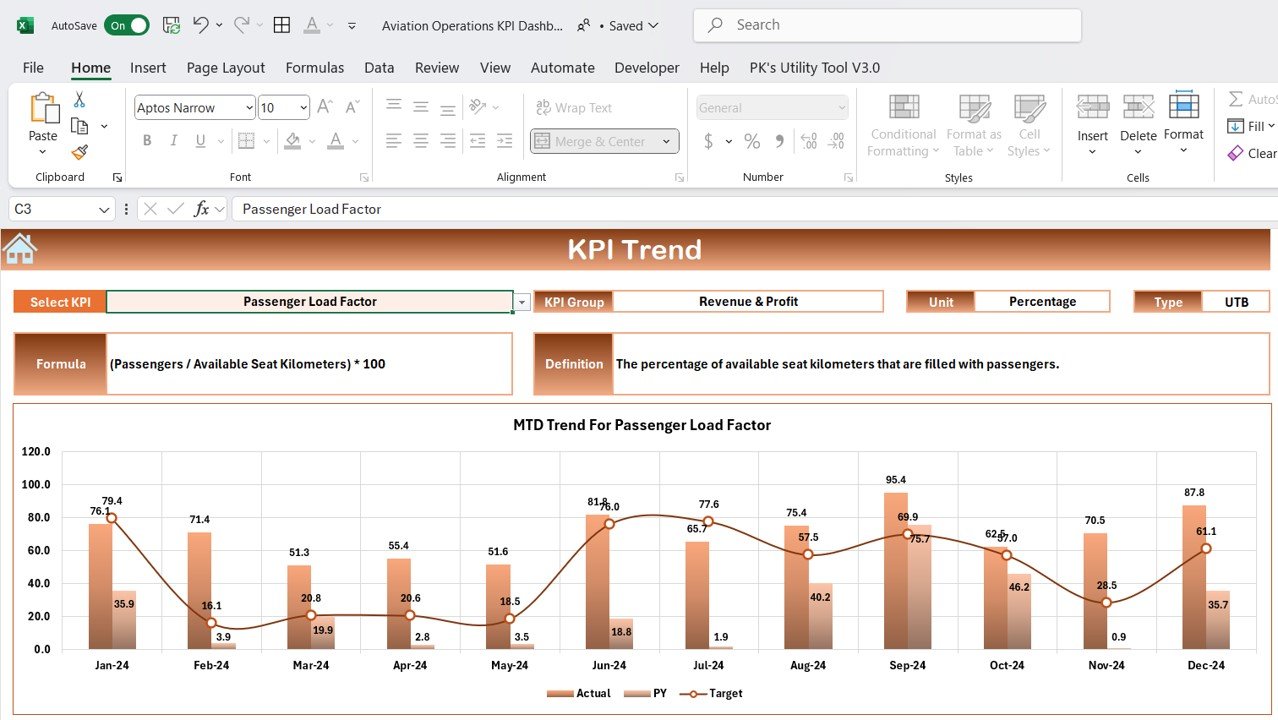
The KPI Trend Sheet allows users to select KPIs from a dropdown in cell C3 and analyze how these indicators have evolved over time. In this sheet, users can view:
- KPI Group: Defines which category the KPI belongs to (e.g., operational efficiency, on-time performance, customer satisfaction).
- Unit: The unit of measurement for each KPI (e.g., number of flights, operational costs).
- KPI Type: Specifies whether the KPI is “Lower the Better” (e.g., delays) or “Upper the Better” (e.g., on-time performance).
- Formula: Shows the aggregation formula used for calculating each KPI.
- KPI Definition: Describes what the KPI measures and its importance.
Click to buy Aviation Operations KPI Dashboard in Excel
4. Actual Numbers Sheet Tab: Input Real-Time Data
The Actual Numbers Sheet allows users to input actual data for MTD and YTD performance metrics. This sheet is crucial for keeping the dashboard updated with the most current data. The month can be selected in Range E1, and all associated metrics will automatically update.

Click to buy Aviation Operations KPI Dashboard in Excel
5. Target Sheet Tab: Setting Monthly and Yearly Targets
In the Target Sheet, users enter target numbers for each KPI, both for MTD and YTD. This sheet helps users track whether actual performance aligns with established goals, offering valuable insights into operational success.

Click to buy Aviation Operations KPI Dashboard in Excel
6. Previous Year Numbers Sheet Tab: Historical Data Comparison
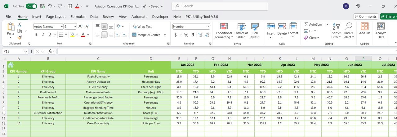
The Previous Year Numbers Sheet allows users to input performance data from the previous year. This historical comparison enables year-over-year tracking, helping to identify trends and evaluate areas of improvement or consistent performance.
Click to buy Aviation Operations KPI Dashboard in Excel
7. KPI Definition Sheet Tab: Clear KPI Information
The KPI Definition Sheet provides users with detailed information on each KPI, including:
- KPI Name
- KPI Group
- Unit of Measurement
- Formula
- KPI Definition
This sheet ensures consistency and clarity in understanding the KPIs tracked in the dashboard.

Click to buy Aviation Operations KPI Dashboard in Excel
Advantages of Using the Aviation Operations KPI Dashboard
The Aviation Operations KPI Dashboard offers several significant benefits for airlines, airports, and other stakeholders involved in aviation operations:
- Improved Performance Monitoring: The dashboard consolidates multiple KPIs into one comprehensive tool, making it easy to track operational health and performance metrics.
- Informed Decision-Making: With real-time data at their fingertips, stakeholders can make data-driven decisions that optimize operations and improve service quality.
- Goal Setting and Tracking: The ability to set and compare performance targets ensures that operational goals are met, improving overall efficiency and effectiveness.
- Identifying Areas for Improvement: By continuously monitoring KPIs, the dashboard makes it easy to identify where operations need improvement, whether it’s reducing delays, optimizing fuel consumption, or improving customer satisfaction.
Opportunities for Improvement in Aviation Operations
While the Aviation Operations KPI Dashboard is a powerful tool, there are always opportunities for improvement. Here are a few suggestions:
- Integration with Other Systems: Integrating the dashboard with flight scheduling, baggage handling, and other operational systems could provide a more comprehensive view of aviation performance.
- Real-Time Data Updates: Ensuring that data is updated in real time (or near real time) will provide more accurate insights and enable faster decision-making.
- Enhanced Data Visualizations: Using advanced visualizations, such as interactive charts, heatmaps, or geo-location data, could further enhance users’ ability to analyze trends and performance metrics.
Best Practices for Using the Aviation Operations KPI Dashboard
To maximize the effectiveness of the Aviation Operations KPI Dashboard, here are some best practices:
- Regular Data Updates: Ensure that the data is regularly updated, especially for MTD and YTD figures, to maintain accurate and timely insights.
- Set Realistic Targets: Set achievable, realistic targets based on historical data and industry benchmarks to ensure continuous improvement and goal alignment.
- Collaborate Across Teams: Encourage collaboration between different teams (e.g., flight operations, customer service, and logistics) to ensure that all KPIs are aligned with the overall goals of the organization.
- Use Conditional Formatting: Leverage conditional formatting (such as up and down arrows) to make key performance indicators easy to interpret at a glance.
Frequently Asked Questions (FAQs)
1. What is an Aviation Operations KPI Dashboard?
An Aviation Operations KPI Dashboard is a tool used to track and measure key performance indicators for aviation operations, helping to optimize efficiency, reduce costs, and improve customer service.
2. What are the key KPIs in the Aviation Operations KPI Dashboard?
Key KPIs include On-Time Performance, Flight Cancellations, Baggage Handling Time, Aircraft Turnaround Time, Customer Satisfaction Rate, Operational Costs, Fuel Efficiency, and Employee Productivity.
3. Can the Aviation Operations KPI Dashboard be customized?
Yes, the dashboard is flexible and can be customized to fit the specific needs of an airline or airport, including adding new KPIs or modifying existing ones.
4. How often should the data in the Aviation Operations KPI Dashboard be updated?
Data should be updated regularly, with monthly updates for MTD and YTD metrics to ensure that insights are based on the most current information.
5. How can the KPI Dashboard help improve aviation operations?
By tracking and analyzing KPIs, the dashboard provides actionable insights that help improve operational performance, reduce inefficiencies, and enhance customer satisfaction.
Conclusion
The Aviation Operations KPI Dashboard is an invaluable tool for optimizing aviation performance. It consolidates key metrics into one dashboard, making it easier to track, analyze, and improve operational efficiency. By setting realistic targets, regularly updating data, and leveraging best practices, aviation stakeholders can make data-driven decisions that lead to better outcomes. Whether you’re an airline operator, an airport manager, or part of the aviation industry, the Aviation Operations KPI Dashboard can significantly enhance your operational strategies and boost overall performance.
Visit our YouTube channel to learn step-by-step video tutorials
