The Railway KPI Dashboard is an essential tool for monitoring and analyzing the key performance indicators (KPIs) of railway operations. Railways, as a critical mode of transport, need to efficiently manage their operations to ensure smooth functioning, reduce delays, and enhance customer satisfaction. This dashboard serves as a centralized tool that helps stakeholders track the performance of various operational metrics such as punctuality, capacity utilization, operational costs, and safety standards. By leveraging this dashboard, railway authorities can make data-driven decisions that optimize operations and improve service delivery.
In this article, we will explore the features, KPIs, and functions of the Railway KPI Dashboard. We will break down each KPI, its unit, formula for aggregation, and whether higher or lower values are desired for each KPI. Furthermore, we will discuss the advantages, opportunities for improvement, and best practices to use the dashboard effectively.
What is the Railway KPI Dashboard?
The Railway KPI Dashboard is a comprehensive and real-time tool that consolidates various performance indicators to help railway operators monitor the efficiency of their operations. It includes data on key operational areas such as punctuality, capacity, safety, and operational costs. With this data readily available, stakeholders can assess performance trends, identify areas for improvement, and take corrective actions when necessary. The dashboard typically includes multiple sheets that allow users to easily track and analyze KPIs for day-to-day operations, as well as long-term performance metrics.
Key Features of the Railway KPI Dashboard
The Railway KPI Dashboard is designed to be a ready-to-use template that offers a simple and clear interface for managing railway performance. Below are the main features of this dashboard:
1. Home Sheet: The Index Sheet
- The Home Sheet serves as the index for the entire dashboard, providing easy navigation to all other sheets. Users can access six buttons for quick links to other sections, ensuring a seamless user experience.

Click to buy Railway KPI Dashboard in Excel
2. Dashboard Sheet Tab: The Core Sheet
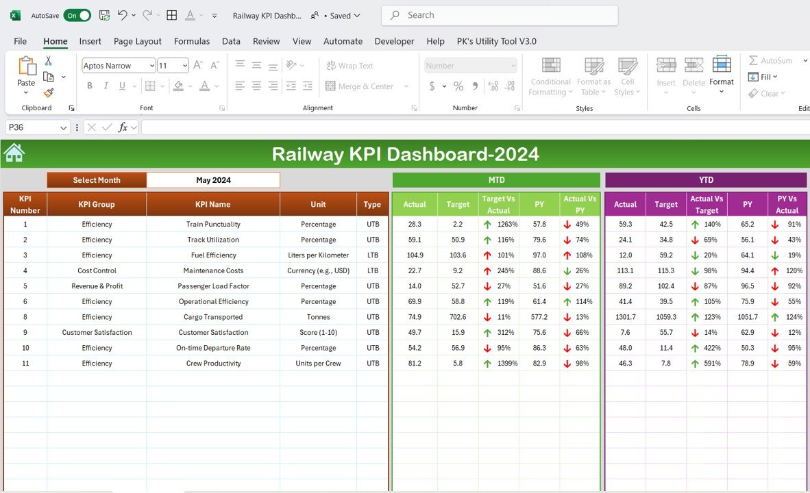
The Dashboard Sheet is the primary sheet where key KPIs are displayed. In this sheet, users can:
- Select the Month: A dropdown in cell D3 allows users to select a specific month, and the entire dashboard automatically updates to reflect data for that month.
- MTD Actual: Displays the actual performance metrics for the selected month.
- MTD Target: Shows the set target for the selected month, comparing it to the actual performance.
- Previous Year Data (PY): Allows users to compare the data of the current month with the previous year’s performance.
- Target vs Actual: Conditional formatting (up and down arrows) is used to visually indicate whether the performance meets or falls short of the set target.
- YTD Actual: Tracks the Year-to-Date performance metrics.
- YTD Target: Shows the cumulative performance targets for the year.
- PY vs Actual: Compares the YTD actual performance with the previous year’s performance, with clear visual cues.
Click to buy Railway KPI Dashboard in Excel
3. KPI Trend Sheet Tab: Performance Tracking Over Time
The KPI Trend Sheet allows users to track the performance of specific KPIs over time. By selecting a KPI from the dropdown menu in cell C3, users can view the following details:
- KPI Group: Defines the category to which the KPI belongs (e.g., operational efficiency, safety, customer service).
- Unit: The unit of measurement for each KPI (e.g., percentage, number of incidents, operational costs).
- KPI Type: Indicates whether a higher or lower value is desired for the KPI (e.g., “Upper the Better” for on-time performance or “Lower the Better” for operational costs).
- Formula: Displays the formula used for calculating the KPI data.
- KPI Definition: Provides a detailed explanation of what the KPI measures and why it is important.

Click to buy Railway KPI Dashboard in Excel
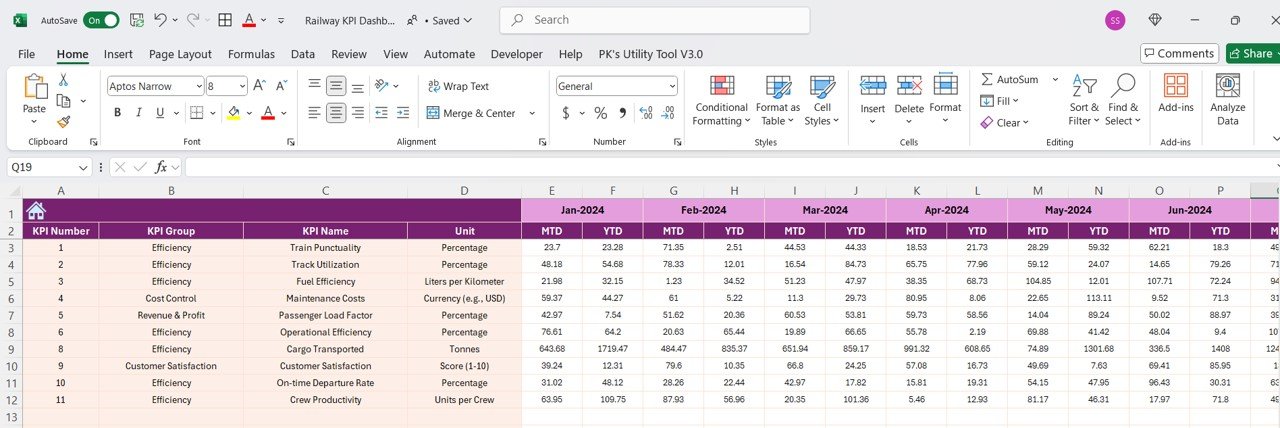
4. Actual Numbers Sheet Tab: Input Real-Time Data
- The Actual Numbers Sheet enables users to input real-time data for MTD and YTD performance metrics. This sheet helps keep the dashboard updated with the most current operational performance.
Click to buy Railway KPI Dashboard in Excel
5. Target Sheet Tab: Setting Monthly and Yearly Targets
- The Target Sheet allows users to set monthly and yearly target values for each KPI. This sheet helps compare actual performance with the set targets and provides valuable insights into operational success.

Click to buy Railway KPI Dashboard in Excel
6. Previous Year Numbers Sheet Tab: Historical Data Comparison
- This sheet allows users to input data from the previous year, enabling year-over-year comparisons. This comparison is crucial for evaluating trends and performance improvements over time.

Click to buy Railway KPI Dashboard in Excel
7. KPI Definition Sheet Tab: Clear KPI Information
- The KPI Definition Sheet provides a comprehensive overview of each KPI, including the KPI name, group, unit of measurement, formula, and definition, ensuring clarity and consistency in understanding the KPIs.

Click to buy Railway KPI Dashboard in Excel
Advantages of Using the Railway KPI Dashboard
The Railway KPI Dashboard offers several significant benefits for railway operators, managers, and stakeholders involved in the railway industry:
- Improved Performance Monitoring: The dashboard consolidates multiple KPIs into one tool, making it easy to track operational health, safety, and customer service levels across various departments.
- Data-Driven Decision Making: By providing real-time data insights, the dashboard enables stakeholders to make informed decisions that improve operational performance, reduce costs, and enhance customer satisfaction.
- Efficient Goal Setting and Tracking: With the ability to set targets and compare them against actual performance, the dashboard ensures that operational goals are met, leading to improved efficiency and higher service standards.
- Enhanced Accountability: Clearly defined KPIs and performance targets help managers and teams take ownership of their goals, which improves accountability and drives performance.
Opportunities for Improvement in Railway Operations
While the Railway KPI Dashboard is an excellent tool for monitoring and optimizing performance, there are always opportunities for improvement:
- Integration with Other Operational Systems: Integrating the dashboard with existing railway management systems such as ticketing, train scheduling, and maintenance systems can provide a more holistic view of operations.
- Real-Time Data Updates: Ensuring that the dashboard reflects real-time data, or near real-time, will enable faster decision-making and improve the accuracy of operational insights.
- Advanced Data Visualizations: Implementing advanced visualizations, such as heatmaps, trend lines, or geographical maps, could further enhance the dashboard’s usability and help users interpret data more effectively.
Best Practices for Using the Railway KPI Dashboard
To make the most of the Railway KPI Dashboard, here are some best practices that can optimize its effectiveness:
- Regular Data Updates: Ensure that the dashboard is regularly updated with accurate data for both MTD and YTD performance to maintain real-time insights into operations.
- Set Realistic Targets: Set achievable, data-driven targets for each KPI, using historical data and industry benchmarks, to foster continuous improvement and goal alignment.
- Cross-Departmental Collaboration: Foster collaboration between different departments (e.g., operations, logistics, customer service) to ensure that all KPIs are aligned with the overall goals of the railway organization.
- Leverage Conditional Formatting: Use conditional formatting (e.g., color-coded indicators, up and down arrows) to make key performance data easy to interpret at a glance.
Frequently Asked Questions (FAQs)
1. What is a Railway KPI Dashboard?
A Railway KPI Dashboard is a tool designed to track and measure key performance indicators (KPIs) for railway operations. It helps monitor efficiency, reduce costs, and improve customer satisfaction.
2. What are the main KPIs in the Railway KPI Dashboard?
Key KPIs include On-Time Performance, Train Cancellations, Passenger Satisfaction, Average Speed, Operational Costs, and Capacity Utilization.
3. Can the Railway KPI Dashboard be customized?
Yes, the dashboard is customizable to fit the unique needs of a railway organization. You can add new KPIs or modify existing ones based on your operational goals.
4. How often should data be updated in the Railway KPI Dashboard?
It’s recommended to update the data regularly, especially for MTD and YTD metrics, to ensure that insights reflect the most current performance data.
5. How can the KPI Dashboard improve railway operations?
By providing actionable insights, the dashboard helps identify inefficiencies, optimize resource allocation, and enhance overall performance, leading to better customer service and reduced operational costs.
Conclusion
The Railway KPI Dashboard is a vital tool for enhancing railway operations. By tracking KPIs like On-Time Performance, Operational Costs, and Passenger Satisfaction, railway operators can make informed decisions that optimize performance, reduce costs, and improve service quality. Whether you are a railway manager, operations officer, or part of the broader transportation sector, this dashboard can be the key to achieving operational excellence and fostering better decision-making. Implementing the dashboard alongside best practices and continuous monitoring will ensure that your railway operations stay on track and meet strategic goals.
Visit our YouTube channel to learn step-by-step video tutorials
View this post on Instagram
Click to buy Railway KPI Dashboard in Excel

