In the fast-evolving world of transportation, safety is always the number one priority. Ensuring that safety standards are met, reducing accidents, and improving operational efficiency are key goals for every transportation company. The Transportation Safety KPI Dashboard in Power BI is a powerful tool designed to track, analyze, and visualize safety performance across the entire transportation network.
This dashboard provides a comprehensive, real-time overview of key performance indicators (KPIs) related to transportation safety. It helps transportation managers and executives monitor the current safety status, identify areas of concern, and make data-driven decisions to enhance safety performance. By integrating this dashboard with your daily operations, you gain better visibility, which helps in improving the overall safety metrics across the transportation system.
The Transportation Safety KPI Dashboard in Power BI is ready to use and captures data seamlessly from Excel files. The dashboard is divided into several pages, each designed to provide a unique insight into specific aspects of safety performance. The combination of visualizations and KPI tracking ensures that stakeholders can effectively monitor key metrics and take timely corrective actions.
Key Features of the Transportation Safety KPI Dashboard
This Transportation Safety KPI Dashboard is packed with features that make it an essential tool for monitoring and analyzing transportation safety performance. Below are the key features of this dashboard:
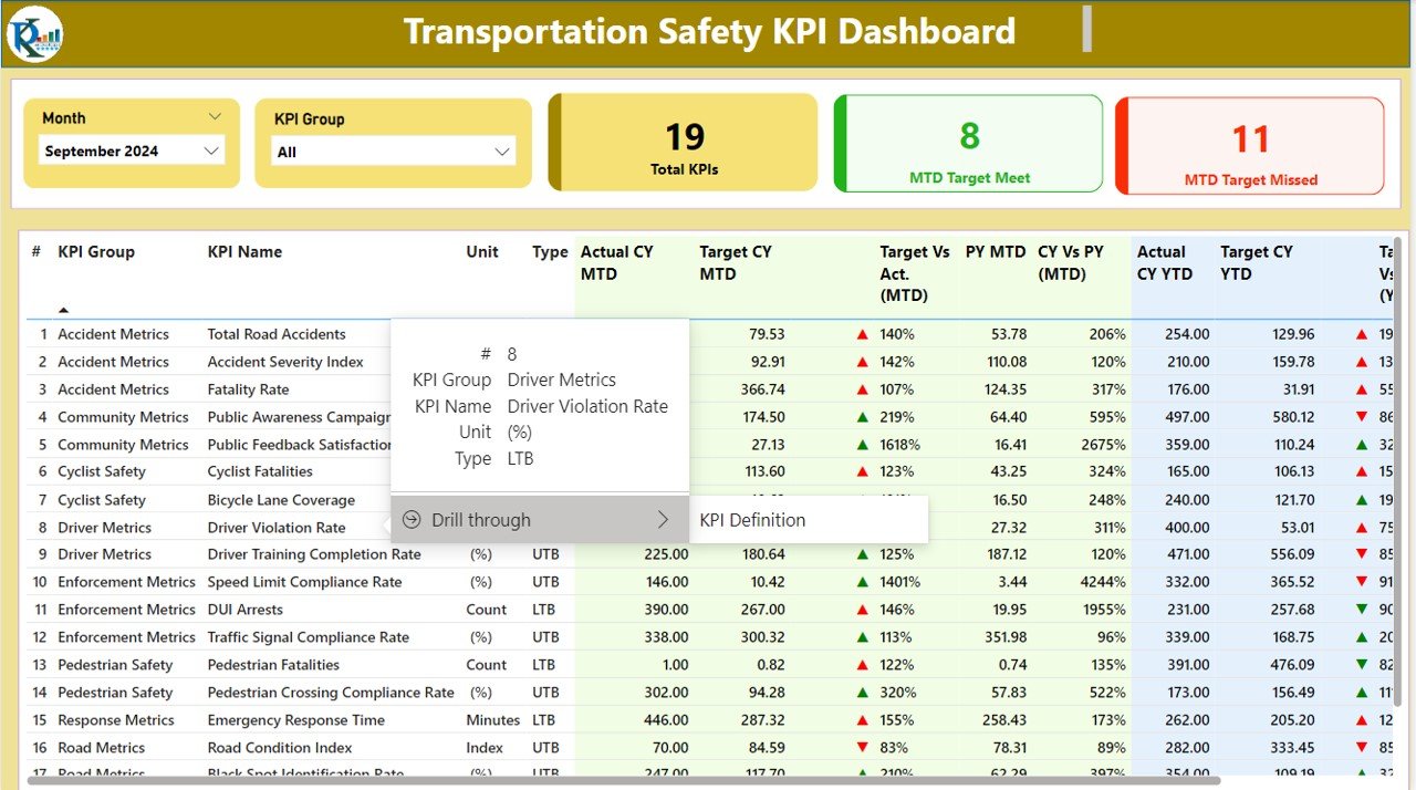
Summary Page:
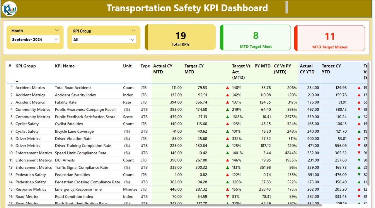
The Summary Page is the main hub of the dashboard, providing a quick overview of key performance metrics. Here’s what it offers:
Month and KPI Group Slicer: Allows you to filter data by the selected month and KPI group for better analysis.
Three Cards Display: Shows total KPIs count, MTD (Month-To-Date) Target Meet count, and MTD Target Missed count.
Detailed Table View: Provides comprehensive KPI data including:
- KPI Number: Sequence number of the KPI.
- KPI Group: Categorizes each KPI.
- KPI Name: Specific name of the KPI being tracked.
- Unit: Unit of measurement for the KPI.
- Type (LTB or UTB): Indicates whether the KPI is a “Lower the Better” (LTB) or “Upper the Better” (UTB) type.
- MTD vs Target: Shows actual MTD performance compared to targets using color-coded icons (red and green arrows).
- CY vs PY (MTD): Comparison of current year’s MTD values against the previous year’s MTD values.
- YTD vs Target: Similar comparison for YTD (Year-To-Date) values.
- CY vs PY (YTD): Year-over-year comparison of current YTD figures.
This page offers a quick, high-level overview of how your transportation system is performing against safety targets.
Click to buy Transportation Safety KPI Dashboard in Power BI
KPI Trend Page:
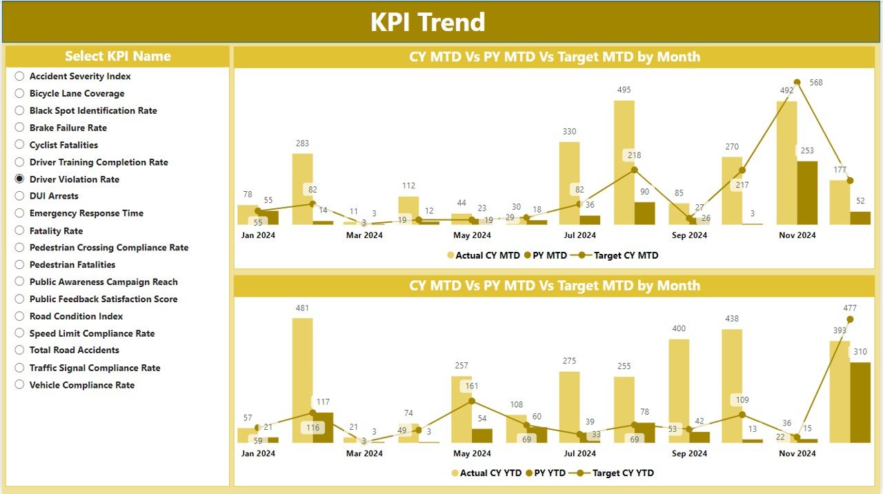
The KPI Trend Page helps track the performance of specific safety KPIs over time using interactive visuals:
- Combo Charts: The combo charts display both Actual Numbers of the current year and previous year for both MTD and YTD figures.
- Slicer for KPI Selection: Allows users to select the specific KPI to focus on for detailed analysis.
This page enables deeper insights into the performance trends of safety metrics, helping identify areas where improvements are needed.
Click to buy Transportation Safety KPI Dashboard in Power BI
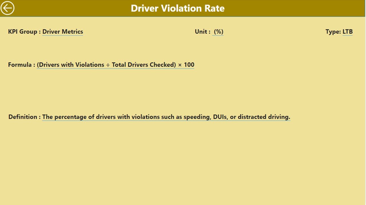
KPI Definition Page:
The KPI Definition Page serves as a detailed resource for understanding the KPIs being tracked. It contains:
Click to buy Transportation Safety KPI Dashboard in Power BI
- Formula and Definition: Provides a drill-through from the summary page, allowing users to see the formula used to calculate each KPI and a detailed explanation of what each KPI measures.
This page is crucial for stakeholders to understand the nuances of each safety metric and the methodology behind the calculations.
Click to buy Transportation Safety KPI Dashboard in Power BI
Excel Data Integration
This dashboard is powered by data inputted into an Excel file that serves as the backend for all the KPI tracking. There are three key worksheets where data must be entered:
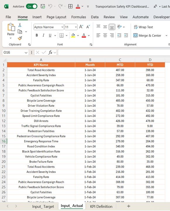
- Input_Actual Sheet Tab:
- Enter the actual number for each KPI, specifying the month (use the first date of the month) and both MTD and YTD values.
Click to buy Transportation Safety KPI Dashboard in Power BI
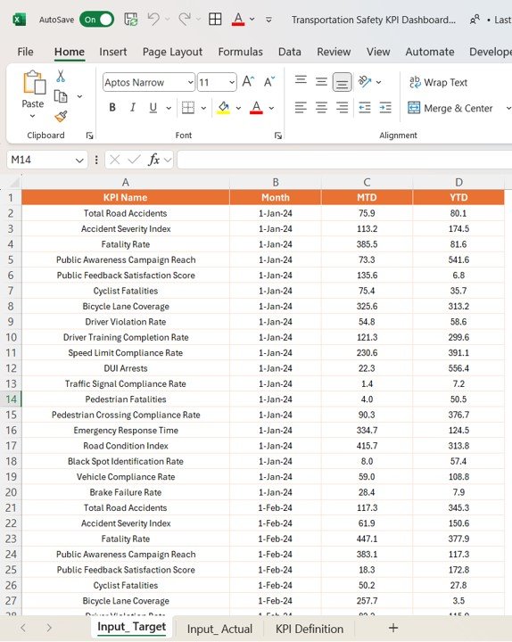
- Input_Target Sheet Tab:
- Enter the target values for each KPI for the same month, including MTD and YTD numbers.
Click to buy Transportation Safety KPI Dashboard in Power BI
- KPI Definition Sheet:
- Enter detailed information about each KPI, including the KPI number, KPI group, KPI name, unit of measurement, formula, definition, and whether the KPI is “Lower the Better” (LTB) or “Upper the Better” (UTB).
These Excel worksheets integrate directly with the Power BI dashboard to provide real-time updates and accurate performance tracking.
Advantages of Using the Transportation Safety KPI Dashboard
The Transportation Safety KPI Dashboard offers numerous advantages to transportation organizations. Below are some of the key benefits:
- Improved Monitoring and Decision-Making:
- With real-time data and visual indicators, stakeholders can make informed decisions to improve safety measures and performance.
- Easy Tracking of Safety Metrics:
- Track key safety performance indicators like punctuality, safety incidents, and operational costs in a single dashboard.
- Goal Setting and Achievement Monitoring:
- With the ability to compare actual values against targets, the dashboard helps organizations set safety goals and track progress towards achieving them.
Opportunities for Improvement in Transportation Safety
While the Transportation Safety KPI Dashboard is an excellent tool, there are always opportunities for further improvement in transportation safety management:
- Integration with Other Operational Systems: Integrating the dashboard with other systems, such as ticketing and scheduling systems, can provide a more complete view of transportation operations, leading to better decision-making.
- Real-Time Data Updates: Incorporating real-time data or near real-time updates would provide more accurate insights and speed up the decision-making process.
- Advanced Data Visualizations: Implementing more advanced data visualizations, such as heatmaps or geospatial mapping, would further enhance the user’s ability to analyze trends and gain insights from complex data.
Best Practices for Using the Transportation Safety KPI Dashboard
To maximize the effectiveness of the Transportation Safety KPI Dashboard, follow these best practices:
- Regular Data Updates: Ensure that both MTD and YTD performance data are updated regularly to keep the dashboard current and accurate.
- Set Realistic and Achievable Targets: Utilize historical data to set realistic targets for KPIs, helping to foster continuous improvement and operational excellence.
- Encourage Cross-Department Collaboration: Work across departments (operations, safety, customer service) to ensure that all KPIs align with the organization’s broader goals.
- Leverage Conditional Formatting: Use color-coded conditional formatting to visually highlight the KPIs that need attention, making it easier to interpret performance at a glance.
Frequently Asked Questions (FAQs)
1. What is a Transportation Safety KPI Dashboard?
A Transportation Safety KPI Dashboard is a Power BI tool that tracks and analyzes key safety performance indicators to help improve operational efficiency and reduce risks.
2. What are the most important KPIs in the Transportation Safety KPI Dashboard?
Key KPIs include On-Time Performance, Safety Incident Rate, Operational Costs, Capacity Utilization, and Customer Satisfaction.
3. How can the Transportation Safety KPI Dashboard help improve safety?
By tracking safety metrics in real time, it allows stakeholders to identify areas that need improvement and implement corrective actions promptly.
4. Can the Transportation Safety KPI Dashboard be customized?
Yes, the dashboard is customizable, allowing you to add or modify KPIs to fit your organization’s specific goals.
5. How frequently should data be updated in the Transportation Safety KPI Dashboard?
It’s best to update data regularly, especially for MTD and YTD metrics, to ensure that you are working with the most accurate and current performance data.
Conclusion
The Transportation Safety KPI Dashboard in Power BI is an invaluable tool for transportation organizations. It streamlines the process of monitoring key safety metrics, helps stakeholders make data-driven decisions, and improves operational performance. Whether you are a transportation manager, operations officer, or part of a broader safety team, this dashboard can enhance your ability to manage safety risks, optimize resources, and provide high-quality service.
Visit our YouTube channel to learn step-by-step video tutorials
View this post on Instagram
Click to buy Transportation Safety KPI Dashboard in Power BI

