A Factory Automation KPI Dashboard serves as a powerful tool that helps manufacturers track, visualize, and analyze their operational performance in real-time. By focusing on the right KPIs, businesses can quickly identify areas for improvement and optimize their automation systems. This article will explore the essential KPIs for factory automation, the key features of a KPI dashboard, its advantages, and how businesses can use it to enhance production efficiency.
Key Features of the Factory Automation KPI Dashboard
The Factory Automation KPI Dashboard is designed to offer a comprehensive view of factory operations. Below are the key features that make it a powerful tool for manufacturers:
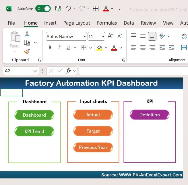
1. Home Sheet
The Home Sheet serves as the main navigation hub for the dashboard. It provides an overview of the key sections and allows users to quickly jump to the relevant worksheets. The home sheet includes six buttons, each linked to a specific section for easy access.
2. Dashboard Sheet Tab
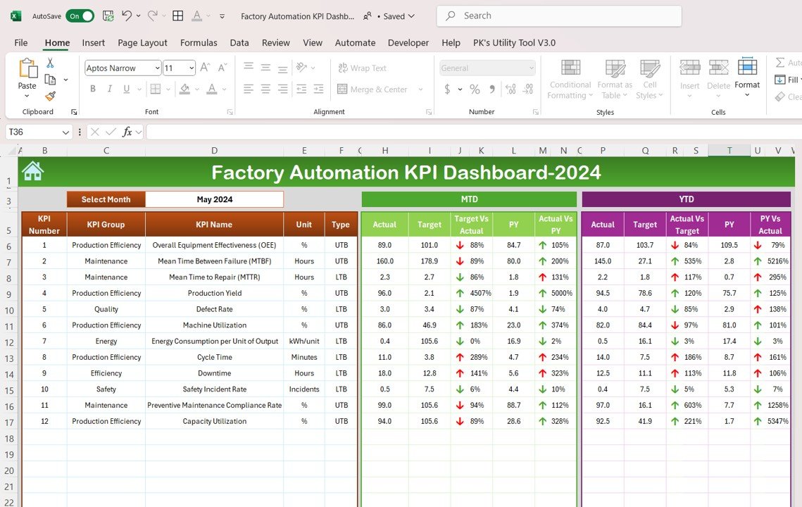
The Dashboard Sheet Tab is the core of the KPI dashboard. Here, users can view all the key KPIs in a single interface. The dashboard allows users to select the desired month using a dropdown menu (Range D3), and all data updates automatically to reflect the selected month.
Key metrics such as MTD (Month-to-Date) and YTD (Year-to-Date) data are displayed, along with target vs. actual performance, previous year comparisons, and conditional formatting that highlights performance with up/down arrows.
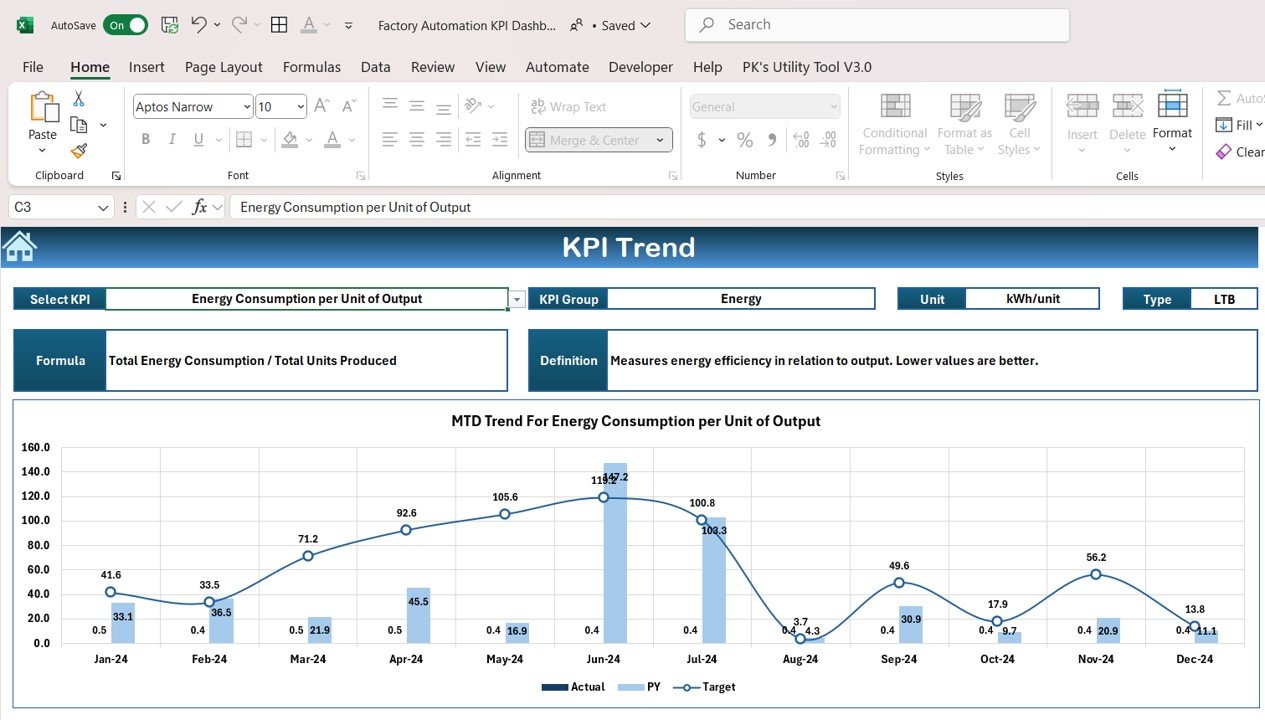
3. KPI Trend Sheet Tab
The KPI Trend Sheet Tab allows users to track the historical performance of specific KPIs. By selecting a KPI from the dropdown (Range C3), users can view key data such as the KPI group, unit of measurement, and whether the KPI is “Lower the Better” or “Upper the Better.” This sheet also provides the formula for calculating each KPI, along with a definition.
4. Actual Number Sheet Tab
In this tab, users input the actual performance data for each KPI, both for YTD and MTD. The month can be updated easily by changing the value in Range E1. The sheet automatically adjusts the data for the selected month.
5. Target Sheet Tab
The Target Sheet enables users to enter target numbers for each KPI, both on a monthly and yearly basis (MTD and YTD). This helps businesses set realistic goals and benchmarks for automation performance.
6. Previous Year Number Sheet Tab
This sheet allows users to input the data from the previous year to compare it with the current year’s performance. This comparison helps businesses identify trends, evaluate growth, and pinpoint areas for improvement.
7. KPI Definition Sheet Tab
The KPI Definition Sheet provides a standardized definition for each KPI. It includes essential details such as the KPI name, group, unit of measure, formula, and a clear definition of what the KPI represents. This sheet ensures that all team members understand the KPIs and how they are calculated.


