Data centers are the backbone of modern IT infrastructure, supporting businesses’ data storage, processing, and management needs. As these operations grow in complexity, it becomes crucial to monitor key performance indicators (KPIs) to ensure optimal functioning, minimize downtime, and improve operational efficiency. A Data Center KPI Dashboard provides a real-time snapshot of critical metrics, offering organizations the insights needed to make data-driven decisions.
In this article, we will dive deep into the importance of a Data Center KPI Dashboard, its key features, the KPIs to track, their formulas, and how they can enhance data center performance. We will also explore best practices, opportunities for improvement, and provide answers to common questions.
What is a Data Center KPI Dashboard?
A Data Center KPI Dashboard is a visual tool designed to monitor and track the key performance indicators related to the operation and performance of a data center. These KPIs can include everything from uptime, energy consumption, temperature, network traffic, to hardware health, among others.
By presenting all essential data in one place, the dashboard enables data center managers and decision-makers to quickly assess the health of their infrastructure, detect any inefficiencies, and implement improvements. A well-designed KPI dashboard helps in reducing risks, improving uptime, ensuring energy efficiency, and maintaining system reliability.
Key Features of the Data Center KPI Dashboard
The Data Center KPI Dashboard is equipped with several features that make it a comprehensive tool for tracking performance. Below are the key components of this dashboard:
1. Home Sheet
The Home Sheet serves as an index or landing page for the entire dashboard. It provides a centralized location with buttons for easy navigation to other sections of the dashboard. This sheet ensures that users can quickly jump to the section they need, improving efficiency and user experience.

Click to buy Data Center KPI Dashboard in Excel
2. Dashboard Sheet Tab
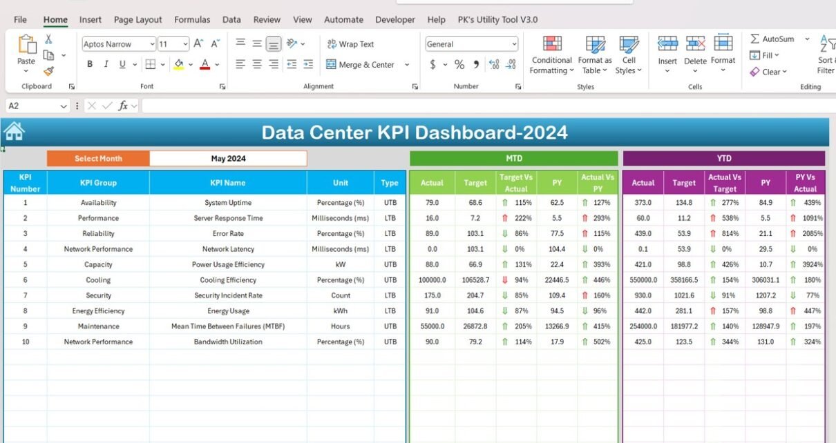
The Dashboard Sheet is the core of the KPI dashboard. It displays the essential KPIs, including:
- MTD (Month-to-Date): Displays actual data, target values, and previous year’s data for the current month.
- YTD (Year-to-Date): Presents cumulative data for the year, showing how well the data center is performing against its targets.
- Conditional Formatting: The data is highlighted with up and down arrows to quickly indicate performance trends (e.g., whether the KPIs are improving or declining).
The month selection dropdown in Range D3 allows you to choose the month, automatically updating all the data and trends accordingly.

Click to buy Data Center KPI Dashboard in Excel
3. KPI Trend Sheet Tab
The KPI Trend Sheet allows users to select specific KPIs from a dropdown in C3 and view historical trends. This sheet includes:
- KPI Group: Classification of KPIs into categories (e.g., energy, uptime, cooling).
- Unit of Measurement: The unit used for each KPI (e.g., percentage, kilowatt-hours, etc.).
- KPI Type: Indicates whether a lower value or higher value is desirable (e.g., lower is better for energy consumption, higher is better for uptime).
- Formula and Definition: Displays the formula used to calculate the KPI and provides a detailed description of what each KPI measures.

Click to buy Data Center KPI Dashboard in Excel
4. Actual Numbers Sheet Tab
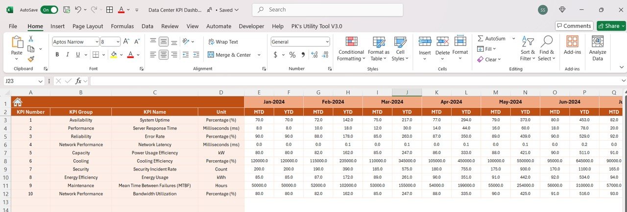
This tab is where you input the actual performance numbers for both MTD and YTD. The month can be selected using the E1 range, ensuring that data for any given month is updated automatically.
Click to buy Data Center KPI Dashboard in Excel
5. Target Sheet Tab
In this section, you will input the target values for each KPI for both MTD and YTD. This comparison helps monitor how well the data center is achieving its performance goals.

Click to buy Data Center KPI Dashboard in Excel
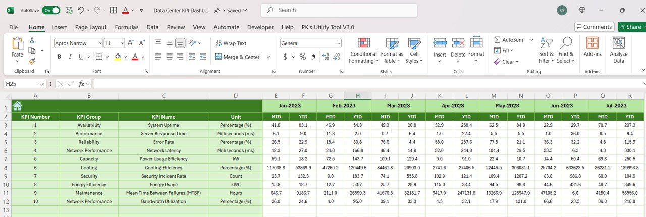
6. Previous Year Numbers Sheet Tab
Here, you can enter the previous year’s data to track year-over-year comparisons. This feature helps evaluate progress and highlight any significant changes in performance.
Click to buy Data Center KPI Dashboard in Excel
7. KPI Definition Sheet Tab
The KPI Definition Sheet serves as a reference guide for all KPIs. It includes:
- KPI Name
- KPI Group
- Unit of Measurement
- Formula for Calculation
- KPI Definition
This sheet ensures transparency and clarity for each KPI, making it easier for users to understand the purpose of each metric.

Click to buy Data Center KPI Dashboard in Excel
Advantages of Using a Data Center KPI Dashboard
Implementing a Data Center KPI Dashboard provides numerous advantages for data center management and operations:
- Real-Time Monitoring: By having real-time access to KPIs, data center managers can quickly identify and address any performance issues. This leads to faster decision-making and ensures that operations run smoothly without delays.
- Improved Efficiency: Tracking KPIs like energy consumption, uptime, and server utilization helps improve overall data center efficiency. With this data, managers can optimize resources, reduce energy costs, and ensure that servers and infrastructure are fully utilized.
- Cost Savings: A well-monitored data center can lead to significant cost savings by reducing downtime, energy waste, and hardware failures. By optimizing energy usage and server load, data centers can lower operational expenses.
- Enhanced Security: Security-related KPIs, such as incident response time, help monitor the effectiveness of security measures in place. A fast response to incidents ensures that potential security breaches are mitigated before they cause significant damage.
Opportunities for Improvement in Data Center KPI Dashboards
While a KPI dashboard is an excellent tool for monitoring performance, there are always opportunities for improvement:
- Integration with External Tools: Integrating the dashboard with other systems, such as facility management software or network monitoring tools, can provide a more holistic view of the data center’s performance and automate data collection.
- Customization of KPIs: Every data center is unique. Customizing the dashboard to include KPIs specific to your facility’s goals or challenges can provide more relevant insights and improve decision-making.
- Mobile Access: Currently, many dashboards are designed for desktop use only. Enabling mobile access would allow managers to monitor data center performance remotely, enhancing flexibility and responsiveness.
- Predictive Analytics: Incorporating predictive analytics can help foresee potential issues before they occur. By analyzing historical data, data centers can predict when servers may fail, when energy usage will spike, or when cooling systems might require maintenance.
Best Practices for Data Center KPI Dashboards
To maximize the benefits of your Data Center KPI Dashboard, follow these best practices:
- Regularly Update Data: Ensure that all KPIs are updated regularly with fresh data. Real-time data is crucial for making timely decisions and responding to performance issues.
- Focus on the Most Relevant KPIs: Avoid overwhelming users with too many KPIs. Focus on the metrics that matter most, such as uptime, energy consumption, and cooling efficiency, to maintain operational efficiency.
- Use Conditional Formatting Effectively: Conditional formatting can help highlight trends and deviations in the data, such as whether energy consumption is exceeding targets. Use this feature to draw attention to important metrics.
- Ensure User-Friendly Design: The dashboard should be easy to navigate and intuitive. A well-designed dashboard will improve user engagement and make it easier to monitor performance regularly.
Frequently Asked Questions (FAQs)
1. What KPIs should I focus on for a Data Center?
Focus on KPIs that measure efficiency, uptime, energy usage, and system health, such as uptime, PUE, and server utilization.
2. How do I customize my Data Center KPI Dashboard?
You can customize the dashboard by adding new KPIs, adjusting existing formulas, and setting specific performance targets that align with your data center’s goals.
3. What is the ideal temperature for a data center?
The ideal temperature typically ranges from 18°C to 27°C (64°F to 80°F) to ensure optimal performance of equipment while maintaining energy efficiency.
4. How does the KPI Dashboard help reduce costs?
By tracking energy consumption, server utilization, and uptime, the dashboard helps identify inefficiencies, optimize resource usage, and reduce energy waste, ultimately lowering costs.
Conclusion
A Data Center KPI Dashboard is a powerful tool that allows data center managers to monitor key metrics in real time, helping them optimize operations, improve efficiency, and ensure high levels of uptime. By tracking essential KPIs such as energy consumption, uptime, and server utilization, data centers can become more cost-effective, secure, and sustainable. Regular updates, customization, and predictive analytics will further enhance the dashboard’s effectiveness, providing a comprehensive solution for modern data center management.
Visit our YouTube channel to learn step-by-step video tutorials
