The petroleum industry is a complex and fast-paced sector that requires precise monitoring of key performance indicators (KPIs) to optimize operations, reduce costs, and ensure safety. The Petroleum Industry KPI Dashboard in Power BI is a powerful tool designed to track and analyze the performance of various KPIs across different aspects of the petroleum industry. This dashboard offers a clear, visual representation of critical data, making it easier for decision-makers to monitor performance and make informed, data-driven decisions.
This article will explore the features of the Petroleum Industry KPI Dashboard in Power BI, its key components, the KPIs you should track, and how to use the dashboard to improve operational efficiency in the petroleum sector.
What is the Petroleum Industry KPI Dashboard in Power BI?
The Petroleum Industry KPI Dashboard in Power BI is a ready-to-use performance monitoring tool that captures and visualizes key performance indicators (KPIs) in the petroleum sector. It allows businesses to track various performance metrics related to production, cost efficiency, safety, and environmental impact. With the dashboard, managers can monitor key data in real-time and make decisions based on comprehensive insights.
The dashboard is powered by Power BI, a powerful data visualization tool, and uses an Excel data source for easy input and analysis. It features several key pages that provide a detailed breakdown of KPIs, including summary reports, trend analysis, and KPI definitions.
Key Features of the Petroleum Industry KPI Dashboard in Power BI
This Petroleum Industry KPI Dashboard offers a variety of features designed to provide a comprehensive view of performance metrics. Below are the key components of the dashboard:
1. Summary Page
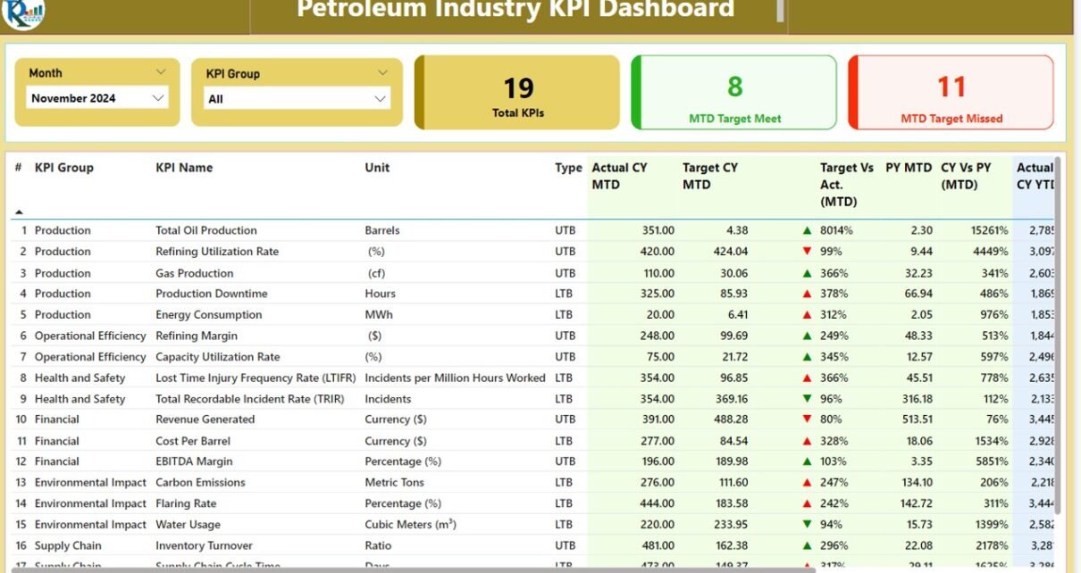
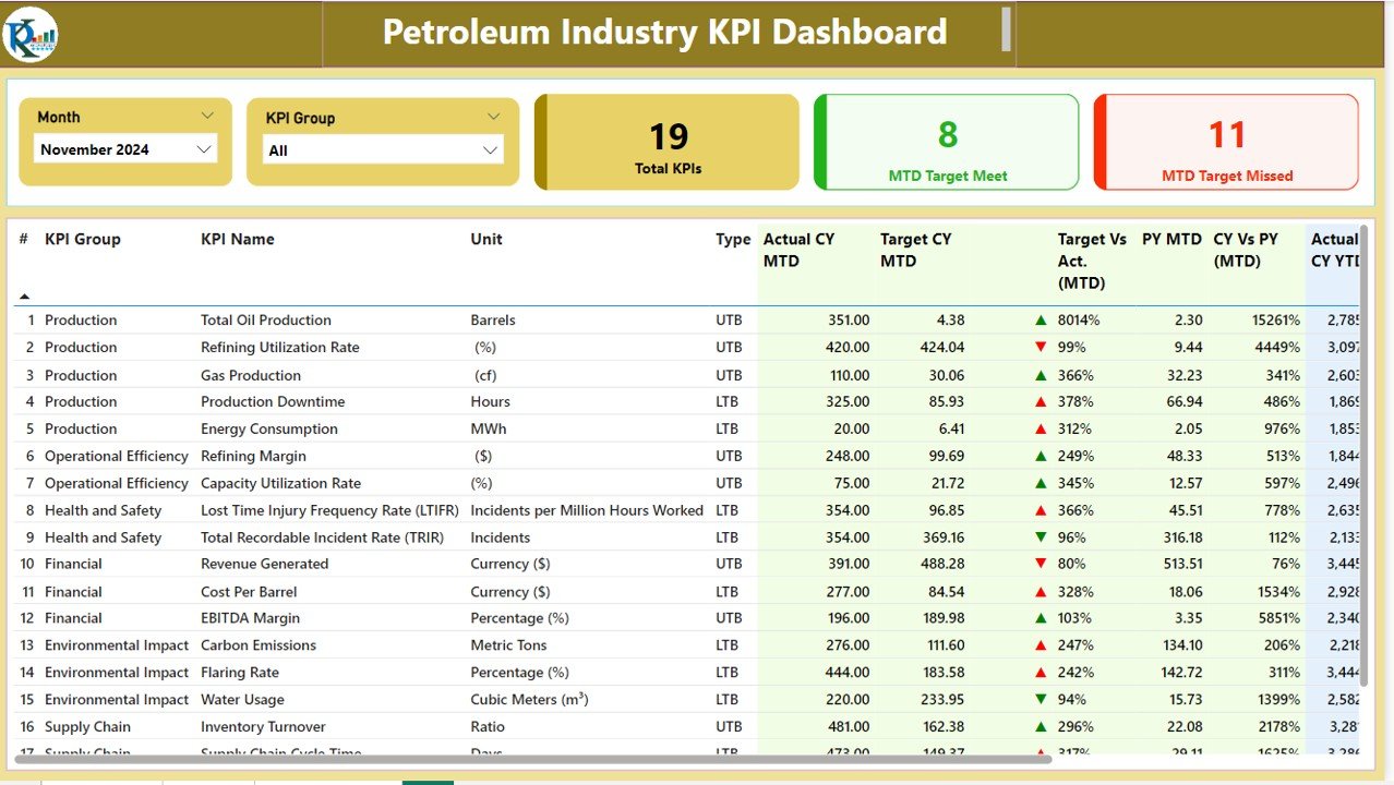
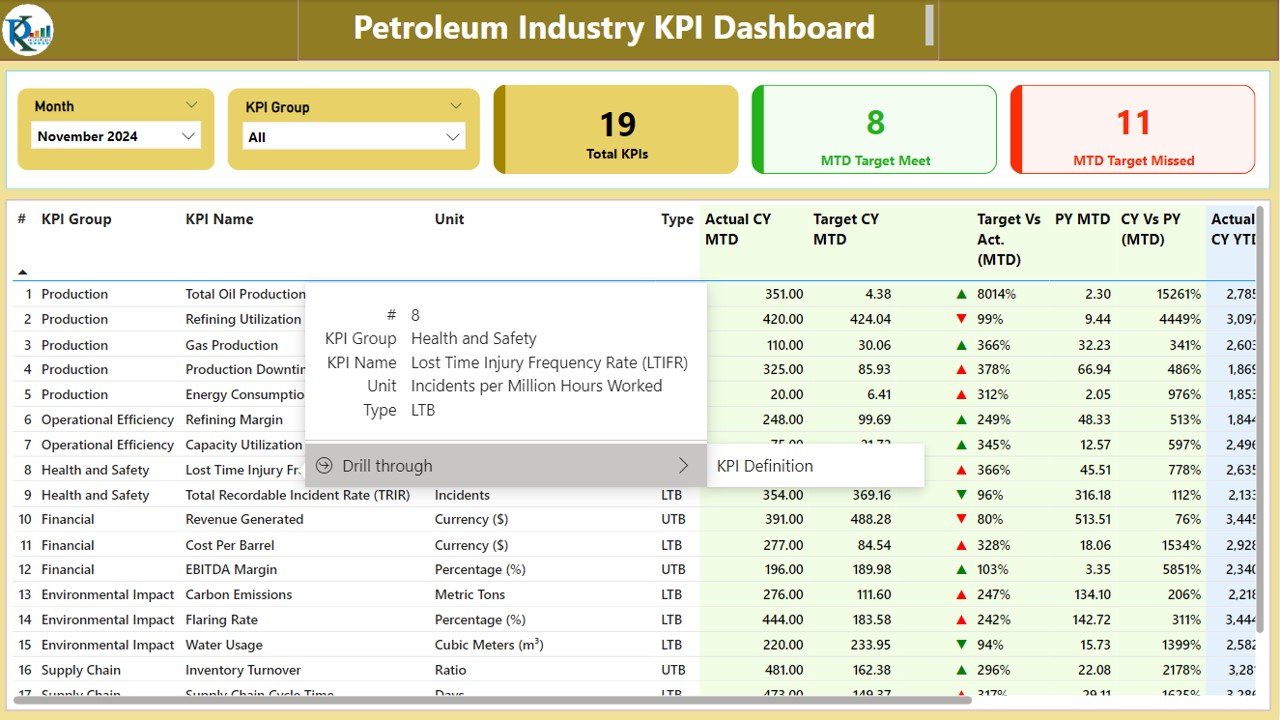
The Summary Page serves as the central hub for the dashboard, providing an overview of all KPIs. Key features of the Summary Page include:
KPI Group Slicer: Allows users to filter KPIs by group/category.
MTD (Month-to-Date) Target Meet and Missed Count: Displays the count of KPIs that met or missed the target for the current month.
Detailed KPI Table: Shows in-depth data for each KPI, including:
- KPI Number: Sequence number of the KPI.
- KPI Group: The group or category of the KPI (e.g., safety, efficiency, cost).
- KPI Name: The name of the KPI being tracked.
- Unit: The unit of measurement for each KPI.
- Type: Specifies whether the KPI is “Lower the Better” (LTB) or “Upper the Better” (UTB).
- Actual CY MTD: The actual value of the KPI for the current year (Month-to-Date).
- Target CY MTD: The target value of the KPI for the current year (Month-to-Date).
- MTD Icon: Displays a green (▲) or red (▼) icon to indicate whether the KPI is on target.
- Target Vs Act. (MTD): A percentage comparison of the actual number vs. the target number for the current month.
- PY MTD: The Month-to-Date value for the same period of the previous year.
- CY Vs PY (MTD): A percentage comparison of the current year’s MTD actual value to the previous year’s MTD value.
- Actual CY YTD: The actual value of the KPI for the current year (Year-to-Date).
- Target CY YTD: The target value of the KPI for the current year (Year-to-Date).
- YTD Icon: Displays a green (▲) or red (▼) icon to indicate whether the KPI is on target.
- Target Vs Act. (YTD): A percentage comparison of the actual number vs. the target number for the year.
- PY YTD: The Year-to-Date value for the same period of the previous year.
- CY Vs PY (YTD): A percentage comparison of the current year’s YTD actual value to the previous year’s YTD value.
Click to buy Petroleum Industry KPI Dashboard in Power BI
This page provides a quick overview of all KPIs, helping decision-makers spot trends and take action.
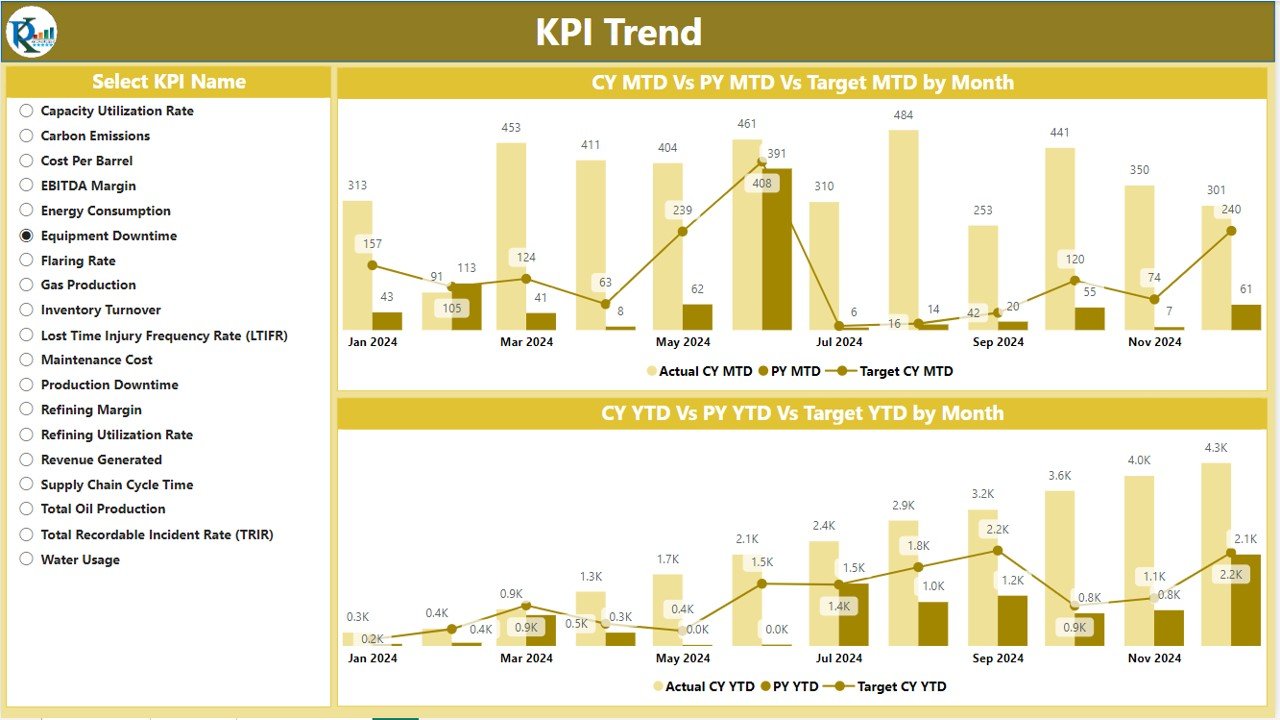
2. KPI Trend Page
The KPI Trend Page provides a visual representation of the performance trends for the selected KPIs. This page includes:
- Combo Charts: Displays the Actual Numbers of the current year, previous year, and targets for both MTD and YTD.
- KPI Selection Slicer: Allows users to select the KPI they want to track, enabling detailed trend analysis for specific KPIs over time.
This page helps users analyze the historical performance of their KPIs and track how they are progressing compared to past performance and set targets.
Click to buy Petroleum Industry KPI Dashboard in Power BI
3. KPI Definition Page
The KPI Definition Page is a drill-through page where users can view detailed definitions and formulas for each KPI. This page includes:
- KPI Name: The name of the KPI.
- KPI Group: The category of the KPI (e.g., cost, production).
- Formula: The formula used to calculate the KPI.
- KPI Definition: A clear and detailed explanation of what the KPI measures and why it’s important.
Click to buy Petroleum Industry KPI Dashboard in Power BI
This page helps provide transparency for users who may need more context or clarification on the KPIs being tracked. Users can easily drill down from the Summary Page to the KPI Definition Page for more detailed information.

Click to buy Petroleum Industry KPI Dashboard in Power BI
How the Dashboard Works: Data Input via Excel
The data for the Petroleum Industry KPI Dashboard is collected via an Excel file. The dashboard pulls data from three key worksheets in the Excel file:
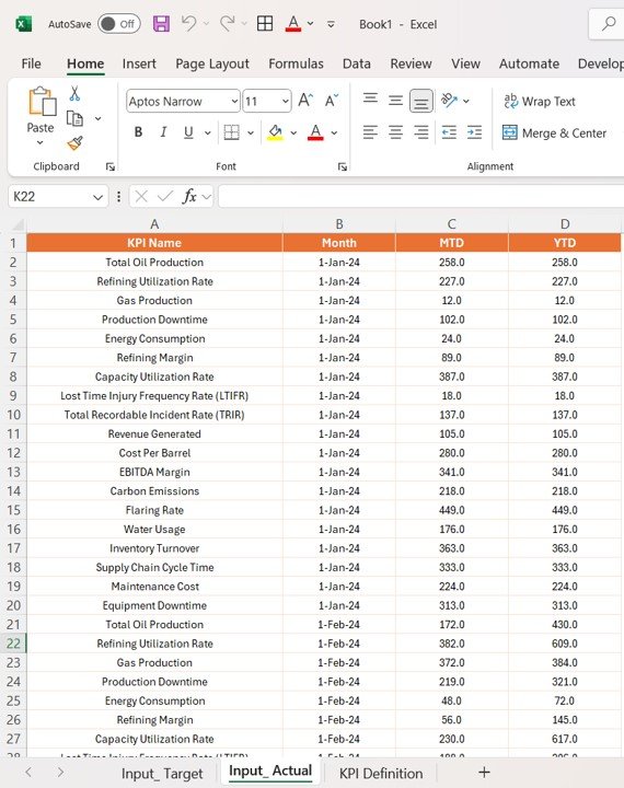
1. Input_Actual Sheet Tab
In this sheet, users input the actual performance numbers for each KPI, including:
- KPI Name
- Month (the first date of the month)
- MTD Number
- YTD Number
Click to buy Petroleum Industry KPI Dashboard in Power BI
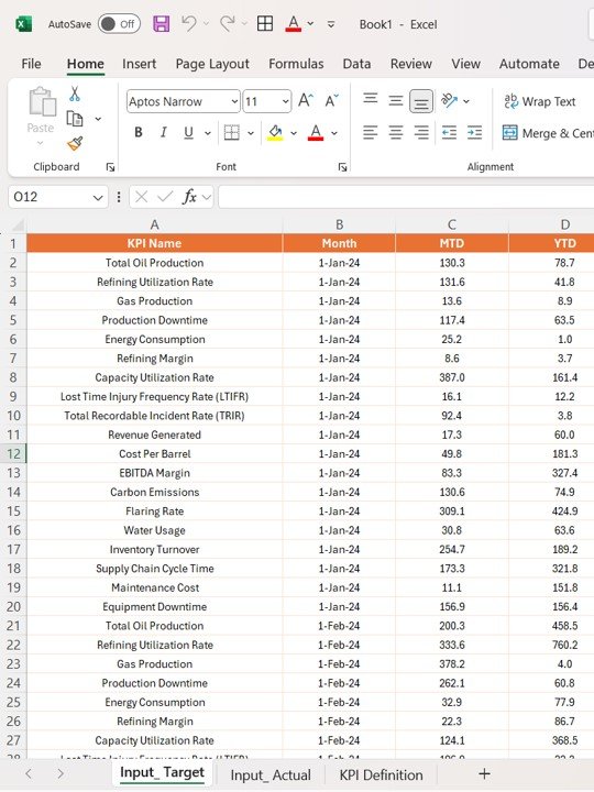
2. Input_Target Sheet Tab
This sheet is where users enter the target values for each KPI, for both MTD and YTD, enabling comparison between actual performance and targets.
Click to buy Petroleum Industry KPI Dashboard in Power BI
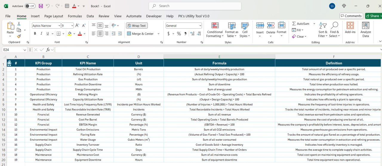
3. KPI Definition Sheet Tab
This sheet contains the definitions of each KPI, including:
- KPI Number
- KPI Group
- KPI Name
- Unit
- Formula
- Definition
- Type (LTB or UTB)
Click to buy Petroleum Industry KPI Dashboard in Power BI
The data entered in these sheets automatically updates the Power BI dashboard, providing real-time insights into performance.
Advantages of Using the Petroleum Industry KPI Dashboard in Power BI
Using a Petroleum Industry KPI Dashboard offers numerous benefits for businesses in the petroleum sector. Here are some key advantages:
- Real-Time Performance Monitoring: The dashboard provides real-time data, helping managers track the performance of key KPIs and make timely decisions to optimize operations.
- Improved Data-Driven Decisions: With all relevant KPIs displayed in one place, decision-makers can analyze cloud service performance, helping them reduce costs and optimize resource allocation.
- Enhanced Resource Allocation: The dashboard helps businesses identify underutilized resources, enabling them to allocate resources more efficiently and reduce wastage.
- Increased Transparency and Accountability: The clear and detailed reporting on KPIs ensures transparency, allowing stakeholders to easily monitor performance and hold teams accountable.
- Easy Trend Analysis: By visualizing KPI trends over time, the dashboard helps businesses track progress, identify areas of improvement, and make data-driven decisions.
Opportunities for Improvement in Petroleum Industry KPI Dashboards
While the Petroleum Industry KPI Dashboard is a powerful tool, there are always opportunities for improvement:
- Integration with External Systems: Integrating the dashboard with other systems, such as ERP or facility management software, can provide a more holistic view of business performance.
- Customization for Specific Needs: Businesses may have unique performance goals or challenges. Customizing the dashboard to track additional KPIs that align with specific objectives can further improve decision-making.
- Predictive Analytics: Incorporating predictive analytics into the dashboard can help forecast future trends, enabling businesses to identify potential issues and address them proactively.
- Mobile Access: Enabling mobile access to the dashboard would allow managers and decision-makers to monitor performance on-the-go, improving responsiveness and operational flexibility.
Best Practices for Petroleum Industry KPI Dashboards
To maximize the effectiveness of the Petroleum Industry KPI Dashboard, follow these best practices:
- Regularly Update Data: Ensure that data is regularly updated with accurate and timely information. Real-time data is crucial for making informed decisions and addressing any issues promptly.
- Focus on Relevant KPIs: Avoid overwhelming users with too many KPIs. Focus on the most relevant metrics that impact performance, such as production levels, safety, and efficiency.
- Leverage Conditional Formatting: Use conditional formatting to highlight trends, such as KPIs that are above or below target. This makes it easier for users to identify areas that need attention.
- Simplify User Navigation: Design the dashboard with an intuitive layout and easy navigation. The user interface should be simple and straightforward, ensuring that both technical and non-technical users can access and interpret the data with ease.
Frequently Asked Questions (FAQs)
1. What is a Petroleum Industry KPI Dashboard?
A Petroleum Industry KPI Dashboard is a tool used to track and monitor key performance indicators related to operations in the petroleum industry, such as production efficiency, cost, and safety.
2. How do I customize the dashboard to my company’s needs?
You can customize the dashboard by adding new KPIs, adjusting formulas, and aligning target values with your organization’s performance goals.
3. Can I track KPIs for multiple sites or locations?
Yes, the dashboard can be customized to track KPIs for multiple locations by adding relevant data for each site and adjusting filters.
Visit our YouTube channel to learn step-by-step video tutorials
View this post on Instagram
Click to buy Petroleum Industry KPI Dashboard in Power BI
