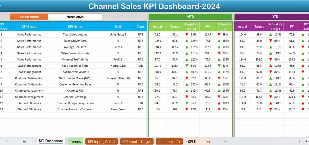
In the competitive world of channel sales, tracking performance is essential. A Channel Sales KPI Dashboard in Excel is a powerful tool that allows you to monitor key metrics, compare targets, and analyze trends—all in one place. This article will guide you through everything you need to know about creating, using, and optimizing a Channel Sales KPI Dashboard in Excel.
Click to buy Channel Sales KPI Dashboard in Excel
What is a Channel Sales KPI Dashboard?
A Channel Sales KPI Dashboard is a dynamic Excel tool that consolidates various performance indicators (KPIs) related to channel sales into a single, interactive dashboard. It simplifies the process of tracking metrics like Monthly Targets, Year-to-Date (YTD) data, and Prior Year comparisons.
This dashboard is particularly useful for sales managers, analysts, and decision-makers who want to:
- Identify growth opportunities.
- Monitor channel-specific performance.
- Make data-driven decisions to optimize sales strategies.
Click to buy Channel Sales KPI Dashboard in Excel
Key Features of the Channel Sales KPI Dashboard
This ready-to-use template for channel sales KPIs is structured into seven worksheets, each tailored to streamline data entry and analysis. Here’s a breakdown of each sheet and its functionality:
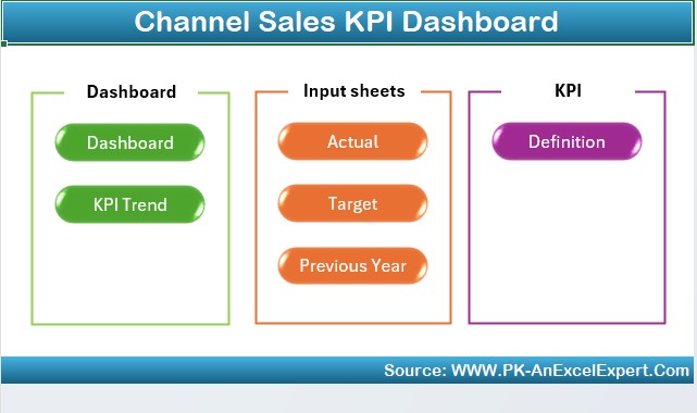
Home Sheet
Click to buy Channel Sales KPI Dashboard in Excel
- The Home Sheet acts as the navigation hub of the dashboard. It includes six interactive buttons, allowing you to jump directly to specific sheets. This saves time and enhances ease of use.
Dashboard Sheet Tab
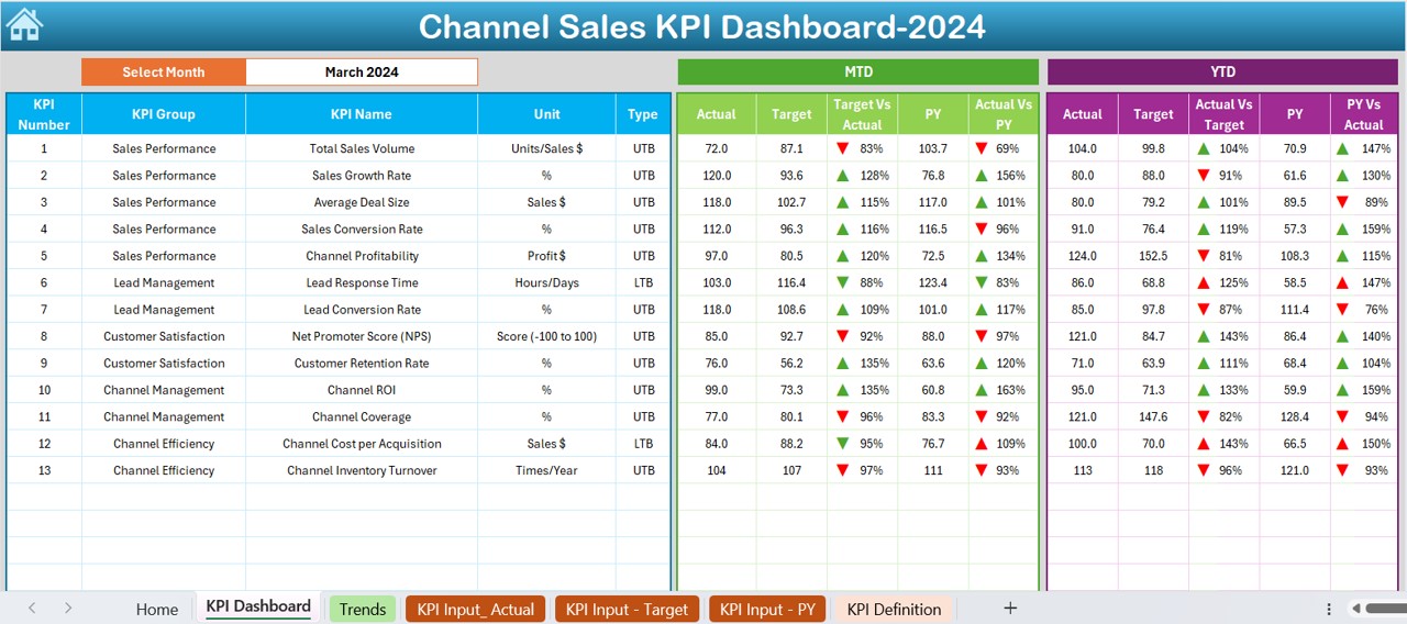
The Dashboard Sheet is the centerpiece of this tool. It provides a complete overview of KPI performance.
Key Highlights:
- Select a month using a dropdown menu in cell D3, and the entire dashboard updates dynamically.
- View metrics such as:
- MTD (Month-to-Date): Actual, Target, and Previous Year data.
- YTD (Year-to-Date): Actual, Target, and Previous Year data.
- Visual indicators, such as up/down arrows, show performance trends using conditional formatting.
KPI Trend Sheet Tab
Click to buy Channel Sales KPI Dashboard in Excel
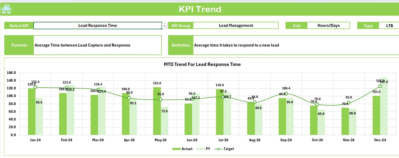
The KPI Trend Sheet offers a deeper dive into specific KPIs.
Key Highlights:
- Choose a KPI from the dropdown in cell C3 to explore:
- KPI Group
- Unit of Measurement
- Type of KPI (e.g., “Lower is Better” or “Upper is Better”)
- Formula and Definition
- View MTD and YTD trend charts for Actual, Target, and Previous Year data.
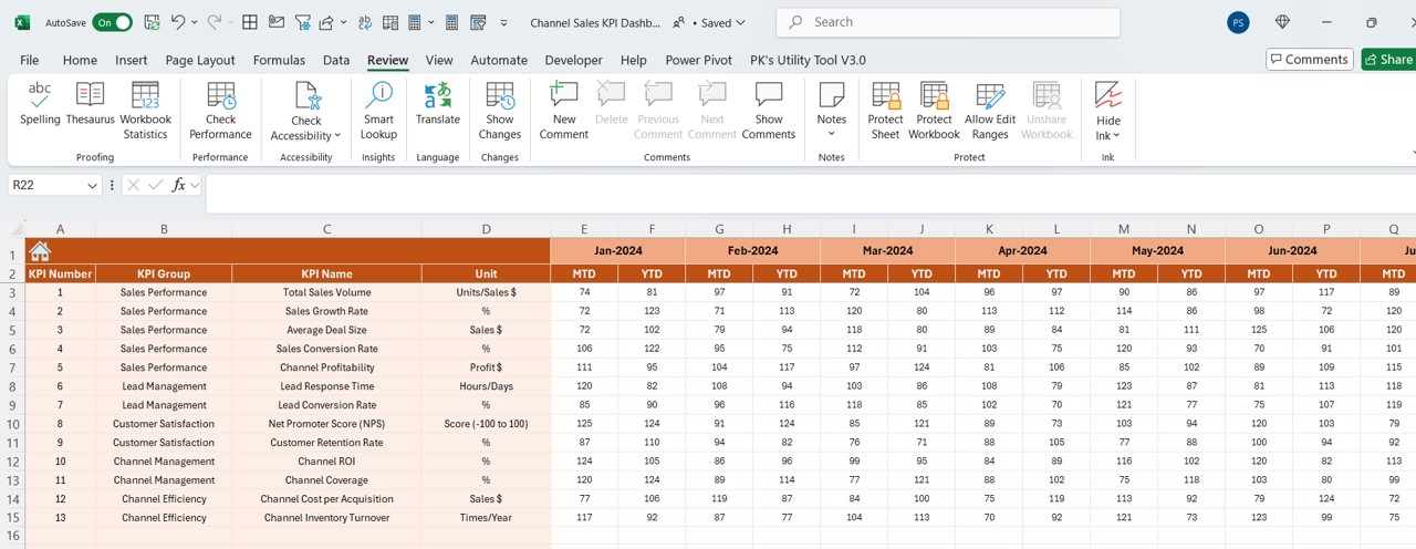
Actual Numbers Input Sheet
Click to buy Channel Sales KPI Dashboard in Excel
This sheet is designed for entering actual performance data.
How it Works:
- Input YTD and MTD numbers for each KPI for a given month.
- Use cell E1 to specify the starting month of the year, which adjusts the timeline accordingly.
Target Sheet Tab
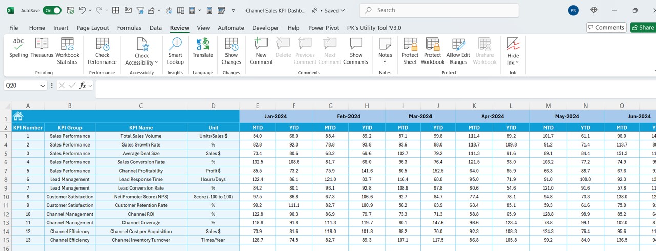
Here, you’ll define performance benchmarks.
How it Works:
Enter target values for each KPI as MTD and YTD for specific months.
Click to buy Channel Sales KPI Dashboard in Excel
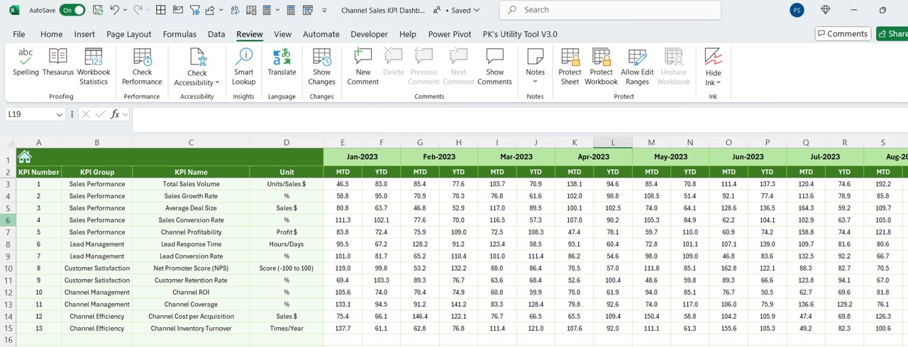
Previous Year Numbers Sheet Tab
Click to buy Channel Sales KPI Dashboard in Excel
To track progress effectively, this sheet allows you to input historical data.
How it Works:
- Enter data for the previous year, mirroring the format of the current year.
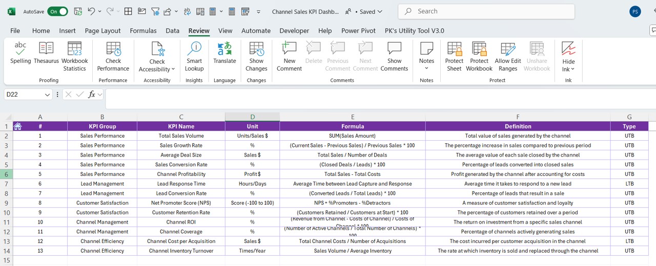
KPI Definition Sheet Tab
Click to buy Channel Sales KPI Dashboard in Excel
- This sheet provides a comprehensive reference for all KPIs.
Key Highlights: - Input the KPI Name, Group, Unit, Formula, and Definition.
Advantages of the Channel Sales KPI Dashboard
A well-designed dashboard offers several benefits:
- Centralized Data Management: All performance metrics are stored in one place, reducing the need for multiple tools.
- Dynamic Analysis: The dashboard updates instantly based on your selections, enabling real-time insights.
- Enhanced Visualization: Charts and conditional formatting make it easier to spot trends and outliers.
- Customization: The template is flexible and can be tailored to meet specific business needs.
- Improved Decision-Making: Clear metrics help identify areas for improvement and guide strategic actions.
Best Practices for Using the Channel Sales KPI Dashboard
To get the most out of your dashboard, follow these best practices:
- Keep Your Data Updated
- Regularly input actual and target values to ensure the dashboard reflects the latest performance.
- Define Clear KPIs
- Use the KPI Definition Sheet to document clear and measurable KPIs. Include the formula and desired performance direction (e.g., “Higher is Better”).
- Leverage Conditional Formatting
- Pay attention to the up/down arrows on the Dashboard Sheet to quickly assess trends.
- Use the Trend Charts
- Regularly review the MTD and YTD trend charts in the KPI Trend Sheet to understand long-term performance.
- Back Up Your Data
- Save versions of your dashboard periodically to safeguard against data loss or accidental changes.
Creating Your Channel Sales KPI Dashboard from Scratch
Click to buy Channel Sales KPI Dashboard in Excel
If you want to create a similar dashboard from scratch, follow these steps:
Step 1: Define Your KPIs
Start by listing all relevant KPIs for your channel sales strategy. Examples include:
- Sales Growth Rate
- Channel Partner Retention
- Average Revenue per Partner
Step 2: Structure Your Data
Organize your data into categories such as:
- Actual Numbers
- Targets
- Historical Data
Step 3: Use Formulas
Incorporate formulas like:
- SUMIF for calculating totals based on criteria.
- IF for setting conditional benchmarks.
- SPARKLINE for embedding trendlines.
Step 4: Add Visual Elements
Use Excel’s built-in chart tools to add bar charts, line graphs, and pie charts for visualizing data.
Step 5: Automate with Dropdowns
Create dropdown menus for selecting months or KPIs using Excel’s Data Validation feature.
How to Optimize the Dashboard for Better Performance
Here are some optimization tips:
- Streamline Data Entry: Use macros or VBA for automating repetitive tasks, such as importing data.
- Enhance User Interface: Incorporate slicers and buttons for easier navigation.
- Focus on Scalability: Design your dashboard to handle additional KPIs or larger datasets as your business grows.
Conclusion
The Channel Sales KPI Dashboard in Excel is an invaluable tool for tracking and optimizing sales performance. With its interactive features, dynamic updates, and comprehensive insights, this dashboard empowers businesses to make informed decisions and achieve their sales goals. By following best practices and regularly updating your data, you can ensure this tool remains a cornerstone of your sales strategy.
Frequently Asked Questions (FAQs)
What is the purpose of a Channel Sales KPI Dashboard?
The purpose of the dashboard is to consolidate key metrics into a single tool, making it easier to track performance, identify trends, and make data-driven decisions.
Can I customize this dashboard for my business needs?
Yes, the dashboard is fully customizable. You can add or remove KPIs, modify charts, and adjust data inputs to fit your specific requirements.
How do I update the dashboard for a new month?
Use the dropdown menu in the Dashboard Sheet to select the desired month. Ensure all data in the Actual Numbers Input, Target, and Previous Year Numbers sheets is updated accordingly.
Are there any automation features in this dashboard?
While the template relies on Excel formulas and dropdowns, you can enhance it further with VBA macros for automating repetitive tasks.
Can I use this dashboard for other sales categories?
Absolutely! While designed for channel sales, you can adapt this dashboard for direct sales, retail, or e-commerce by redefining KPIs and data sources.
Click to buy Channel Sales KPI Dashboard in Excel
Visit our YouTube channel to learn step-by-step video tutorials
View this post on Instagram
Click to buy Channel Sales KPI Dashboard in Excel
