In today’s data-driven world, tracking Key Performance Indicators (KPIs) is crucial for broadcasting companies. KPIs provide insights into operational efficiency, audience engagement, and overall success. To streamline KPI tracking, Power BI offers a dynamic and visually appealing solution: the Broadcasting KPI Dashboard.
This article explores the key features, advantages, best practices, and frequently asked questions about using a Broadcasting KPI Dashboard in Power BI. By the end, you’ll have all the information needed to leverage this dashboard effectively.
Click to Purchase Broadcasting KPI Dashboard in Power BI
What is a Broadcasting KPI Dashboard in Power BI?
A Broadcasting KPI Dashboard in Power BI is a pre-designed, interactive tool to monitor, analyze, and visualize broadcasting-specific KPIs. The dashboard is powered by data stored in Excel files, ensuring easy data updates and scalability.
Key Features of the Broadcasting KPI Dashboard
The dashboard comprises three core pages, each designed for specific analytical purposes:
Summary Page
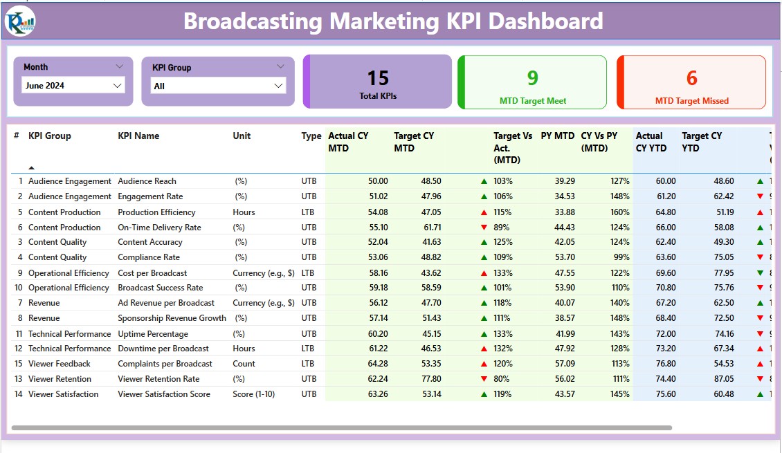
This page provides a high-level overview of KPI performance using intuitive visualizations.
- Filters (Slicers):
- Month selector.
- KPI Group selector.
- KPI Performance Cards:
- Total KPIs Count: Displays the number of KPIs tracked.
- MTD Target Met Count: Shows how many KPIs met their monthly targets.
- MTD Target Missed Count: Highlights underperforming KPIs.
- Detailed Table Information:
- KPI Number: Sequential number for easy identification.
- KPI Group: Category or group of the KPI.
- KPI Name: The name of the KPI being tracked.
- Unit: Unit of measurement (e.g., percentage, count).
- Type: Indicates whether the KPI is “Lower the Better” (LTB) or “Upper the Better” (UTB).
- Actual CY MTD & Target CY MTD: Actual and target metrics for the current month.
- MTD Icon: Visual indicators (▲/▼) for KPI status based on monthly targets.
- Target vs Actual (MTD): Percentage comparison of actual vs. target values.
- PY MTD & CY vs PY (MTD): Previous Year’s MTD value and year-over-year comparison.
- Actual CY YTD & Target CY YTD: Year-to-date values for actual and target metrics.
- YTD Icon: Visual indicators for KPI performance against annual targets.
- PY YTD & CY vs PY (YTD): Historical YTD values and comparisons.
KPI Trend Page
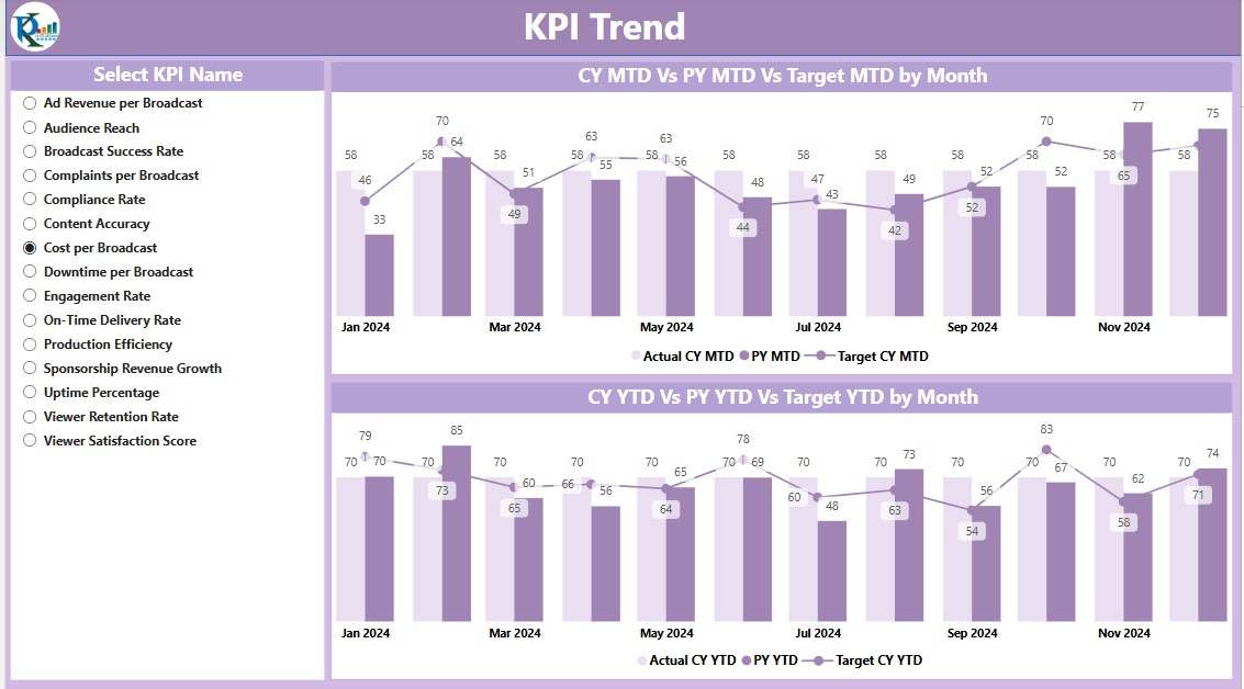
- The trend page focuses on detailed KPI analysis over time. Key features include:
- Combo Charts:
- Visualize Actual Numbers for the Current Year (CY), Previous Year (PY), and Targets for MTD and YTD.
- Slicer for KPI Name:
- Allows users to select and analyze specific KPIs.
This page ensures granular insights into trends and deviations, enabling better decision-making.
KPI Definition Page
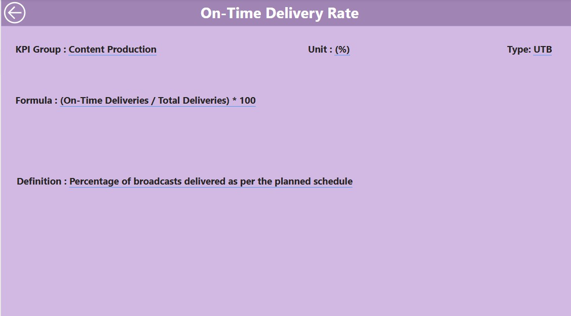
The definition page provides an in-depth explanation of each KPI. It is a hidden drill-through page accessible from the Summary Page.
- Key Information:
- Formula for KPI calculation.
- Detailed KPI definitions.
- Navigation:
- Use the Back Button on the top-left corner to return to the Summary Page seamlessly.
Excel Data: Backbone of the Dashboard
The dashboard uses an Excel file as its primary data source, ensuring ease of use and flexibility. The file contains three key worksheets:
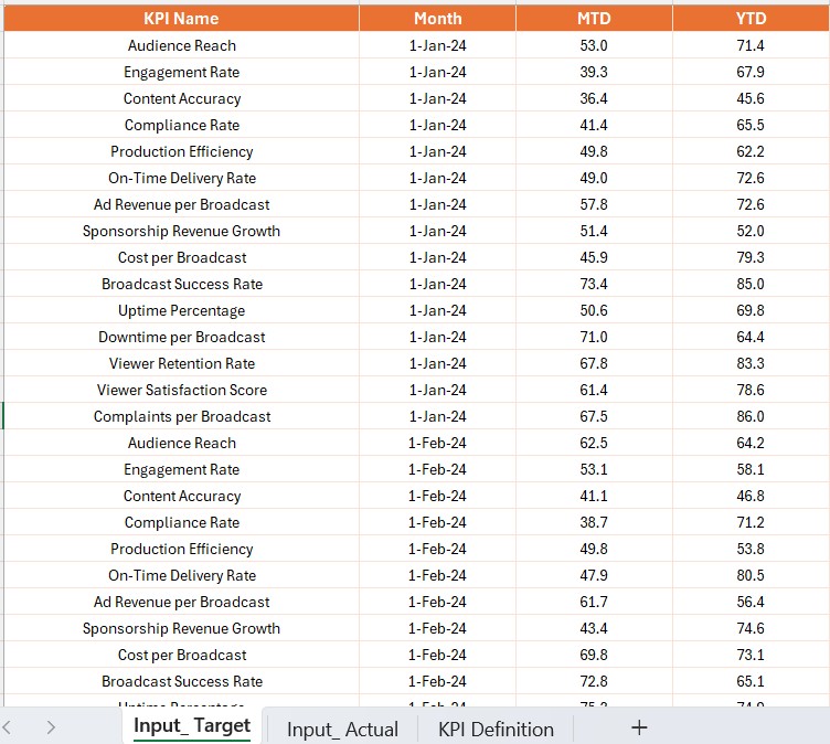
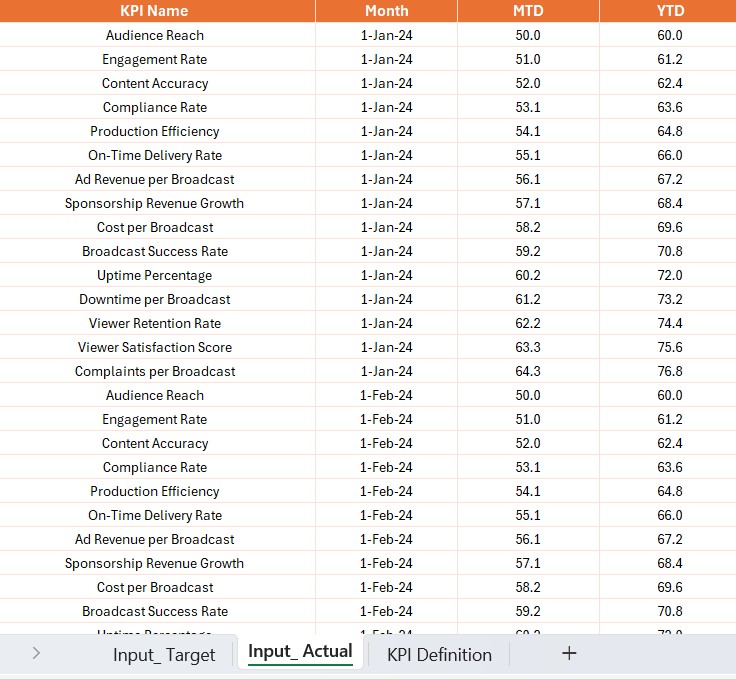
Input Actual Sheet Tab:
- Enter the KPI name, month (use the first day of the month), and the MTD and YTD actual values.
Input Target Sheet Tab:
Fill in the KPI name, month, and MTD and YTD target numbers.
KPI Definition Sheet:
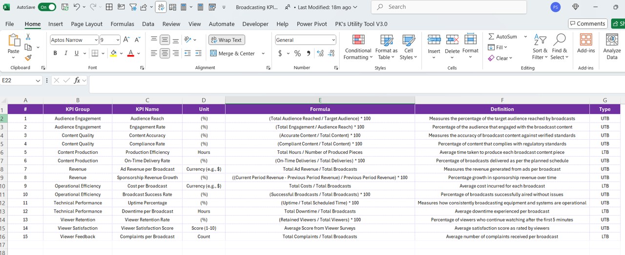
Provide the KPI number, group, name, unit, formula, definition, and type (LTB or UTB).
This structured data input ensures the dashboard remains up-to-date with minimal effort.
Advantages of the Broadcasting KPI Dashboard
- Real-Time Tracking: With Power BI, the dashboard offers near real-time tracking of broadcasting KPIs, ensuring timely decisions.
- Interactive Visualizations: Filters, slicers, and charts make it easy to drill down into data for actionable insights.
- Customizable and Scalable: The dashboard structure allows users to add new KPIs or modify existing ones based on evolving business needs.
- Data-Driven Decisions: Comparative metrics like CY vs. PY and Target vs. Actual ensure stakeholders focus on critical performance areas.
Best Practices for Using the Broadcasting KPI Dashboard
Regularly Update Data: Ensure the Excel sheets are updated monthly with accurate data to reflect the latest metrics.
- Define Clear KPIs: Use the KPI Definition Sheet to establish clear formulas, measurement units, and performance thresholds.
- Leverage Slicers: Use slicers to filter data for specific months or KPI groups, simplifying analysis.
- Monitor Trends: Utilize the KPI Trend Page to identify long-term trends and patterns.
- Train Your Team: Educate users on navigating and interpreting the dashboard effectively.
Frequently Asked Questions (FAQs)
What is the purpose of the KPI Trend Page?
The KPI Trend Page provides a detailed view of KPI performance over time, enabling users to track progress and deviations against targets.
Can I customize the dashboard?
Yes, you can modify the dashboard by adding or removing KPIs, updating formulas, or customizing visuals to suit your requirements.
What are LTB and UTB KPIs?
- LTB (Lower the Better): Metrics where lower values indicate better performance (e.g., error rates).
- UTB (Upper the Better): Metrics where higher values indicate better performance (e.g., revenue).
How often should I update the data?
It is recommended to update the data monthly to ensure accuracy and relevance.
Can I use a different data source instead of Excel?
Yes, Power BI supports various data sources, including SQL databases, SharePoint, and cloud-based platforms.
Conclusion
The Broadcasting KPI Dashboard in Power BI is a powerful tool for monitoring and improving broadcasting operations. Its interactive features, visual indicators, and structured data inputs make it a must-have for broadcasting professionals.
Click to Purchase Broadcasting KPI Dashboard in Power BI
View this post on Instagram
Visit our YouTube channel to learn step-by-step video tutorials