In today’s fast-paced business environment, Public Relations (PR) teams are required to maintain a high level of accountability and transparency. One effective way to achieve this is by using Key Performance Indicators (KPIs) that provide insights into the efficiency of PR campaigns and activities. With Power BI, you can take this one step further by creating dynamic and interactive dashboards to monitor these KPIs in real-time.
In this article, we will walk you through the Public Relations KPI Dashboard in Power BI, explaining its key features, advantages, opportunities for improvement, best practices, and much more. By the end of this guide, you will understand how to set up and use such a dashboard for tracking the performance of your PR strategies.
What is a Public Relations KPI Dashboard in Power BI?
A Public Relations KPI Dashboard in Power BI is a comprehensive tool designed to track and display the success of PR campaigns. The dashboard offers various visualizations, including charts, tables, and indicators, to assess the performance of PR activities, such as media mentions, audience engagement, sentiment analysis, and more.
Power BI allows PR teams to integrate data from different sources, such as social media, news outlets, and press releases, into a single dashboard, enabling them to make informed decisions quickly and efficiently. It helps to align PR strategies with the overall business objectives, ensuring measurable outcomes and continuous improvement.
Key Features of the Public Relations KPI Dashboard
A successful PR dashboard must be designed with user experience and functionality in mind. Below are the core features of the Public Relations KPI Dashboard in Power BI:
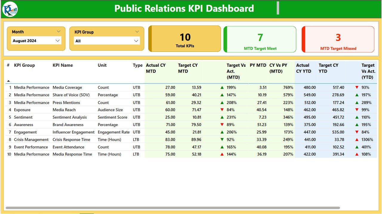
1. Summary Page
The Summary Page serves as the main dashboard interface, providing an overview of all KPIs related to public relations activities. The page includes the following elements:
Slicers for Month and KPI Group: These filters allow users to select the month and category of KPIs they want to focus on.
KPI Cards: These three cards display critical metrics such as:
- Total KPIs Count
- MTD (Month-to-Date) Target Meet Count
- MTD Target Missed Count
Detailed Table: This table shows in-depth data for each KPI, including:
- KPI Number, KPI Group, and Name
- Unit of Measurement
- KPI Type (e.g., Lower the Better, Upper the Better)
- Actual CY (Current Year) MTD and Target CY MTD
- MTD Icon (Red or Green) to Indicate Status
- Target Vs Actual (MTD and YTD)
- Comparison with Previous Year’s Data (PY MTD and PY YTD)
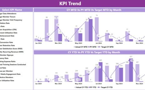
2. KPI Trend Page
The KPI Trend Page provides an in-depth view of how PR performance has evolved over time. It includes:
- Combo Charts for MTD and YTD Performance: These charts display actual numbers for the current and previous years, along with the targets.
- KPI Slicer: This slicer allows users to select specific KPIs to track.

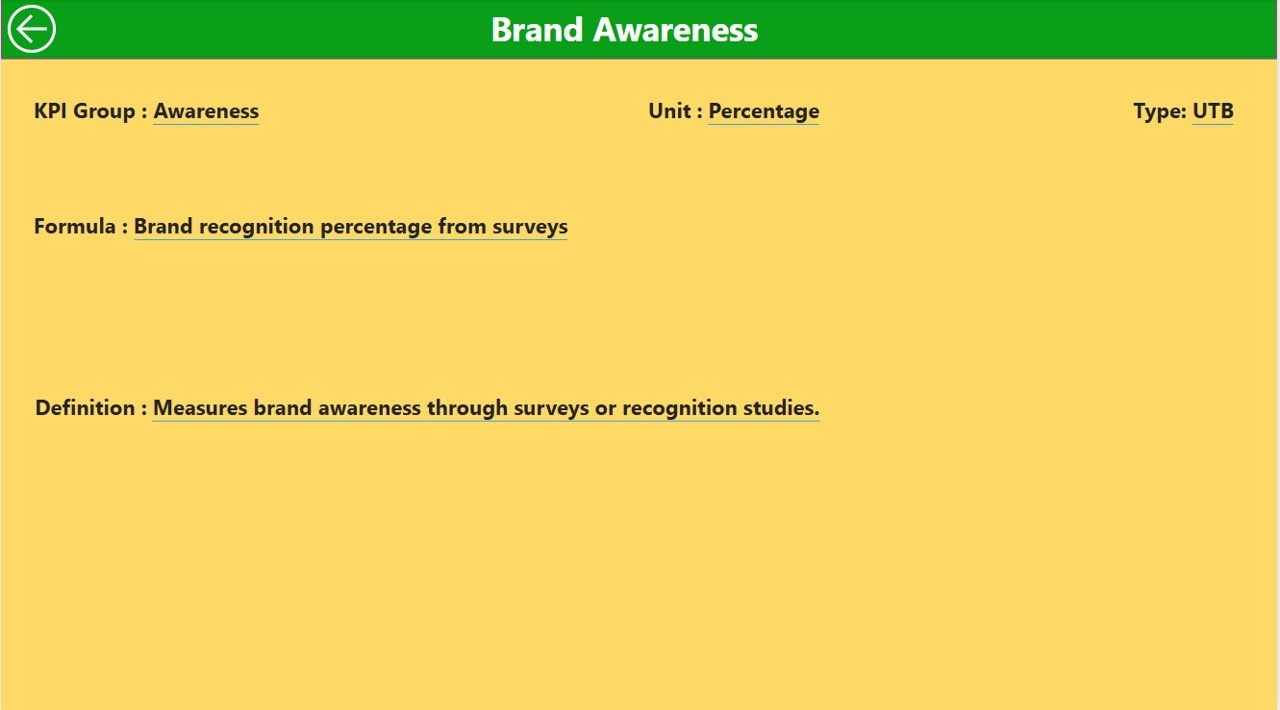
3. KPI Definition Page
This is a hidden page used for drill-through functionality. Users can click through from the Summary Page to view detailed information about each KPI, including:

- KPI Formula
- KPI Definition
- KPI Type
A “Back” button on this page allows users to easily navigate back to the Summary Page.
Advantages of Using a Public Relations KPI Dashboard in Power BI
Integrating KPIs into your PR strategy using Power BI offers several key benefits that help to optimize PR efforts. Some of these advantages include:
- Real-Time Monitoring: By using Power BI, you can track KPIs in real-time, enabling you to make adjustments to your PR strategy as needed. Whether you’re monitoring social media mentions, press releases, or audience engagement, you’ll have up-to-the-minute data at your fingertips.
- Comprehensive View of PR Performance: The dashboard aggregates various PR metrics in one place, offering a holistic view of your PR efforts. It helps you measure different facets of PR campaigns, such as media mentions, share of voice, sentiment analysis, and engagement metrics.
- Improved Decision Making: With a clear and easy-to-understand visualization of KPIs, you can quickly identify areas where your PR strategy is succeeding and where it needs improvement. This data-driven approach leads to more informed decision-making and better results.
- Customizable and Interactive: Power BI allows users to customize the dashboard based on their specific needs. Whether you want to focus on particular KPIs or display data from different timeframes, Power BI’s flexibility makes it easy to tailor the dashboard to your needs.
- Time and Cost Efficient: Automating the tracking of PR KPIs reduces manual reporting efforts and errors. It saves both time and costs by enabling teams to focus on strategy rather than data entry or manually pulling reports.
Opportunity for Improvement in the Public Relations KPI Dashboard
While Power BI provides a highly effective platform for tracking PR KPIs, there are always opportunities to enhance the dashboard’s capabilities. Some potential improvements could include:
- Integrating More Data Sources: Currently, the dashboard relies on Excel data. However, to make the dashboard even more powerful, you could integrate additional data sources such as:
- Incorporating Predictive Analytics: Adding predictive analytics features can allow the dashboard to not only display past performance but also forecast future trends. Using machine learning and AI, you can predict PR outcomes based on historical data, giving you a proactive approach.
- Enhancing Collaboration Features: While Power BI allows users to share dashboards, improving the collaboration features would allow teams to work together more effectively. For instance, enabling real-time commenting and annotations on the dashboard could lead to more dynamic teamwork.
Best Practices for Building a Public Relations KPI Dashboard
To ensure the dashboard is effective and user-friendly, it’s essential to follow some best practices during its creation:
- Keep the Design Simple and Intuitive: A cluttered dashboard can overwhelm users. Ensure the layout is clean and easy to navigate. Limit the use of complex visuals and focus on simplicity and clarity.
- Provide Context with Annotations: It’s important to offer context with the data. For example, when showing a KPI’s actual performance compared to the target, add a short description explaining why the target was missed or exceeded.
- Regularly Update Data: Keep your data current by setting up automated data refresh cycles. This ensures that the dashboard is always displaying the latest insights.
Frequently Asked Questions (FAQs)
2. How can I improve the accuracy of the data in my PR KPI dashboard?
Ensure that you are pulling data from reliable and verified sources. Regularly audit your data to identify and correct any discrepancies.
3. How often should I update my PR KPI Dashboard?
To ensure you have accurate and timely insights, update your dashboard at least once a week. However, you can automate data updates to refresh daily.
4. Can I integrate social media data into the dashboard?
Yes, Power BI supports integration with several social media platforms such as Twitter, Facebook, and LinkedIn. You can use APIs to pull in real-time social media analytics.
5. How can I share the Public Relations KPI Dashboard with my team?
Power BI offers several options for sharing dashboards, including publishing them to the web, embedding them in websites, or sending them through email.
Conclusion
The Public Relations KPI Dashboard in Power BI is an invaluable tool for PR teams seeking to optimize their campaigns and strategies. By tracking the right KPIs, integrating multiple data sources, and presenting information in a user-friendly format, you can ensure that your PR efforts align with business objectives and deliver measurable outcomes.
Visit our YouTube channel to learn step-by-step video tutorials
View this post on Instagram