In the healthcare industry, managing operational efficiency is critical for delivering quality patient care. A Hospital Operations KPI Dashboard in Power BI provides real-time insights into hospital performance, ensuring that key metrics are tracked effectively. This guide will walk you through the dashboard’s features, advantages, and best practices to help you optimize hospital operations Hospital Operations KPI Dashboard.
What is a Hospital Operations KPI Dashboard?
A Hospital Operations KPI Dashboard is a visual representation of key performance indicators (KPIs) that measure the effectiveness of hospital operations. It allows healthcare administrators to monitor performance trends, compare actual results with targets, and make data-driven decisions.
Key Features of the Dashboard
This ready-to-use dashboard captures data from an Excel file and comprises three main pages in the Power BI desktop application:
Summary Page
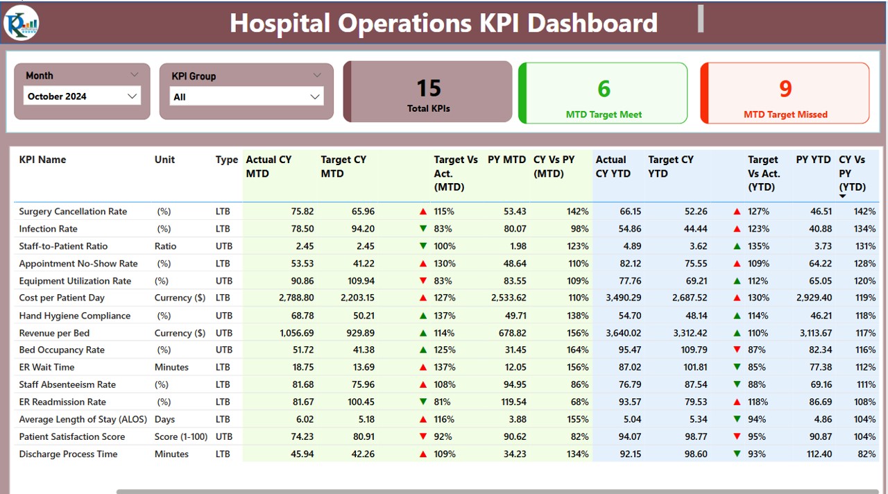
- The Summary Page serves as the main interface of the dashboard, providing a snapshot of key metrics. It includes:
- Month and KPI Group slicers: Allow filtering by time and KPI category.
KPI Overview Cards:
Total KPIs Count
MTD (Month-to-Date) Target Met Count
MTD Target Missed Count
- Detailed KPI Table: Displays vital KPI data such as:
- KPI Number: Sequence number of the KPI.
- KPI Group: Categorization of the KPI.
- KPI Name: Specific KPI being tracked.
- Unit: Measurement unit (e.g., percentage, number of patients).
- Type: KPI classification (Lower the Better – LTB, Upper the Better – UTB).
- Actual CY MTD: Actual Month-to-Date values for the current year.
- Target CY MTD: Month-to-Date target values.
- MTD Performance Indicator: ▲ or ▼ symbols to indicate performance status.
- Target Vs Actual (MTD): Percentage comparison (Actual / Target).
- PY MTD: Previous Year’s Month-to-Date actual values.
- CY vs PY (MTD): Year-over-year comparison.
- Actual CY YTD: Current Year’s Year-to-Date actual values.
- Target CY YTD: Year-to-Date target values.
- YTD Performance Indicator: ▲ or ▼ symbols to indicate performance status.
- Target Vs Actual (YTD): Percentage comparison (Actual / Target).
- PY YTD: Previous Year’s Year-to-Date actual values.
- CY vs PY (YTD): Year-over-year comparison.
KPI Trend Page
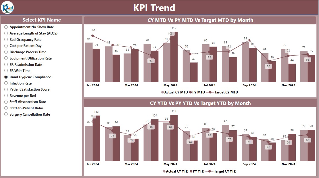
The KPI Trend Page provides a visual representation of trends over time using:
- Two Combo Charts: Displaying actual numbers for the Current Year, Previous Year, and Target values for both MTD and YTD.
- Slicer for KPI Selection: Allows users to filter trends based on specific KPIs.
KPI Definition Page
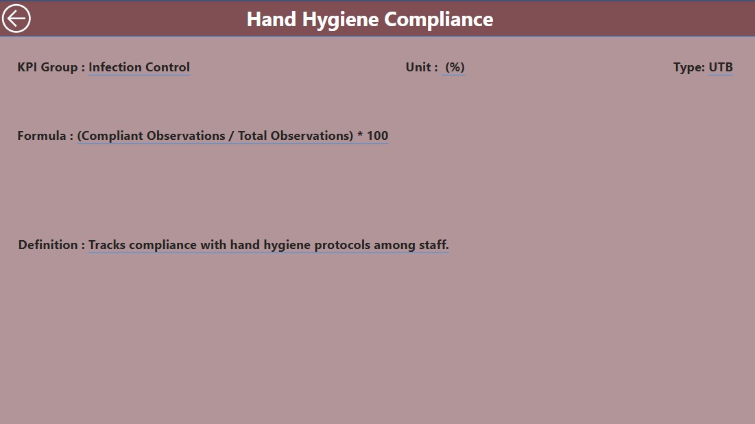
The KPI Definition Page is a hidden drill-through page, accessible from the Summary Page. It provides detailed information such as:
- KPI Formula
- KPI Definition
- Measurement Criteria
- Performance Benchmark
- Users can return to the Summary Page by clicking the Back Button at the top-left corner.
Data Input and Excel Integration
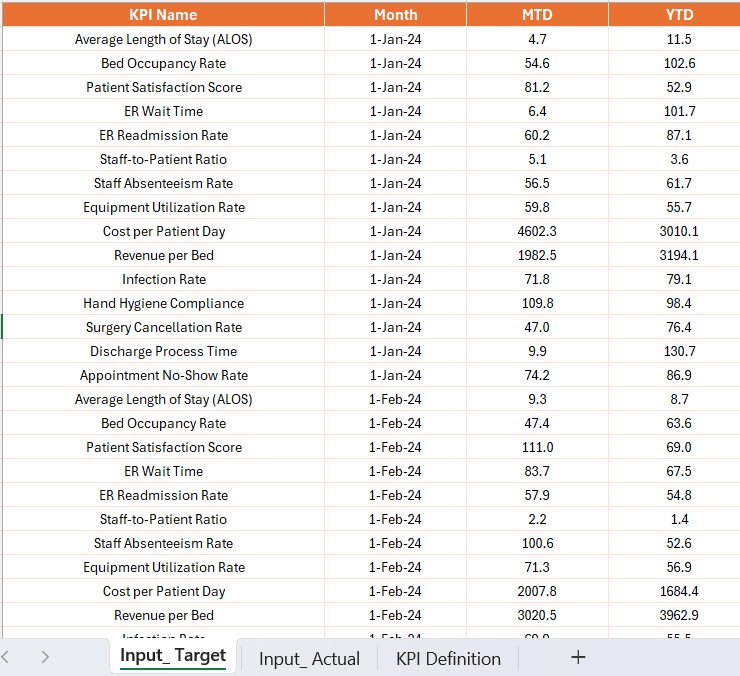
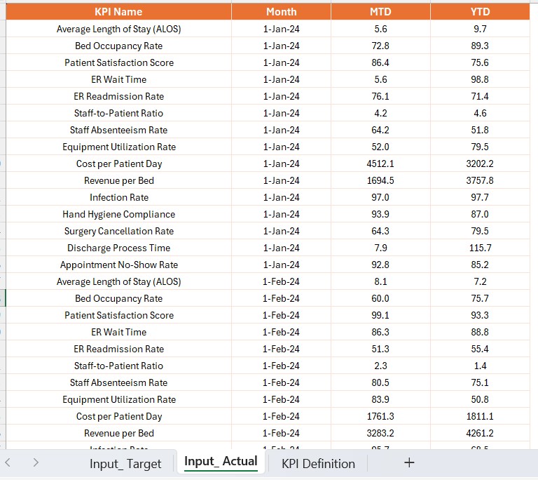
- The dashboard sources data from an Excel file, which contains three worksheets:
Input Actual Sheet Tab:
- Enter actual KPI values.
- Include Month (first date of the month), MTD, and YTD values.
Input Target Sheet Tab:
- Enter target KPI values.
- Include Month (first date of the month), MTD, and YTD values.
KPI Definition Sheet:
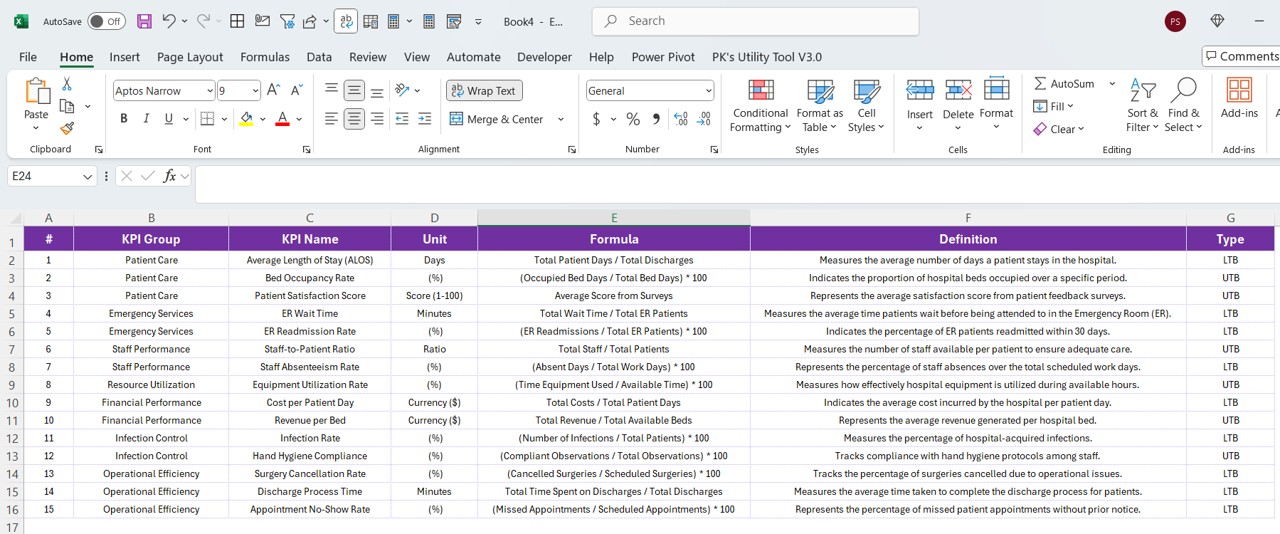
- Define KPI Number, KPI Group, KPI Name, Unit, Formula, Definition, and Type (LTB or UTB).
Advantages of the Hospital Operations KPI Dashboard
- Real-time Performance Monitoring – Track KPIs dynamically for improved decision-making.
- Data-Driven Decision Making – Helps administrators optimize hospital resources.
- Automated Data Visualization – Eliminates manual reporting, reducing errors.
- Improved Compliance and Reporting – Ensures regulatory compliance with accurate KPI tracking.
- Customizable Filters and Views – Provides flexible data exploration.
Best Practices for Using the Dashboard
- Ensure Data Accuracy: Validate data inputs in Excel before uploading to Power BI.
- Set Realistic KPI Targets: Define achievable and measurable goals.
- Monitor Trends Regularly: Track trends to identify areas for improvement.
- Use Drill-Through Analysis: Access detailed KPI definitions for deeper insights.
- Optimize Dashboard Performance: Keep Excel data structured and avoid excessive calculations in Power BI.
Frequently Asked Questions (FAQs)
Why is a KPI Dashboard important for hospital operations?
A KPI dashboard helps hospitals track performance, optimize resources, and improve patient care by providing real-time data visualization.
Can this dashboard be customized for different hospitals?
Yes, the dashboard is fully customizable. Users can modify KPI definitions, add new metrics, and update data sources as per their hospital’s needs.
How does the dashboard track KPI performance?
It compares actual values vs. targets using indicators (▲ or ▼) and provides percentage-based insights for both MTD and YTD data.
Can this dashboard integrate with other hospital management systems?
Yes, it can integrate with Electronic Health Records (EHR), Hospital Information Systems (HIS), and other databases using Power BI’s data connectors.
Is Power BI the best tool for hospital performance tracking?
Power BI is an excellent choice due to its interactive visualizations, automation features, and ability to handle large datasets.
Conclusion
A Hospital Operations KPI Dashboard in Power BI is a game-changer for healthcare management. It enables hospital administrators to monitor key metrics, enhance operational efficiency, and make informed decisions. With features like real-time trend analysis, detailed KPI tracking, and customizable filters, this dashboard is essential for any hospital looking to improve its performance. Start leveraging Power BI today to take your hospital operations to the next level!
Visit our YouTube channel to learn step-by-step video tutorials
View this post on Instagram