In today’s competitive business landscape, the ability to track and monitor Key Performance Indicators (KPIs) is crucial to maintaining a successful subscription-based business model. Businesses rely on accurate, real-time insights into their performance to make informed decisions, adjust strategies, and drive growth. This is where a Subscription Business KPI Dashboard in Power BI comes into play. This dashboard not only streamlines the tracking of various KPIs but also provides a comprehensive view of the business’s health and performance at any given time.
Whether you’re managing a subscription service or any subscription-based model, this Subscription Business KPI Dashboard offers you a powerful tool for managing, analyzing, and visualizing your data. Let’s explore the features, benefits, and best practices of using this dynamic Power BI dashboard.
What is a Subscription Business KPI Dashboard in Power BI?
A Subscription Business KPI Dashboard in Power BI is a data visualization tool designed specifically for subscription-based businesses. It allows business owners, managers, and teams to track important metrics related to the subscription model such as Monthly Active Users (MAUs), Churn Rate, Average Revenue Per User (ARPU), and more. Using Power BI’s powerful analytics and reporting tools, businesses can visualize their data, compare it to targets, and make data-driven decisions to enhance their subscription services.
This ready-to-use dashboard in Power BI captures and presents your key metrics in an easily digestible format, providing you with accurate and timely insights that help guide your subscription business strategy.
Key Features of the Subscription Business KPI Dashboard in Power BI
The Subscription Business KPI Dashboard in Power BI is designed to be both powerful and user-friendly. Let’s take a closer look at its key features:
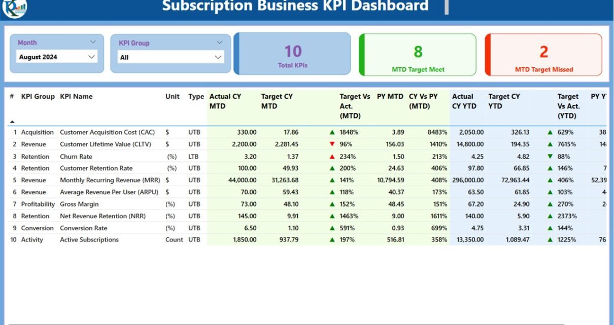
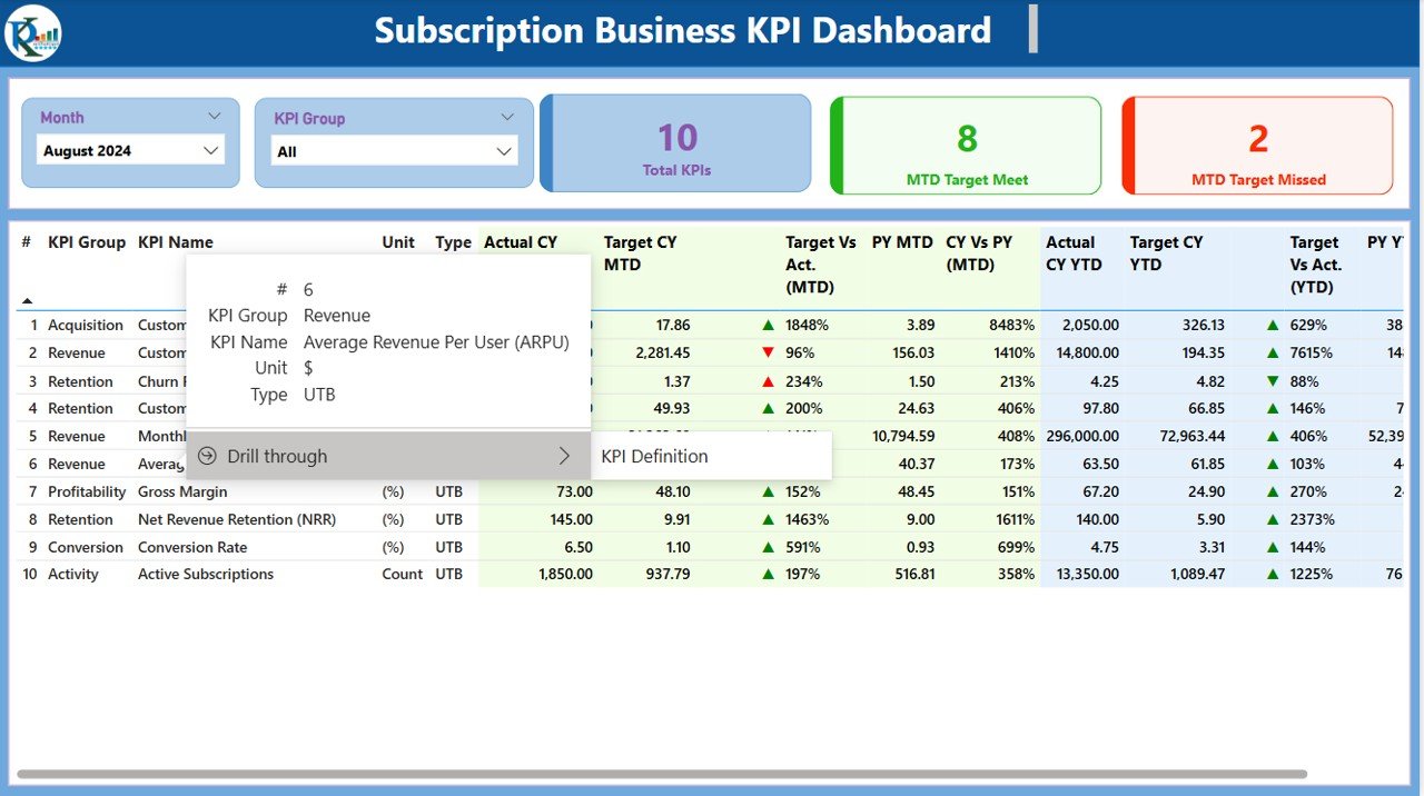
Summary Page: The Central Hub of Your Dashboard
The Summary Page is the main page of the dashboard and provides a comprehensive overview of the subscription business’s performance. This page is designed to offer quick insights into your KPIs through the following elements:
KPI Slicers: Use the Month and KPI Group slicers to filter the data based on specific periods and KPI groups.
KPI Cards: Three key cards are displayed at the top showing:
- Total KPI count
- MTD Target Met count
- MTD Target Missed count
Detailed KPI Table: Below the cards, a detailed table shows various KPI metrics, including:
- KPI Number
- KPI Group
- KPI Name
- Unit of Measurement
- KPI Type (Lower the Better or Upper the Better)
- Actual MTD and YTD Numbers
- Target MTD and YTD Numbers
- Target vs Actual comparison for both MTD and YTD, with percentage and icons indicating performance against targets.
- Previous Year (PY) MTD and YTD for year-over-year performance analysis.
The Summary Page provides an at-a-glance understanding of how your subscription business is performing and helps identify areas for improvement.

Click to Subscription Business KPI
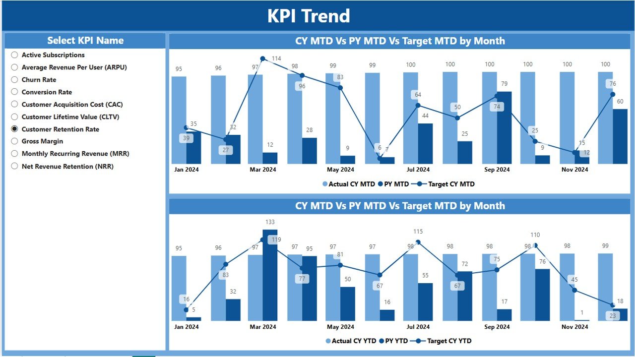
KPI Trend Page: Visualize Your Performance Over Time
The KPI Trend Page is where you can see the historical performance of your KPIs. This page contains two Combo Charts that visualize your actual numbers for MTD and YTD compared to targets and the previous year. The key features of this page include:
- MTD and YTD Combo Charts: The combo charts display actual figures for the current year and previous year alongside the target numbers, providing a clear view of performance trends over time.
- KPI Slicer: Select the specific KPI you want to focus on using the slicer on the left. This allows you to drill down into individual KPIs to see detailed trends.
Click to Subscription Business KPI
The KPI Trend Page enables you to easily track the progression of your KPIs and identify whether the business is meeting, exceeding, or falling short of its targets.
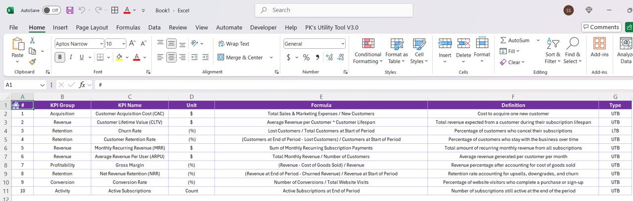
KPI Definition Page: In-Depth Understanding of Your KPIs
The KPI Definition Page is designed for detailed insights into each KPI. This hidden page allows users to drill through from the Summary Page to view more details about any KPI. Key information on this page includes:
Click to Subscription Business KPI
- KPI Formula: Understand how each KPI is calculated.
- KPI Definition: Get a detailed description of the KPI and its significance to your subscription business.
- KPI Type: Learn whether the KPI is “Lower the Better” (LTB) or “Upper the Better” (UTB).
The KPI Definition Page offers in-depth clarity for each KPI, ensuring that everyone in your team understands the metrics and their importance.

Click to Subscription Business KPI
Excel Data Integration: Powering Your Power BI Dashboard
The Power BI dashboard relies on data from an Excel file. The Excel file is where you input the necessary information to fuel the dashboard’s visualizations and reports. The key data inputs include three worksheets:
- Input_Actual Sheet:
Fill in actual numbers for the KPIs, including MTD and YTD values for each KPI.

- Input_Target Sheet:
Enter the target values for the KPIs, including MTD and YTD targets.
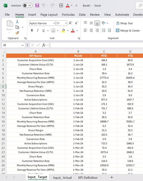
- KPI Definition Sheet:
Provide detailed information about each KPI, including the KPI number, group, name, unit, formula, definition, and type (LTB or UTB).
These worksheets serve as the backbone of the Power BI dashboard, ensuring that your data is up-to-date and accurately reflected in the visualizations.
Advantages of Using the Subscription Business KPI Dashboard in Power BI
Implementing the Subscription Business KPI Dashboard in Power BI provides several key benefits to businesses:
- Real-Time Insights: With this dashboard, you gain real-time insights into how your subscription business is performing. Whether it’s monitoring monthly active users, churn rate, or average revenue per user (ARPU), the dashboard gives you the visibility you need to take quick actions.
- Data-Driven Decision Making: The ability to visualize your KPIs makes it easier to base your business decisions on data rather than assumptions. The dashboard provides accurate and reliable performance metrics, empowering you to optimize your subscription strategy.
- Easy Monitoring of Multiple KPIs: The dashboard’s layout allows you to monitor multiple KPIs simultaneously, making it simple to track overall business health and individual subscription performance.
- Customizable: With the use of slicers and filters, you can easily customize the dashboard to suit your specific business needs. You can focus on different KPI groups or periods, ensuring that the data you see is always relevant.
Opportunities for Improvement in the Subscription Business KPI Dashboard
While the Subscription Business KPI Dashboard offers a wealth of features and functionalities, there are always areas for enhancement:
- Integration with Other Data Sources: While this dashboard currently pulls data from Excel, it could be further enhanced by integrating it with other data sources, such as CRM systems, payment processors, and subscription management tools. This would provide even richer insights.
- Automation of Data Inputs: Automating the data entry process would eliminate the need for manual updates in the Excel file. This could involve integrating the dashboard with APIs from various business platforms, ensuring that your KPIs are always up-to-date without manual intervention.
- Enhanced Forecasting: Integrating predictive analytics or forecasting models could allow you to project future trends based on historical data. This would enable you to anticipate potential challenges in your subscription business and plan ahead.
- Mobile Compatibility: Currently, the dashboard is optimized for desktop use. However, making it mobile-friendly would enhance accessibility, allowing business owners and managers to view their KPIs on-the-go.
Best Practices for Using the Subscription Business KPI Dashboard
To maximize the effectiveness of the Subscription Business KPI Dashboard, consider these best practices:
- Regularly Update Your Data: Ensure that your data is updated regularly to reflect the most current figures. Outdated data will compromise the accuracy of your KPIs and hinder effective decision-making.
- Focus on the Most Important KPIs: While the dashboard tracks multiple KPIs, focusing on the most relevant ones for your business will make it easier to monitor performance and take timely action.
- Collaborate with Your Team: Encourage collaboration by sharing the dashboard with your team. This will allow everyone to stay on the same page and work towards common goals.
- Analyze Trends Over Time: Use the trend pages to analyze how KPIs have evolved over time. This will help you identify patterns and areas for improvement.
Frequently Asked Questions (FAQs)
How do I input data into the Subscription Business KPI Dashboard?
Data is inputted into three Excel sheets: Input_Actual, Input_Target, and KPI_Definition. Simply fill out the relevant fields in these sheets, and the data will automatically update in the Power BI dashboard.
Can I customize the KPIs displayed on the dashboard?
Yes, the dashboard allows you to select the KPI group and month through slicers, enabling you to filter and display only the KPIs that matter to you.
Can the dashboard show future projections?
Currently, the dashboard focuses on past and present data. However, you can integrate forecasting features for future projections as part of future enhancements.
How often should I update my KPI data?
It is recommended to update your data monthly to ensure that the dashboard reflects the most current information and provides accurate insights.
Is the dashboard mobile-friendly?
Currently, the dashboard is designed for desktop use. However, future enhancements could include mobile compatibility for on-the-go monitoring.
Conclusion
The Subscription Business KPI Dashboard in Power BI is an essential tool for subscription-based businesses, offering a clear, real-time view of your key metrics. By providing powerful visualizations and detailed insights into your KPIs, the dashboard helps you stay on top of performance, make data-driven decisions, and drive business growth. Whether you are tracking customer acquisition, retention, or revenue metrics, this dashboard is a game-changer for any subscription business.
Visit our YouTube channel to learn step-by-step video tutorials
View this post on Instagram