Managing an ATM Network efficiently requires tracking key performance indicators (KPIs) that measure various aspects of performance. From transaction success rates to downtime tracking, a well-structured KPI dashboard can help banks, financial institutions, and ATM service providers make data-driven decisions.
Click to ATM Network KPI
In this article, we will explore how to use an ATM Network KPI Dashboard in Excel to track performance, optimize operations, and improve customer satisfaction. This dashboard is a ready-to-use template that allows you to monitor crucial metrics at a glance.
Key Features of the ATM Network KPI Dashboard
This Excel dashboard consists of 7 key worksheets, each designed to perform specific functions. Let’s take a closer look at them:
Home Sheet
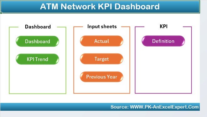
This is the index sheet that serves as the starting point of the dashboard. It contains six navigation buttons that allow you to jump to the respective sheets quickly.
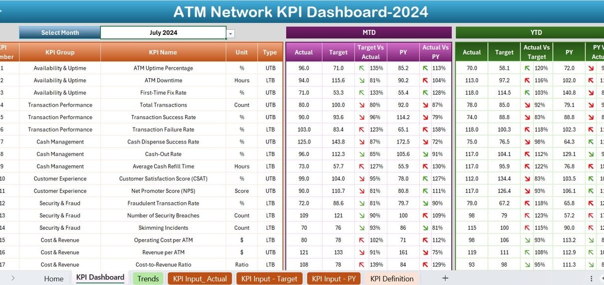
Dashboard Sheet
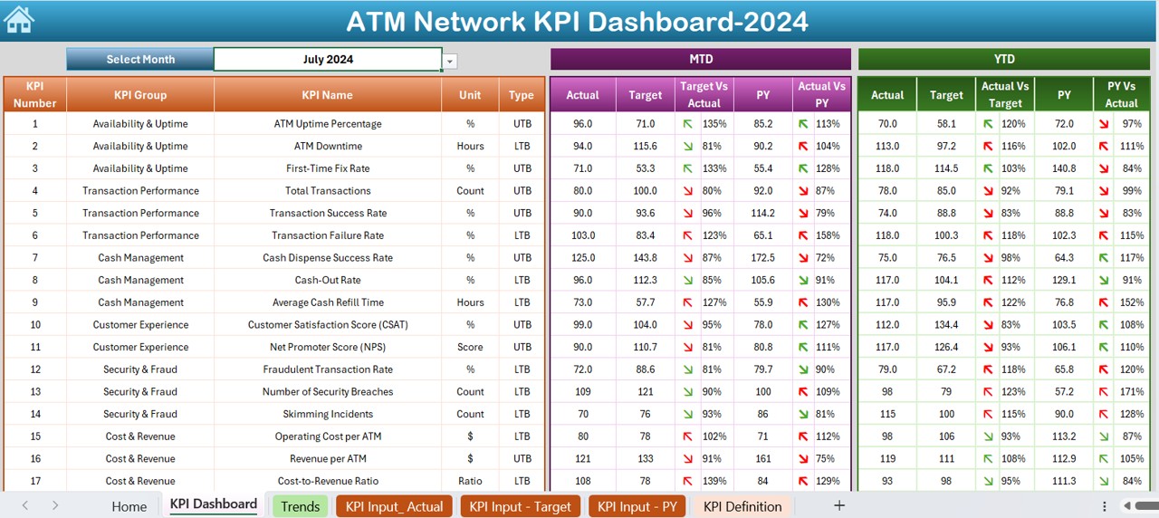
- This is the main sheet where all KPI-related information is displayed. It provides a month-wise overview of ATM performance.
- Month Selection (D3 Drop-Down): Users can select a specific month from the drop-down, and all data updates accordingly.
- MTD and YTD Data: The sheet displays Month-to-Date (MTD) and Year-to-Date (YTD) actual values, targets, and previous year data.
- Target vs Actual Comparison: The dashboard highlights variances between actual numbers and targets.
- Conditional Formatting: It uses up and down arrows to indicate whether performance has improved or declined compared to the previous year and target.
Click to ATM Network KPI
KPI Trend Sheet
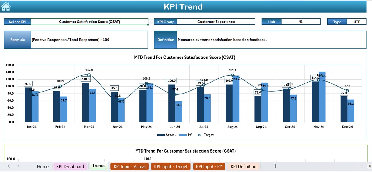
This sheet provides a detailed trend analysis for each KPI.
- Drop-Down Selection (C3): Users can choose a KPI from the drop-down menu.
- KPI Details: The sheet displays KPI Group, Unit of KPI, Type (Lower or Upper is Better), KPI Formula, and KPI Definition.
- Trend Charts: MTD and YTD trends for Actual, Target, and Previous Year values are visually represented in charts.
Click to ATM Network KPI
Actual Numbers Input Sheet
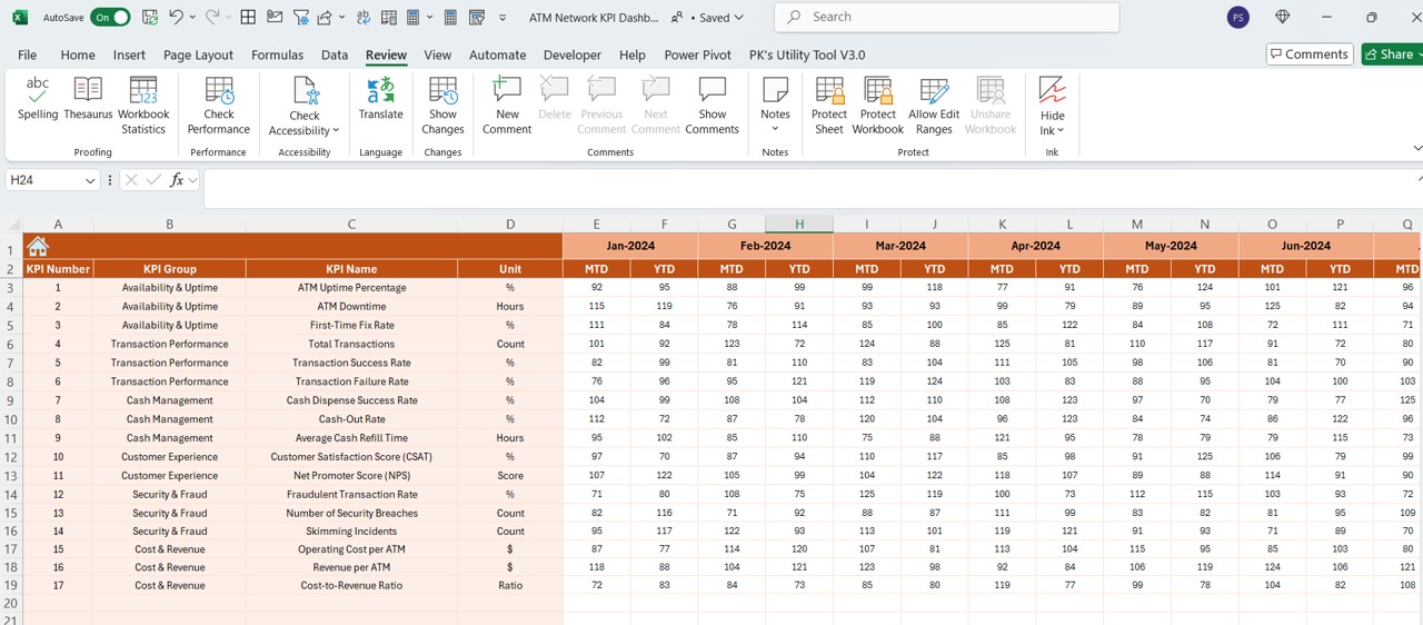
This sheet is where actual KPI values are entered for each month.
- Month Selection (E1): Users input the first month of the year, and all subsequent months adjust accordingly.
- YTD and MTD Data Entry: The sheet allows users to enter actual values for each KPI for a selected month.
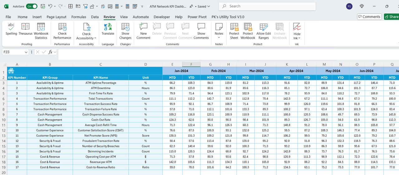
Target Sheet
Click to ATM Network KPI
- Here, users set target values for each KPI.
- MTD and YTD Targets: The sheet allows users to input monthly and yearly targets for every KPI.
Previous Year Numbers Sheet
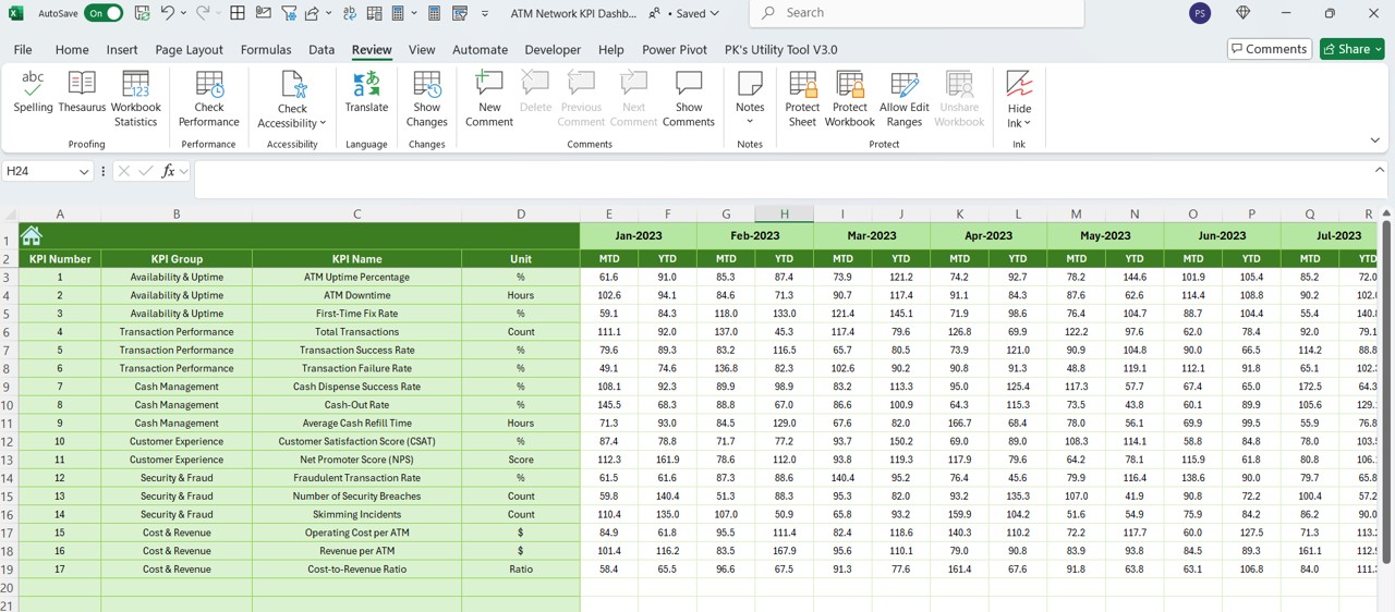
- This sheet stores historical data for KPIs.
- Same Data Structure as the Current Year: Users enter previous year’s numbers, enabling the dashboard to compare past and present performance.
Click to ATM Network KPI
KPI Definition Sheet
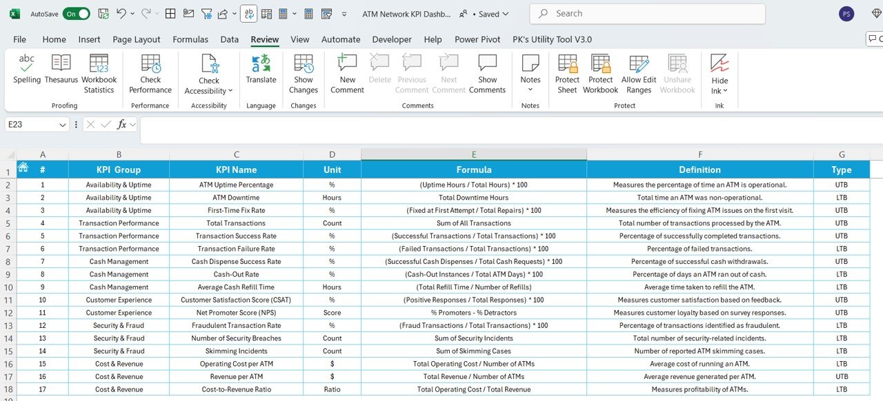
- This sheet serves as a reference document containing important KPI-related information.
- KPI Name, Group, Unit, Formula, and Definition: This structured approach ensures consistency in KPI calculations.
Advantages of Using an ATM Network KPI Dashboard
Real-Time Monitoring
The dashboard updates dynamically based on data inputs, ensuring you always have an up-to-date view of ATM performance.
Data-Driven Decision Making
By tracking key metrics, financial institutions can identify trends, detect inefficiencies, and optimize ATM operations.
Performance Analysis Over Time
With the trend analysis feature, users can compare current vs past performance, helping in setting realistic goals.
User-Friendly Interface
The dashboard is easy to navigate, with drop-down selections and automated calculations making it accessible to non-technical users.
Improved Operational Efficiency
Tracking metrics like transaction failures, cash replenishment frequency, and downtime helps institutions improve ATM reliability.
Best Practices for Using the ATM Network KPI Dashboard
- Ensure Data Accuracy: Regularly update the actual numbers, target values, and previous year data.
- Set Realistic Targets: Base KPI targets on historical data and industry benchmarks.
- Review KPI Trends Monthly: Use the trend analysis feature to assess performance on a monthly basis.
- Use Conditional Formatting for Alerts: Utilize the up/down arrows to quickly spot performance dips and take corrective action.
- Automate Data Entry Where Possible: If handling large ATM networks, consider linking the Excel sheet to a database for automatic data updates.
Click to ATM Network KPI
Conclusion
An ATM Network KPI Dashboard in Excel is a powerful tool that allows banks and financial institutions to monitor ATM performance efficiently. By tracking critical KPIs, users can ensure high ATM availability, minimize failures, and improve customer experience.
This Excel-based template provides a structured way to track ATM performance, making it easy to identify issues and take corrective action in real time. Whether you are monitoring a small ATM network or a large-scale banking infrastructure, this dashboard helps in maximizing efficiency and profitability.
Frequently Asked Questions (FAQs)
What are the key KPIs to track in an ATM Network?
- Some important KPIs include:
- ATM Uptime (%) – Measures the time an ATM is operational.
- Transaction Success Rate (%) – Percentage of successful transactions.
- Cash Replenishment Frequency – Tracks how often cash needs to be refilled.
- Customer Wait Time (Seconds) – Measures how long customers wait before their transaction is completed.
- ATM Maintenance Cost ($) – Total operational and maintenance expenses.
How does the KPI Trend Sheet help in analysis?
The KPI Trend Sheet allows users to track KPI trends over time, helping them identify seasonal trends, inefficiencies, and performance improvements.
Can I customize this dashboard for my organization?
Yes! The ATM Network KPI Dashboard in Excel is fully customizable. You can modify KPIs, add new metrics, and update visualizations based on your institution’s needs.
How often should I update the dashboard?
It is recommended to update the dashboard monthly for accurate performance tracking. If you have real-time data integration, daily updates can provide even better insights.
Click to ATM Network KPI
Visit our YouTube channel to learn step-by-step video tutorials
View this post on Instagram