Climate change is one of the most pressing challenges of our time. Organizations and governments worldwide are striving to monitor and manage their environmental impact effectively. One of the best ways to achieve this is by leveraging data-driven insights through a Climate Action KPI Dashboard in Power BI.
This dashboard allows organizations to track key climate metrics, measure progress towards sustainability goals, and make informed decisions. In this article, we will explore the features, advantages, best practices, and frequently asked questions related to the Climate Action KPI Dashboard in Power BI.
Click to Climate Action KPI
What is a Climate Action KPI Dashboard?
A Climate Action KPI Dashboard is a data visualization tool built in Power BI that enables organizations to track climate-related key performance indicators (KPIs). It helps in monitoring carbon emissions, energy usage, waste management, and other sustainability metrics. The dashboard provides real-time insights, allowing decision-makers to assess their environmental performance effectively.
Click to Climate Action KPI
Key Features of the Climate Action KPI Dashboard
- This Power BI dashboard consists of three main pages, each designed to provide different layers of insights:
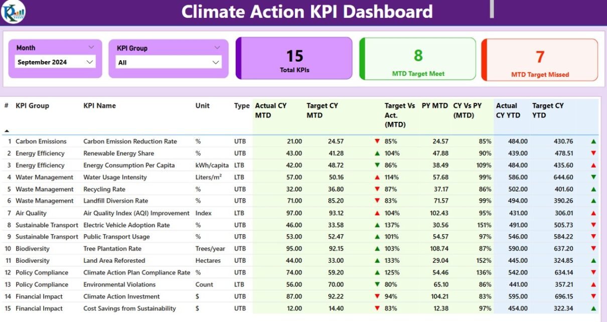
Summary Page
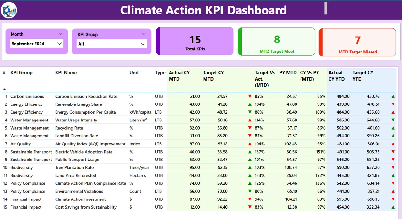
This is the main dashboard page that provides an overview of climate action KPIs with interactive visual elements.
- Slicers: Month and KPI Group slicers at the top allow users to filter data based on specific time periods and KPI categories.
Click to Climate Action KPI
KPI Cards:
- Total KPIs Count
- MTD (Month-to-Date) Target Met Count
- MTD Target Missed Count
Detailed KPI Table:
- KPI Number: A unique identifier for each KPI.
- KPI Group: Categorization of the KPI (e.g., Carbon Emission, Energy Efficiency).
- KPI Name: Descriptive name of the KPI.
- Unit: Measurement unit (e.g., kg CO2, kWh).
- Type: Whether the KPI follows Lower the Better (LTB) or Upper the Better (UTB) approach.
- Actual CY MTD: Current Year’s Month-to-Date actual value.
- Target CY MTD: MTD target value.
- MTD Icon: Red and green arrow icons indicating whether KPIs are meeting targets.
- Target vs. Actual (MTD): Ratio of actual KPI value to the target.
- PY MTD: Last year’s MTD value for comparison.
- CY vs. PY (MTD): Percentage comparison of current and previous year’s MTD values.
- Actual CY YTD: Current Year’s Year-to-Date actual value.
- Target CY YTD: YTD target value.
- YTD Icon: Red and green icons indicating whether KPIs are meeting YTD targets.
- Target vs. Actual (YTD): Ratio of actual KPI value to the target.
- PY YTD: Last year’s YTD value for comparison.
- CY vs. PY (YTD): Percentage comparison of current and previous year’s YTD values.
Click to Climate Action KPI
KPI Trend Page
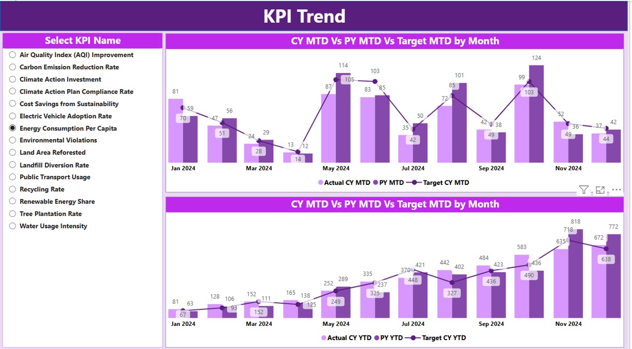
- This page features two combo charts to visually display trends:
- Actual Numbers of Current Year, Previous Year, and Targets for both MTD and YTD.
- Slicers on the left to select specific KPIs for detailed trend analysis.
KPI Definition Page
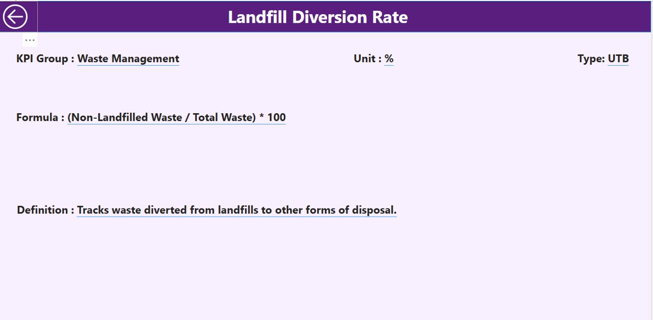
- This hidden drill-through page allows users to view additional details about KPIs by clicking on them in the summary table.
- Shows KPI definitions, formulas, and calculation logic.
- Users can navigate back to the main page using the back button at the top-left corner.
Data Source: Excel-Based Input Sheets
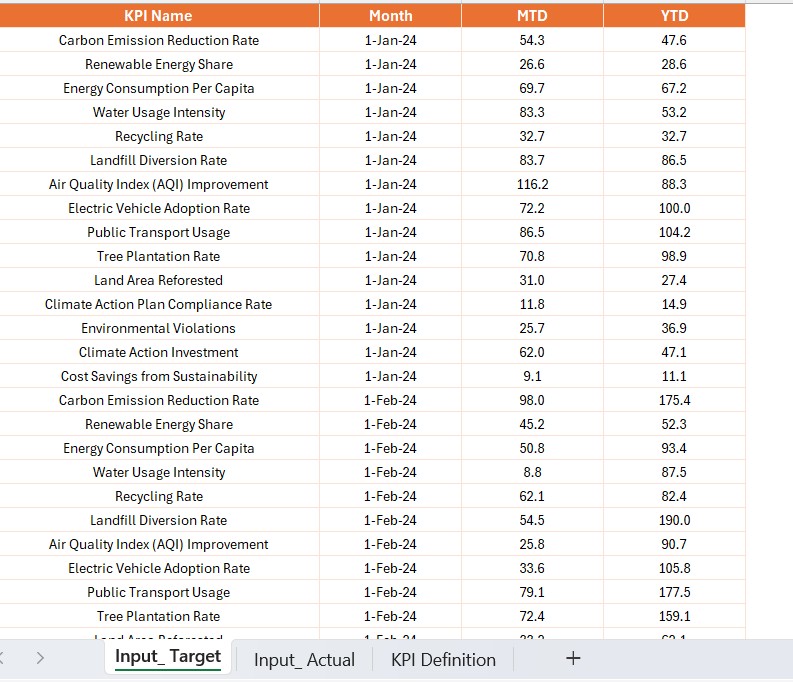
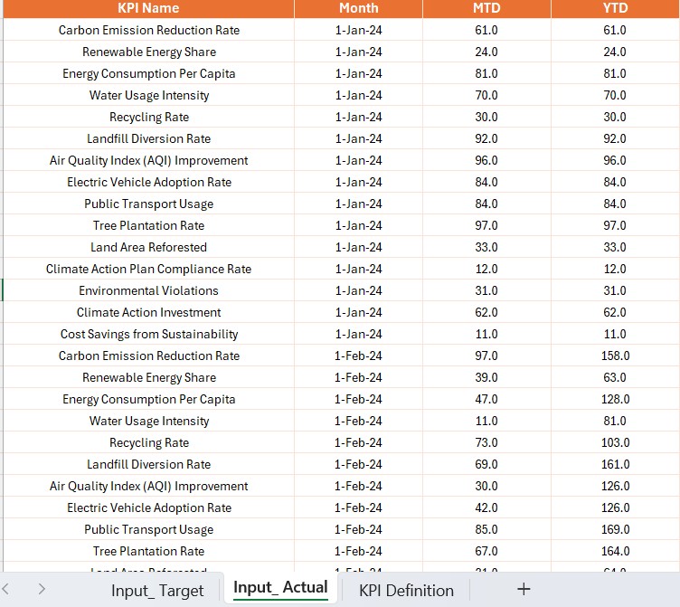
The Climate Action KPI Dashboard in Power BI is powered by an Excel file with three input sheets:
Input Actual Sheet Tab
- Contains actual numbers for each KPI.
- Users need to fill in KPI Name, Month (first date of the month), MTD number, and YTD numbers.
Click to Climate Action KPI
Input Target Sheet Tab
- Contains target numbers for each KPI.
- Users need to fill in KPI Name, Month (first date of the month), MTD number, and YTD numbers.
KPI Definition Sheet
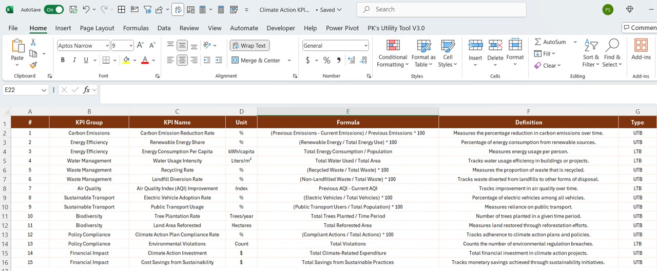
- Contains detailed KPI metadata.
- Users need to fill in KPI Number, KPI Group, KPI Name, Unit, Formula, Definition, and Type (LTB or UTB).
Advantages of the Climate Action KPI Dashboard
- Real-time Monitoring: Provides up-to-date insights into sustainability metrics.
- Data-Driven Decisions: Helps organizations make informed choices about their climate action strategy.
- Trend Analysis: Identifies historical patterns and trends in climate performance.
- Customizable Visuals: Interactive charts and slicers allow easy data exploration.
- KPI Benchmarking: Compares current vs. previous years’ performance.
- User-Friendly Interface: Designed for easy navigation and interpretation of data.
- Drill-Through Functionality: Allows users to dive deeper into KPI details.
- Excel Integration: Uses an Excel-based data source for seamless updates.
Best Practices for Using the Climate Action KPI Dashboard
- Keep Data Updated: Regularly update the Actual and Target sheets to maintain dashboard accuracy.
- Utilize Slicers: Use Month and KPI Group slicers to focus on relevant data.
- Analyze Trends: Leverage the KPI Trend Page to identify performance patterns.
- Monitor Target vs. Actual Performance: Use the red and green icons to quickly spot issues.
- Refine KPIs Over Time: Adjust KPI definitions and targets as sustainability goals evolve.
- Ensure Data Consistency: Maintain uniform units and definitions in the KPI Definition Sheet.
Click to Climate Action KPI
Conclusion
A Climate Action KPI Dashboard in Power BI is an essential tool for organizations committed to sustainability. It provides real-time insights, trend analysis, and benchmarking capabilities that drive effective climate strategies. By following best practices and leveraging interactive features, users can maximize the dashboard’s impact in tracking climate-related KPIs.
Frequently Asked Questions (FAQs)
What is the main purpose of a Climate Action KPI Dashboard?
The dashboard helps organizations track and manage climate-related KPIs, such as carbon emissions, energy usage, and sustainability targets, using Power BI.
Can this dashboard be customized for specific climate goals?
Yes, users can modify KPIs, visual elements, and data sources to align with their specific climate objectives.
What data sources are used for this dashboard?
This dashboard is built on an Excel-based data model, where users fill in actual values, targets, and KPI definitions.
How often should I update the dashboard?
It is recommended to update the data monthly to ensure accurate and up-to-date insights.
Is the Climate Action KPI Dashboard user-friendly?
Yes! The dashboard features interactive slicers, visual charts, and drill-through capabilities, making it easy to use for beginners and experts alike.
Click to Climate Action KPI
Visit our YouTube channel to learn step-by-step video tutorials
View this post on Instagram