In today’s digital world, tracking website performance is essential. Google Analytics provides tons of useful data, but it can sometimes feel overwhelming. That’s where Excel dashboards come in handy. With a well-structured Google Analytics KPI Dashboard in Excel, you can easily organize and analyze key performance indicators (KPIs) to make better business decisions. In this guide, we’ll walk you through everything you need to know about creating a Google Analytics KPI Dashboard in Excel and how it can benefit you.
Click to Google Analytics KPI
What is a Google Analytics KPI Dashboard in Excel?
A Google Analytics KPI Dashboard in Excel is a user-friendly, ready-to-use template that helps businesses track their website performance. It consolidates key data points into a single, organized view, making it easier to analyze traffic trends, user behavior, and overall site performance.
Key Features of the Google Analytics KPI Dashboard
This dashboard is made up of seven worksheets, each serving a specific purpose. Let’s take a closer look at what each sheet does:
Home Sheet
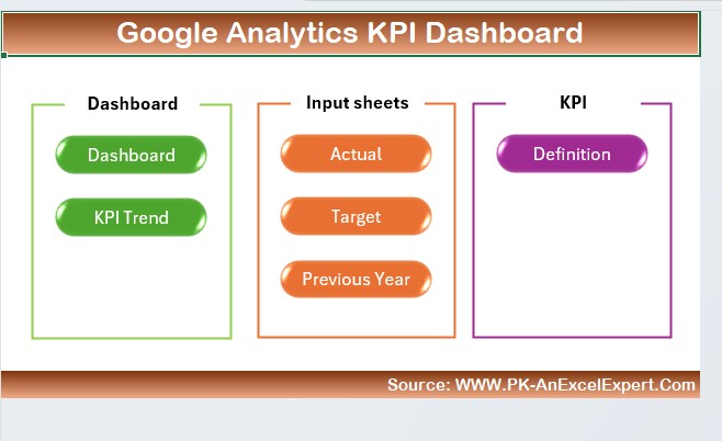
- This is the main navigation hub for the dashboard.
- It contains six buttons that let you jump directly to different sections.
- It provides a clear and structured starting point for users.
Click to Google Analytics KPI
Dashboard Sheet
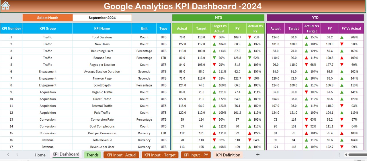
- This is the heart of the dashboard, where all KPI data is displayed.
- You can select a specific month from a drop-down list in cell D3.
- It automatically updates to show MTD (Month-to-Date) and YTD (Year-to-Date) numbers.
- It displays actual values, targets, and previous year comparisons.
- Conditional formatting highlights trends with up/down arrows for easy visualization.
KPI Trend Sheet
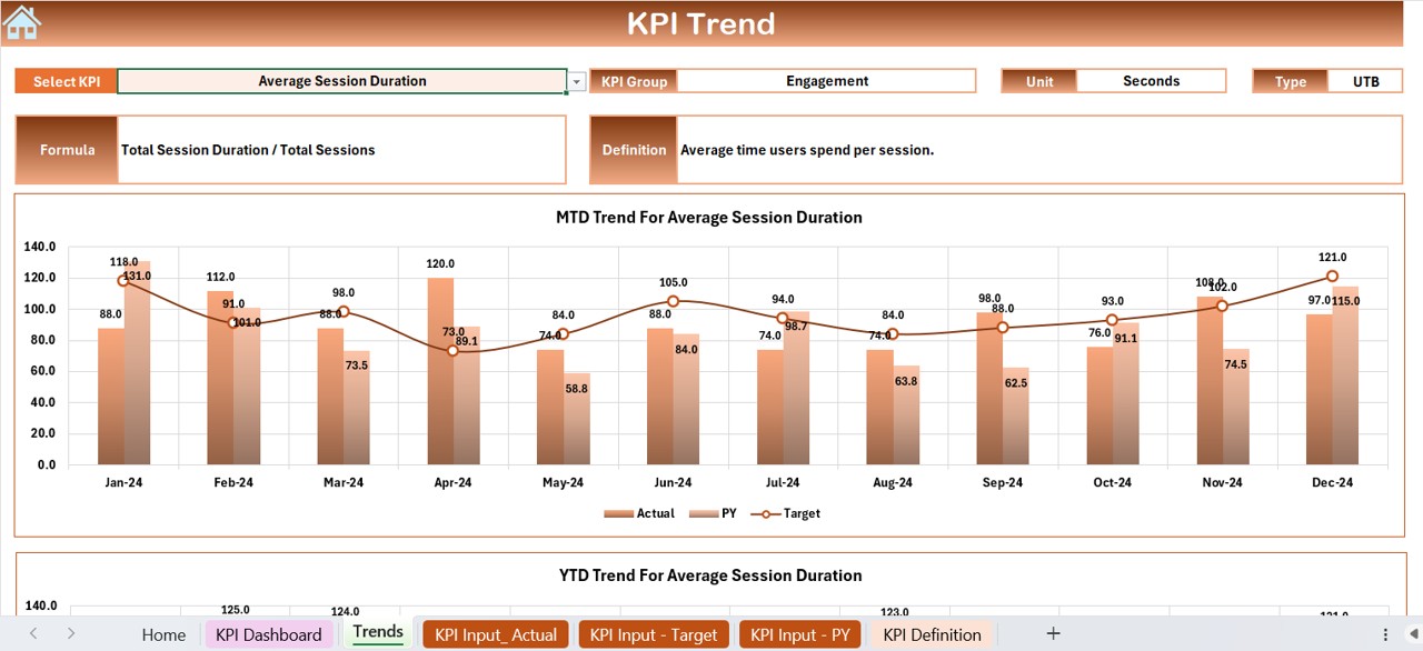
This sheet allows you to select a KPI from a drop-down list in cell C3.
- It provides useful details, such as:
- KPI Group
- Unit of Measurement
- Performance Type (Lower is Better or Higher is Better)
- Formula and Definition
- It also includes a trend chart that compares MTD, YTD, and previous year data.
Click to Google Analytics KPI
Actual Numbers Input Sheet
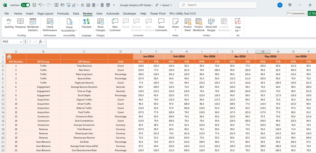
- This is where you manually enter actual performance numbers.
- You can change the first month of the year in cell E1, and all other months will update accordingly.
Target Sheet
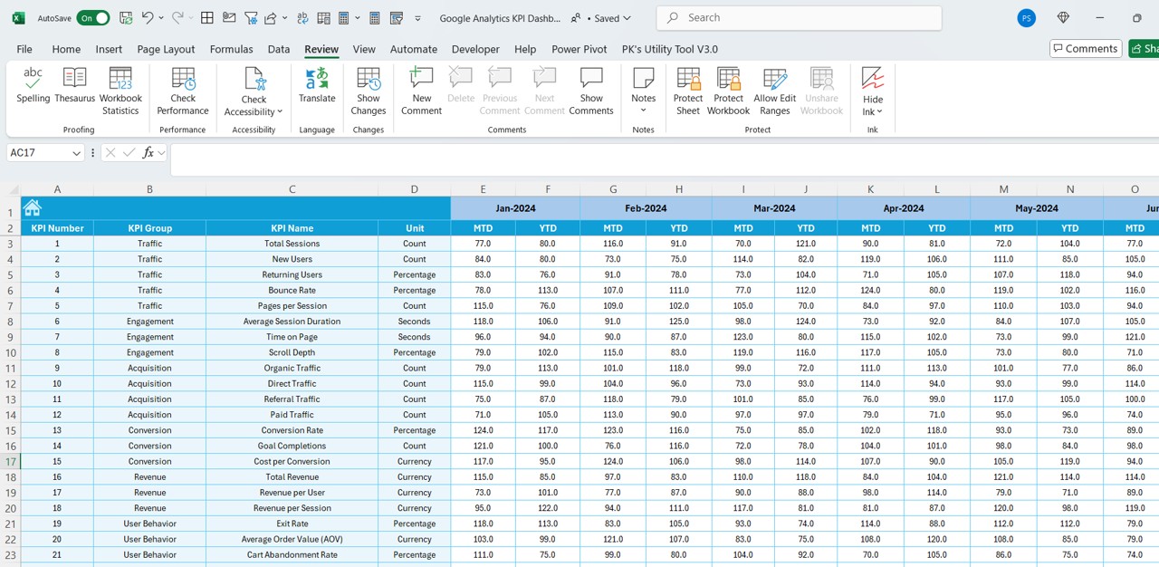
- Here, you input the target values for each KPI on a monthly and yearly basis.
Click to Google Analytics KPI
Previous Year Numbers Sheet
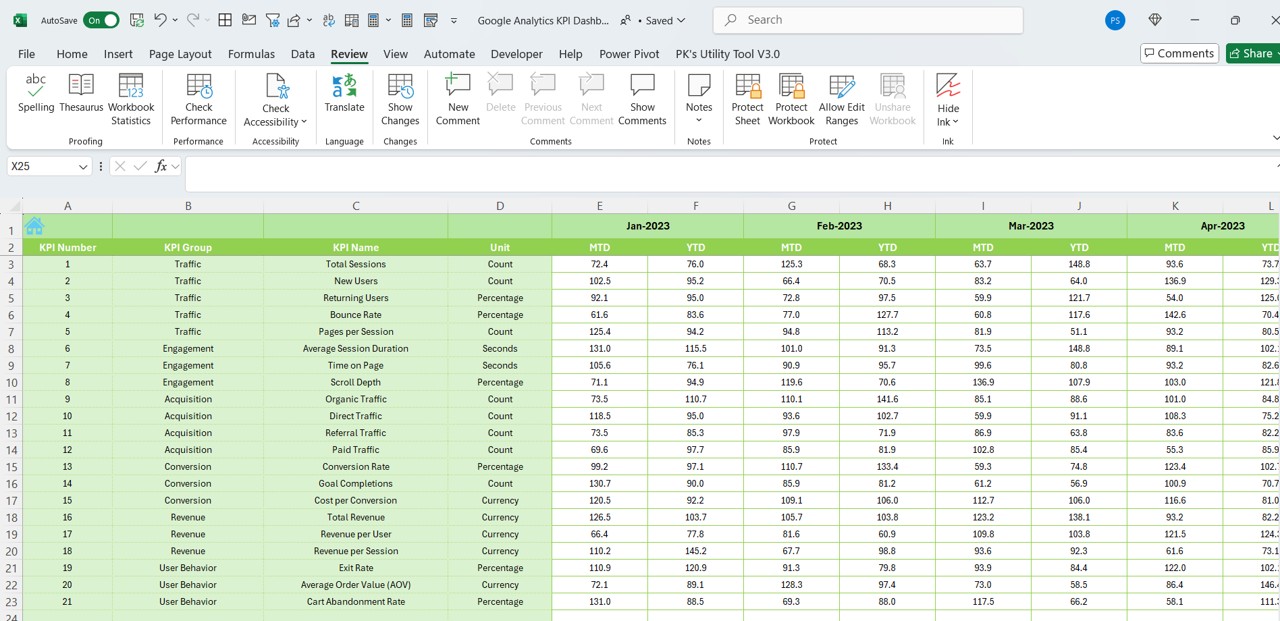
- This sheet stores last year’s data, which is crucial for comparisons and trend analysis.
KPI Definition Sheet
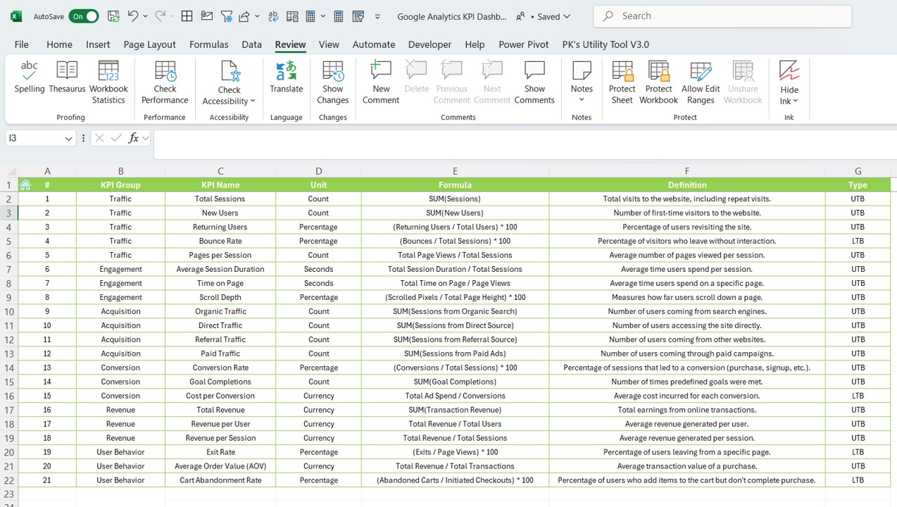
This sheet contains a list of all KPIs with the following details:
- KPI Name
- KPI Group
- Unit of Measurement
- Formula
- Definition
Why Use a Google Analytics KPI Dashboard in Excel?
Everything in One Place
- Instead of jumping between reports, you have all important KPIs in one view.
- It allows for quick and easy comparisons.
Fully Customizable
- You can add new KPIs, charts, or filters to fit your needs.
- This flexibility makes it perfect for businesses of all sizes.
Easy-to-Use Interface
- The drop-down menus and formatted visuals make it user-friendly.
- Even if you’re not an Excel expert, you can navigate through it effortlessly.
Helps with Decision-Making
- With real-time insights, you can quickly identify trends and make adjustments.
- It improves business planning and marketing strategies.
Click to Google Analytics KPI
Best Practices for Creating a Google Analytics KPI Dashboard
Choose the Right KPIs
Focus on metrics that matter the most to your business.
Some key KPIs include:
- Traffic Sources (Where are your visitors coming from?)
- Bounce Rate (Are users leaving without interaction?)
- Conversion Rate (How many visitors complete an action?)
- Page Load Time (Is your site fast enough?)
Automate Data Updates
- Instead of manually copying data, use Google Analytics API to pull information directly into Excel.
- This helps eliminate errors and saves time.
Use Conditional Formatting
- Apply colors, arrows, and data bars to highlight trends.
- This makes it easier to spot patterns at a glance.
Keep It Simple & Organized
- Avoid clutter by grouping similar KPIs together.
- Use clear headings and labels for easy readability.
Update Data Regularly
- Refresh your dashboard weekly or monthly to ensure accuracy.
- Always compare data with previous periods to track performance trends.
Conclusion
A Google Analytics KPI Dashboard in Excel is an effective way to analyze website performance and make data-driven decisions. With a well-structured dashboard, you can easily track important metrics, identify trends, and optimize your marketing efforts. Whether you’re a business owner, marketer, or analyst, this tool will help you stay on top of your website’s performance and improve overall digital strategy.
Frequently Asked Questions (FAQs)
What are the most important KPIs in Google Analytics?
- The most essential KPIs include:
- Traffic Sources (Where visitors come from)
- Bounce Rate (How often users leave without engaging)
- Conversion Rate (Percentage of visitors who complete a goal)
- Page Load Speed (How fast your site loads)
Can I automate data import into Excel?
Yes! You can use Google Analytics API to fetch data automatically, or use Google Sheets integration to pull data into Excel.
How often should I update my KPI Dashboard?
- Weekly or Monthly updates are recommended.
- Real-time updates are ideal for large businesses needing instant insights.
Are there alternatives to using Excel for KPI dashboards?
- Yes, other tools include:
- Google Data Studio (Free and cloud-based)
- Power BI (Great for data visualization)
- Tableau (For advanced reporting needs)
Is this dashboard beginner-friendly?
Absolutely! It is designed to be simple, intuitive, and easy to use. Even users with basic Excel knowledge can navigate and interpret the dashboard.
Click to Google Analytics KPI
Visit our YouTube channel to learn step-by-step video tutorials
View this post on Instagram