Debt management is a critical part of any financial strategy, and the ability to monitor and analyze key performance indicators (KPIs) can make all the difference. Power BI provides a robust platform for building dashboards that help organizations manage debt effectively. The Debt Management KPI Dashboard in Power BI is designed to streamline debt tracking and give financial managers clear insights into the health of their debt portfolio.
In this article, we will explore the structure and benefits of the Debt Management KPI Dashboard, how to use it, and best practices for managing debt with Power BI.
What is a Debt Management KPI Dashboard?
A Debt Management KPI Dashboard is a tool that helps monitor and visualize KPIs related to debt. These KPIs are critical to evaluating the effectiveness of debt management strategies, improving financial health, and ensuring compliance with various regulations.
Power BI, a popular business analytics tool, can be used to create visually appealing and interactive dashboards that display real-time data, enabling users to make data-driven decisions. This dashboard typically includes several key pages that break down debt data into manageable segments.
Key Features of the Debt Management KPI Dashboard
The Debt Management KPI Dashboard in Power BI is designed with the following features:
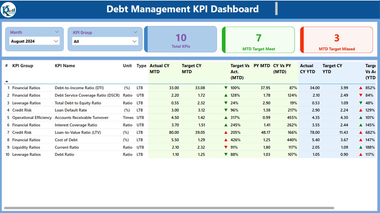
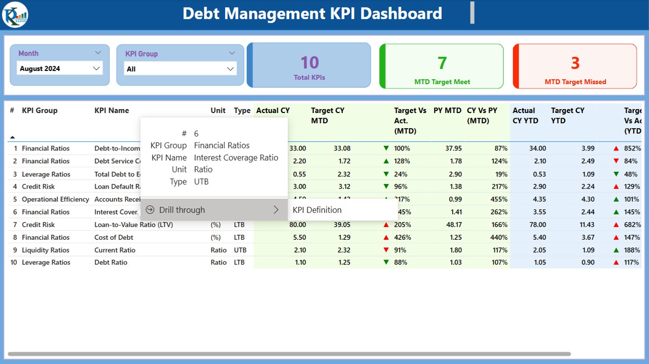
1. Summary Page
The Summary Page serves as the main dashboard of the KPI tool. It provides an overview of debt-related KPIs across different time periods and gives users a quick snapshot of how they are performing relative to their targets.
Month and KPI Group Slicer: These slicers allow users to filter data based on the selected month and the KPI category.
KPIs Cards: Three key cards display the following:
- Total KPIs Count: The total number of KPIs in the system.
- MTD Target Meet Count: The count of KPIs that met their target for the current month.
- MTD Target Missed Count: The count of KPIs that missed their target for the current month.
Detailed Table Breakdown
Below the summary cards, the dashboard features a detailed table with the following information:
- KPI Number: Sequential number assigned to each KPI.
- KPI Group: Category or group under which the KPI falls.
- KPI Name: The name of the KPI.
- Unit: Unit of measurement for each KPI (e.g., percentage, monetary value).
- Type (LTB/UTB): Indicates whether the KPI is “Lower the Better” (LTB) or “Upper the Better” (UTB).
- Actual CY MTD: Actual value for the current year, month-to-date (MTD).
- Target CY MTD: Target value for the current year, MTD.
- MTD Icon: Green (▲) or red (▼) icons to indicate whether the KPI status is above or below target.
- Target vs Actual (MTD): The percentage comparison between the actual and target MTD values.
- PY MTD: MTD value for the same period of the previous year.
- CY vs PY (MTD): The percentage change between the current year’s MTD and the previous year’s MTD.
- Actual CY YTD: Actual value for the current year, year-to-date (YTD).
- Target CY YTD: Target value for the current year, YTD.
- YTD Icon: Green (▲) or red (▼) icons indicating whether the KPI status is above or below target.
- Target vs Actual (YTD): The percentage comparison between the actual and target YTD values.
- PY YTD: YTD value for the same period of the previous year.
- CY vs PY (YTD): The percentage change between the current year’s YTD and the previous year’s YTD.
Click to buy Debt Management KPI Dashboard in Power BI
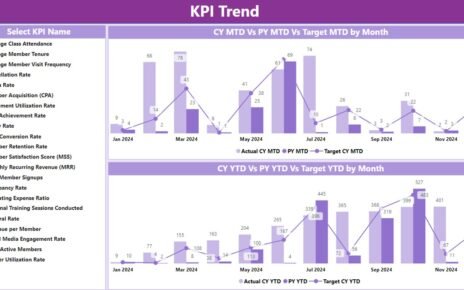
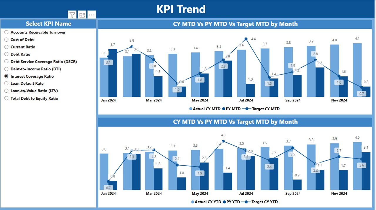
2. KPI Trend Page
The KPI Trend Page provides visual insights into the performance of debt management KPIs over time. The page includes:
-
Combo Charts: These charts display actual values for the current and previous year, along with target values for both MTD and YTD. This allows users to track trends and identify areas that need attention.
-
KPI Name Slicer: A slicer to select the specific KPI for which the trend should be displayed, making it easy to analyze individual KPIs over time.
Click to buy Debt Management KPI Dashboard in Power BI
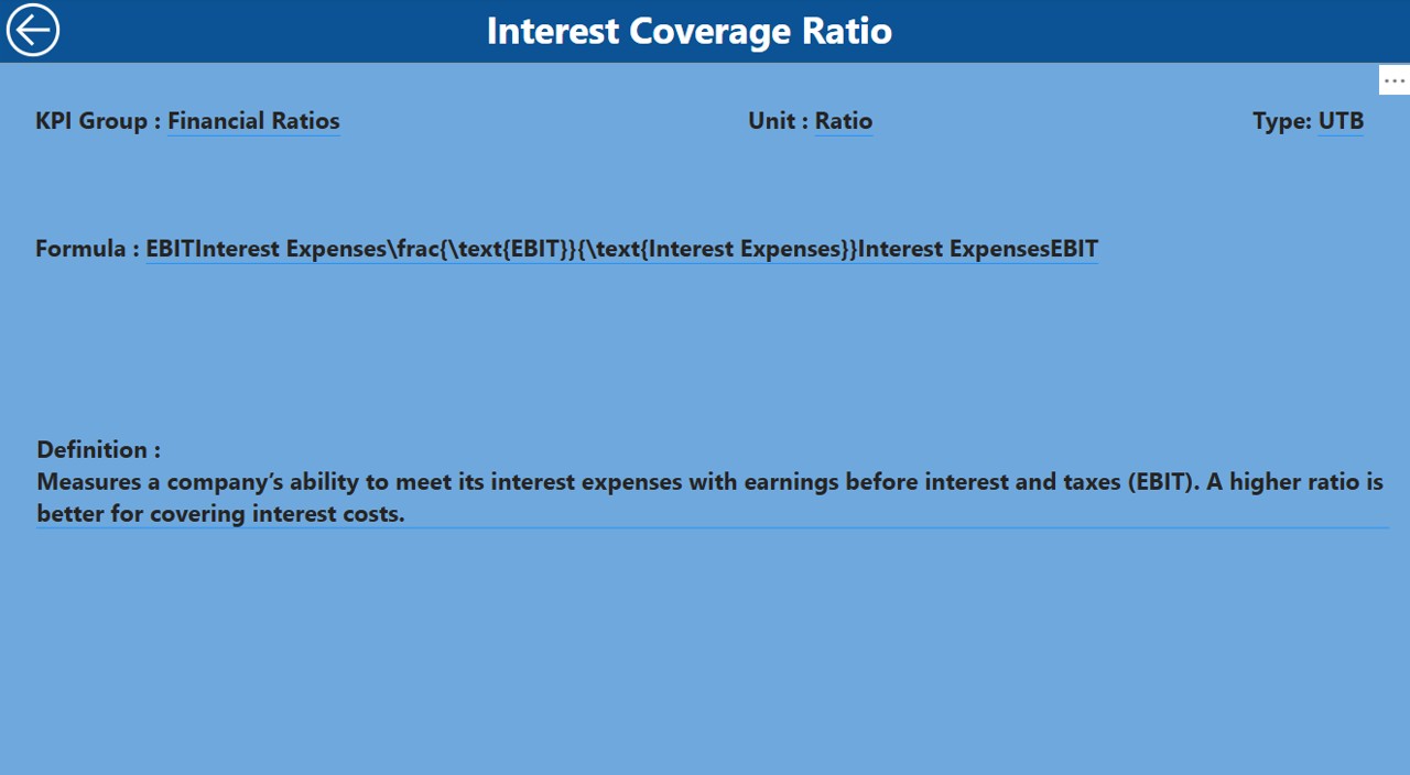
3. KPI Definition Page
Click to buy Debt Management KPI Dashboard in Power BI
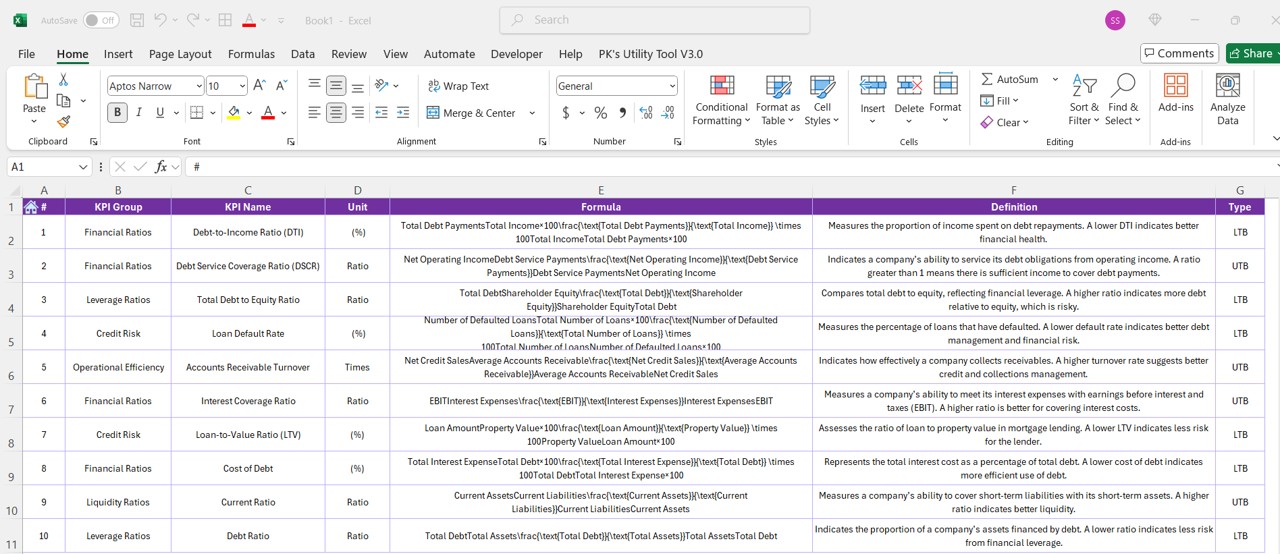
The KPI Definition Page provides detailed information about each KPI, including its formula, definition, and how it contributes to the overall debt management process. This page is essential for users to understand the metrics being measured and how to interpret the results. The KPI Definition Page is hidden by default, but users can drill through from the Summary Page to access this detailed information.
To return to the main page, users simply click the back button located in the top left corner.
Click to buy Debt Management KPI Dashboard in Power BI
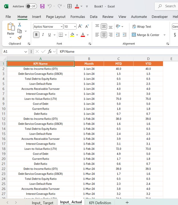
Excel Data Integration for the Debt Management KPI Dashboard
The Debt Management KPI Dashboard uses data sourced from an Excel file. The file is divided into three main worksheets:
1. Input_Actual Sheet
This sheet contains the actual figures for each KPI, including MTD and YTD numbers. Users need to fill in:
- KPI Name
- Month
- MTD Number
- YTD Numbers
Click to buy Debt Management KPI Dashboard in Power BI
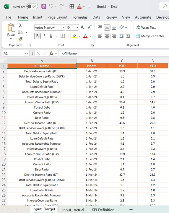
2. Input_Target Sheet
Here, users input the target values for each KPI, including MTD and YTD targets, along with the corresponding month.
Click to buy Debt Management KPI Dashboard in Power BI
3. KPI Definition Sheet
This sheet contains the core details of each KPI, including:
- KPI Number
- KPI Group
- KPI Name
- Unit
- Formula
- Definition
- Type (either LTB or UTB)
By filling in these three worksheets, users ensure that the dashboard is populated with up-to-date and accurate data.
Click to buy Debt Management KPI Dashboard in Power BI
Advantages of the Debt Management KPI Dashboard
Implementing a Debt Management KPI Dashboard in Power BI offers several advantages, including:
- Clear Visualization: Power BI dashboards provide a visually appealing way to monitor KPIs. By using graphs, charts, and icons, users can quickly identify trends and areas that need attention, making the data easier to interpret.
- Real-time Data: With Power BI, your dashboard updates automatically as new data is added to the underlying Excel file. This ensures that users always have the most up-to-date information, leading to more accurate decision-making.
- Customizable and Scalable: The Debt Management KPI Dashboard is highly customizable. You can adjust the KPIs, add new ones, and modify the layout to suit the needs of your organization. As your business grows, the dashboard can scale to accommodate more data and additional KPIs.
- Improved Decision-Making: By continuously monitoring debt-related KPIs, managers can make informed decisions that reduce financial risks, improve cash flow, and optimize debt management strategies.
Opportunities for Improvement in the Debt Management KPI Dashboard
While the Debt Management KPI Dashboard offers a wealth of insights, there are always opportunities for improvement:
- Integration with Other Financial Tools: Integrating the dashboard with other financial management tools like accounting software can provide a more holistic view of your finances, helping to ensure that all aspects of debt management are in sync.
- Advanced Analytics Features: Adding features like predictive analytics or AI-driven forecasting could help anticipate future debt trends, allowing businesses to make more proactive decisions.
- Mobile Accessibility: Ensuring that the dashboard is mobile-friendly would enable users to monitor their debt KPIs on the go, providing more flexibility and accessibility.
Best Practices for Managing Debt with Power BI
To get the most out of your Debt Management KPI Dashboard, consider these best practices:
- Regularly Update Data: Make sure to update the Excel file regularly with the latest data. Inaccurate or outdated data can lead to misleading insights.
- Focus on Key KPIs: Not all KPIs are equally important. Focus on the KPIs that have the most significant impact on your debt management strategy and prioritize those in your dashboard.
- Leverage Power BI’s Filtering and Drill-through Features: Use the slicers and drill-through features to gain deeper insights into specific KPIs or time periods. This helps identify problem areas and opportunities for improvement.
- Collaborate with Stakeholders: Share the dashboard with key stakeholders in your organization to ensure that everyone is on the same page regarding debt management performance.
Conclusion
The Debt Management KPI Dashboard in Power BI is an indispensable tool for any organization looking to gain better control over its debt. By providing clear insights, real-time data, and customizable options, this dashboard empowers businesses to monitor their debt portfolio effectively and make data-driven decisions.
Frequently Asked Questions (FAQs)
1. What KPIs are included in the Debt Management KPI Dashboard?
The dashboard includes KPIs such as Days Sales Outstanding (DSO), Receivables Turnover Ratio, Bad Debt Ratio, and others, which provide insights into various aspects of debt management.
2. How do I update the data in the dashboard?
The data is updated by filling in the Excel worksheets (Input_Actual, Input_Target, and KPI_Definition) with the latest figures. Power BI will automatically refresh the dashboard when the data is updated.
3. Can I customize the dashboard for my organization?
Yes, Power BI dashboards are highly customizable. You can adjust the KPIs, layout, and other elements to suit the specific needs of your organization.
4. Is Power BI suitable for small businesses?
Yes, Power BI is suitable for businesses of all sizes. It offers scalable solutions that can grow with your business, making it a great choice for small businesses as well as large enterprises.
Visit our YouTube channel to learn step-by-step video tutorials
View this post on Instagram
Click to buy Debt Management KPI Dashboard in Power BI